B.I.G. Tips – Earnings Summary and Top Triple Plays
Turkish Stocks Still Declining
One factor behind Thursday’s rally in US equities was an apparent stabilization of the situation in Turkey. Not only had the lira rebounded off of its lows from earlier in the week, but the ETF that tracks Turkish stocks (TUR) also bounced more than 10% off of its lows. It doesn’t look like much, but the fact that it stopped going down was good enough.
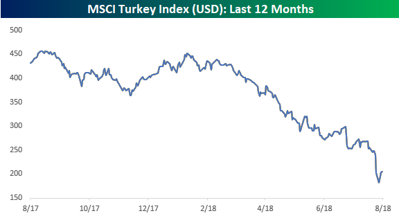
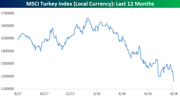
While the lira and TUR bounced, today the lira is back to its losing ways with a decline of 5% versus the dollar. In addition to that, in local currency terms, Turkish stocks haven’t stopped declining and traded to new lows yesterday. While the decline isn’t as bad in percentage terms as the dollar adjusted chart above, in order to be confident that Turkey is in fact stabilizing, we would expect to see its stock market stop declining in both dollar-adjusted as well as local currency terms. Both the chart above and below are updated through Thursday, but in early trading today, Turkish stocks are down in both local and dollar adjusted terms.
Mortgage Delinquencies At Multi-Decade Lows
Earlier this week, we noted that the New York Fed’s quarterly household debt data showed a collapse in the share of consumers facing collections for bad debts. On Thursday, quarterly data from the Mortgage Bankers’ Association relating to mortgage bankruptcy and delinquency showed similar results. In the charts below we show the share of all loans facing foreclosure, share of loans with new foreclosure proceedings started, delinquent loans, and seriously delinquent loans all as a share of total mortgage loans.
As shown, these indicators of mortgage credit performance are in free-fall and making new lows on a consistent basis. The foreclosure stats are the most impressive. New foreclosures as a share of all loans are the lowest since 1986 per the MBA data, while foreclosures as a share of all loans are the lowest since 2006. Delinquency data isn’t quite as positive but also shows impressive levels of timely payment. By all indications, consumers are in very good financial shape, buoyed by the job market, strong home prices, and higher post-crisis borrower standards.
The Closer — Big Breadth Uptick, Housing — 8/16/18
Log-in here if you’re a member with access to the Closer.
Looking for deeper insight on markets? In tonight’s Closer sent to Bespoke Institutional clients, we review the sudden uptick in breadth posted by the S&P 500 today. We also review two pieces of housing market data updated today.

See today’s post-market Closer and everything else Bespoke publishes by starting a 14-day free trial to Bespoke Institutional today!
Bespoke’s Sector Snapshot — 8/16/18
B.I.G. Tips – Death by Amazon – 8/16/18
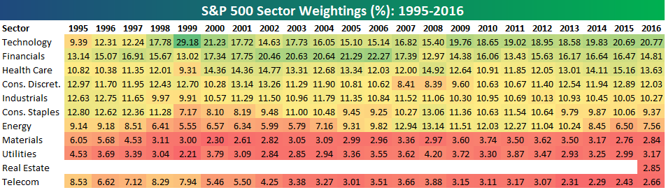
Bespoke’s S&P 500 Sector Weightings Report — August 2018
S&P 500 sector weightings are important to monitor. Over the years when weightings have gotten extremely lopsided for one or two sectors, it hasn’t ended well. Below is a table showing S&P 500 sector weightings from the mid-1990s through 2016. In the early 1990s before the Dot Com bubble, the US economy was much more evenly weighted between manufacturing sectors and service sectors. Sector weightings were bunched together between 6% and 14% across the board. In 1990, Tech was tied for the smallest sector of the market at 6.3%, while Industrials was the largest at 14.7%. The spread between the largest and smallest sectors back then was just over 8 percentage points.
The Dot Com bubble completely blew up the balanced economy, and looking back you can clearly see how lopsided things had become. Once the Tech bubble burst, it was the Financial sector that began its charge towards dominance. The Financial sector’s sole purpose is to service the economy, so in our view you never want to see the Financial sector make up the largest portion of the economy. That was the case from 2002 to 2007, though, and we all know how that ended.
Unfortunately we’ve begun to see sector weightings get extremely out of whack once again.
If you would like to see the most up-to-date numbers for S&P 500 sector weightings, simply start a two-week free trial to our Bespoke Premium or Bespoke Institutional services. Click back to this post to see the numbers once you’re signed up!
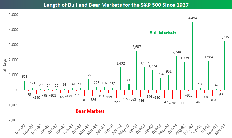
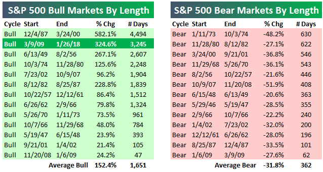
Historical Bull and Bear Markets of the S&P 500
There’s been plenty of chatter lately about the current bull market becoming the “longest on record.” Below is an updated look at the length of the current bull market compared to past bull markets for the S&P 500.
First things first, though. Until the S&P 500 closes at a new high, January 26th, 2018 represents the end point of the current bull market because that’s the date of the S&P’s highest closing point of the bull market. Thus, the length of the current bull market has been stopped at 3,245 days since January 26th (3/9/09-1/26/18). A bull market is most commonly defined as a 20%+ rally that was preceded by a 20%+ decline. If the S&P never closes above its January 26th closing level, and instead it goes on to fall 20% from that level, a new bear market will have begun with a start date of January 26th, 2018. Since we don’t know whether the S&P will go into a new bear market before it closes above its 1/26 high, or vice versa, we can’t extend the length of the current bull market past the 1/26 high point.
Based on the most commonly used definition of bull and bear markets (20% rallies and declines using closing prices), below is a chart showing the length (in calendar days) of bull and bear markets for the S&P 500 since 1927. We’ve shaded bull markets in green and made them positive, while we’ve shaded bear markets in red and made them negative.
The current bull market that has lasted 3,245 days is the second longest on record behind the 4,494-day bull market that ran from late 1987 through early 2000. Yes, the S&P 500 went from late 1987 to early 2000 without experiencing a single decline of 20% or more on a closing basis.
If the S&P 500 went on to make a new closing high today, the current bull market would be at 3,447 days, which would still be more than 1,000 days less than the longest bull market on record. For the current bull to become the longest on record, the S&P 500 would need to move above its 1/26 closing high and then not experience a 20% decline from an all-time high through June 29th, 2021.
Two things stand out the most in the chart below. The first is that bull markets last a lot longer than bear markets. Indeed, the average bull market since 1927 has lasted 981 calendar days, while the average bear market has lasted 296 days. The second is that US bull/bear market cycles became much longer lasting post-WW2.
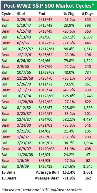
Below is a table showing the 13 post-WW2 market cycles for the S&P 500. The average bull market since WW2 has lasted 1,651 days and seen a gain of 152.4%. The average bear market has lasted 362 days and seen a decline of 31.8%. The current bull market’s gain of 324.6% over 3,245 days is more than double the length and strength of the average bull market.
There is always a lot of debate about the 20% rally/decline definition of a bull market. That’s because there have been multiple 19%+ declines from a closing high that just didn’t quite make it to the 20% threshold for a new bear market. Shouldn’t the 19.92% decline back in 1990 be considered a bear market since the index was just 0.08% away from the 20% threshold? Or shouldn’t the 19.39% decline seen in 2011 be considered a bear as well?
We try to be as consistent as possible with the data, so we’re always going to use some type of percentage threshold to measure bull and bear markets over time instead of trying to be subjective about them. And we would never try to say that one 19%+ decline should be considered a bear market while another 19%+ decline shouldn’t be. So for those that would rather use a 19% threshold for market cycles instead of the standard 20% threshold, below we offer a side-by-side comparison of the two.
As you can see, the 19%+ threshold ends up adding 5 more bull and bear markets to the tally in the post-WW2 era.

As mentioned earlier, the current bull market is the 2nd longest on record using the standard 20% threshold for bull and bear markets.
If we use the 19% threshold, the current bull would rank as the third longest on record instead of the second longest.
At Bespoke, we’ll likely always use the 20% rally/decline threshold as our definition for bull and bear markets. For investors out there that prefer to be subjective about it or include some 19% declines, that’s fine too!
In regards to the current bull market, even if you include the 19% selloff in 2011 as its own bear market, the bottom line is that this bull has still been a really long one.
There are two things to remember, though, for the time being. 1) As mentioned above, the current bull is actually not aging at this point until it takes out its January 26th high. And 2) — more importantly — bull markets don’t die of old age.
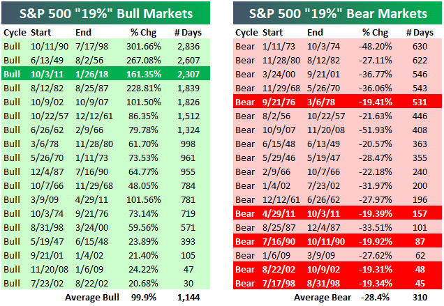
the Bespoke 50 — 8/16/18
Every Thursday, Bespoke publishes its “Bespoke 50” list of top growth stocks in the Russell 3,000. Our “Bespoke 50” portfolio is made up of the 50 stocks that fit a proprietary growth screen that we created a number of years ago. Since inception in early 2012, the “Bespoke 50” has beaten the S&P 500 by 92.1 percentage points. Through today, the “Bespoke 50” is up 198.7% since inception versus the S&P 500’s gain of 106.6%. Always remember, though, that past performance is no guarantee of future returns.
To view our “Bespoke 50” list of top growth stocks, click the button below and start a trial to either Bespoke Premium or Bespoke Institutional.
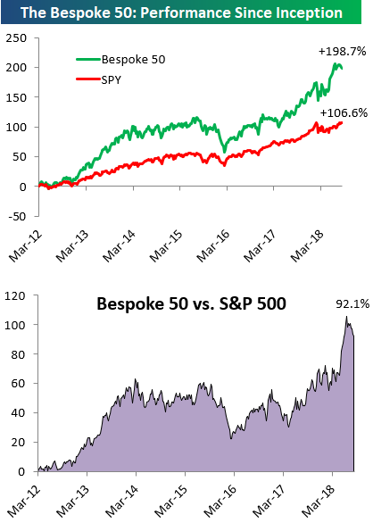
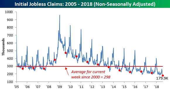
Death, Taxes, and Strong Jobless Claims Reports
Yeah, jobless claims are starting to get that dependable in terms of delivering a strong weekly print. This week’s report was no different as first-time claims came in at 212K versus estimates of 215K. So now it’s time to update the streaks. This week’s report was the record 180th straight week of sub-300K claims, the 45th straight week where claims were at or below 250K (longest streak since 1970), and the 6th straight week that claims were at or below 220K (longest streak since 1969).
Despite the decline in claims this week, the four-week moving average increased to 215.5K, which is 2K above the multi-decade low of 213.5K from mid-May. Unless we get a print below 209K next week, the May low will hold for at least another week.

Finally, on a non-seasonally adjusted (NSA) basis, jobless claims dropped to 179.9K. For the current week of the year, this is the lowest reading on record and nearly 120K below the average of 298K dating back to 2000.