Fixed Income Weekly – 9/12/18
Searching for ways to better understand the fixed income space or looking for actionable ideals in this asset class? Bespoke’s Fixed Income Weekly provides an update on rates and credit every Wednesday. We start off with a fresh piece of analysis driven by what’s in the headlines or driving the market in a given week. We then provide charts of how US Treasury futures and rates are trading, before moving on to a summary of recent fixed income ETF performance, short-term interest rates including money market funds, and a trade idea. We summarize changes and recent developments for a variety of yield curves (UST, bund, Eurodollar, US breakeven inflation and Bespoke’s Global Yield Curve) before finishing with a review of recent UST yield curve changes, spread changes for major credit products and international bonds, and 1 year return profiles for a cross section of the fixed income world.
This week we review whether home prices are likely to slow given the modest increase in mortgage rates we’ve seen this year.

Our Fixed Income Weekly helps investors stay on top of fixed income markets and gain new perspective on the developments in interest rates. You can sign up for a Bespoke research trial below to see this week’s report and everything else Bespoke publishes free for the next two weeks!
Click here and start a 14-day free trial to Bespoke Institutional to see our newest Fixed Income Weekly now!
Canadian Home Prices Get Used To A Slower Roll
The Teranet-National Bank House Price Index of Canadian home prices for August was released this morning. On a national level, the index rose 0.14% MoM at an annual rate; higher, but just barely. August’s YoY growth came in at 1.36%, its lowest level since November 2009. While this may sound bad, the low year over year growth reading is a result of last August’s peak in the index; base effects are now weighing more than high frequency changes.
Of the 11 metropolitan areas that make up the composite, Montreal saw the greatest gains of 10.64% MoM annualized, followed by Hamilton and Ottawa with 9.91% and 8.70%, respectively. Conversely, Vancouver experienced the greatest decline of 4.20%, with Calgary not far behind, down 4.13%.
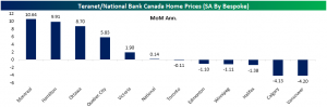
In the past year and a half, Toronto—the largest of the 11 metros—and Hamilton have seen significant declines in YoY growth. The August reading, while still negative, was the first sequential increase in YoY change for the cities since May 2017.
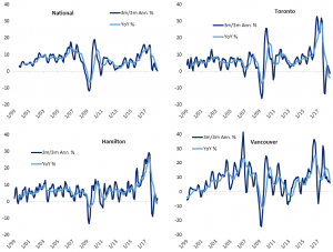
Prices have climbed in Canada for some time now, bringing to question an affordability problem or a housing bubble. The repercussions of rising rates, local policy reforms, and higher lending standards nationally are starting to weigh on home prices. Overall from this report, the Canadian housing market is a mixed bag; not necessarily showing strength or weakness on a national level. While the two largest index contributors, Toronto and Vancouver, have seen modest and great MoM declines, other areas of the country like Montreal—the third largest area—have seen strong growth. Nationally, home prices are clinging to positive territory on both a YoY and 3m/3m annualized rate. While they may avoid declines, it’s pretty clear that the double-digit annual rate of advance we’ve seen in Canada for years is not coming back.
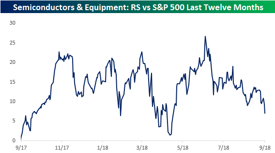
Semiconductors: Bottom of the Barrel
With the broader market (including Technology) at or right near all-time highs, it is pretty surprising just how weak the semis have been. Just yesterday, the S&P 500 Semiconductor and Equipment industry broke back below its 200-DMA, and it is sinking further today following negative comments from Goldman and Stifel.
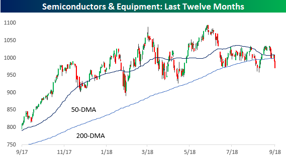
On a relative strength basis versus the S&P 500, the group looks even weaker. Since peaking out in June, the group’s relative strength has been trending sharply lower, and it just made another new short-term low today.
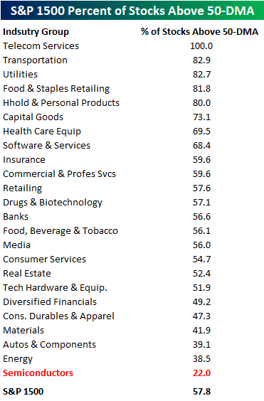
When looking at the various Industry Groups within the S&P 1500 and what percentage of stocks in each one are trading above their 50-DMA, none are currently weaker than the semis. For the S&P 500 as a whole, 57.8% of stocks in the index are above that level. As shown in the table below, with just 22% of stocks in the Semiconductor Industry Group trading above their 50-DMA, no other Industry Group is even close in terms of how few stocks are trading above their 50-DMA. Talk about out of favor!
Bespoke’s Global Macro Dashboard — 9/12/18
Bespoke’s Global Macro Dashboard is a high-level summary of 22 major economies from around the world. For each country, we provide charts of local equity market prices, relative performance versus global equities, price to earnings ratios, dividend yields, economic growth, unemployment, retail sales and industrial production growth, inflation, money supply, spot FX performance versus the dollar, policy rate, and ten year local government bond yield interest rates. The report is intended as a tool for both reference and idea generation. It’s clients’ first stop for basic background info on how a given economy is performing, and what issues are driving the narrative for that economy. The dashboard helps you get up to speed on and keep track of the basics for the most important economies around the world, informing starting points for further research and risk management. It’s published weekly every Wednesday at the Bespoke Institutional membership level.
You can access our Global Macro Dashboard by starting a 14-day free trial to Bespoke Institutional now!

The Closer — Yields Break Out, Quits Surge — 9/11/18
Log-in here if you’re a member with access to the Closer.
Looking for deeper insight on markets? In tonight’s Closer sent to Bespoke Institutional clients, discuss the breakout in 10 year yields and the relationship between 10s and the shape of the yield curve. We also discuss in detail today’s very strong JOLTS report, price action and valuations in EM, and the outlook for inventories to add to GDP over coming quarters.

See today’s post-market Closer and everything else Bespoke publishes by starting a 14-day free trial to Bespoke Institutional today!
Bespoke CNBC Appearance (9/10)
Bespoke co-founder Paul Hickey appeared on CNBC’s Power Lunch on Monday (9/10) to discuss the widening performance gap between the US and Emerging Markets. To watch the interview, click on the image below.

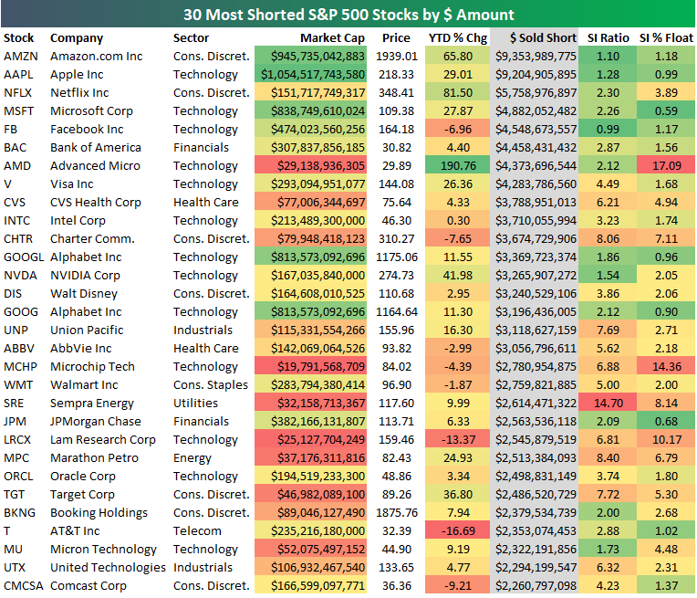
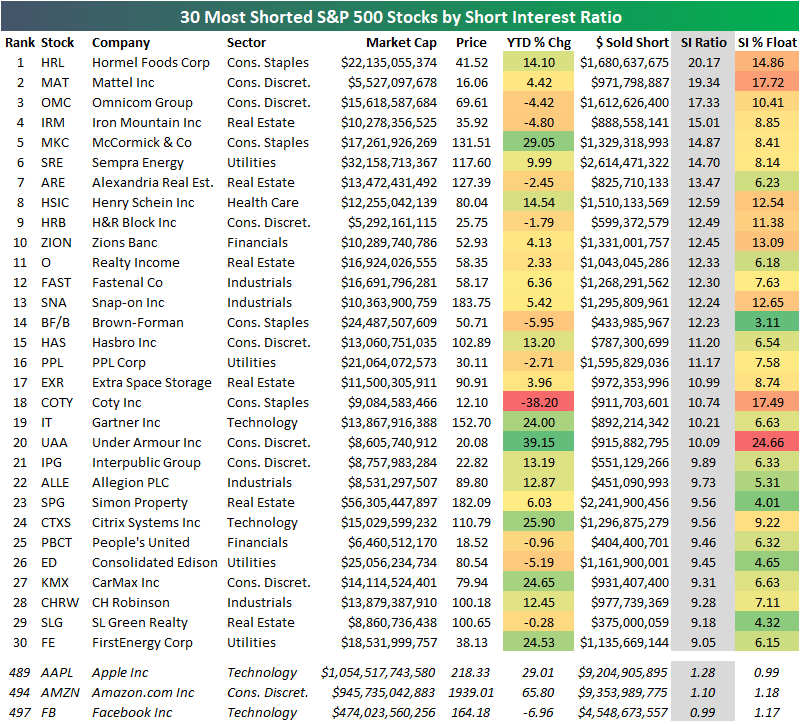
The Most Shorted S&P 500 Stocks — Apple (AAPL) is NOT One of Them
We laughed when we saw the headline below linked on the popular Drudge Report website this morning. “Apple becomes most shorted company ahead of iPhone launch…” Here’s a link to the story posted on Telegraph.co.uk.

For those reading this headline that aren’t familiar with the inner-workings of short selling, the assumption might be that investors are turning extremely negative on Apple (AAPL). This assumption would be completely wrong, however.
Yes, when it comes to the $ amount of Apple (AAPL) shares that are sold short, the stock is right at the top of the list at $9.2 billion. (Note that as of the close yesterday, Amazon.com (AMZN) actually had Apple beat in this regards.) But measuring short interest by $ amount is nonsensical because it doesn’t take a company’s overall market cap into account.
Below is a list of the 30 S&P 500 stocks with the highest dollar amount of shares sold short. For each stock, we also include its market cap, its YTD % change, its short interest ratio, and its short interest as a percentage of float.
Short interest ratios and short interest as a percentage of float are the indicators that investors use to measure how true short interest levels. The short interest ratio is the number of shares sold short divided by the stock’s average daily volume. It’s also known as “days to cover” because the number tells you how many trading days it would take for short-sellers to cover all of their shares (based on the stock’s average daily volume).
Short interest as a percentage of float tells you the percentage of a stock’s tradeable share count that are sold short, and this is the reading we use most often when measuring how bearish investors are on a name.
As you’ll see below, most of the names on the list are only there because of their massive market caps. Stocks like Apple and Amazon indeed have a high dollar amount of shares sold short, but their short interest ratios and short interest as a percentage of float are right around 1. That’s actually an extremely low number for these two measures.
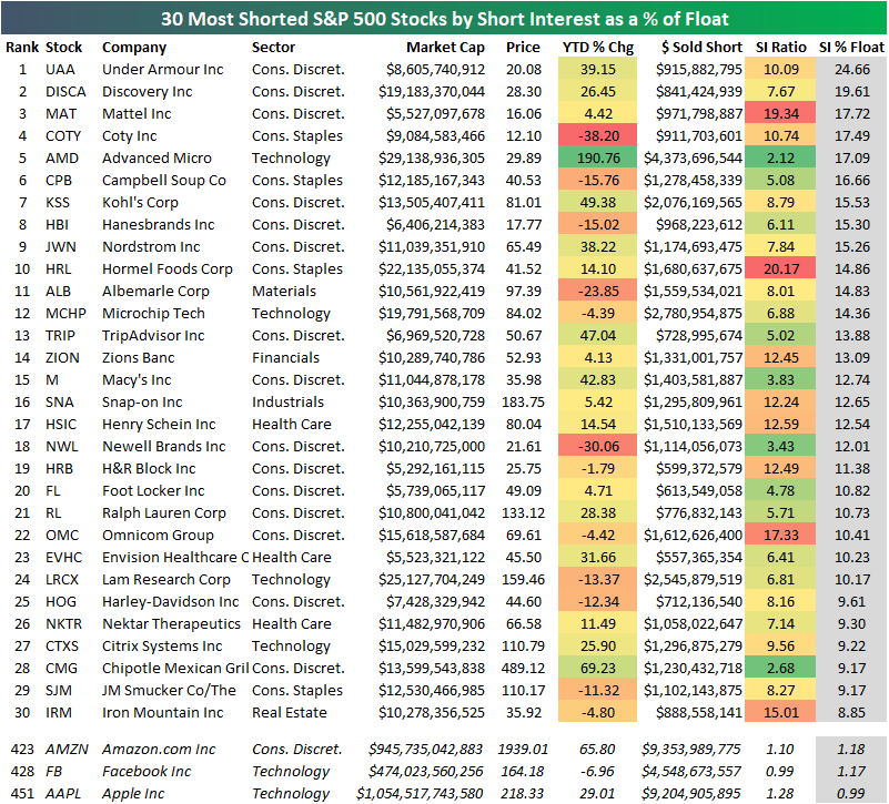
Below we highlight the actual list of the most shorted stocks in the S&P 500 using short interest as a percentage of float. As shown, Under Armour (UAA) tops the list with 24.66% of its float sold short, followed by Discovery (DISCA), Mattel (MAT), Coty (COTY), and Advanced Micro (AMD).
At the bottom of the table, we show that stocks like Apple (AAPL), Amazon.com (AMZN), and Facebook (FB) are actually some of the least shorted stocks in the S&P 500. Apple (AAPL) currently ranks as the 451st most shorted stock in the S&P 500 — hardly “the most shorted company” as the Drudge headline suggests.
When it comes to short interest ratios (days to cover), Apple (and AMZN, and FB) rank even lower. Apple is the 489th most shorted stock based on short interest ratio, while AMZN ranks 494th and FB ranks 497th.
Based on short interest ratios, Hormel Foods (HRM) is at the top of the list with a reading of 20.17, followed by Mattel (MAT), Omnicom Group (OMC), and Iron Mountain (IRM).
Monster JOLTS
Today’s Job Openings and Labor Turnover Survey from the BLS came in significantly stronger than expected as the number of job openings came in at 6.939 million versus estimates for a level of 6.675 million. Based on this report and reports over the last few months, 2018 is shaping up as a year where economists have underestimated the strength of the US job market. To illustrate, in the each of the JOLTS reports covering 2018 so far, all seven of them have come in better than expected, beating expectations by an average of 219K!
In the chart below, we update the spread between the number of Job openings in the US to the number of unemployed. You may recall that back in March the number of job openings exceeded the number of unemployed for the first time since the data for the JOLTS survey begins in 2001. Since then, the gap between job openings and available workers has continued to widen. Through July, which is the most recent available data for the JOLTS survey, the gap stood at a record 659K.
Earlier on Tuesday, the NFIB Small Business Optimism Index showed that small businesses are increasingly having trouble finding available workers and the latest data from the JOLTS survey confirm the tightness of the US labor market. These days, available jobs are like shooting fish in a barrel.

Bespoke Stock Scores — 9/11/18
Gauging US Versus Eurozone Employment
Today the Eurostat updated its quarterly measurement of employment in the Eurozone. As shown in the chart below, Eurozone payrolls expanded less than the US for three quarters running, after three quarters of Eurozone employment outstripping the US. Both economies are growing employment at a pretty similar and strong pace, in the mid-1% annualized range. Most of the current global cycle has seen the US grow employment faster than the Eurozone, but of course the US saw employment contract faster than the Eurozone during the global financial crisis.
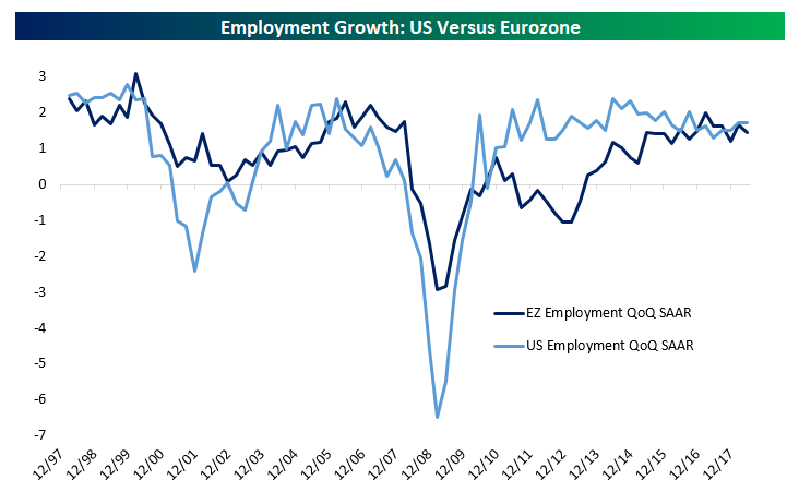
Since the first quarter of 2008, when both Eurozone and US employment peaked (chart below), there have been multiple large swings in employment in the world’s two largest economies. In the US, employment dropped 6.2% from the pre-crisis peak through Q1 of 2010. The Eurozone drop (-3.6% from peak) was much less dramatic, but it took further to get there (Q2 2013 bottom). Since bottoming, US payrolls have surged 7.5% relative to their Q1 2008 peak, while Eurozone payrolls have advanced 2.4% versus the prior peak.