Trend Analyzer — 9/21/18
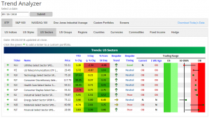
Coming off of the Dow and S&P 500 both hitting all-time highs during yesterday’s session, our Trend Analyzer is showing a sea of green. Yesterday we highlighted several of these ETFs as being down versus a week ago. Today, every one of the fourteen major US Index ETFs are higher than they were heading into last Friday. Additionally, eleven are currently overbought, three are neutral, and none are oversold.
This week, there has been a recurring theme in our Trend Analyzer that while most ETFs have been overbought, it was not by much. This is no longer the case today. Many of the ETFs are considerably more overbought than before with some nearing extreme overbought levels. Two that have neutral readings—Core S&P Small-Cap (IJR) and the Russell 2000 (IWM)—are on the cusp of moving into overbought territory. Meanwhile, the Micro-Cap ETF (IWC) has traded below its 50-DMA all week but has finally moved above. The Dow (DIA) is flexing its muscles from yesterday’s gains with a gain of 2.01% on the week (double the next highest) and is the most overbought ETF up 4.15% from its 50-DMA.

Finally, as we discussed yesterday in our Bespoke Sector Snapshot, the Financials and Materials sectors have recently lagged, but that hasn’t been the case this week. Both Materials (XLB) and Financials (XLF) have experienced the largest gains of the sector ETFs over the past week moving well into overbought territory.
The Closer — Insurers Buck The Season, Valuation, Flow of Funds — 9/20/18
Log-in here if you’re a member with access to the Closer.
Looking for deeper insight on markets? In tonight’s Closer sent to Bespoke Institutional clients, we take a look at the performance of property & casualty insurers relative to the S&P 500 with surprising results for the period around hurricane season. We also take a look at S&P 500 (ex Financials) valuation and debt, before a detailed analysis of today’s Flow of Funds report from the Federal Reserve. That report includes debt and income levels for various macroeconomic sectors, with myriad interesting analyses possible.

See today’s post-market Closer and everything else Bespoke publishes by starting a 14-day free trial to Bespoke Institutional today!
Chart of the Day: Leaders “Fall” Back in September
Bespoke’s Sector Snapshot — 9/20/18
We’ve just released our weekly Sector Snapshot report (see a sample here) for Bespoke Premium and Bespoke Institutional members. Please log-in here to view the report if you’re already a member. If you’re not yet a subscriber and would like to see the report, please start a two-week free trial to Bespoke Premium now.
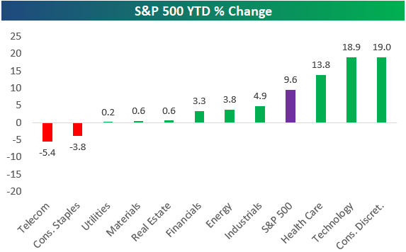
Below is one of the many charts included in this week’s Sector Snapshot, which simply shows the year-to-date performance of the S&P 500 and its eleven sectors. After a rally to new all-time highs today, nine of eleven sectors are in the green for the year, with just Telecom and Consumer Staples in the red. Health Care, Technology, and Consumer Discretionary are the three top performing sectors with double-digit percentage gains so far in 2018.
To find out what this means and to see our full Sector Snapshot with additional commentary plus six pages of charts that include analysis of valuations, breadth, technicals, and relative strength, start a two-week free trial to our Bespoke Premium package now. Here’s a breakdown of the products you’ll receive.
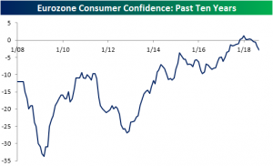
Eurozone Consumer Confidence Disappoints Again
The preliminary reading of the European Commission’s Eurozone consumer confidence for September fell for the fourth month in a row to -2.9 from -2.0 in August. Although not as big a miss as August’s report, this was the second weaker than expected report in a row. The last time consumer confidence was this low was in May of 2017.
Consumer confidence further confirms the undertows of worsening European economic activity; echoing the weaker Eurozone retail sales and industrial production report from earlier this month. If this release is any indication, no one should hold high expectations for next month’s retail sales. While the level of the confidence index is still very strong relative to recent history, and therefore is no reason to panic about the end of the Eurozone’s economic expansion, the direction it’s moving definitely represents slowing consumer spending prospects.
the Bespoke 50 — 9/20/18
Every Thursday, Bespoke publishes its “Bespoke 50” list of top growth stocks in the Russell 3,000. Our “Bespoke 50” portfolio is made up of the 50 stocks that fit a proprietary growth screen that we created a number of years ago. Since inception in early 2012, the “Bespoke 50” has beaten the S&P 500 by 102.9 percentage points. Through today, the “Bespoke 50” is up 215.9% since inception versus the S&P 500’s gain of 113.0%. Always remember, though, that past performance is no guarantee of future returns.
To view our “Bespoke 50” list of top growth stocks, click the button below and start a trial to either Bespoke Premium or Bespoke Institutional.

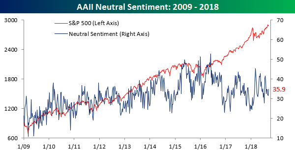
Individual Investors Still Not Feeling It
The stock market is back at record highs, but don’t tell that to individual investors. In the latest survey of individual investor sentiment from AAII, bullish sentiment declined (ever so slightly) for the third straight week, dropping from 32.09% down to 32.04%.
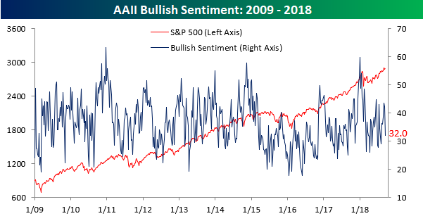
Interestingly enough, bearish sentiment came in at the exact same level as bullish sentiment this week, dropping from 32.84% down to 32.04%. The last time both gauges of sentiment were at the exact same level was in June 2016.

With both bearish and bullish sentiment at the same levels and neutral sentiment right around a third as well, can individual investors be any more indecisive? We do have to say that the last three days of gains for the US equity market have caught a lot of people off guard.
Philly Comeback
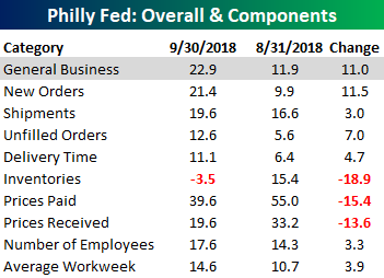
With the headline index falling to a 21-month low in August, last month’s Philly Fed was a bit of a disappointment. However, with an overall strong reading in the ISM in early September, the weak reading in Philly was considered more of a one-off anomaly than anything else. With this month’s report for September, that reasoning was confirmed as the index saw a nice rebound, rising from 11.9 up to 22.9. Now, the question is which region is right? Philly with its strong report in September, or the New York report, which was weak.

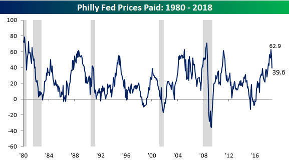
Looking through the various sub-indices of the report, New Orders saw a sharp rebound, followed by Unfilled Orders and Delivery Times. In terms of the Labor market, both the Number of Employees and Average Workweek components also saw modest increases. To the downside, Inventories saw the sharpest decline, but Prices Paid and Prices Received weren’t far behind. With regards to Prices Paid, after hitting the highest level in a decade two months ago, that component has pulled back quite a lot in the last two months (chart below).
The US Current Account: Goods Are Bad & Ugly
The US current account deficit may seem fantastically large, with over $100bn in payments flowing out of the US relative to inbound payments each quarter, but that works out to less than 2% of GDP at an annual rate; during the last economic expansion, that deficit was as large as 6.3% of GDP.
The US hasn’t run a current account surplus since 1991. To help understand why, it’s worth looking at the composition of the US current account. Any current account balance is made up of debits (payments flowing out) and credits (payments flowing in) in three basic categories: trade (exports are credits, imports are debits), primary income (“earned” income by labor or capital, with US ownership of overseas assets or US workers overseas a credit, and overseas ownership of US assets or foreign workers in the US a debit), and secondary income (“transfers”, which are typically remittances to home countries by residents to relatives overseas, and sometimes foreign aid).
The Sankey chart below helps show how all the credits and debits stack up, with debits much larger than credits and hence the US current account being in a deficit. Since there’s a lot of information in the graph, it may be helpful to click it and enlarge.
As shown, the US current account deficit is driven mostly by the US trade deficit. While primary and especially secondary income is relatively small in the scope of gross payments, the US actually enjoys a surplus in primary income and secondary income flows are tiny. The primary plus secondary income categories collectively have a small surplus, all of which is consumed by trade deficits and specifically goods trade deficits. Taking all current account payments together except goods trade, the US actually runs a surplus of over $100bn. In other words, trade deficits in goods are so large that they overwhelm relatively robust surpluses in services and primary income, less small deficits in the modestly sized secondary income category.
In the 6 major categories of goods trade (food/feed/beverages, industrial supplies/materials, capital goods ex autos, autos/parts, consumer goods ex auto, and other), the only US surplus is in the food/feed/beverages category, with the largest deficit ($106bn) coming from consumer goods other than autos. Automotive and parts trade has a deficit about half as large, while industrial supplies and capital goods combine to bring a $200bn swing in the overall current account from goods trade balances.

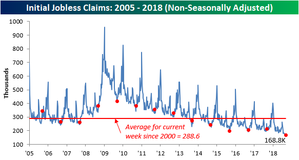
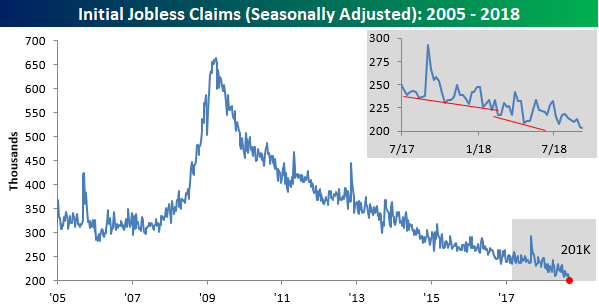
Jobless Claims Move Towards a “1” Handle
In their quarterly conference call on Thursday, Darden (DRI) CEO Gene Lee noted that the “workforce pool in the US is shrinking,” and this week’s Jobless Claims report confirmed that sentiment. While first time claims were expected to come in at an absurdly low level of 210K, the actual reading was even lower at 201K. That’s getting awfully close to a ‘1’ handle on the weekly print, which is a level we haven’t seen since November 1969. With this week’s print, claims have now been at or below 300K for a record 195 straight weeks, at or below 250K below for 50 weeks (longest streak since January 1970), and at or below 225K for eleven straight weeks (longest streak since 1969).
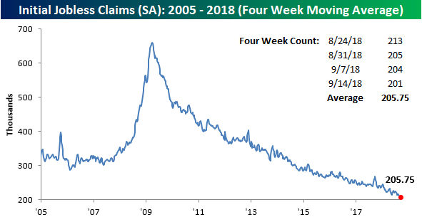
With this week’s low print, the four-week moving average also ticked down to a new multi-decade low of 205.75K from 208K last week. The last time the four-week average was this low was in December 1969.
Finally, on non-seasonally adjusted (NSA) basis, claims ticked modestly higher, rising from 162.3K up to 168.3. For the current week of the year, this is the lowest reading since 1969, and it’s nearly 120K below the average for the current week of the year dating back to 2000.