Stitch Fix (SFIX) Smashed Earnings, Gaps Up 24%
For the second quarter in a row, popular online clothing retailer Stitch Fix (SFIX) has reported an earnings triple play. Reporting after yesterday’s close, SFIX handily beat EPS estimates of -$0.03 with an actual EPS of $0.07. Revenues also came in at $409 million, $13.94 million above estimates. While the company has never struggled to beat estimates (has only missed revenues once and never missed EPS), SFIX is very volatile on earnings. On average, it has seen an absolute change of 20.19% on its earnings reaction day. In response to last night’s report, SFIX is sticking to that script with a gain of over 16%. Start a two-week free trial to Bespoke Institutional to access our interactive Earnings Expolorer and much more.
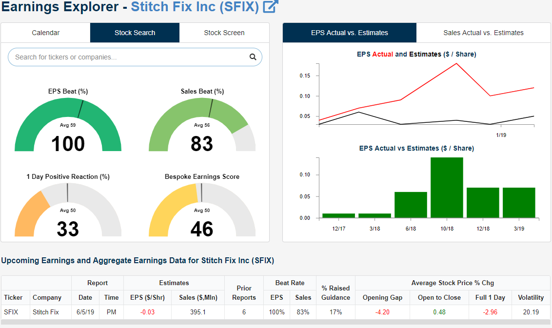
At today’s open, SFIX surged to gap up just over 24% to $29.23! Briefly afterward, it ran a little bit higher to just under $30. But like last quarter, so far in today’s session, these levels are not holding as the stock has been falling since the open, down to $27.73 as of this writing, but still a respectable 18% higher than last night’s close. Whereas the initial gap up brought SFIX through both the 50 and 200-DMA, today’s intraday selling has sent the price back down towards the 200-DMA and early May’s lower high, so it will be important for those levels to hold into the close. The next support level to watch after that will be the 50-DMA. Looking back at the stock’s reaction to its earnings report last quarter, it wasn’t very inspiring. After rising 25.2% in response to its last triple play, SFIX was never able to make a move higher with a series of lower highs and lower lows being made throughout the quarter. While it did not happen the same day as earnings, the 200-DMA and 50-DMA did not provide much support but instead acted more as resistance.

Chart of the Day: Under Armour (UAA) Busting Out
It’s hard to come up with a better example of momentum gone wrong than Under Armour (UAA). From January 2009 through the highs in September 2015, the sports apparel company returned over 3,000% or 70.3% per year. Then it all fell apart and the stock collapsed 78% on a number of negative catalysts: slowing margins, slowing growth, and extreme valuation were all reflected in the huge decline in the stock’s price. Since the end of 2017, though, the stock has performed much better, though it carved out a double top over the course of 2018. With the gap above that resistance this week, the stock is into the gap formed by earnings reported at the start of 2017, and there’s another gap for the stock to fill even higher. Combined with rising 50 and 200 DMAs, this is an attractive long-term chart from a technical perspective.
Continue reading this Chart of the Day by logging in (if you’re already a member) or starting a two-week free trial to any of our research membership levels.
Bearish Sentiment Still on the Rise
Sentiment on the part of individual investors in the weekly survey from AAII has been reflecting equity weakness throughout May and this week was once again no exception. Despite the rally over the past two sessions, declines Monday and at the end of last week have dragged bullish sentiment from 24.8% last week down to 22.53%. At this level, bullish sentiment remains at an extreme low by historical standards and is now at its lowest since December 13th of last year when it was at 20.9%. Similar parallels can be drawn with another sentiment survey conducted by Investors Intelligence. The Investors Intelligence survey saw a massive drop in bullish sentiment from 49% last week to 42.7% this week. That brings bullish sentiment in this survey to its lowest level since January 16th. Respondents who reported that they expect a correction also rose sharply by 5.1% to 38.8%. The last time respondents turned this negative was in the final weeks of December when it rose by the same amount to 39.3%. Start a two-week free trial to Bespoke Institutional to access our interactive economic indicators monitor and much more.
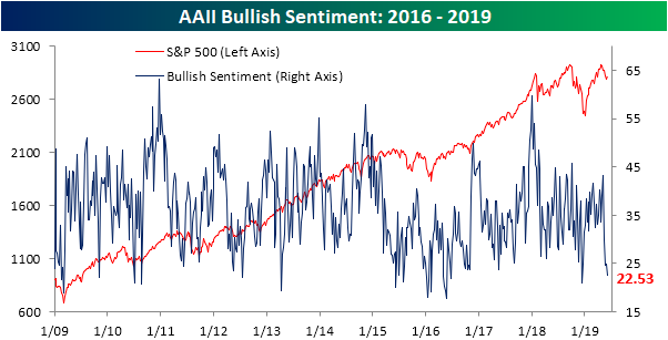
Given bullish sentiment has dropped again, formerly bullish investors have joined the bearish camp as it has now expanded to 42.58%. That is a 2.5% increase from last week and up to its highest level since January 3rd when the bearish reading was only slightly higher at 42.77%. Once again this week, bearish sentiment sits over one standard deviation above its historical average. This was the second week in a row that bearish sentiment has done this while bullish sentiment is simultaneously more than one standard deviation below its historical average; that is only the 38th time this sort of back-to-back reading has happened in the history of the survey going back to 1987.

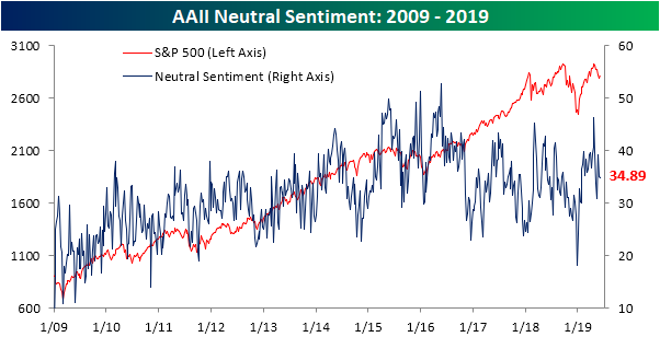
Neutral sentiment was little changed falling 0.23% to 34.89% and has basically stayed in the middle of its range from the past few years. It now sits well off of its multi-year high seen earlier this year. Given neutral sentiment has held steady, bearishness is still the predominant sentiment among investors by multiple measures. Fortunately, many of the current readings more closely resemble those around the bottom of the Q4 2018 sell-off, meaning from a contrarian perspective, a rally is possible.
Trend Analyzer – 6/6/19 – Back to Neutral
Despite a sour start to the week on Monday, strong gains have lifted the major index ETFs out of extreme oversold levels over the last two sessions. Nine of these ETFs have now worked off their oversold levels and sit at neutral. The five other index ETFs that are still oversold are primarily small caps including the Russell 2000 (IWM) and Micro-Cap (IWC), though, large caps like the S&P 100 (OEF) and Nasdaq (QQQ) also remain oversold. IWC is the only one of these ETFs to still be lower than this time last week. While IWC sits 0.29% lower, the rest have seen a variety of gains ranging from the Nasdaq’s (QQQ) meager 0.1% move all the way up to a 2.76% gain from the Russell Mid Cap (IWR). In addition to IWR, other mid-caps have also outperformed rising over 2%. These large gains over the past week now leave IWR the closest to its 50-DMA too. MM_Member_Decision ismember=’false’]Start a two-week free trial to Bespoke Institutional to access our interactive Trend Analyzer and much more.[/MM_Member_Decision]
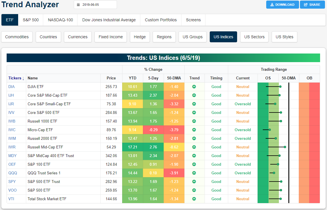
Looking at the industry groups, those exposed to oil, which has fallen sharply recently, are currently the most oversold. Moving with oil, the Dynamic Energy E&P (PXE) and S&P Oil and Gas E&P (XOP) are both down the most of all industries over the last week with a 4.8% and 4.73% loss, respectively. Semiconductors (SMH), which fell hard on Monday (some like AMD or NVDA fell as much as 7%), have rebounded this week now having risen 2.51% but are still oversold. While oil has fallen, another commodity has surged: gold. The Junior Gold Miners ETF (GDXJ) and Gold Miners ETF (GDX) are now both up over 10% in the past week. Even with this rally, they are still not the most overbought. Real Estate (IYR) actually holds that accolade as it currently stands at an extreme level. The REIT ETF (VNQ) and Solar ETF (TAN) are not quite at an extreme yet but have also become very overbought. TAN is actually the best-performing industry group ETF this year with a gain of 44.58%.

Morning Lineup – Three in a Row?
After a shaky start to the trading month on Monday, equities have seen solid gains over the last two trading days and are on track for a third straight day of positive returns today. Treasuries are also continuing their strong rally as talks between the US and Mexico over tariffs failed to result in an agreement. In Europe, the ECB left rates unchanged (as expected) and noted that rates will remain at current levels through at least the first half of 2020.
Economic data just released showed Initial Jobless Claims and Productivity readings that were pretty much right inline with expectations, while Unit Labor Costs came in significantly weaker than expected (-1.6% vs -0.8%).
Please click the link below to read today’s Bespoke Morning Lineup for our take on the latest news driving markets overseas overnight and this morning.

After the worst May in years, June is off to a very strong start as the S&P 500 is up 2.69% after the first three trading days. As shown in the table below, that ranks as the eighth strongest start to the month in the index’s history and the best since 2000. The table below lists the eleven years where the first three trading days of June saw returns stronger than 2%. Of the seven years where June saw a stronger gain in the first three trading days, returns over the rest of the month were mixed ranging from a loss of 9.4% to a gain of 8.3% and an average decline of 0.1%. In the four months where returns were above 2% but weaker than this year, the rest of the month was consistently negative.

Start a two-week free trial to Bespoke Premium to see today’s full Morning Lineup report. You’ll receive it in your inbox each morning an hour before the open to get your trading day started.
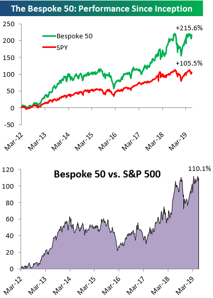
The Bespoke 50 Top Growth Stocks
Every Thursday, Bespoke publishes its “Bespoke 50” list of top growth stocks in the Russell 3,000. Our “Bespoke 50” portfolio is made up of the 50 stocks that fit a proprietary growth screen that we created a number of years ago. Since inception in early 2012, the “Bespoke 50” has beaten the S&P 500 by 110.1 percentage points. Through today, the “Bespoke 50” is up 215.6% since inception versus the S&P 500’s gain of 105.5%. Always remember, though, that past performance is no guarantee of future returns.
To view our “Bespoke 50” list of top growth stocks, please start a two-week free trial to either Bespoke Premium or Bespoke Institutional.
The Closer – Big Bounce, Credit vs Eurodollars, ADP Collapse, Beige Book – 6/5/19
Log-in here if you’re a member with access to the Closer.
Looking for deeper insight on markets? In tonight’s Closer sent to Bespoke Institutional clients, with the S&P 500 rallying over 2.5% in the past two days, we provide a decile analysis of the best and worst performers since the market’s peak on April 30th as well as forward performance following similarly strong gains. After reviewing the recent inversion of Eurodollars, we recap today’s massive miss in ADP payrolls and make better sense of what this could mean for Friday’s NFP data. We also review June’s Beige Book and weekly EIA data.

See today’s post-market Closer and everything else Bespoke publishes by starting a 14-day free trial to Bespoke Institutional today!
Chart of the Day: Downward Inflation Pressures Lessening
10 Year Yields Down Across The Globe in May
US Treasuries rallied significantly in May as investors flocked to safety amidst month long equity declines. But falling yields were not just a US phenomenon. The average 10-year yield for the 23 countries that we track in our Global Macro Dashboard fell from 1.79% a month ago to 1.52% today. Across these 23 countries, over the last month, ten-year yields fell for every country except South Africa and Taiwan. Even though they did not decline, the two countries’ yields also did not rise significantly. South Africa’s ten-year yield only rose 4 bps and Taiwan’s was actually unchanged at 0.83% as a result of less consistent issuance of 10-years. Yields have been consistently falling for most of these countries over the past year, and May’s further declines have brought many of them to new multi-year lows.
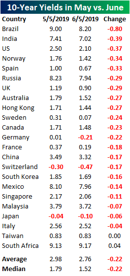
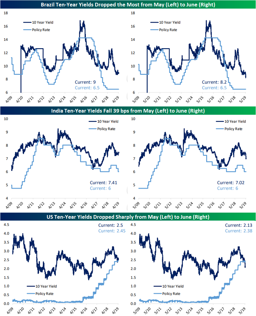
Notably, Brazil’s 10-year yield fell the most of the 23 countries in May, falling 80 bps. None of the other countries saw their 10-year yield decline by nearly as much, as the next largest decline was seen by India who’s 10-year yield fell by less than half of that (39 bps). The US 10-year was right on India’s heels as it saw the third largest decline, falling almost 40 bps to 2.1% today. This move has also brought it below the current policy rate of 2.38%. In the charts below we show these three countries’ ten-year yields and policy rates from the first week in May (left) alongside the same chart in this week’s Global Macro Dashboard (right chart); the steep drop in yields has become pretty evident even on a long term chart.
Southwest Gas (SWX) Tops Stock Scores
Our weekly Stock Scores report is Bespoke’s ranking of all S&P 1500 stocks based on our proprietary Fundamental, Technical, and Sentiment ratings. A large number of data points go into each category. For our Fundamental rating, we of course look at valuation measures and growth expectations to rate every stock relative to other names in its industry group. For our Technical rating, we look at the stock’s upside (or downside) price momentum, relative strength, overbought/oversold levels, and more. Finally, for our Sentiment Rating, we look at analyst sentiment and short interest levels among other things.
In order for a stock to rank at the top of our list, it must rank highly across all three categories with strong fundamentals, technicals, and sentiment. This is a “fusion” approach to stock selection that many investors have adopted in recent years.
A boring old Utilities company — Southwest Gas Holdings (SWX) — came in as one of the top stocks this week with a total score of 83.51 (out of 100). The company operates in the Southwestern US states like Nevada and California. On a technical basis, the stock scored perfectly and price action today is confirming this as it has risen 1.76% up to all-time highs. For most of this year, the stock has been trending sideways in what is a longer-term uptrend. In early May, the stock fell below this range but found nice support at its 200-day moving average and then bounced. In the past week, it again pulled back to find support at the 50-DMA from where it has reached its current levels.
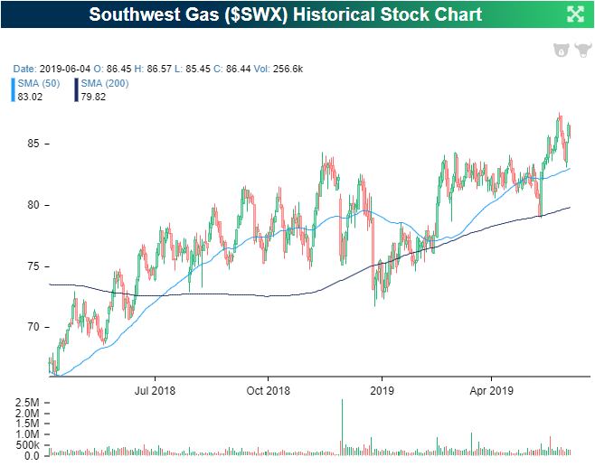
In addition to a strong technical picture, the fundamentals are solid as the stock is valued cheaply by several measures as shown below. With this cheaper valuation, Southwest Gas also has higher sales growth around 13% YoY compared to an average of 9.64% for other gas utilities. On top of all of this, SWX has paid out a consistent and increasing dividend for the past decade since the financial crisis. The dividend currently sits at 2.48%, which is a bit below average for a utility but again has been growing at a solid pace, rising 5% last year alone. If you would like to view our full Stock Scores report and see where stocks you own rank, start a two-week free trial to Bespoke Premium today!
