Morning Lineup – Semis Spoil the Party
In a post on Wednesday, we highlighted the important juncture the semiconductor space was at, and unfortunately, the group didn’t take the bullish route. After failing to break out above resistance, last night’s earnings report from Broadcom (AVGO) dashed any hopes for the sector ending the week on a positive note and above resistance. The group is poised to open lower by close to 3% this morning as AVGO dampened the outlook for a second-half turnaround. Retail Sales, which haven’t exactly inspired confidence lately, actually came in relatively well, and Industrial Production and Capacity Utilization will be released later on. Please read today’s Morning Lineup for further analysis on AVGO’s earnings and the semis in general as well as a recap of some important overnight economic data in China.
Bespoke Morning Lineup – 6/14/19

Today’s decline in the semi ETF (SMH) will mark the 16th downside opening gap of more than 2.5% for the group over the last five years. Below we list each of those prior occurrences along with how SMH performed from the open to close. Overall, SMH has seen an average open to close gain of 0.76% (median 1.73%) following these downside gaps with gains 60% of the time. For each day, we also list the opening gap of SPY to show if the downside move in SMH was market-related or more specific to semis (like today’s move). As shown, the only time SMH gapped down this much or more while the S&P 500 saw a smaller downside gap was in October 2014.

Start a two-week free trial to Bespoke Premium to see today’s full Morning Lineup report. You’ll receive it in your inbox each morning an hour before the open to get your trading day started.
The Closer – Rates & Real Estate, Rails, Import Prices – 6/12/19
Log-in here if you’re a member with access to the Closer.
Looking for deeper insight on markets? In tonight’s Closer sent to Bespoke Institutional clients, we review real estate’s outperformance relative to equities and underperformance relative to rates. We also show the dominance of software versus traditional industrial companies. Further on the topic of industrials, we take a look at the collapse in rail volumes and performance of rail stocks. We finish with an update on import prices.

See today’s post-market Closer and everything else Bespoke publishes by starting a 14-day free trial to Bespoke Institutional today!
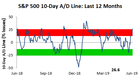
Bespoke’s Sector Snapshot — 6/13/19
We’ve just released our weekly Sector Snapshot report (see a sample here) for Bespoke Premium and Bespoke Institutional members. Please log-in here to view the report if you’re already a member. If you’re not yet a subscriber and would like to see the report, please start a two-week free trial to Bespoke Premium now.
In this week’s Sector Snapshot, we note an overbought 10-Day Advance/Decline line even though the S&P 500’s price is trading at neutral levels.
To gain access to the report, please start a two-week free trial to our Bespoke Premium package now. Here’s a breakdown of the products you’ll receive.
The Magic of Disney
What a day and a year it has been for Disney (DIS). The company’s stock is up over 4% today, which is the type of one day gain it has only seen three other times in the last four years. While the stock is not quite at an all-time high on an intraday basis, if the current levels hold into the close, it will be the highest closing price for the stock on record.
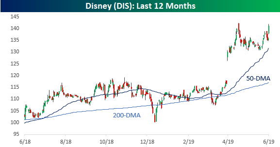
Shares of Disney are currently up over 29% YTD, putting it on pace for its best YTD performance (through 6/13) since 2000. The table below lists all years in which Disney shares were up 25% or more through this date in the year going back to 1980. For the nine prior years shown, we also show how DIS performed from 6/13 through year-end as well as how the stock performed for the entire year. As the results indicate, there is no clear pattern for the stock following strong starts for the year in the first half. In the nine prior years shown, the stock was up 10%+ four times, down 10%+ four times, and basically flat once!
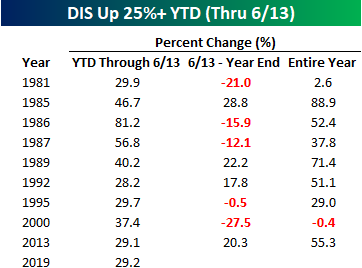
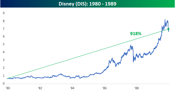
One decade out of the last four that was exceptionally strong for DIS was the 1980s. Of the nine prior years highlighted in the above table, five of them were in the 1980s. All those strong years add up. In that decade alone, the stock was up 918%, even after a decline of 17% in the final 12 weeks of 1989. Without that last sell-off to close out the decade, DIS would have been up over 1,120%. Start a two-week free trial to Bespoke Institutional to access all of our research and best stock ideas.
Bulls Slowly Return
With equities pulling back in May, investor sentiment has held a bearish bias over the past few weeks. Last week’s rally has reversed this build-up of bearish sentiment to a small degree as the percentage of investors reporting as bulls in this week’s AAII survey grew to 26.84% from 22.53% last week. While this is an improvement, investors have been hesitant to rush back as bullish sentiment remains low relative to history. This week’s reading is still over one standard deviation below the historical average of 38.19%. This is a bit of a contrast to the Investors Intelligence survey of newsletter writers, which saw bulls come surging back with the largest increase in the number of respondents reporting as bullish since the first weeks of 2019.
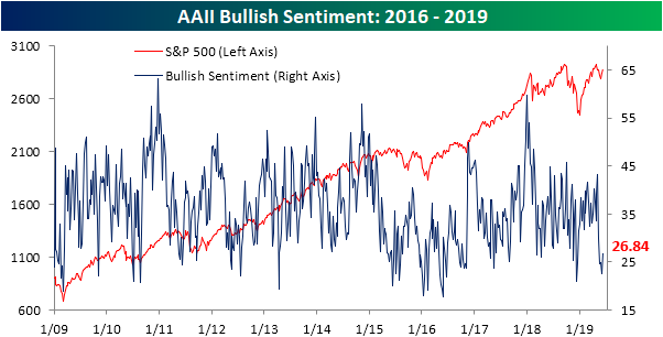
Bearish sentiment, on the other hand, saw a sharper move, falling to 34.2% versus 42.58% last week. That is the largest decline in bearish sentiment since February 7th of this year when it had fallen just under 9% from 31.76% to 22.78%. Similar to bulls, while this is an improvement, bearish sentiment remains elevated above its historical average. Additionally, the bull-bear spread has favored bears for five weeks in a row now. The last time the spread had a streak like this (also five weeks long) was in May of 2016.

More than anything, investors appear to be hesitant on the current market as neutral sentiment is the predominant sentiment this week. Neutral sentiment is up ~4% this week to 38.96%. While higher than average and elevated, as it has been most of this year, this is not at any sort of extreme reading. Start a two-week free trial to Bespoke Institutional to access our interactive economic indicators monitor and much more.
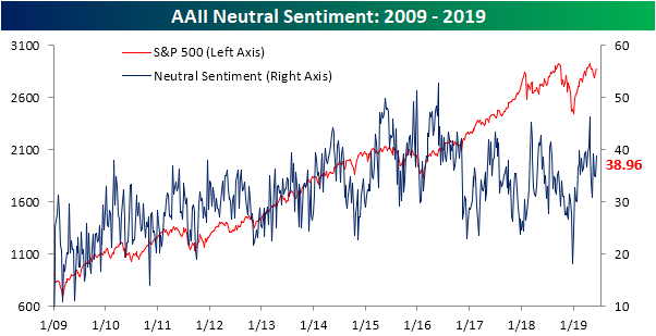
Chart of the Day: Zscaler Scaling
B.I.G. Tips – CAT Sales Stabilizing in the Low Single Digits
Year over Year Increases are Back for Claims
Last week’s initial jobless claims number was pretty unexciting, especially compared to the ADP and NFP numbers which saw massive misses. While certainly not to the same degree as last week’s data, this week’s claims also came in weaker rising to 222K compared to last week’s upwardly revised 219K. This also missed forecasts which called for a small drop to 215K. While it was an increase and a miss relative to estimates, on a seasonally adjusted basis, claims are still at healthy levels in the middle of the range from the past several months. In other words, given this week’s data, claims are neither improving nor worsening in any significant way. Claims have now spent a record 223 weeks under 300K and 74 weeks under 250K, closing in on the record streak of 89 weeks.
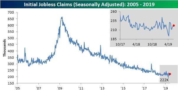
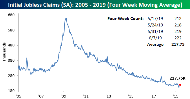
The less volatile four-week moving average also saw a slight increase this week to 217.75K from 215.25K last week. Like the seasonally adjusted number, the four-week moving average has not seen any large movements over the past month and is in between recent highs and lows.
Non-seasonally adjusted initial jobless claims rose to 219.9K. That is a sizeable increase from last week’s 189.6K, but this increase was not anything unusual for the current week of the year. From this time of the year through the next several weeks, NSA data typically sees a steady increase due to seasonal patterns as schools get out for summer. While the week-over-week increase could be expected, the NSA number also rose year-over-year. The increasing frequency of these YoY increases in 2019 is something that we have made note of in the past as a possible concern and could be pointing to a potential bottoming out in claims. Start a two-week free trial to Bespoke Institutional to access our interactive economic indicators monitor and much more.

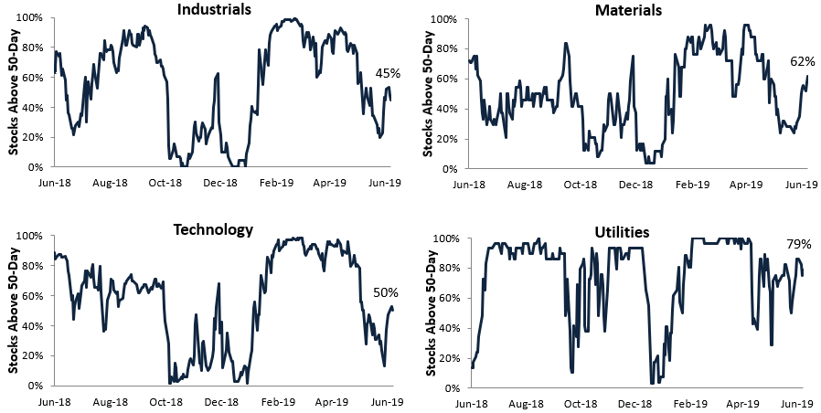
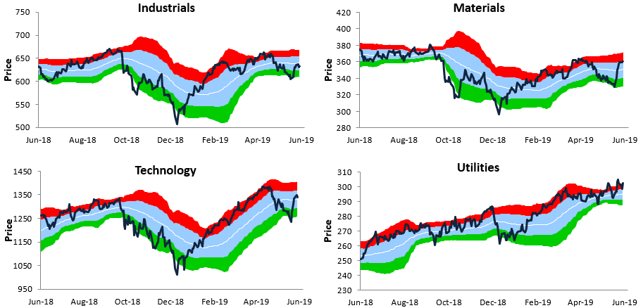
S&P 500 Sector Trading Range Charts
Every Thursday we publish the trading range charts below in our Sector Snapshot report. Start a two-week FREE TRIAL to Bespoke Premium to read our weekly Sector Snapshot report every Thursday. Along with these price charts that help identify overbought and oversold levels for sectors, we also publish breadth charts of the 10-day advance/decline line and the percentage of stocks above their 50-day moving averages. Additionally, we include relative strength charts and PE charts so that when put together, investors get a very clear picture of how the S&P’s major sectors all look at the moment.
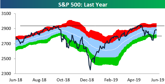
As shown below, the S&P 500 is currently about as neutral as it gets. The index is just above its 50-day moving average, and right in between a key resistance level on the upside and a key support level on the downside.
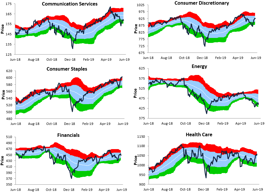
Looking at individual sectors, two defensives — Consumer Staples and Utilities — are currently in the strongest uptrends, which doesn’t say much for the health of the rally. However, we have seen cyclical sectors like Consumer Discretionary, Materials, Financials, and Technology all re-take their 50-day moving averages recently. Health Care has also popped over the last few weeks, which has caused it to put a dent in the longer-term downtrend channel that had been in place for the sector all year.
On the weaker side, Industrials hasn’t managed to get back above its 50-day moving average yet, and neither has Communication Services due to weakness from mega-cap companies like Alphabet (GOOGL) and Facebook (FB) that are dealing with anti-trust issues. The Energy sector is by itself with the weakest chart pattern by far. Like these charts and want to see more of them? Start a two-week FREE TRIAL to Bespoke Premium to view them in our Sector Snapshot report every Thursday.
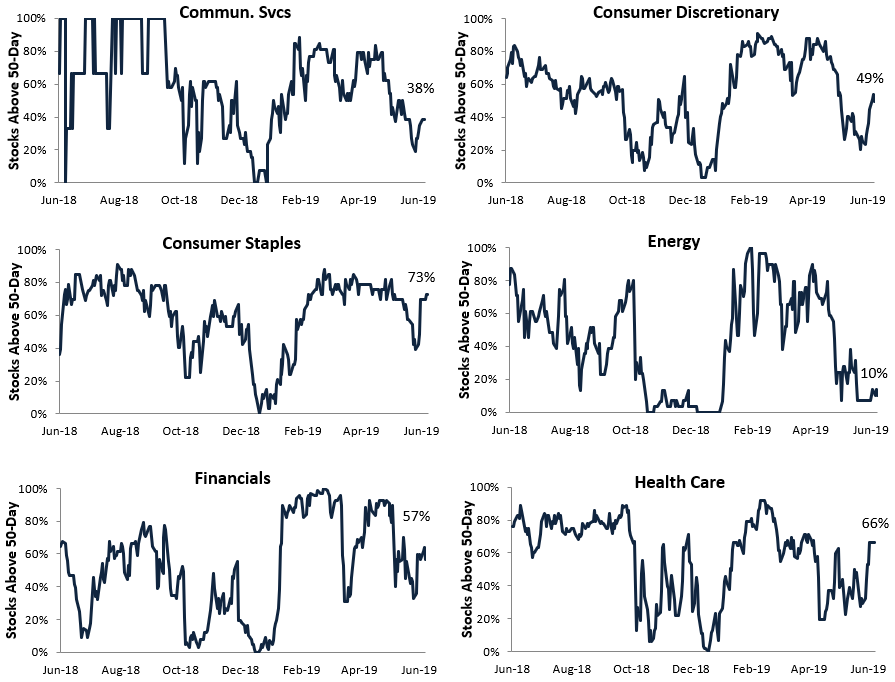
S&P 500 Sectors: Percentage of Stocks Above 50-Day Moving Averages
54% of stocks in the S&P 500 are currently trading above their 50-day moving averages. This indicator has been in a downtrend since peaking in February when breadth exploded higher.
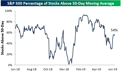
Below we show similar breadth readings by S&P 500 sector. Utilities, Consumer Staples, Health Care, and Materials currently have the strongest readings (all above 60%), while Energy is currently the weakest sector with just 10% of its stocks above their 50-day moving average.
The ever-important Technology sector currently has a reading of 50%, which means exactly half of the sector’s stocks are above their 50-DMAs. It doesn’t get more neutral than that!
Given its massive weighting, whichever direction Tech breaks in the coming days will likely set the near-term trend for the overall market. Start a two-week FREE TRIAL to Bespoke Premium to read our weekly Sector Snapshot report every Thursday.