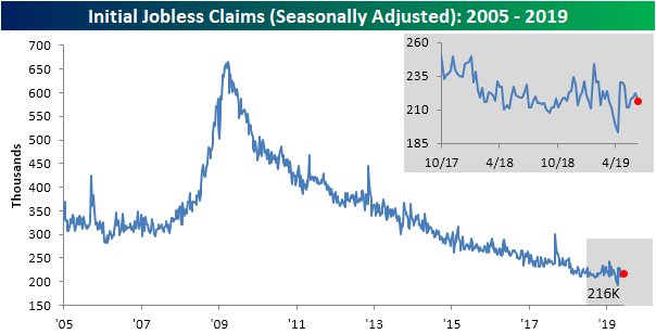
Tied for Record Streak in Claims
The Department of Labor’s weekly report on initial jobless claims were expected to fall from 220K from 222K last week on a seasonally adjusted basis. The release surprised with stronger results showing only 216K initial jobless claims. That is the lowest print since claims came in at 212K on May 23rd. With this stronger print, a couple of impressive streaks continue. For starters, claims have remained at or below 300K for a record 224 weeks. Additionally, this week marks the 89th week at or below 250K. That ties the previous record of 89 weeks ending January 10th, 1970! Save a massive spike higher, claims will likely beat that record next week.
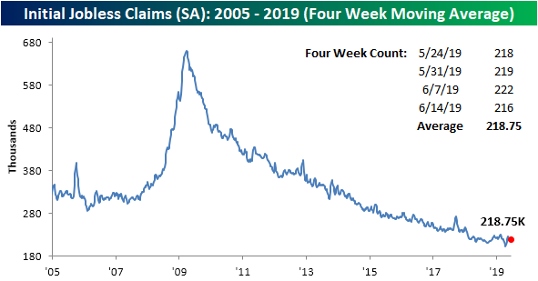
The less volatile four-week moving average saw a small increase of 1K this week to 218.75K. As we mentioned last week, the four-week moving average has been very stable in the past month. Since the May 30th release, the four-week moving average has only moved in a tight 3.5K range with this week’s print actually being at the high end of this range.
As is typical for the current week of the year, claims saw a sizeable downtick this week on a non-seasonally adjusted basis. The NSA number fell from 220K last week down to 205K. As is usually the case, that is well below the average for the current week of the year since 2000 of 320K. As we have mentioned in the past, this year has seen a significant number of weeks with YoY increases in the NSA data unlike what can be observed over the past several years. After last week saw another YoY increase, this week caught a break, albeit, the YoY decline was only 1K. So this week’s NSA claims number was just barely the strongest of the current cycle for the current week of the year. Start a two-week free trial to Bespoke Institutional to access our interactive economic indicators monitor and much more.
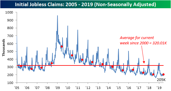
Chart of the Day: 1% Gap Ups To All-Time Highs
Morning Lineup – New Highs
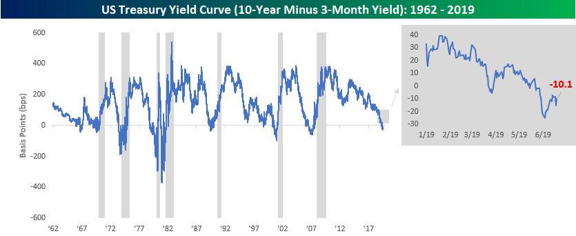
Markets slept on yesterday’s Fed-fest and decided they liked it. The S&P 500 has its sight set on record highs, while the Nasdaq isn’t far behind. The 10-year yield dipped below 2% overnight and is still slightly below that psychological level as of now, and the yield curve (10y vs 3m) is still firmly inverted at negative 14 bps.
There’s a decent chunk of economic data to contend with this morning as initial (220K) and continuing (1,680K) jobless claims will be released at 8:30 along with the Philly Fed (+10.7). Then at 10:00, we’ll get Leading Indicators for May (+0.1). While jobless claims are always closely watched, the Philly Fed will also be under the microscope as investors look for insight as to whether the Empire Manufacturing report earlier this week was a one-off or the beginning of a trend.
Please read today’s Morning Lineup for our take on the biggest momentum trade in the market right now, the breakout in gold, and international economic data overnight.
Bespoke Morning Lineup – 6/20/19

As mentioned in a post yesterday afternoon, while US markets crave dovish Fed commentary, emerging markets love it even more. The main reason? It weakens the dollar. Another group of stocks that like a weaker dollar as much as emerging markets is US multi-nationals. The top chart below shows the performance of our S&P 500 Domestics and Internationals indices over the last 12-months. While the Domestics are already at record highs, it has been the Internationals that have outperformed in the most recent leg higher. Since the low on June 3rd, the Internationals have rallied 8.6% compared to a gain of just 4.5% for the Domestics.
In the lower chart, we compare the performance spread between the Domestics and Internationals to the Bloomberg US Dollar Index. The two have tracked each other relatively closely over time, although the addition of tariffs to the mix shook the relationship up a bit earlier this year. With the dollar under pressure again this morning and on pace for its worst day since January, you can expect to see Internationals continue to lead, and then any additional positive news on trade will only add fuel to the fire.

Start a two-week free trial to Bespoke Premium to see today’s full Morning Lineup report. You’ll receive it in your inbox each morning an hour before the open to get your trading day started.
B.I.G. Tips – S&P 500 Bull Market P/E Expansion
The Closer – Fed Opens The Door, Market Stampedes Down The Street – 6/19/19
Log-in here if you’re a member with access to the Closer.
Looking for deeper insight on markets? In tonight’s Closer sent to Bespoke Institutional clients, following today’s FOMC decision, we review how the market reacted and what the Statement of Economic Projections (SEP) is now showing. We also recap yesterday’s very bearish release of Bank of America’s Global Fund Manager Survey and how ICI Fund Flows are backing these results up. We finish with freight volumes which are a bit concerning and weekly EIA data.

See today’s post-market Closer and everything else Bespoke publishes by starting a 14-day free trial to Bespoke Institutional today!
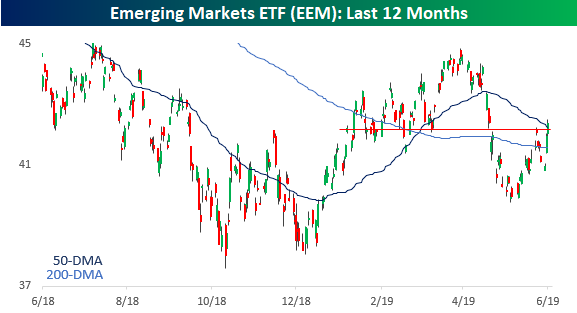
Nice Day for Emerging Markets
US equities surely liked what they heard from the FOMC on Wednesday, but emerging markets cheered the comments even more. Starting with the group as a whole, the Emerging Markets ETF (EEM) rose 0.8% and closed above its 50-DMA for the first time since May 3rd and also looks to have broken above some short term resistance as well.
Down in Brazil, the benchmark Ibovespa index saw a similar move closing at a record high and above 100,000 for the first time in its history.
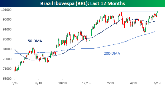
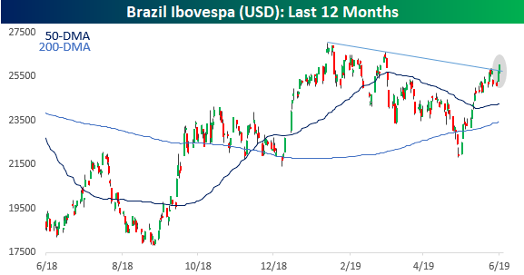
On a dollar-adjusted basis, the Brazilian benchmark still remains well off its recent highs, but it does look to have broken its downtrend from its highs in early February. No one likes easy money more than emerging markets and this week’s moves from global central banks has been music to their ears. Start a two-week free trial to Bespoke Institutional to access our interactive economic indicators monitor and much more.
Global Fund Manager Survey Strikingly Pessimistic
Yesterday, Bank of America released the results of its Global Fund Manager Survey conducted from June 7th to the 13th, and the data did not paint a very positive picture for the global economy. In fact, BofAML labeled the monthly survey as the “most bearish survey of investor confidence since the Global Financial Crisis.” The trade war was reported as the greatest concern among respondents, but monetary policy and a slowdown in growth also came in high up on the list of risks. Given these trends, growth expectations are now at a record low for the survey.
These concerns have been playing into positioning as allocations reported in the survey have become increasingly defensive. The average cash balance held by respondents has skyrocketed to the largest since August 2011. Additionally, those surveyed reported the second largest MoM drop in equity allocation in the survey’s history. Equities that have been bought include defensive sectors like REITs, Utilities, and Staples. Currently, these are also the most overbought sectors from a technical perspective. Meanwhile, the most crowded trade as per the survey has become the safety of being long US Treasuries. That’s notable given the massive disparity of late between bond and equity flows.
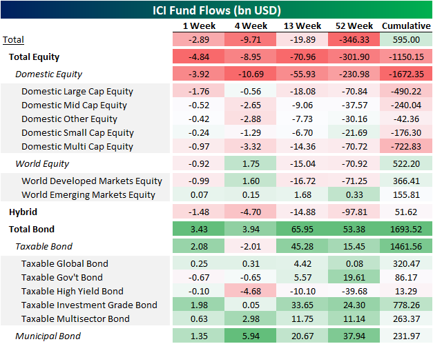
Mutual fund flow data from ICI, most recently released today, is our best evidence for flows. Total equity outflows totaled $4.84 billion over the past week, which is in the 21st percentile of all flows in the data’s history. Meanwhile, bonds saw inflows totaling $3.43 bn. All equities except for Emerging Markets saw outflows with large-cap domestics seeing the largest of these outflows totaling $1.76 bn; EM saw a small inflow of $0.07 bn. Again, bonds broadly saw inflows, although Taxable Government and High Yield did see modest outflows. On a cumulative basis, bonds and world equities have been seeing inflows in very high percentiles. The opposite is true for equities. The Global Fund Manager Survey’s indicated elevated cash level is also showing up in ICI data as mutual funds overall saw total outflows this week of $2.89 billion.

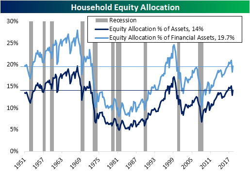
Just one more piece of economic data mirroring the outflow from equities was the most recent quarterly Federal Reserve Z.1 Report released on June 6th. While this is lower frequency than these other reports, it showed a similar story of US households having less of their allocation placed in equities versus prior years. Whereas households have seen equities take up a greater portion of assets in the past several years, more recently this percentage has pulled back a bit, driven in no small part by market price declines in Q4. Start a two-week free trial to Bespoke Institutional to access our interactive economic indicators monitor and much more.
B.I.G. Tips – Yield Curve Inversion Completes Fourth Week
After becoming less inverted in seven out of the prior nine trading days heading into last weekend, it was looking as though the yield curve was working its way out of inverted territory. After Tuesday’s dovish commentary from ECB President Mario Draghi, though, traders flooded into fixed income, sending yields lower and putting additional pressure on the already inverted curve. Today, the market is undoing some of that pressure, but 10s/3s still remains inverted by 10 basis points.
What’s notable about the yield curve today is that it is now on pace to finish the day at inverted levels for 20 consecutive trading days. In our latest B.I.G. Tips report, we analyzed S&P 500 performance following periods of extended yield curve inversions to see if there was any connection to future equity market performance. To see the report, sign up for a monthly Bespoke Premium membership now!
Bespoke Equity and ETF Screens
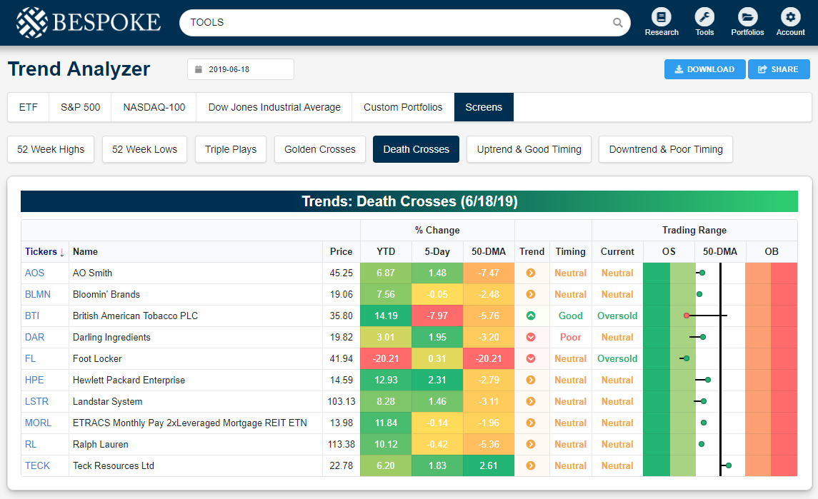
Bespoke has a nice selection of pre-defined stock and ETF screens for investors looking for actionable ideas throughout the trading week. Each day, users of our interactive tools can find stocks making new 52-week highs and lows, stocks trading in uptrends or downtrends, stocks reporting earnings triple plays, and stocks experiencing golden or death crosses. Below is a snapshot from our tools section showing the stocks and ETFs that experienced a “Death Cross” yesterday. A Death Cross occurs when a stock’s 50-day moving average crosses below its 200-day moving average as both moving averages are trending lower. It is generally viewed as a negative technical signal for a stock that is seriously breaking down.
As shown, some of the names that experienced Death Crosses yesterday include AO Smith (AOS), Bloomin’ Brands (BLMN), British American Tobacco (BTI), Foot Locker (FL), and Ralph Lauren (RL). Notably, all of the stocks and ETFs listed are up year-to-date with the exception of Foot Locker (FL), and all but one are currently below their 50-day moving averages.
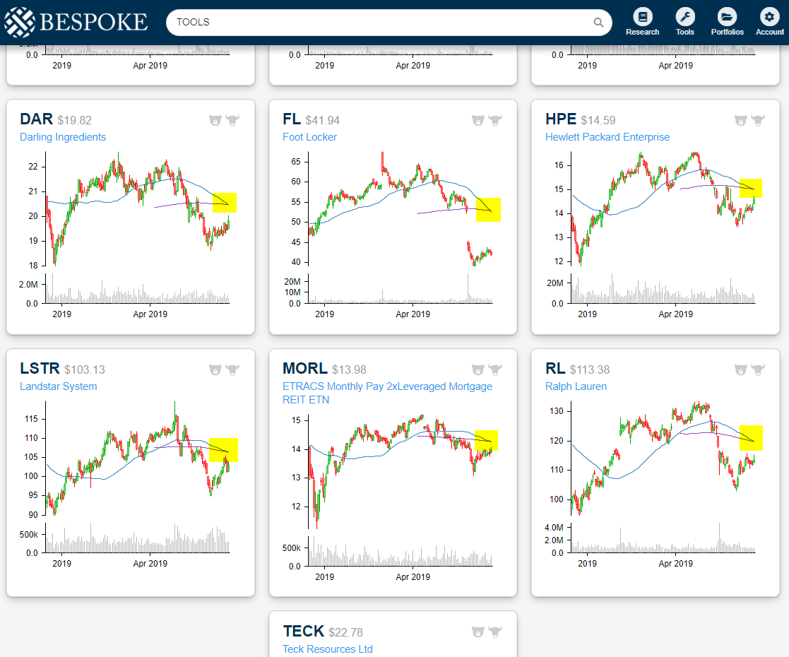
Our pre-defined screens also appear in our Chart Scanner tool so that users can get a closer look at names that fit whatever criteria they’re looking for. Below is a snapshot of six of the names that experienced Death Crosses yesterday, and we’ve highlighted the actual Death Cross in yellow. Access our pre-defined screens now by starting a two-week free trial to Bespoke Premium!
Fed Days by Month
Below is a look at the S&P 500’s performance on Fed Days by month since 1994 when the Fed began announcing its policy decision on FOMC meeting days. June Fed Days have typically seen muted returns, with the S&P averaging a small gain of just 0.06%. June is actually the second worst month of the year for Fed Days behind only February, which is the only month that has seen the S&P post negative Fed-Day returns (-0.30%). In terms of consistency to the upside, June is the worst month for Fed Days with the S&P seeing gains just 40% of the time. April Fed Days, on the other hand, have been the most consistently positive with gains 75% of the time.
June Fed Days have also seen low volatility relative to other months. The average absolute one-day change for the S&P on June Fed Days has been +/-0.61%, which is tied with February as the third lowest vol month for Fed Days. August and March Fed Days have historically been the most volatile with average moves up or down 1%+. Start a two-week free trial to one of Bespoke’s premium memberships to access our suite of investment tools and daily equity market research.
