Bespoke Stock Scores — 8/27/19
Anaplan (PLAN) Still Flawless on Earnings
Anaplan (PLAN) now has four earnings reports under its belt as a public company, and it is setting a high standard for itself with a triple play in each of these quarters! Its most recent quarterly release came this morning, and while EPS was still negative at -$0.12, it beat analyst estimates. Revenues also beat, growing at a solid clip of 46.2% YoY. The company also raised guidance for the fourth time in a row.
In terms of stock price reaction to earnings, PLAN has usually been very strong rising over 10% each time with last quarter’s 18.22% gain being the best of these. Today is bucking that trend though as the stock gapped down 3.82% at the open even after its triple play. It traded as low as -8% on the day later in the morning, but it has seen buying this afternoon and is now down just 3% on the day. PLAN has been in a solid uptrend since its IPO but has been moving sideways in the month leading up to this report. Yesterday’s intraday high tested resistance at the previous high around $60, but with the stock failing to react positively to earnings today, it has yet to break out higher. We’ll be monitoring this one to see if it can report its 5th triple play in a row three months from now! Start a two-week free trial to Bespoke Institutional to access our interactive Earnings Explorer, Triple Plays, and much more.

Richmond Rebounds
The Richmond Fed’s business condition surveys saw a dramatic rebound in August after July’s composite release came in at the lowest level since the financial crisis. The composite reading for current manufacturing conditions rose 13 points and came back into positive territory this month. This was thanks to strong breadth among the individual components as two-thirds improved with big pickups in shipments, new orders, backlogs, capacity utilization, local business conditions, equipment spending, and average workweek. Last month also saw half of these components come in with negative readings, but now only five are showing contraction. Notably, the employment component has fallen further after it turned negative last month for the first time since 2016. This is as businesses continue to struggle to find skilled workers.Start a two-week free trial to Bespoke Institutional now to see how the Richmond Fed data impacts our tracking of manufacturing activity across the whole country in The Closer tonight.
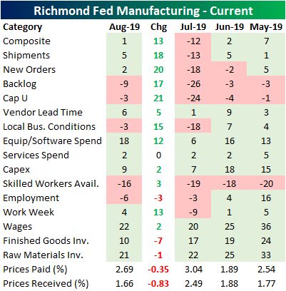
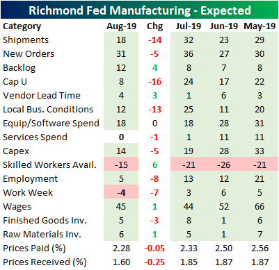
While current conditions improved dramatically, expectations six months out actually came in weaker. Only 29% of the components saw an improvement from June as many saw the opposite change from their current condition counterpart. For example, although shipments, new orders, capacity utilization, local conditions, and average work week all saw sizable gains in current conditions, the outlook for these components have simultaneously worsened. Companies are also expecting prices paid and received to fall further. Meanwhile, despite falling rates and the Fed’s cut last month, current conditions for capex remains subdued compared to where it has stood over the past year and expectations are not looking like there will be any pick up either. It is a similar story for equipment and software spending, although current conditions for this component is in better shape.
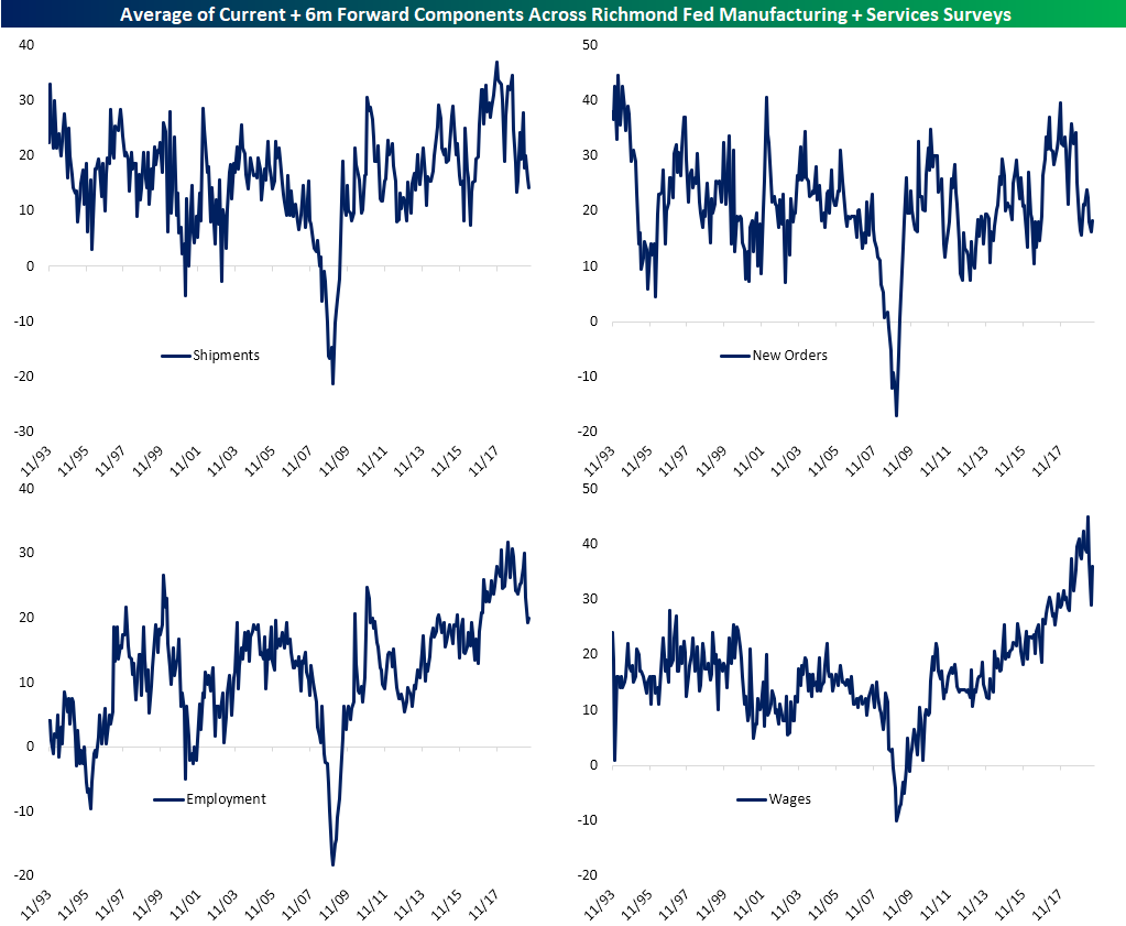
Looking at the averages of the current and forward-looking components for both the manufacturing and service surveys, business conditions, while not disastrous, have somewhat deteriorated over the past few months. Shipments have fallen for two straight months to the lowest level since last December. New orders are similarly at the lower end of its range, although it did improve marginally for the first time in three months in August. The indices for employment have been the real kicker. This has been nearly cut in half since April even with a small pickup this month. On average, employment indices are at their weakest level since late 2016 while wages have recovered a portion of their recent drop.
City-by-City Home Price Update — S&P Case Shiller
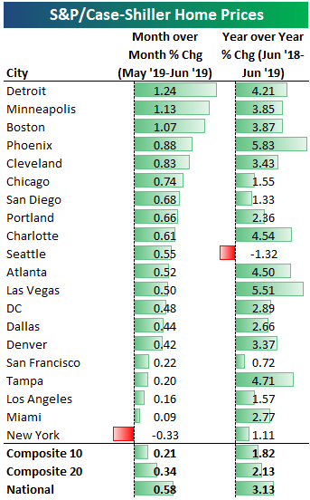
Below is an updated look at home price changes across the 20 cities tracked by S&P/CoreLogic’s Case Shiller indices. Detroit, Minneapolis, and Boston were the hottest areas for home prices on a month-over-month basis in June. All three areas saw prices increase by more than 1% MoM. The only area that saw MoM home price declines was New York at -0.33%.
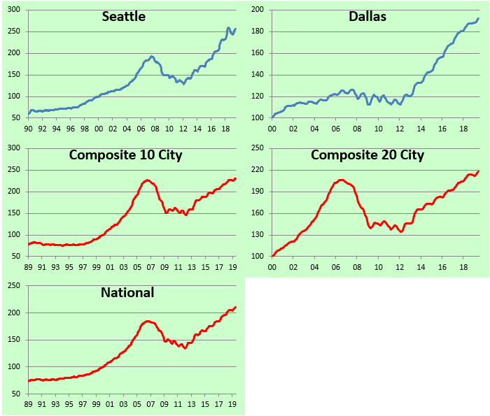
On a year-over-year basis, the 10-city composite index was up just 1.82%, while the National index was up 3.13%. Seattle is the one area that is down year-over-year at -1.32%. Phoenix and Las Vegas are up the most YoY at 5%+.
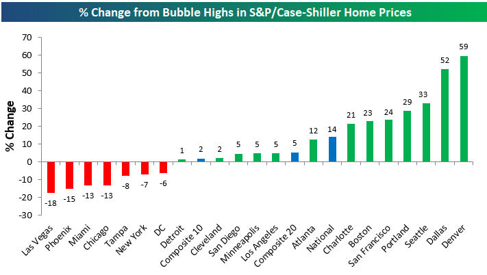
Below is a look at where home prices in each city stand versus their peak prices during the housing bubble of the mid-2000s. At this point, roughly two-thirds of cities have managed to take out their prior housing bubble highs. The only cities where prices are still below their prior highs are Las Vegas, Phoenix, Miami, Chicago, Tampa, New York, and DC. Detroit is the most recent city to take out its prior highs.
Denver and Dallas are both up the most above their prior highs at 50%+.
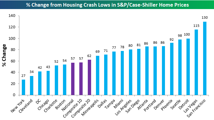
Below we show where home prices currently stand versus their housing crash lows. The composite indices are up 57-62% from their financial crisis lows, while San Francisco, Las Vegas, and Detroit are all up triple digit percentages. New York is up the least at just 27%.
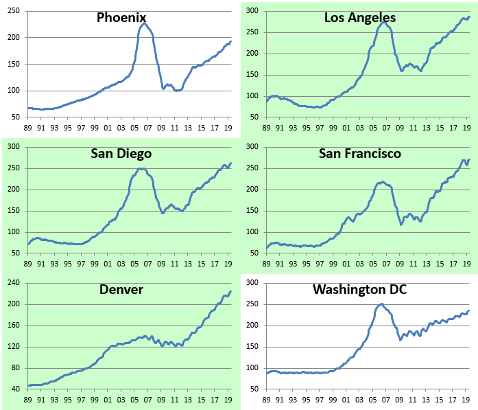
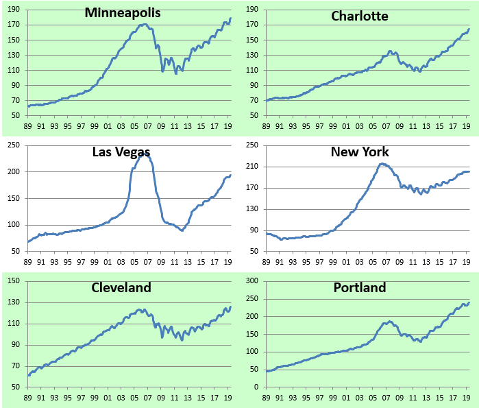
Below are charts of home prices for each city going back to 1989 (Dallas only goes back to 2000). Charts highlighted in green highlight cities where home prices have taken out their prior bubble highs. Start a two-week free trial to Bespoke Premium for more in-depth equity market and economic research.

Slowing Home Price Growth
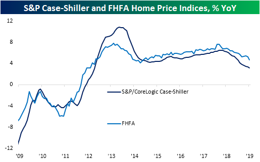
It was a busy morning for data on home prices with the releases of the June readings for S&P/CoreLogic Case-Shiller and the FHFA’s home price indices. Both indices essentially told the same story for home prices: still growing, but at the slowest rate in years. The S&P/CoreLogic reading was expected to show home prices grew by +3.30% YoY compared to +3.43% last month. Results were even weaker with home prices slowing to +3.13% for June while the May release was revised down to +3.35%. This marks the slowest growth since September of 2012 when home prices grew +3.0% YoY. For this index, June marked the 15th consecutive month of declines in the YoY growth rate. That has surpassed a 14-month long streak ending February 2015 and is now the longest since a 41-month long streak that came to a close in February of 2009 when prices were falling over 12% YoY.
The monthly FHFA Home Price index came in at 4.7% YoY which was lower than the prior reading for May of 5.2%. While it is not part of any dramatic streak like the S&P/CoreLogic index, this was the lowest growth rate since early 2015. One important thing to note, though, is that these two home price readings did not take into account all of the effects of the most recent plunge in rates or the Fed’s July rate cut because they’re on a two-month lag. Start a two-week free trial to Bespoke Premium for more in-depth equity market and economic research.
S&P 500 Yield Tops the Thirty Year
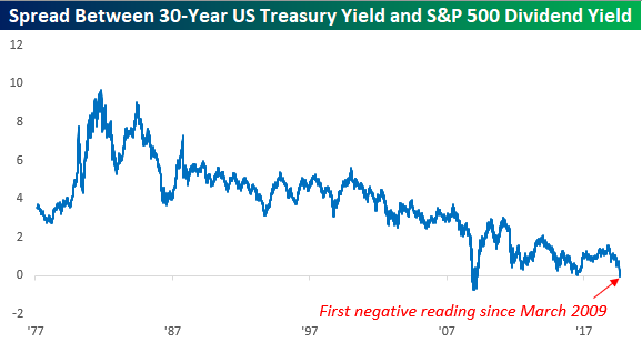
The yield on the 10-year US Treasury dropping below the dividend yield on the S&P 500? That’s so last month. Today, it’s the 30-year yield that’s falling below the S&P 500’s dividend yield. At 1.966%, the 30-year Treasury yield just dropped below the dividend yield of the S&P 500 for the first time since March 2009. Who knows if we’ll finish the day with a 30-year/S&P 500 inversion, but the way things have been moving, it’s probably just a matter of time if it doesn’t happen today.
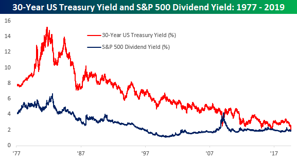
The chart below shows the spread between the 30-year and the dividend yield of the S&P 500 going back to 1977. The only other time in the last 40+ years where we have seen a similar inversion was for a few months in late 2008 through March 2009 (the low point of the Financial Crisis). In July 2016 right after the Brexit vote, the S&P 500 dividend yield came within 0.01% of the 30-year’s yield, but it couldn’t quite make it higher.
Looking at individual stocks, it’s pretty amazing how many stocks now yield more than the 5,10, and 30 year US treasuries. As of this morning, two-thirds of the stocks in the S&P 500 yield more than the 5-year, more than 62% yield more than the 10-year, and slightly more than half yield more than the 30-year. Start a two-week free trial to Bespoke Premium for more of Bespoke’s actionable equity market research.
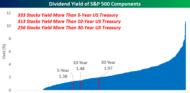
Chart of the Day – Massive Bond Outperformance
Bespoke’s Morning Lineup — Drifting Higher
See what’s driving market performance around the world in today’s Morning Lineup. Bespoke’s Morning Lineup is the best way to start your trading day. Read it now by starting a two-week free trial to Bespoke Premium. CLICK HERE to learn more and start your free trial.

The Closer – Copper, Curve, Mortgage Rates, Sector Valuation, Manufacturing – 8/26/19
Log-in here if you’re a member with access to the Closer.
Looking for deeper insight on markets? In tonight’s Closer sent to Bespoke Institutional clients, we begin with a look at copper’s 52-week low as the 2s10s curve made new flats for the cycle. We also show the lag in the drop in mortgage rates compared to bond yields. Next, we show just how much investors have flocked to defensive sectors this year before finishing with a review of today’s manufacturing data including durable goods and our Five Fed Manufacturing Composite.

See today’s post-market Closer and everything else Bespoke publishes by starting a 14-day free trial to Bespoke Institutional today!