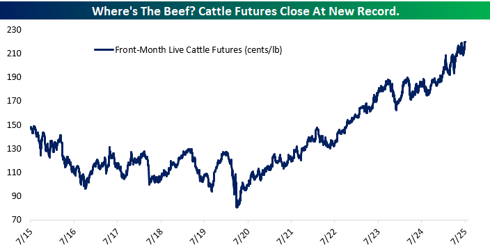
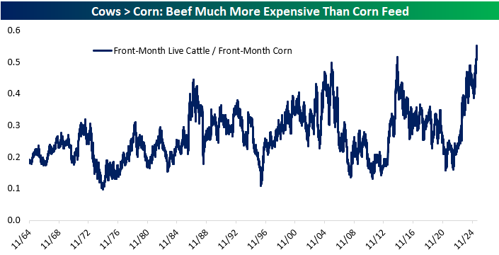
Cattle Futures and Cattle to Corn Ratio Hit Record Highs
Beef prices continue to sizzle. Live cattle futures just closed at a new all-time high, climbing to $2.20 per pound after a multi-year rally that’s been quietly unfolding since mid-2020. While inflation has cooled in many parts of the economy, the beef market remains red-hot, driven by a combination of shrinking cattle herds, ongoing drought conditions in key ranching states, and steady consumer demand for beef across both retail and food service channels.
What makes this even more striking is how cheap corn, the primary feedstock for cattle, has remained in relative terms. A long-term chart of the cattle-to-corn ratio shows that beef has never been this expensive relative to feed costs, with the spread hitting its highest point in over six decades. For cattle producers, this is an extremely favorable setup: high output prices and low input costs translate into wide margins.
This divergence has interesting implications. Publicly traded meat processors could benefit from stronger margins. It also speaks to broader commodity cycles: while grain prices have cooled post-Ukraine shock, protein prices have marched higher. If you’re looking for margin tailwinds in the ag and food supply chain, the beef market is one to chew on.

The Closer – Meeting Minutes, Retail Risk, Corn & Cows – 7/9/25
Log-in here if you’re a member with access to the Closer.
Looking for deeper insight into markets? In tonight’s Closer sent to Bespoke Institutional clients, we lead off with a recap of the June FOMC meeting minutes and what some proxies of retail risk sentiment are showing (page 1). We then dive into commodity markets including a look at the steady rise of cattle prices and drops in cocoa and coffee (page 2). Next, we look at deflation in GPU costs (page 3) and “picks and shovels” plays for that space (page 4). We then finish with a note comparing the housing bubble to AI stock valuations in addition to some commentary on the rising economic importance of Prime Day (page 5).
See today’s full post-market Closer and everything else Bespoke publishes by starting a 14-day trial to Bespoke Institutional today!
Chart of the Day – NVDA Tops Another Trillion
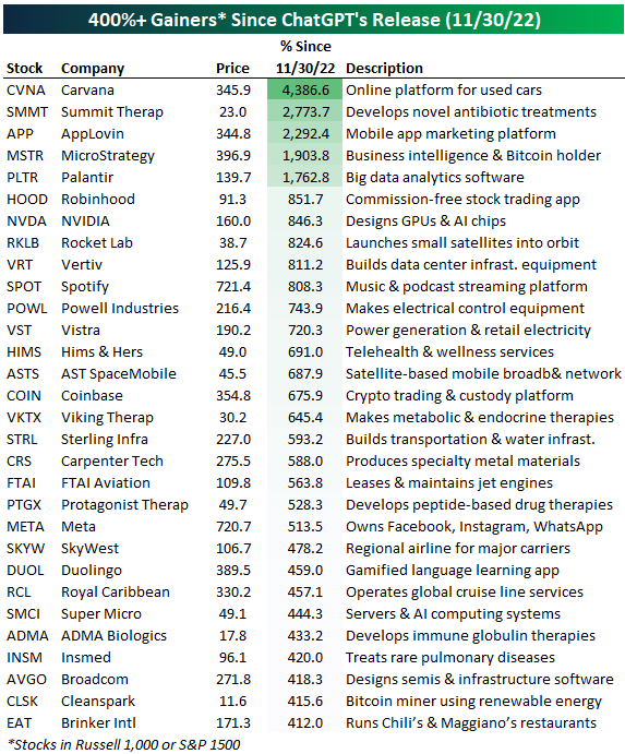
UPDATE: Biggest Winners and Losers Since the Release of ChatGPT
Since the launch of ChatGPT in November 2022, the stock market has seen an explosion of interest in companies exposed to artificial intelligence, digital transformation, and infrastructure innovation. While the average stock across the Russell 1,000 and S&P 1,500 is up roughly 50% since 11/30/22 when ChatGPT launched, there are 30 stocks that have gained more than 400%.
The list of 400%+ gainers since AI’s pivotal moment highlights several key themes driving outsized performance. At the top is Carvana (CVNA) with a staggering 4,386% gain, an example of a distressed digital-first business that rebounded sharply as cost-cutting, improved execution, and investor optimism around e-commerce platforms collided. Similarly, Summit Therapeutics (SMMT) and AppLovin (APP) reflect how early-stage biotech breakthroughs and ad-tech optimization powered by AI can supercharge investor enthusiasm, with both stocks up over 2,700%.
The AI boom itself is strongly represented: NVIDIA (NVDA), the GPU powerhouse enabling nearly all modern AI workloads, has surged 846%, while companies like Super Micro Computer (SMCI) and Vertiv (VRT) have ridden the infrastructure tailwinds, supplying AI servers and data center power/cooling systems. On the software side, Palantir (PLTR) and Meta (META) are capitalizing on surging enterprise demand for AI-driven insights and next-gen consumer experiences.
Beyond AI, this list captures a broader tech renaissance: MicroStrategy’s (MSTR) embrace of Bitcoin, Coinbase (COIN) benefiting from crypto’s resurgence, and Duolingo (DUOL) leveraging gamified ed-tech all reflect how tech adaptability is being rewarded. Meanwhile, healthcare and biotech have seen some stealth rallies too, with Hims & Hers (HIMS), Protagonist Therapeutics (PTGX), and ADMA Biologics (ADMA) riding innovation in drug delivery, telehealth, and immune therapies. Even travel and leisure names like Royal Caribbean (RCL) and SkyWest (SKYW) are enjoying massive comebacks as post-pandemic demand meets operating leverage.
In short, the market’s biggest winners since the AI boom began aren’t just about chips and chatbots. They span digital platforms, infrastructure enablers, health breakthroughs, and comeback stories, all unified by their exposure to innovation, scalability, and renewed investor confidence.
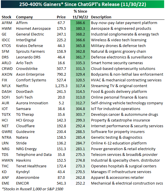
There are another 29 stocks up between 250% and 400% since ChatGPT’s release, which we show in the table below.
The list of 250% to 400% gainers since the launch of ChatGPT in November 2022 showcases a diverse group of companies benefiting from technological disruption, infrastructure tailwinds, and consumer trends. Leading the pack is Affirm (AFRM), up nearly 387%, as investors embrace the resurgence of digital lending and Buy-Now-Pay-Later platforms amid a growing shift in consumer payment behavior. Industrial heavyweights like Howmet Aerospace (HWM) and General Electric (GE) also made major strides, reflecting renewed investor interest in manufacturing, defense, and energy transition infrastructure.
On the software side, the gains in CrowdStrike (CRWD), Cloudflare (NET), and Guidewire (GWRE) highlight how enterprise IT security and insurance software remain core beneficiaries of the digital transformation. Consumer-facing names like Netflix (NFLX) and DoorDash (DASH) continue to outperform as scale, brand loyalty, and subscription models drive durable growth.
Altogether, many of these names may not have made headlines like the mega-cap AI leaders, but their gains reflect a broader, powerful undercurrent of digital acceleration and operational leverage across the economy.
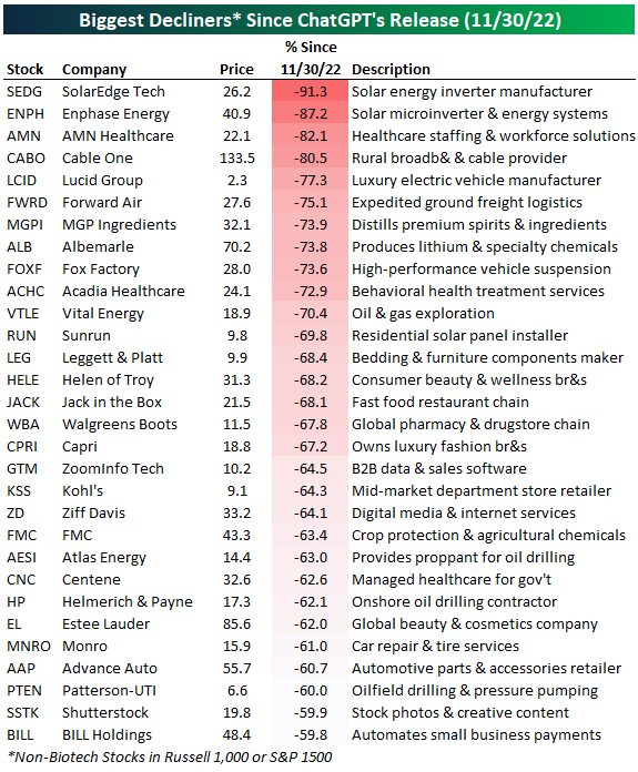
The list of biggest decliners since ChatGPT’s release in November 2022 paints a sobering picture of sectors and business models that have struggled to gain traction in a rapidly shifting market landscape. Solar energy names have been hit the hardest, with SolarEdge (SEDG) and Enphase Energy (ENPH) each down over 85%, victims of rising rates, margin compression, and a post-IRA (Inflation Reduction Act) hangover that failed to meet investor hype. These moves show how even long-term secular themes like clean energy can suffer during periods of tightening financial conditions and execution hiccups.
Other notable losers include AMN Healthcare (AMN) and Acadia Healthcare (ACHC), which struggled as labor costs and reimbursement pressures weighed on the post-pandemic healthcare sector. Consumer-facing brands like MGP Ingredients (MGPI), Helen of Troy (HELE), and Capri Holdings (CPRI) saw sharp drawdowns, reflecting broader concerns around slowing discretionary spending and inventory issues. On the industrial side, stocks like Lucid (LCID) and Forward Air (FWRD) highlight the risks of capital intensity and poor cost control, while ZoomInfo (GTM) and Ziff Davis (ZD) show how some B2B tech and digital media firms are being rerated lower in a more selective market for growth.
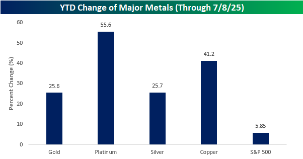
Heavy into Metals
Earlier today in our Morning Lineup sent to clients, we noted the fact that major metals were all up sharply on the year. With copper’s surge on Tuesday, it was up an impressive 41.2% YTD, but still trailed platinum’s monster gain of 55.6%. While in any other year, the 25%+ gains in gold and silver would be impressive, but they look modest next to the gains in the other two, and the 5.85% gain for the S&P 500 almost looks pathetic.
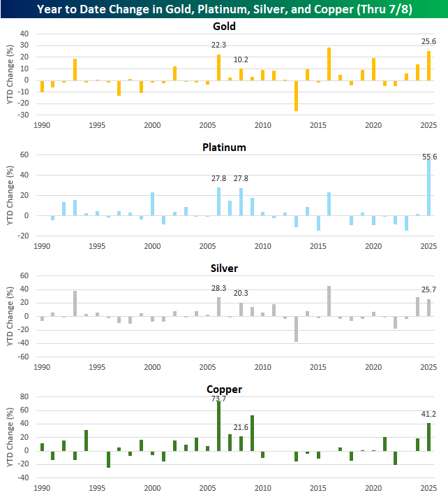
The charts below show the YTD change in all four metals through July 8th of each year since 1990.
Again, while gold is up less than any of the other four metals this year, through yesterday’s close, the only other year with a larger YTD gain was in 2016. The only other year it was up over 20% was in 2006 (22.3%).
Platinum’s 55.6% gain is easily a record through this point in the year. In fact, it’s double the prior record of 27.8% that was reached in 2006 and 2008. The only other year that platinum gained more than 20% YTD through 7/8 was in 2000 (23.6%) and 2016 (23.4%).
Silver and copper have both experienced 20%+ YTD gains through 7/8 more than gold and platinum. Silver had a larger YTD gain last year and has now had six 20%+ YTD gains since 1990. Copper’s 41.2% gain this year ranks as the best since 2009 (53.1%) and is the seventh time that the commodity has rallied more than 20% YTD.
While all four commodities have experienced other YTD gains of 25%+, this year is the first time all four have rallied 25%+ YTD through 7/8 in the same year. The only time they ever all simultaneously rallied 20%+ YTD was in 2006, and the only other year when all four were even up 10% YTD at this point in the year was in 2008. Other years since 1990 have seen big runs in the metals, but none of them have been quite like the 25%+ across the board gains in 2025.
Fossil (FOSL): From 8,000% to 6%
Fossil Group (FOSL) was one of the biggest post-financial crisis winners in the market, with its stock surging to a post-IPO gain of more than 8,000% at its highs in the mid-2010s. The company had built a dominant brand in watches, and investors rewarded it with a meteoric run that outpaced just about everything else at the time. But as the chart below shows, that entire move ultimately proved fleeting. Today, FOSL is up just 6% since its IPO in 1993, while the S&P 500 is up more than 2,500%. So what happened?
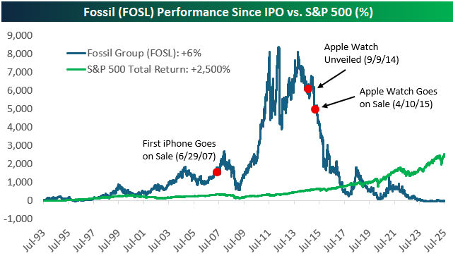
The turning point came in September 2014 when Apple unveiled the Apple Watch. At the time, the product hadn’t launched yet and there was still plenty of debate over whether consumers would embrace wearable tech. But investors didn’t wait to find out. FOSL’s stock started dropping almost immediately and has never recovered. As Apple’s ecosystem expanded, Fossil’s relevance shrank, and the stock followed.
Fossil wasn’t a company in obvious decline when the Apple Watch was announced. In fact, its fundamentals were still strong. But the market is forward-looking, and it doesn’t wait for earnings reports to adjust. Just the idea of a better product from a bigger competitor was enough to spark a mass exodus. While consumers were still deciding if they needed a smartwatch, Wall Street had already moved on.
That’s why this chart matters for today’s winners. Any of the stocks leading the market higher right now could be like Fossil in 2014. Massive runs, strong fundamentals, and dominant positions in a booming narrative. But disruption rarely announces itself in advance, and today’s leaders don’t have to stumble on their own to fall out of favor. All it takes is a shift in the landscape, whether it’s a better chip, a new platform, or a change in demand.
No one’s saying today’s market leaders are doomed, but Fossil’s chart is a reminder of how quickly things can turn, and how the market often sees it before the headlines do. Even an 8,000% gain can vanish if the narrative flips. It’s a good reason to stay humble and diversified and always think about what’s coming around the corner.
Bespoke’s Morning Lineup – 7/9/25 – Copper Glitters
See what’s driving market performance around the world in today’s Morning Lineup. Bespoke’s Morning Lineup is the best way to start your trading day. Read it now by starting a two-week trial to Bespoke Premium. CLICK HERE to learn more and start your trial.
“A great wind is blowing, and that gives you either imagination or a headache.” – Catherine the Great

Below is a snippet of commentary from today’s Morning Lineup. Start a two-week trial to Bespoke Premium to view the full report.
Looking at the quote above from Catherine the Great, isn’t that just the way you feel when it comes to AI? While the possibilities are endless, the pace of change and trying to keep on top of everything going on can be exhausting!
The S&P 500 has declined for two straight sessions, but futures are looking modestly higher this morning on little in the way of news. Investors will continue to monitor Washington for any tariff-related headlines, but the letters and policies released and announced this week have, broadly speaking, had little impact. It’s another quiet day for data as there are no economic reports on the calendar, but minutes from the last FOMC meeting will be released at 2 PM.
Speaking of the FOMC, the Wall Street Journal is reporting this morning that the President is currently leaning towards Kevin Hassett over Kevin Warsh to replace Fed Chair Powell. Warsh is reportedly falling out of favor for some of his past criticism of the Fed’s zero-interest rate policy and asset purchase programs.
In international markets, Asian stocks were mostly lower overnight following Trump’s comments that he wouldn’t extend his August 1st tariff deadline. The only major index to buck the negative trend was Japan, where the Nikkei rallied 0.33%. In Europe, the tone is much more positive with the STOXX 600 up over 0.7% as defense stocks lead the charge.
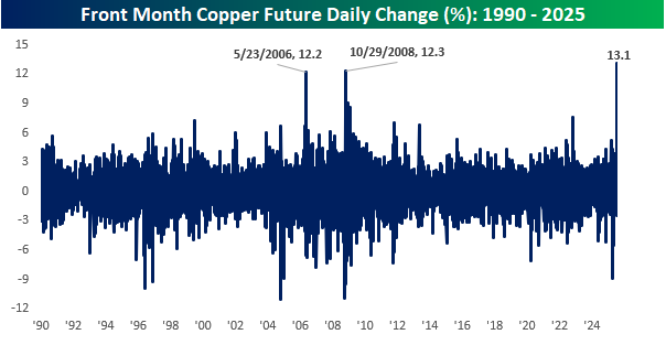
As mentioned above, the President’s various tariff policies announced this week haven’t had much impact on a macro basis, but for certain areas like copper, the impacts have been significant. After the year has already seen incredible rallies in the price of gold, platinum, and silver, yesterday, President Trump gave copper the boost it needed when he announced 50% tariffs on all copper imports. The news came just as copper was starting to pull back last week after testing its highs from earlier in the year. That resistance proved no match for the 50% tariff bazooka, and prices broke out to a record high, eclipsing $5.40 per pound, finishing up more than 13% on the day. Strength in copper is often considered a sign of economic strength, but we’re not sure a rally artificially propelled by trade policy would qualify.
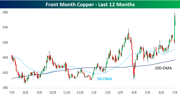
Yesterday’s 13.1% rally in copper was a record one-day gain for the commodity, eclipsing the prior record of 12.3% from October 2008. Since 1990, it was also only the third time the commodity rallied more than 10% in a single day.
The Closer – No Profits, Copper, Housing – 7/8/25
Log-in here if you’re a member with access to the Closer.
Looking for deeper insight into markets? In tonight’s Closer sent to Bespoke Institutional clients, we start with a look at the performance of stocks based on whether or not they turn a profit (page 1) followed by a look into the huge spread in performance between US and London traded copper futures (page 2). After that, we review the latest consumer credit figures (page 3), New York Fed consumer expectation data (pages 4 and 5), and Realtor.com housing figures (pages 6 and 7).

See today’s full post-market Closer and everything else Bespoke publishes by starting a 14-day trial to Bespoke Institutional today!
Profit Taking and Discount Shopping
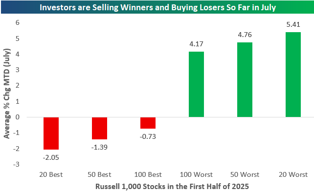
We’re just five trading days into the second half of 2025, but so far this month, the average stock in the large-cap Russell 1,000 is up a solid 1.84%. If you did well in the first half of the year, however, you’re likely seeing red, while those that lagged in the first half are finally seeing some green.
The chart below highlights a sharp reversal in investor behavior so far this month, with a clear rotation out of the first-half winners and into the biggest losers. Looking at average month-to-date returns for Russell 1,000 stocks, the 20 best-performing names from the first half are down an average of 2.05%, while the top 50 and 100 from the first half are also in negative territory this month. In contrast, the worst performers from the first half are seeing a surge in buying interest: the 20 worst names are up an average of 5.41% MTD, followed by the 50 worst at 4.76%, and the 100 worst at 4.17%. This pattern reflects classic mean reversion trading, where investors rotate into beaten-down names in hopes of a rebound, while locking in profits on stocks that have already had big runs. It also suggests that investors are bottom-fishing in laggards in search for value or speculative bounce plays. Whether this is a short-term rebalancing or the start of a more sustained shift in market leadership remains to be seen, but it’s interesting that we saw similar pullbacks in first-half market leaders in July 2023 and July 2024 as well.
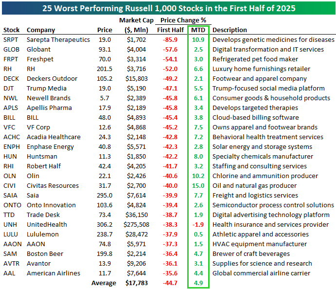
Of the 25 worst-performing Russell 1,000 stocks in the first half, all but one are up so far this month. On average, these stocks fell 44.7% in the first half, and they’re up 4.9% already in the first five trading days of July.
Take a look at the first-half losers below, of which you’ll likely be familiar with most.
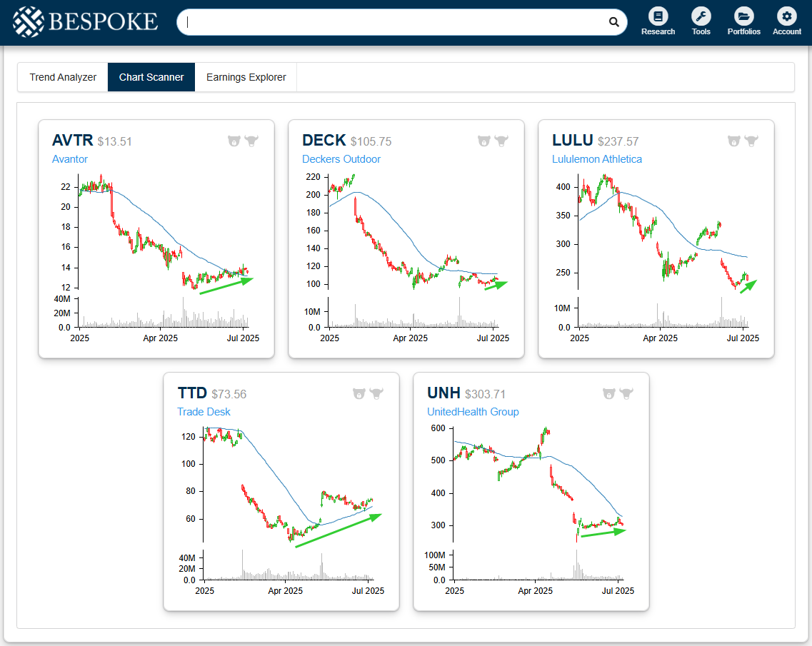
Below are price charts of the five biggest stocks on the list of first-half losers shown above: Avantor (AVTR), Deckers Outdoor (DECK), Lululemon (LULU), Trade Desk (TTD), and UnitedHealth (UNH). All five fell off a cliff at some point in the first half, but they’re currently attempting to round out a bottom. Trade Desk (TTD) has been trying to turn things around for the longest, as it bottomed back in April and now has a rising 50-day moving average again.
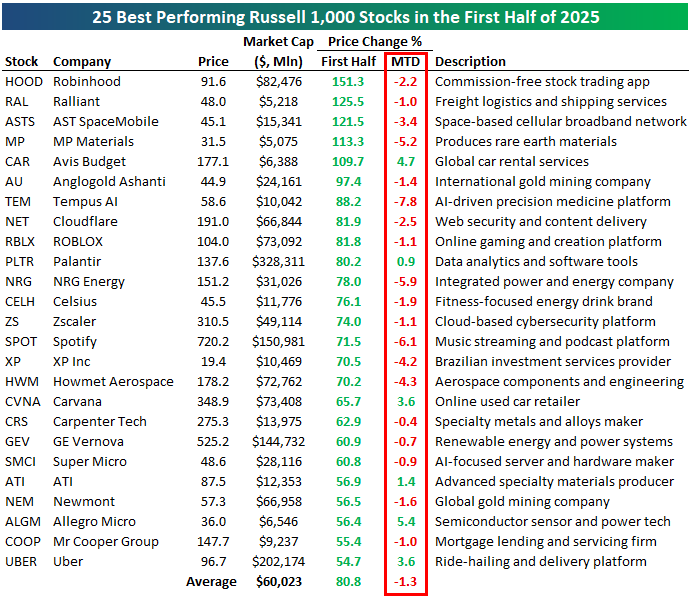
Of the 25 best performers in the first half, only six are in the green so far this month: CAR, PLTR, CVNA, ATI, ALGM, and UBER. On average, these stocks, which all gained at least 50% in the first half, are down 1.3% month-to-date. None are down more than 8%, though, so the selling hasn’t been that extreme.
With earnings season on the horizon, maybe some investors are cashing in on high-beta winners to try and avoid earnings blow-ups.
Small Business Foibles
Early this morning, the NFIB published their June report on small business sentiment. We discussed some details of the report in today’s Morning Lineup, but to recap, the headline reading came in slightly lower and inline with expectations at 98.6. As we often note, this survey is politically sensitive with a bias towards Republican administrations. As such, the index surged in the wake of the election, and after pulling back significantly earlier this year, it now remains in the middle of that range, which is also lower than it was for much of the first Trump administration.

In spite of the minor change to the headline number, there were some interesting findings throughout the rest of the report. Apart from the headline index, there are parts of the report with less political sensitivity and more economic importance that are concerning. Two such areas with notable weakness were employment and capital expenditures. As shown below, the indices tracking actual changes to those areas of business have fallen sharply in recent months. For employment, current levels are at the weakest since August 2022, and the equivalent index for capital expenditures is down to the lowest reading since August 2022. While those new lows do indicate weakness, the declines could also be in part due to seasonality, with similar summer slumps for both indices observed in the past few years.


Holding the caveat of potential seasonality aside, the report offers additional insights in the form of what firms are spending their capex on. As shown below, all categories have fallen significantly in the past few months, with particularly sharp declines in June. The worst declines have been for vehicles and equipment, which are the two largest categories for capex. Vehicles—which is a tariff-impacted area—is tied with the spring of 2020 for the lowest reading of the past decade. Also worth noting is that additional building or land spending is now at a record low in data going back to early 2014.

The report also includes a look at which problems firms claim to be their most important. In another concerning data point for economic activity, 10% reported poor sales as their biggest problem in what was the highest reading for this category since March 2021. On the bright side, inflation continues to be a less important problem, as it was cited by a still high but rapidly declining 11% of respondents.

The drop in inflation as the most important problem gives room for other issues to come to the forefront. With tariff concerns front and center, it should come as no surprise that taxes are now the single biggest concern for small businesses, accounting for 19% of answers. When combined with government red tape, the 28% reading is the highest since November 2021.

As noted earlier, the NFIB historically tends to be sensitive to politics, favoiing Republican administrations. That makes the turn higher in tax and red tape concerns more surprising. Other series in the report further indicate a turn away from those political biases, though. As shown below, when it comes to reasons for positive and negative expansion outlooks, fewer firms point to politics as a good reason to expand, and more point to that as a reason for a negative outlook.
