Kiwi Home Prices: Current World Valuation Champs
Where are homes most expensive around the world? Australia and Canada both get a lot of credit for extremely high housing prices, while countries like Ireland, Denmark, and Spain all saw very large home price levels during the 2000s. Overall, across the OECD, the current home price to income ratio is about 105% as-of Q1 2018. In other words, a home costs about the same as annual household income. By that measure, houses in Ireland went for 50% more than annual income at the peak of the last bubble while American home prices topped out at about 131% of income.
By contrast, New Zealand is now the most expensive housing market with the latest OECD data (Q4 of last year), showing homes running 143% of income. That contrasts with the most recent data from the housing “bubble” in Canada (129% home price-to-income ratio in Q2 2018) and Australia (120% in Q1 2018). It’s no wonder that the government in New Zealand recently passed a bill to restrict foreign ownership of houses in the small economy, part of a broader effort to make sure homes stay affordable.
The Closer — GDP Strong, Energy Draws, Argentine Flaws — 8/29/18
Log-in here if you’re a member with access to the Closer.
Looking for deeper insight on markets? In tonight’s Closer sent to Bespoke Institutional clients, we take a look at very strong GDP growth in Q2, driven partially by temporary factors. We also review weekly EIA petroleum numbers and the catastrophic day for the Argentine peso.

See today’s post-market Closer and everything else Bespoke publishes by starting a 14-day free trial to Bespoke Institutional today!
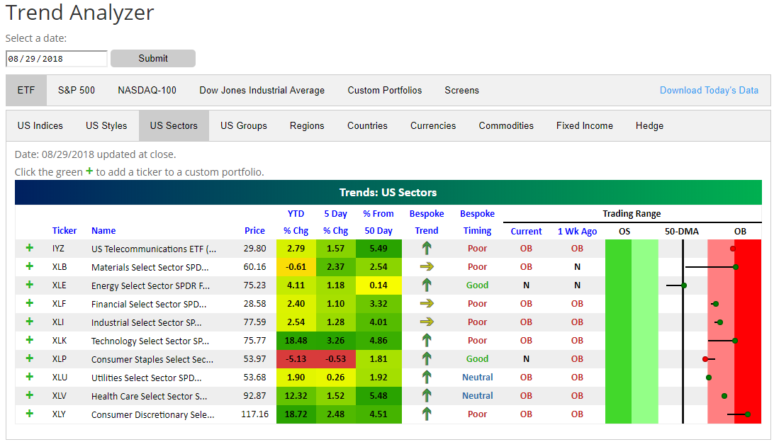
All Sectors Back Above 50-Day Moving Averages
As shown in our trading range chart below, the S&P 500 continues to leg higher after breaking out last week.
Another bullish signal is that every major sector is now back above its 50-day moving average. You can see the recent moves in the snapshot below from our Trend Analyzer tool (available for use by Premium and Institutional members). The Energy sector (XLE) joined the party with a move back above its 50-DMA today. Outside of Energy and Consumer Staples (XLP), every other sector is also trading in overbought territory.
New York Home Prices Lag — Updated Case Shiller Numbers
The June S&P/Case-Shiller home price readings came out yesterday, and below we provide our updated summary charts and tables of the data. Nineteen of twenty cities saw month-over-month gains in home prices, with New York seeing the only decline at -0.07%. Las Vegas was up the most MoM at +1.39%, followed by Detroit and Minneapolis. Year-over-year, Las Vegas, Seattle, and San Francisco are up the most.

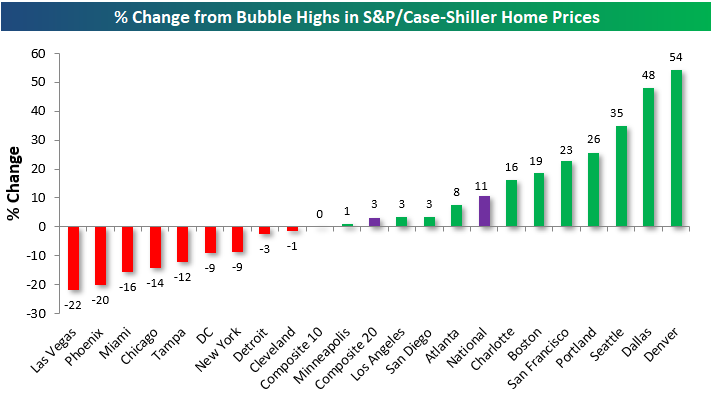
Below we show where home prices stand relative to their prior highs during the mid-2000s housing bubble. As shown, a majority of cities have now eclipsed their housing-bubble highs, with Denver, Dallas, Seattle, and Portland up the most. Denver home prices are 54% above their prior housing bubble highs. Las Vegas, Phoenix, Miami, Chicago, Tampa, DC, New York, Detroit, and Cleveland are the cities that have yet to clear their prior highs.
Our next chart shows how much each city is up off of its housing crash lows. As shown, the composite indices are all now up more than 50% off of their lows, while home prices in San Francisco, Las Vegas, and Seattle are up more than 100% off of their lows. New York real estate has seen the weakest recovery with a gain of just 25%.

Below we provide charts of each city along with the three composite indices. Cities shaded in green are at new highs. Minneapolis is the most recent city to hit a new high.
Start a two-week free trial to Bespoke Premium for more housing market analysis.
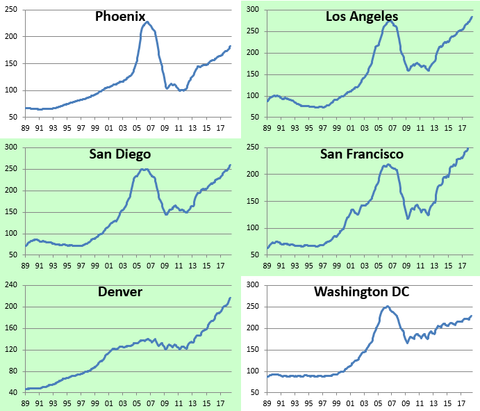
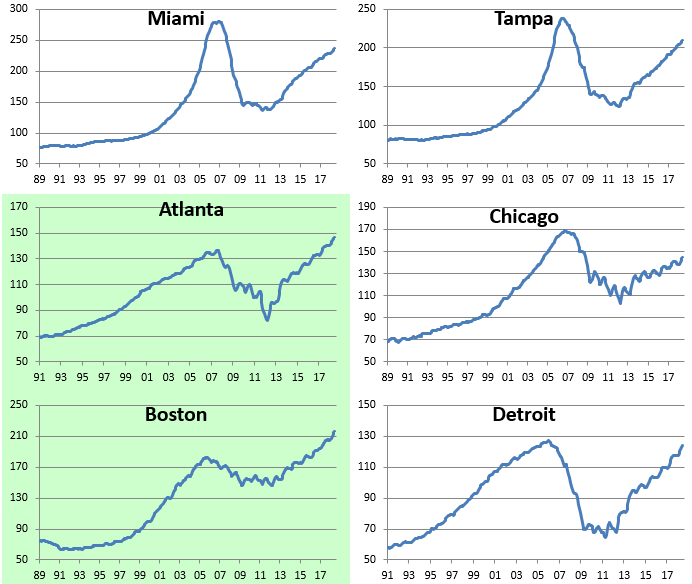
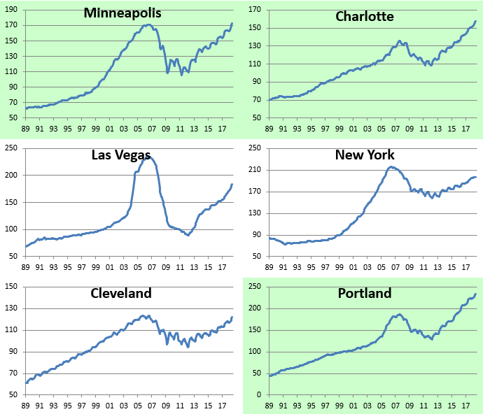
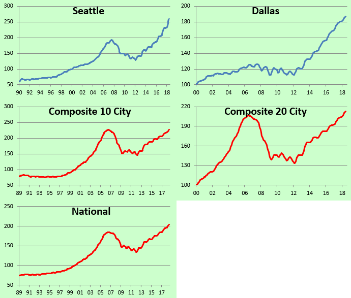
Chart of the Day: Cheap China
Fixed Income Weekly – 8/29/18
Searching for ways to better understand the fixed income space or looking for actionable ideals in this asset class? Bespoke’s Fixed Income Weekly provides an update on rates and credit every Wednesday. We start off with a fresh piece of analysis driven by what’s in the headlines or driving the market in a given week. We then provide charts of how US Treasury futures and rates are trading, before moving on to a summary of recent fixed income ETF performance, short-term interest rates including money market funds, and a trade idea. We summarize changes and recent developments for a variety of yield curves (UST, bund, Eurodollar, US breakeven inflation and Bespoke’s Global Yield Curve) before finishing with a review of recent UST yield curve changes, spread changes for major credit products and international bonds, and 1 year return profiles for a cross section of the fixed income world.
This week we take a look at which parts of the high yield bond market are trading at double-digit yields. It’s a very small and much less distressed corner of the fixed income markets than you might expect!

Our Fixed Income Weekly helps investors stay on top of fixed income markets and gain new perspective on the developments in interest rates. You can sign up for a Bespoke research trial below to see this week’s report and everything else Bespoke publishes free for the next two weeks!
Click here and start a 14-day free trial to Bespoke Institutional to see our newest Fixed Income Weekly now!
Bespoke’s Global Macro Dashboard — 8/29/18
Bespoke’s Global Macro Dashboard is a high-level summary of 22 major economies from around the world. For each country, we provide charts of local equity market prices, relative performance versus global equities, price to earnings ratios, dividend yields, economic growth, unemployment, retail sales and industrial production growth, inflation, money supply, spot FX performance versus the dollar, policy rate, and ten year local government bond yield interest rates. The report is intended as a tool for both reference and idea generation. It’s clients’ first stop for basic background info on how a given economy is performing, and what issues are driving the narrative for that economy. The dashboard helps you get up to speed on and keep track of the basics for the most important economies around the world, informing starting points for further research and risk management. It’s published weekly every Wednesday at the Bespoke Institutional membership level.
You can access our Global Macro Dashboard by starting a 14-day free trial to Bespoke Institutional now!

The Closer — Recession Not Likely Yet, Consumer Confidence Booms — 8/28/18
Log-in here if you’re a member with access to the Closer.
Looking for deeper insight on markets? In tonight’s Closer sent to Bespoke Institutional clients, we argue that intense focus on the likelihood of recession is misplaced. We also discuss extremely strong consumer confidence, a modest deceleration in home price growth, and the update to our 5 Fed Manufacturing index that came today with the release of Richmond Fed data.
See today’s post-market Closer and everything else Bespoke publishes by starting a 14-day free trial to Bespoke Institutional today!
Chart of the Day: What Got the Market to New Highs?
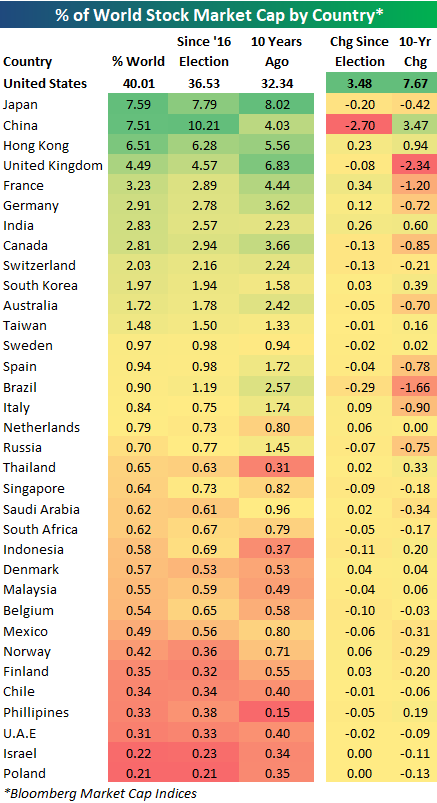
US as % of World Stock Market Cap Tops 40% Again
Below is a look at each country’s percentage of total world stock market capitalization based on Bloomberg indices. (We only include the 35 largest countries by market cap in the table.)
For each country, we show its current percentage of world market cap, where it stood on Election Day 2016, and where it stood ten years ago.
Notably, the US has just recently eclipsed the 40% level for the first time since 2005. At the moment, the US stock market makes up 40.01% of world stock market capitalization. Given dollar strength, gains in US equities, and declines in most international equity markets recently, it’s no surprise that this reading is at multi-year highs.
As the US’ share of world market cap has gone up, China’s share has taken the biggest hit. On Election Day 2016, the US made up 36.53% of world market cap, while China made up 10.21%. Since Election Day, the US has gained 3.48 percentage points, while China has lost 2.7 percentage points.
China’s drop has actually moved it into the third place ranking behind Japan, which currently makes up 7.59% of world stock market cap.
Behind the US, Japan, and China ranks Hong Kong (6.51%), the UK (4.49%), France (3.23%), Germany (2.91%), and India (2.83%).