Trend Analyzer – 2/21/19 – First Trend Change
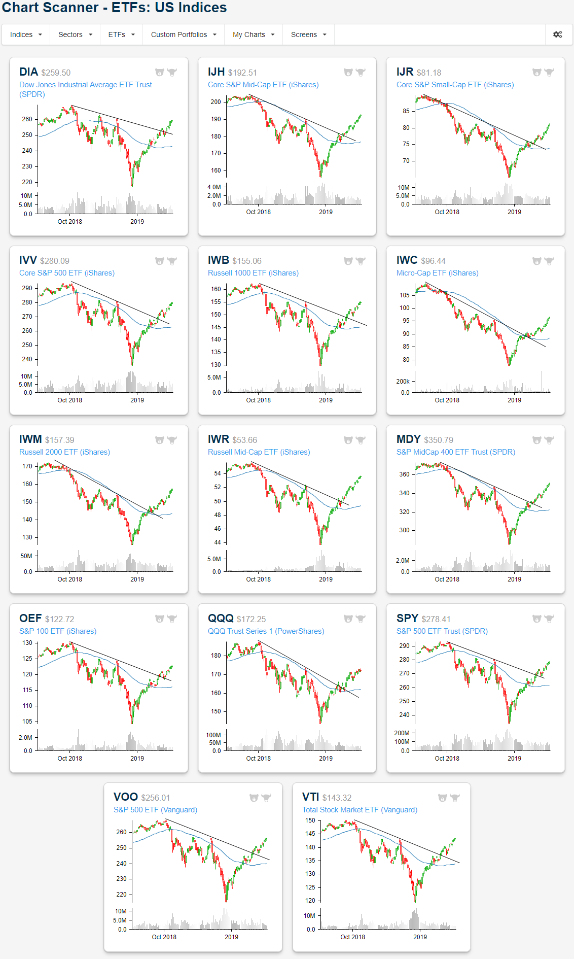
For the first time since December 17th of last year, one of the major US index ETFs is not in a downtrend. Tacking on another day of gains has led the Dow (DIA) to finally register as trending sideways. While that still may not be the uptrend bulls would hope for, it is certainly an improvement as not a single major index ETF has shown anything but a downtrend in the past two months. Yesterday’s gains also bring the group increasingly close to extremely overbought conditions (2+ standard deviations above the 50-DMA). As they have raged on this year, small caps are the closest to moving into that range. Of these, the Core S&P Small-Cap (IJR) is the most likely to be the first to become extremely overbought. IJR has also been one of the top performers this week as it is up 3.41%.
The aforementioned trends are a bit more obvious when looking at the charts of the ETFs. Taken from our Chart Scanner tool, as six-month charts the ETFs illustrate, they have all recovered from their late 2018 lows reentering the range from before the steep December declines. Being in this range, they are still well off of highs from the Fall but have also all broken their downtrend lines. Some like the S&P 500 (SPY) have actually come back to bounce off of these lines as support. In other words, the charts are still showing downtrends (price broadly going down and to the right), but these downtrends are showing signs of weakness.
Phill Fed: Look at Your Own Risk
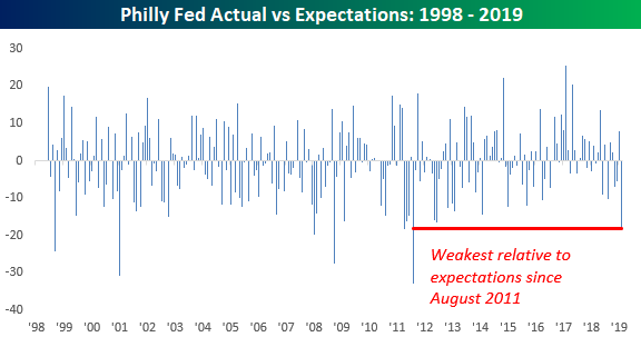
Terrible. That’s just about the only way you can describe Thursday’s release of the Philly Fed Manufacturing report. For a city that booed Santa Claus, we can’t imagine that people in the region are very happy with the latest report. While economists were expecting the headline print to come in at a level of 14.0, which would have been just a slight decline from last month’s reading of 17.0, the actual reading came in at negative 4.1. Yes, you read that correctly, negative 4.1.
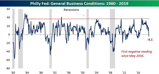
Not only did February’s reading end a streak of 32 straight months of positive readings, which was the longest streak since the late 1980s, but it was also the largest m/m decline and the biggest miss relative to expectations since August 2011. That’s pretty bad!
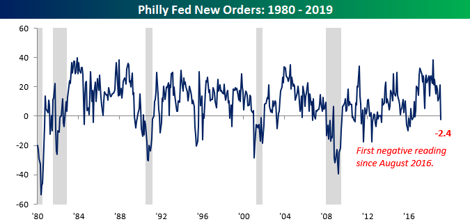
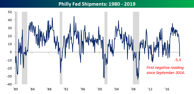
But it gets even worse. The table below breaks down this month’s report by each of the report’s components. Even worse than the headline reading, which saw the largest m/m drop in nearly eight years, New Orders actually collapsed at the fastest rate since October 2008. It doesn’t get much worse than that! Shipments were also very weak falling from 11.4 down to negative 5.3 for its first negative reading since September 2016.
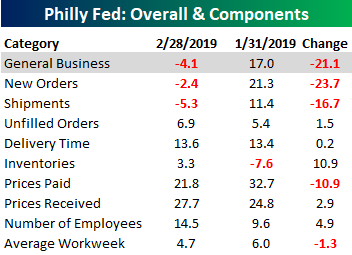
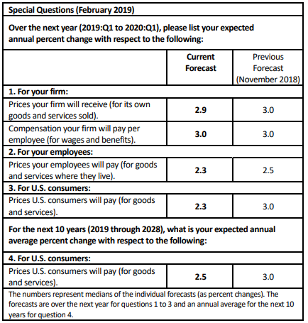
Finally, inflation doesn’t seem to be a concern of manufacturers in the Philadelphia region these days. The table below shows the results of the special question asked in this month’s survey. As shown, expectations for growth in prices that firms, employees, and consumers will pay going forward have come down from levels they were at just four months ago.
Initial Jobless Claims Drop Back to 216k
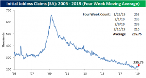
Initial Jobless Claims this week are breathing a sigh of relief after a string of concerningly weak prints. On a seasonally adjusted basis, claims came in at 216K, which was well below consensus expectations of 229K and also down from last week’s reading of 239K. Moving back down towards the lower end of the range the indicator has been at for much of the past year, the seasonally adjusted number has now spent a record 207 weeks under 300K.

Turning to the four-week moving average, a less volatile measure of the high-frequency indicator, the picture has not improved despite the healthier looking SA number. The moving average once again hit a 52-week high this week with a 235.75K print; up about 4K from last week. That was the highest reading since January 19th of last year. This week’s uptick was largely predictable as a result of the very low 200K SA number from mid-January rolling off of the average. Given that another very high print like the 253K reading from late January is not expected, we may see the inverse effect next week.
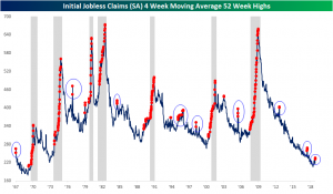
As we mentioned in last week’s Bespoke Report, while a 52-week high in the indicator is not necessarily the end of the world, consistent releases at a year’s high are concerning as it is a coincident recessionary indicator. Given this is only the second straight 52-week high, there is certainly no need to sound the alarms just yet. As shown below, there are several occurrences of the multiple 52-week highs in a short span outside of recessions. If the indicator continues on for several more consecutive weeks or months, then it would be much more of a concern.
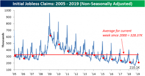
Finally, turning to the non-seasonally adjusted data, claims came in at 210.1K versus last week’s print of 242.8K. This week-over-week drop is right in line with seasonal patterns seen throughout the history of the indicator. This week’s data is also well below the average for the current week since 2000 (328.37K). It also came in as the lowest reading for the current week in the past several years; granted it is only 2K below last year’s print for the same week.
Morning Lineup – Blow Out in…Sneakers
In these emails, when we use the term blow out it is usually in reference to yields, spreads, or earnings, but today traders on Wall Street are focused on the blow out in Duke star Zion Williamson’s sneakers and specifically how it will impact the stock of Nike this morning. Thankfully for Mr. Williamson, the injury doesn’t appear to be too serious, but Nike overnight has been in full-blown damage control. Even former President Obama immediately noticed the cause of the fall as being due to the fact that “his shoe broke.”
In broader news this morning, US equity futures are lower after some mixed economic data. Although Jobless Claims came in better than expected, the Philly Fed report missed by a mile and actually went negative for the first time since May 2016. Read all about overnight events around the world and this morning’s news in today’s Morning Lineup.
Bespoke Morning Lineup – 2/21/19
In last night’s Closer, we discussed, among other things, the recent strength in the Russell 2000 and its 8 straight days of gains. Along those lines, we wanted to highlight not only how strong small caps have been overall, but also relative to the S&P 500. Just recently, the 30-day performance spread between the Russell 2000 and the S&P 500 topped 5 percentage points. As shown in the chart below, although this was common in the early days of the bull market, ever since the FOMC started hiking rates, occurrences have been fewer and far between. The last time the spread topped 5 percentage points was in late 2017 and before that late 2016.

The chart below shows the relative strength of the Russell 2000 versus the S&P 500 since the start of 2009, and the red dots indicate each time the performance spread above topped 5 percentage points. What’s notable about this is that in each of the last two periods where the spread reached similar levels, small caps underperformed going forward.

Start a two-week free trial to Bespoke Premium to see today’s full Morning Lineup report. You’ll receive it in your inbox each morning an hour before the open to get your trading day started.

The Closer — Fed Minutes, Russell Streaks, Credit Slows, Fund Flows — 2/20/19
Log-in here if you’re a member with access to the Closer.
Looking for deeper insight on markets? In tonight’s Closer sent to Bespoke Institutional clients, in the wake of the release of the FOMC’s Minutes, we provide our analysis of the Fed’s statements, especially in regards to the balance sheet. Next, we turn to the Russell 2000 reaching 8 consecutive days of open to close and close to close gains, which is tied for the second best streak in the past ten years. We finish with a checkup on credit markets, commodities, and weekly fund flows.

See today’s post-market Closer and everything else Bespoke publishes by starting a 14-day free trial to Bespoke Institutional today!
Fixed Income Weekly – 2/20/19
Searching for ways to better understand the fixed income space or looking for actionable ideals in this asset class? Bespoke’s Fixed Income Weekly provides an update on rates and credit every Wednesday. We start off with a fresh piece of analysis driven by what’s in the headlines or driving the market in a given week. We then provide charts of how US Treasury futures and rates are trading, before moving on to a summary of recent fixed income ETF performance, short-term interest rates including money market funds, and a trade idea. We summarize changes and recent developments for a variety of yield curves (UST, bund, Eurodollar, US breakeven inflation and Bespoke’s Global Yield Curve) before finishing with a review of recent UST yield curve changes, spread changes for major credit products and international bonds, and 1 year return profiles for a cross section of the fixed income world.
In this week’s report we take a look a the size of emerging markets credit.

Our Fixed Income Weekly helps investors stay on top of fixed income markets and gain new perspective on the developments in interest rates. You can sign up for a Bespoke research trial below to see this week’s report and everything else Bespoke publishes free for the next two weeks!
Click here and start a 14-day free trial to Bespoke Institutional to see our newest Fixed Income Weekly now!
US Retail Sales Still Better Than Most
Last week, Retail Sales raised eyebrows as the December release came in with a horrendous print. Taking a step back and looking at sales from a global scale, though, US retail sales are still fairly strong compared to the other 23 major economies that we track through our Global Macro Dashboard. With a y/y growth rate of 2.3%, the indicator has a little bit of headroom above the average global rate of 2.16% and a full percentage point above the median global growth rate. In other words, while the December print wasn’t great—reasons to be suspect of the most recent data (see here and here) aside—and the indicator has been trending downwards in recent months, US Retail Sales are growing at a faster rate than 14 of the 23 global economies in our Dashboard. Of the developed economies tracked, the US actually has the fourth fastest growing retail sales behind the UK, France, and Australia, while the rest of the countries with faster growth are all emerging markets. Meanwhile, 5 of the countries in our Dashboard have actually seen contractions in their most recent y/y retail sales reading.
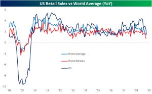
Chart of the Day: After Hours vs. Open to Close by Weekday
Treasury Yields Keep Drifting Lower
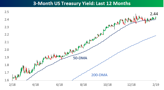
Despite continuing calls for a move higher in rates, US Treasury yields have been flat to lower across the curve recently. Let’s start with the short end of the curve. While you could practically set your watch to the pace of rising yields on the 3-month UST for most of 2018, the rise came to a halt late in Q4 as economic data slowed and the equity market declined. Last month’s pivot by the FOMC to pause its rate hiking cycle has only reinforced that trend. For now, 2.5% should be a ceiling.
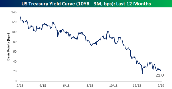
At the long end of the curve, yields have not only not been rising, but they’ve also been falling. When equity markets bottomed in late 2018, the yield on the 10-year briefly started rising again, but that move higher in yields came to a halt just shy of 2.8%, which had formerly been a support level. As things stand now, the 10-year yield is at 2.65% and not far from one-year lows.

With lower yields at the longer end of the curve, the yield curve (10-year minus 3-month yield) has been flattening dramatically again. At today’s level, the yield curve is barely legal to drink and outside that brief period at the end of last year is at its lowest levels in over a decade. What will it take to get the curve steepening again?
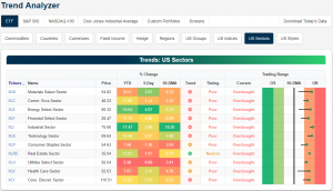
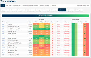
Trend Analyzer – 2/20/19 – S&P 100 (OEF) Gets Left Behind
Every major index ETF remains overbought headed into the open. Small caps continue to lead the group with the Core S&P Small Cap (IJR) having risen the most over the past week at 4.08%. The Micro-Cap (IWC) is right on IJR’s heels with a gain of 4.03%. Both ETFs are also the most overbought and among the highest above their 50-DMAs (IWM Russell 2000 is the highest above its moving average). On the other hand, large caps have continued to lag behind their smaller peers as they have much of the year. While gains over the past week have been somewhat middling, the S&P 100 (OEF) is currently the only index to not have seen double-digit gains since the start of the year. The other large-cap index, the Dow (DIA), has managed to edge out returns more in line with the other major indices at 10.98% YTD.
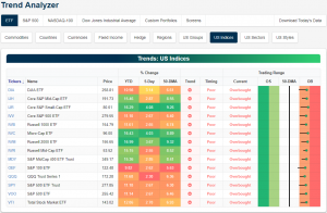
Looking at the 11 sectors of the economy, every ETF tracking the individual sectors is now also overbought. This time last week, a number of these sectors were still neutral. Industrials (XLI) is currently the most overbought as it sits 10.2% above its 50-DMA. XLI has also seen the best returns gaining 17.47% YTD. As the best performer over the past week (+5%), Energy (XLE) is next in line in YTD terms adding 15.64%. A major positive development to note when looking at the sectors is that in the past month, trends have begun to reverse whereas every sector was firmly in a downtrend at the beginning of the year. Real Estate (XRE) is currently the only one in an uptrend. Three others (XLP, XLU, and XLV) are now trending sideways.