The Closer — Credit Still Trending Wider, Five Fed, Claims Diffusion — 3/28/19
Log-in here if you’re a member with access to the Closer.
Looking for deeper insight on markets? In tonight’s Closer sent to Bespoke Institutional clients, we begin with a look at the multi-year trend of widening credit spreads while dollar and rate volatility has fallen; mirroring that of stocks and WTI. We also observe the lackluster performance of green energy stocks before giving the full picture of our Five Fed Manufacturing Composite with the addition of today’s Kansas City Fed’s data. To finish, expanding on an earlier blog post, we created a diffusion index of state-level jobless claims. The index shows a bit of a contrast between Initial and Continuing Jobless Claims.

See today’s post-market Closer and everything else Bespoke publishes by starting a 14-day free trial to Bespoke Institutional today!
Bespoke’s Sector Snapshot — 3/28/19
We’ve just released our weekly Sector Snapshot report (see a sample here) for Bespoke Premium and Bespoke Institutional members. Please log-in here to view the report if you’re already a member. If you’re not yet a subscriber and would like to see the report, please start a two-week free trial to Bespoke Premium now.
In this week’s Sector Snapshot, we discuss mean reversion to close the quarter for the S&P 500, and we look at weakening relative strength for Health Care and Financials. Please click the thumbnail image below to read this week’s report.
To gain access to the report, please start a two-week free trial to our Bespoke Premium package now. Here’s a breakdown of the products you’ll receive.
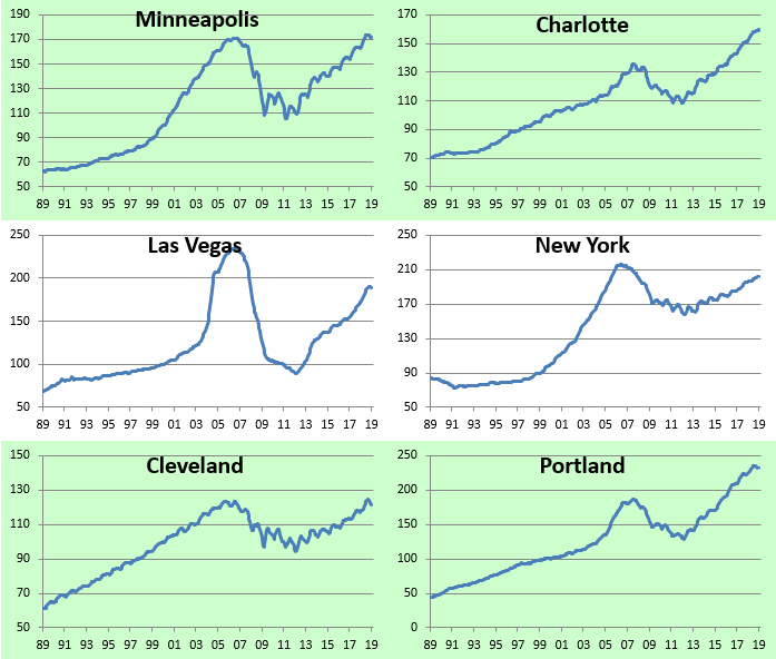
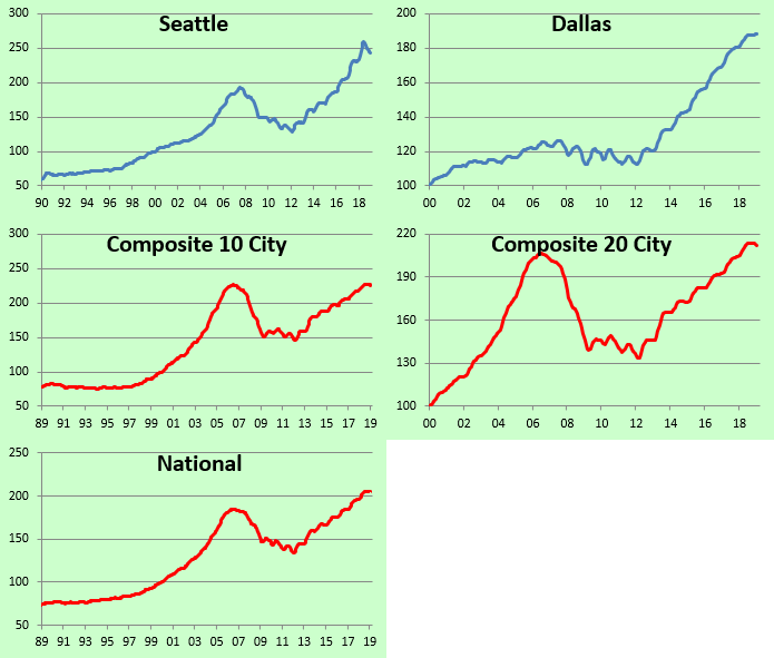
City-by-City Home Price Trends Around the Country
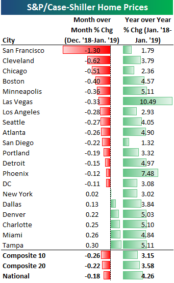
City-by-city home price data was released for January by S&P/Case Shiller earlier this week. Below we provide our regularly updated charts and tables covering the release.
The 10-city and 20-city composite indices that cover home prices across the country showed month-over-month declines to the tune of 20-25 basis points. San Francisco was by far the biggest standout with a month-over-month decline of 1.3%. The next closest city was Cleveland at less than half that with a decline of 0.62%. Other cities that saw decent-sized month-over-month drops in home prices include Chicago, Boston, Minneapolis, and Las Vegas.
Six cities saw increases in home prices from December 2018 to January 2019. Two Florida cities were up the most as the no-income-tax state continues to benefit from the sharp drop in state and local income tax (SALT) deductions that took place with Trump’s tax reform package. Miami was up 0.26% month-over-month while Tampa was up 0.30%.
Every city has still seen home prices increase on a year-over-year basis, but the rate of change is shrinking.
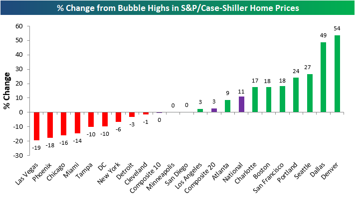
Below we show where home prices currently stand compared to each city’s peak price level at the highs during the mid-2000s housing bubble. The National index is now 11% above its prior highs. Denver and Dallas are by far the most above their prior highs at ~50%. Las Vegas, Phoenix, and Chicago are the furthest below their prior highs. Las Vegas prices are still 19% below levels seen at the peak of the mid-2000s bubble.
The next chart shows how much prices are up compared to their low points after the housing bubble burst. Most cities saw home prices bottom in 2011-2012. As shown, San Francisco has seen the biggest bounce off of its lows at +119%. And while Las Vegas is still 19% below its prior highs, prices have more than doubled off of their lows!
At the national level, home prices are up roughly 55% off of their lows, while New York and Cleveland have seen the smallest bounces. New York home prices have rebounded just 28%.

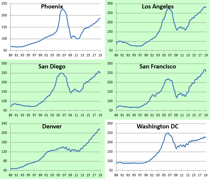
Below we show home price levels for each city tracked by S&P/Case Shiller. Cities shaded in green have managed to eclipse their prior housing bubble highs, while those that aren’t shaded still have a ways to go. You’ll notice in the charts that prices in a lot of cities have pulled back a bit recently, but so far it doesn’t look like we’ve reached a tipping point. For now, the drops can still be categorized as regular ebb and flow inside of an expansion.

Individual Investors Still Neutral
Bullish sentiment is back down this week to 33.2% as the percentage of individual investors reporting as bulls fell just over 4% from last week’s 37.3%. Optimism has now declined 8.4 percentage points from the recent high in late February. While still not at any sort of extreme levels, this most recent reading does sit on the lower end of the range from the past few weeks.
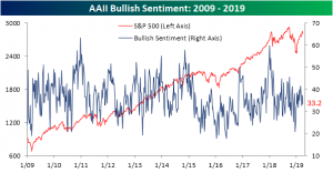
All of the declines in bullish sentiment seem to have predominately gone to the negative camp as bearish sentiment rose this week to 27.2% from 23.4% last week. Similar to bullish sentiment, bearish sentiment has yet to reach any sort of extreme readings.
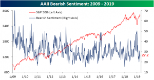
The same cannot necessarily be said for neutral sentiment. As price action has somewhat plateaued around current levels, an increasing amount of investors predict the market to remain here for the coming months. At 39.6% this week and just off of the recent high of 39.82% from last month, neutral sentiment has remained the most popular opinion among investors for three weeks in a row now. These levels are approaching an extreme too as they sit just under 1 standard deviation above the historical average.

S&P 500 Quarterly Returns
Despite the rocky finish, investors will be sad to see Q1 come to a close. Below we have provided a summary of the S&P 500’s average return by quarter going all the way back to WWII and just over the last ten years. Over the long-term, average returns in Q2 are actually pretty similar to Q1 with the S&P 500 averaging a gain of 1.9% compared to an average gain of 2.2% in Q1. In terms of consistency, both Q1 and Q2 have seen positive returns 62% of the time. Over the long-term, the real weakness for equities has come in Q3 when the S&P 500 averages a gain of just 0.5% and then bounces back in Q4 with an average gain of 3.8%. In terms of consistency, though, Q3 isn’t quite that different from Q1 and Q2 as it posts gains 60% of the time. Q4, however, has been the clear leader with positive returns 78% of the time.
Over the last ten years, Q2 hasn’t been as friendly to bulls. As shown in the chart on the right, Q2 has historically been the worst quarter of the year for the S&P 500 over the last ten years posting an average gain of 1.4% with gains 60% of the time. In every other quarter, the S&P 500’s average gain has been greater than 2.5% with positive returns 80% of the time. Also notable is the fact that Q2 is the only quarter where the average gain over the last ten years is lower than the long-term average (1.4% vs 1.9%).
Every month, Bespoke Premium subscribers receive detailed reports on seasonal market patterns for the upcoming month. Clients also receive access to our Stock Seasonality database, which allows users to screen for stock and ETF performance over pre-specified and custom time frames. To gain access to our seasonality tools, please start a two-week free trial to our Bespoke Premium package now. Here’s a breakdown of the products you’ll receive.

Chart of the Day: Barclays Agg Overbought
Fiscal Stimulus Not Faded Yet, GDP Slowing Anyways
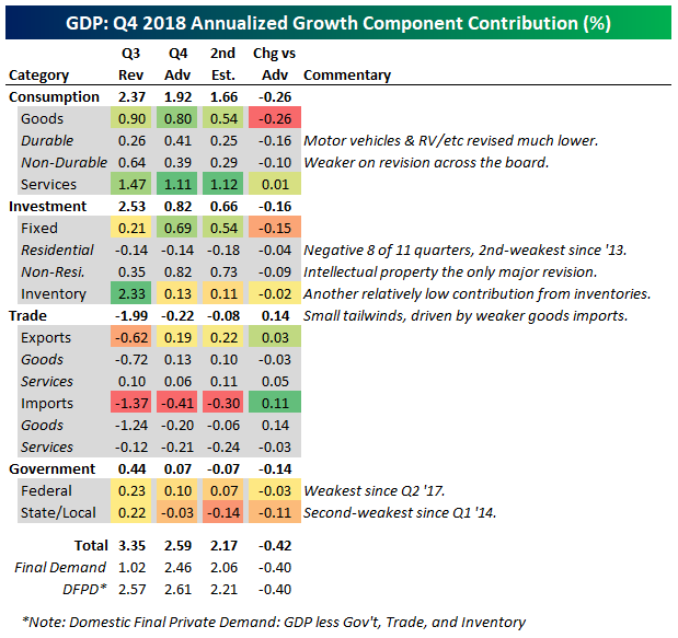
Today the BEA released its second (and final, thanks to the government shutdown earlier this year) estimate of fourth quarter 2018 GDP. Analysts were expecting a downward revision from 2.6% QoQ SAAR to 2.3% QoQ SAAR, but the actual impact was slightly more at 2.2% QoQ SAAR. Notably, every category except trade saw downward revisions, with broadly lower estimates of consumption growth across both durable and non-durable goods. Services was mostly unchanged. Fixed investment was also weaker, with housing continuing its very soft run with an 8th negative contribution in the last 11 quarters, while intellectual property product investment weighed on the non-residential side. Inventory investment was also slower at +11 bps contribution. Trade was a small positive, mostly thanks to weaker goods imports. Finally, government contributions to growth were revised lower. Notably the federal contribution was the weakest since Q2 ’17 while state and local governments weighed on growth the most since Q1 ’14.
Back in February of 2018, we showed the chart below in a Chart of the Day (link), which detailed the degree of fiscal easing relative to GDP by fiscal year. Fiscal years run October to September, so Fiscal Year 2018 ended last October and the current fiscal year is one-third finished. In other words, we are right in the heart of the fiscal stimulus unleashed by the combination of tax cuts and eased budget/spending caps at the end of 2017 and in early 2018.
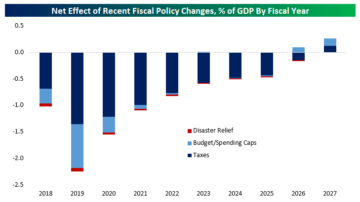
Despite the fiscal stimulus (mostly in the form of tax cuts, which in the near term tend to boost growth less than new outlays like the spending caps that were eased by Congress early last year), growth has only barely made it to 3%. As shown in the chart below, there doesn’t appear to have been a change in the trend for GDP, which is somewhere around 2% annualized. If fiscal stimulus totaling more than 3% of GDP in its first two years can’t push growth materially higher, that’s a pretty strong indication that there are very powerful factors keeping growth at a relatively slow 2% trend.
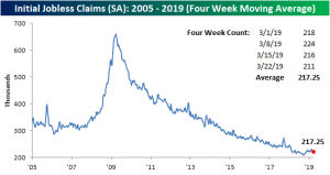
Claims Still Healthy
Bucking the trend of recent weak economic releases, this week’s Initial Jobless Claims provided a sigh of relief as it came in stronger than expected. On a seasonally adjusted basis, claims fell 5K from last week’s 216K to 211K. The past two weeks’ decline in the claims number has brought the indicator back to a level near the lower end of the range it has been in since Q4 2018. This week’s 211K is also the lowest print since January 18th. Once again, the labor market is still showing strength as claims have now come in at or below 300K for 212 consecutive weeks.
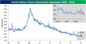
With early 2019 data that was frankly all over the place now having rolled off of the average, the less volatile four-week moving average has continued to stabilize and came in lower again this week. Down from 220.5K last week, the moving average is now at 217.25K. That is the lowest reading since early November and also well off of levels from February when this measure was reaching 52-week highs. So while other economic data has been week recently, this week’s initial jobless claims and lack of more 52-week highs in the four-week moving average seem to show that some of the worries of the past few months have more or less subsided.
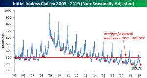
Turning to the non-seasonally adjusted number for this week, as we have frequently seen it came in at the lowest level since at least 2005 and for the current cycle. It is also well below the average for the current week since 2000.
Morning Lineup – Back to China
We’ve just published today’s Morning Lineup featuring all the news and market indicators you need to know ahead of the trading day. To view the full Morning Lineup, start a two-week free trial to Bespoke Premium.
After four trading days of non-stop focus on the yield curve, investors are moving on to the new topic du jour as positive headlines with respect to China have provided a boost to equity futures. As they say, everything old is new again! The news this time around is that the Chinese government is planning to offer more access to its cloud computing market for foreign tech firms. While sentiment is positive right now, there’s a lot to focus on today with a number of economic indicators on the calendar and several FOMC speakers set to speak.
Please click the link below to read today’s Bespoke Morning Lineup.
Sentiment sure can shift quickly in financial markets, and the latest example comes from Brazil. Just a little more than a week ago, Brazil’s benchmark Ibovespa index crossed the 100,000 level on an intraday basis for the first time ever. While the index was still down over 40% in dollar-adjusted terms, crossing 100,000 was a pretty big deal.
The party didn’t last long, though. The Ibovespa was never able to close above 100,000 last week, and ever since then, we have seen steady selling. Just yesterday the index broke down through short-term support and is now down nearly 8% from its recent highs. This morning is also looking like more of the same at the open as Brazilian equities are set to open down about 1%. Easy come easy go.

Start a two-week free trial to Bespoke Premium to see today’s full Morning Lineup report. You’ll receive it in your inbox each morning an hour before the open to get your trading day started.

The Closer — Stocks Sticky, Hedges Ride Herd On Rates, Current Account Deficit — 3/27/19
Log-in here if you’re a member with access to the Closer.
Looking for deeper insight on markets? In tonight’s Closer sent to Bespoke Institutional clients, taking a look at the recent decimation of Treasury yields, we note that stocks have actually held up well, and are not always perfectly correlated with yields. We make a similar note regarding oil before delving deeper into the mess that has been rates. We examine the evidence that interest rates’ movements have been a result of hedging by looking at swap spreads and mortgages. In macro data, we review the US Current Account which showed the largest deficit since 2012 driven by the Goods and Services trade balance. We also show US income from portfolio investment which is at a record and the gross value of goods and services multi-year declines as a share of GDP. We finish with a recap of today’s EIA data.
See today’s post-market Closer and everything else Bespoke publishes by starting a 14-day free trial to Bespoke Institutional today!