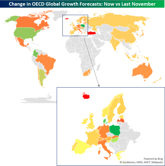
2019 Global Growth Forecasts: US at the Wheel
Given the increased friction over trade between the US, China and other countries around the world, concerns over global growth have been on the rise, and the latest revisions to global growth forecasts for countries in the OECD (Organisation for Economic Co-Operation and Development) reflect those concerns.
For the OECD as a whole, 2019 global GDP growth forecasts were cut from 2.12% in November to 1.78% now, marking a 36 basis point (bps) haircut. The map below shows the change in growth forecasts for each OECD country from November to now. Looking at the chart, there isn’t a whole lot of green. Besides the gray shading which indicates non-member OECD countries, most countries are colored in a shade of red to yellow. In fact, of the 45 countries shown, only six saw upgrades to their GDP growth forecasts, and none of the increases were all that significant as no country saw its growth forecast raised by more than 30 bps. On the downside, however, three countries (Turkey, Iceland, and Latvia) saw their growth forecasts slashed by more than a full percentage point, while another eleven saw growth estimates cut by more than half a percentage point! While no country saw an especially large increase in its growth forecasts, the US, which is by far the largest economy in the world, saw an upgrade to its growth forecast from 2.71% up to 2.82%. China, meanwhile, saw a cut in its GDP growth forecast from 6.2% down to 6.1%, a level of growth that most other global economies would kill for.
In the second chart below, we have zoomed in a bit on Europe since it is hard to see each country’s individual change in growth forecasts. For the region as a whole, growth forecasts were cut by a pretty sizable chunk, falling from 1.77% down to 1.22%. Countries in the Euro region that saw the largest downgrade to growth forecasts were Iceland, Latvia, Luxembourg, Italy, and Germany. Poland, Denmark, and Hungary were the only three countries that saw increases to global growth estimates. Start a two-week free trial to Bespoke Institutional to read more on international economies and the global macro backdrop.
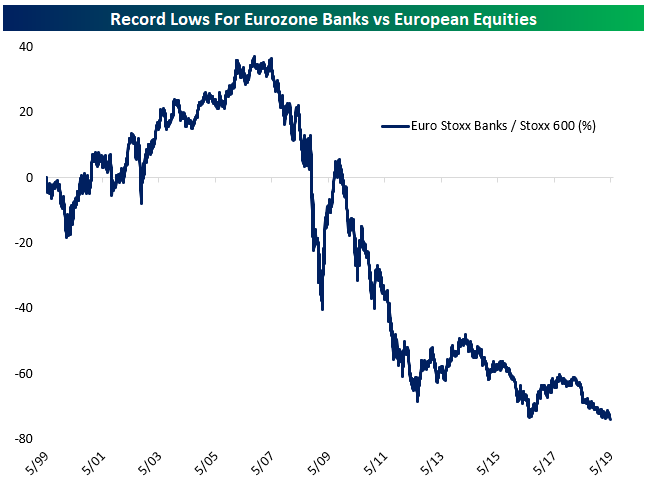
Eurozone Banks Make New Lows Versus The Market
Today Eurozone banks are lagging the market, but that’s nothing new. During the mid-2000s banks were the key drivers of European equity market performance, outperforming by almost 40% from mid-1999 through mid-2007. Since, it’s been a seemingly never-ending series of disasters: the global financial crisis, the Eurozone crisis, non-performing loan build-ups, recapitalization, negative interest rates, and more. As a result, Eurozone banks have underperformed the broadest measure of European stock prices by 77% since the 1990s came to a close. How much lower can this ratio go? Buying Eurozone banks here would certainly qualify as “buying low.” Start a two-week free trial to Bespoke Institutional to read more on international equity markets and the global macro backdrop.
Shifting Winds In Global Aerospace
Last night we discussed the shifting balance of power in the global passenger plane duopoly in our post-market macro report, The Closer. In the chart below, we show the relative performance of shares of Boeing (BA) and Airbus (traded in France under the ticker AIR, or with the US ADR EADSY). As shown, the ratio of the two share prices has moved back and forth in a range for the past two decades. Boeing is currently much more richly valued, has a drastically higher return on capital, but is facing challenges related to Boeing 737-MAX crashes and trade disputes, including a new EU-China civil air safety pact reported yesterday. When the line is rising, Airbus is outperforming Boeing and vice versa. With a recent spike following a low at the bottom end of the 20-year range, is Airbus now set to outperform for a much longer period of time? Start a two-week free trial to Bespoke Institutional to read more in The Closer.
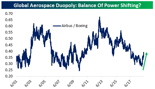
Chart of the Day: Buy the Dip
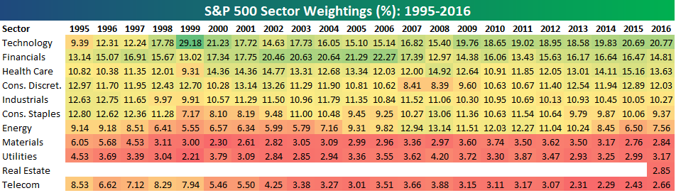
S&P 500 Sector Weightings Report: May 2019
S&P 500 sector weightings are important to monitor. Over the years when weightings have gotten extremely lopsided for one or two sectors, it hasn’t ended well. Below is a table showing S&P 500 sector weightings from the mid-1990s through 2016. In the early 1990s before the Dot Com bubble, the US economy was much more evenly weighted between manufacturing sectors and service sectors. Sector weightings were bunched together between 6% and 14% across the board. In 1990, Tech was tied for the smallest sector of the market at 6.3%, while Industrials was the largest at 14.7%. The spread between the largest and smallest sectors back then was just over 8 percentage points.
The Dot Com bubble completely blew up the balanced economy, and looking back you can clearly see how lopsided things had become. Once the Tech bubble burst, it was the Financial sector that began its charge towards dominance. The Financial sector’s sole purpose is to service the economy, so in our view you never want to see the Financial sector make up the largest portion of the economy. That was the case from 2002 to 2007, though, and we all know how that ended.
Unfortunately we’ve begun to see sector weightings get extremely out of whack once again.
If you would like to see the most up-to-date numbers for S&P 500 sector weightings, simply start a two-week free trial to our Bespoke Premium or Bespoke Institutional services. Click back to this post to see the numbers once you’re signed up!
Morning Lineup – Leaning Positive
In what is preliminarily looking like another turnaround Tuesday, S&P 500 and DJIA futures are indicating a positive open this morning and looking to erase all of Monday’s declines. While there has been no easing in trade tensions with China, the rally in US futures is coming on the back of a positive day in Europe. Bulls are hoping the gains can hold throughout the day, but all it takes is one tweet…
We’ve just published today’s Morning Lineup featuring all the news and market indicators you need to know ahead of the trading day.

Although S&P 500 and DJIA futures are on pace to erase most of Monday’s declines, the same can’t be said for the Nasdaq which isn’t even on pace to erase half of Monday’s declines. The last couple of weeks have been especially tough on the tech sector, and therefore the Nasdaq, versus the broader market.
As shown in the intraday relative strength chart from the last three weeks, the underperformance for the Nasdaq began in earnest after the first full week of May and really accelerated with the major gap down at the open last Monday (5/13). While the Nasdaq spent much of the rest of the week trying to dig itself out of the hole, shortly before the close last Friday and into Monday, the bottom fell out again.

Start a two-week free trial to Bespoke Premium to see today’s full Morning Lineup report. You’ll receive it in your inbox each morning an hour before the open to get your trading day started.
The Closer — Breadth, Spreads, Aerospace, and Fedspeak — 5/20/19
Log-in here if you’re a member with access to the Closer.
Looking for deeper insight on markets? In tonight’s Closer sent to Bespoke Institutional clients, we take a look at how the S&P 500’s breadth through the A/D line and performance versus the equal weight index. We also show investment grade and high yield spreads reaching new highs. Next, we compare Airbus and Boeing before finishing with an updated look at our Fedspeak monitor.

See today’s post-market Closer and everything else Bespoke publishes by starting a 14-day free trial to Bespoke Institutional today!
Tesla’s (TSLA) Shrinking Market Cap
In late April, we highlighted that Ford (F) had retaken Tesla (TSLA) in terms of market capitalization following a massive jump for Ford in response to earnings. Notwithstanding some weakness today on news of job cuts, in both terms of price and market cap, F has held pretty steady since that gap up. On the other hand, TSLA has continued its fall from grace from the title of largest US auto manufacturer that it earned for the first time back in 2017. Analyst downgrades today were the catalyst of an early 3%+ decline for TSLA, sending the stock to a 52-week low—its lowest level since December of 2016—further diminishing the company’s market cap. TSLA is now similar to its size in early 2017. With a market cap of $4.8 billion less than Ford, it is also the lowest of the auto manufacturers. Meanwhile, with a market cap of roughly $52 billion, General Motors (GM) is now distinctively the largest automaker in the country. Start a two-week free trial to Bespoke Institutional to access our Chart Scanner, Earnings Explorer, and much more.
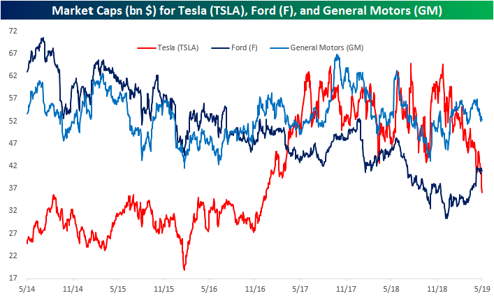
Chart of the Day – Semi Underperformance
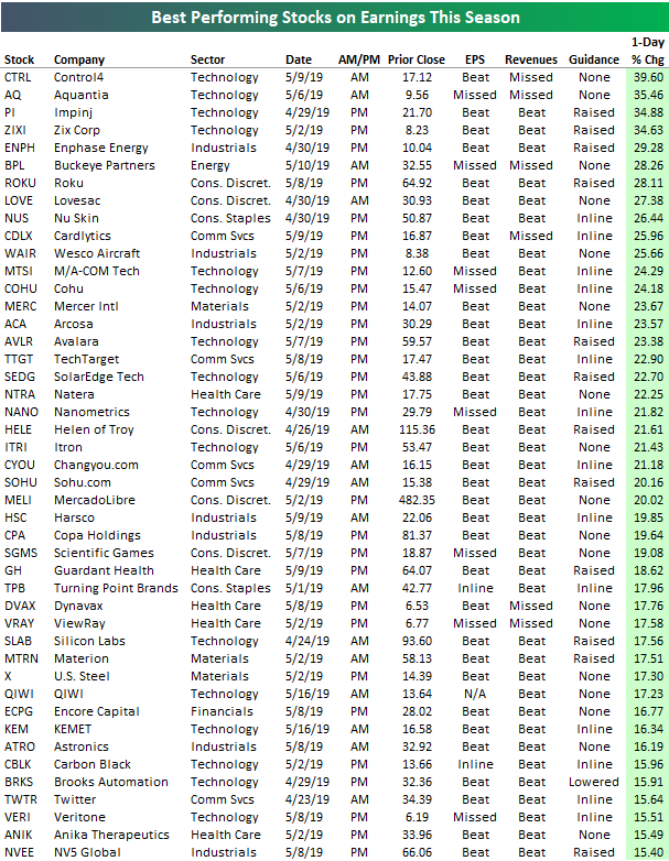
Biggest Earnings Winners and Losers
More than 2,000 public companies released quarterly earnings during the Q1 reporting period between April 10th and May 16th. On average, these stocks fell 0.57% on their earnings reaction days, so collectively, investors were net sellers on earnings this past season. (For a stock that reports before the open, its earnings reaction day is that trading day. For a stock that reports after the close, its earnings reaction day is the next trading day.)
There were 25 stocks that gained more than 20% on their earnings reaction days this season, and there were 108 that gained more than 10%. Below is a list of the very best performers. As shown, Control4 (CTRL) ranks at the top with a one-day gain of 39.6% when it reported on May 9th. While the company missed revenue estimates, it announced that it was being acquired for $23.91/share — 39.66% above the price it closed at prior to its earnings report.
The same thing happened to the 2nd best performer on earnings this season — Aquantia (AQ). AQ reported earnings on May 6th, and while it missed both EPS and revenue estimates, it announced that it had been bought by Marvell Technology for $13.25/share.
Behind CTRL and AQ, the next best three stocks on their earnings reaction days this past season were Impinj (PI), Zix Corp (ZIXI), and Enphase Energy (ENPH). PI and ZIXI both gained nearly 35%, while ENPH gained 29.3%. Other notables on the list of biggest winners include Sohu.com (SOHU), MercadoLibre (MELI), US Steel (X), and Twitter (TWTR).
While there were 25 stocks that gained more than 20% on their earnings reaction days this season, there were 31 that fell more than 20%. Additionally, there were 108 stocks that gained more than 10%, but there were 157 that fell more than 10%. In other words, there were more big losers than winners.
At the top of the “biggest losers” list is Stamps.com (STMP), which fell 55.75% on May 9th after its evening report on May 8th. For STMP, it was its second 50%+ decline on earnings in a row — something that had never happened for any stock in our Earnings Database dating back to 2001!
Behind STMP, we saw Conduent (CNDT) and Puma Biotech (PBYI) both fall more than 38%, while Tenneco (TEN) fell 37.5%. Other notables on the list of biggest losers this past earnings season include Fluor (FLR), iRobot (IRBT), MarineMax (HZO), Sleep Number (SNBR), and 3D Systems (DDD). With every company on the list below experiencing a one-day drop of more than 17% recently, this is not a distinguished list that you want to be on if you’re a publicly traded company! Start a two-week free trial to Bespoke Institutional to access our Earnings Explorer tool and everything else we have to offer.
