The Bespoke Report – 6/7/24 – Freaky Friday
To read our weekly Bespoke Report newsletter and access everything else Bespoke’s research platform has to offer, start a two-week trial to Bespoke Premium.


This Week’s Can’t-Miss Analysis — 6/7/24
We publish a lot of market-related content each week, and we want to make sure you don’t miss the most important topics. Below are some of the charts and tables we view as “can’t miss” from the last week.
Our first chart from Thursday’s Closer touches on a theme we’ve focused a lot on in recent weeks: weak breadth. As shown below, while the S&P 500’s price has been making new all-time highs this week, its cumulative advance/decline line has yet to get there and is trending slightly lower. Shorter-term, it’s pretty incredible to see the S&P’s 10-day advance/decline line near oversold territory even though price has rallied.

To continue reading the rest of this week’s “Can’t-Miss” analysis, which includes another dozen or so important market-related topics, start a two-week trial to Bespoke Premium today! With a two-week trial, you’ll also receive our daily research in your inbox as it gets posted. Go ahead and give it a try by signing up at this link.
Before you go…
Make sure to check out Bespoke co-founder Paul Hickey’s appearance on CNBC if you missed it earlier this week. Click here or on the image below to view.
Have a great weekend!
Bespoke’s Morning Lineup – 6/7/24 – Unchanged into Unemployment
See what’s driving market performance around the world in today’s Morning Lineup. Bespoke’s Morning Lineup is the best way to start your trading day. Read it now by starting a two-week trial to Bespoke Premium. CLICK HERE to learn more and start your trial.
“Tell me a musician who’s got rich off digital sales. Apple’s doing pretty good though, right?” – Prince

Below is a snippet of commentary from today’s Morning Lineup. Start a two-week trial to Bespoke Premium to view the full report.
The recent market trend in non-farm payrolls reports has been positive. Over the last nine months, the headline report came in stronger than expected seven times, and the S&P 500 has been higher eight times on the day of the report. Even including the one day that the S&P 500 was down on a “Payrolls Friday”, its average change on the day of the report was a gain of 0.63%, and the Financial sector has been positive on the day of the report for nine straight months.

We’ve been discussing weak market breadth for a couple of weeks now, including yesterday’s Closer report where we compared the weakness in the cumulative advance/decline (A/D) line to the new high in the S&P 500. Another example is the fact that while yesterday was the only day this week that the S&P 500 was down (and barely at that), the S&P 500’s net A/D line has been negative in three of the last four trading days.
While weak breadth has become especially pronounced in recent days, the trend is not new. Look at the chart below which shows the performance of the S&P 500 market cap-weighted index versus its equalweight counterpart over the last two years. While the S&P 500 has rallied 30.3%, the equalweight index is up by just a little more than a third of that (11.3%).

Below we show the rolling two-year performance spread between the two indices over time. At the current level of 19 percentage points, the spread has reached its widest level in nearly 24 years (6/30/00) putting it in the 95th percentile relative to all other two-year periods since 1992. The last time the spread was this wide, it came just ahead of what ended up being a period of massive long-term underperformance for the cap-weighted index. That being said, the period during which the cap-weighted index had outperformed leading up to that lasted for years.

To continue reading the rest of today’s morning note, where you’ll find much more analysis of global equities and economic readings released this morning, read today’s full Morning Lineup with a two-week Bespoke Premium trial.
Bespoke’s Consumer Pulse Report — June 2024
Bespoke’s Consumer Pulse Report is an analysis of a huge consumer survey that we run each month. Our goal with this survey is to track trends across the economic and financial landscape in the US. Using the results from our proprietary monthly survey, we dissect and analyze all of the data and publish the Consumer Pulse Report, which we sell access to on a subscription basis. Sign up for a 30-day free trial to our Bespoke Consumer Pulse subscription service. With a trial, you’ll get coverage of consumer electronics, social media, streaming media, retail, autos, and much more. The report also has numerous proprietary US economic data points that are extremely timely and useful for investors.
We’ve just released our most recent monthly report to Pulse subscribers, and it’s definitely worth the read if you’re curious about the health of the consumer in the current market environment. Start a 30-day free trial for a full breakdown of all of our proprietary Pulse economic indicators.
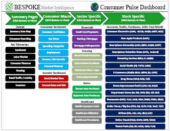
Chart of the Day – Nothing Flies Forever
Bespoke’s Morning Lineup – 6/6/24 – Watch What We Do, Not What We Say
See what’s driving market performance around the world in today’s Morning Lineup. Bespoke’s Morning Lineup is the best way to start your trading day. Read it now by starting a two-week trial to Bespoke Premium. CLICK HERE to learn more and start your trial.
“You get your ass on the beach. I’ll be there waiting for you and I’ll tell you what to do. There ain’t anything in this plan that is going to go right.” – Col. Paul R. Goode, June 1944
Below is a snippet of commentary from today’s Morning Lineup. Start a two-week trial to Bespoke Premium to view the full report.
As expected by everyone, the ECB just cut rates by 25 bps in its latest policy decision. Still, within its statement, it made some hawkish comments noting that “domestic price pressures remain strong as wage growth is elevated, and inflation is likely to stay above target well into next year.” The statement added, “The Governing Council is determined to ensure that inflation returns to its 2% medium-term target in a timely manner. It will keep policy rates sufficiently restrictive for as long as necessary to achieve this aim.” In looking at their words versus actions, there’s the appearance of a wide disconnect, but actions always speak louder than words. We’ll be looking for more color in the 8:45 press conference.
Looking at the moves in financial markets over the last several minutes, you wouldn’t have even noticed there was a major policy decision from a major central bank. Equity futures have seen little reaction and remain modestly higher, while the dollar is little changed, and yields are modestly higher. In the US, Non-Farm Productivity came in higher than expected while Unit Labor Costs were a bit lower. That’s all good news, but jobless claims did come in slightly higher than expected on both an initial and continuing basis.
Even accounting for last Thursday’s 0.6% decline, the last week of trading has seen stocks put in healthy gains as the S&P 500 rallied 1.7% and hit a record high yesterday. The rally has also been broad-based. As shown in the snapshot below, every sector except for Energy has notched gains, and surprisingly, Technology has not been the leader. It’s basically the only other sector that isn’t up 1%. Leading the way higher, Real Estate, Health Care, and Communication Services have rallied more than 2.5%. Five out of eleven sectors finished yesterday at overbought levels while seven are above their 50-day moving average, and only Energy is oversold.

The Energy sector has been in a steady and well-defined downtrend since its high in early April, and if the sector is going to see at least a short-term bounce, now would be the time as the sector closed yesterday right near the bottom end of that channel after bouncing right near its 200-DMA.

Not surprisingly, the Energy sector has been tracking the performance of crude oil which has also been weak. The sector broke its uptrend in early May, and after failing multiple times to get back above that uptrend line in the middle of the month, crude saw extreme weakness to close out the month. While the price decline has been bad for energy stocks, it has been great news for drivers. According to AAA, the national average price of a gallon of gas has dropped below $3.50 for the first time since March 18th and is down over 5% from its April high.

To continue reading the rest of today’s morning note, where you’ll find much more analysis of global equities and economic readings released this morning, read today’s full Morning Lineup with a two-week Bespoke Premium trial.
Chart of the Day – 10-Year Yield Drawdowns
Bespoke’s Morning Lineup – 6/5/24 – Softening Indeed
See what’s driving market performance around the world in today’s Morning Lineup. Bespoke’s Morning Lineup is the best way to start your trading day. Read it now by starting a two-week trial to Bespoke Premium. CLICK HERE to learn more and start your trial.
“If you put the federal government in charge of the Sahara Desert, in 5 years there’d be a shortage of sand.” – Milton Friedman
Below is a snippet of commentary from today’s Morning Lineup. Start a two-week trial to Bespoke Premium to view the full report.
This morning, we’re seeing a modestly positive tone in equity markets as treasury yields have barely moved. The risk-on mentality can be seen in Bitcoin where prices cracked back above $70K yesterday and now sit right around $71K. Overnight in Asia, India bounced over 3% while Japan and China both traded down nearly 1%. Service sector PMIs for both countries were better than expected. In Europe, the tone is more positive as Services sector PMIs were close to expectations indicating a modest expansion in that sector.
Back here in the US, the ADP Employment report for May just came out, and it came in weaker than expected at 152K versus forecasts for a reading of 175K. As shown below, the monthly reading has been right around these levels for ten months now, but it is well below the four-year average of 308K. With ADP out of the way, the only other report on the calendar is ISM Services at 10 AM.

Investors are closely watching a stream of employment data this week, including the just-released ADP report. But another insightful source often flies under the radar: Indeed’s job posting report.
This report provides valuable details on various employment trends, as we explored in last night’s Closer. One metric we find very useful is the percentage of industries on Indeed with job postings below their pre-pandemic baseline.
In the wake of COVID, job postings plummeted across all industries. However, from summer 2020 to summer 2021, this percentage steadily decreased. Remarkably, from August 2021 to early 2023, no industries fell below their baseline, reflecting an exceptionally tight labor market.
Over the past year, however, the labor market has begun to loosen. In recent weeks, the percentage of industries with below-baseline postings has reached 32%. While that means two-thirds of industries still have above-normal job postings, the trend suggests easing.
This aligns with other labor market indicators – employment remains strong but not strengthening. If the trend in Indeed job postings over the last several months continues, over half of all industries could see fewer job postings by year’s end compared to pre-pandemic levels.

To continue reading the rest of today’s morning note, where you’ll find much more analysis of global equities and economic readings released this morning, read today’s full Morning Lineup with a two-week Bespoke Premium trial.
EM Election Madness
Equities here in the US have gotten off to a weak start this month with the S&P 500 (SPY) down modestly over the past couple of sessions. However, those declines are being overshadowed by emerging markets. As we discussed in yesterday’s Morning Lineup and Closer and expanded on further in today’s Chart of the Day, Mexican equities have gotten massacred following the country’s election of Claudia Sheinbaum as president. The US-traded ETF that tracks Mexican stocks (EWW) is down 8.3% month-to-date and 12.3% year-to-date. After that decline, the ETF closed yesterday at a record 4.19 standard deviations below its 50-day moving average (DMA). That recent weakness is also a 180 from last year when EWW was the best-performing country ETF of the 22 tracked in our Global Macro Dashboard.
Turning forward to today’s news, Indian equities are likewise responding negatively to an election. As we detailed in today’s Morning Lineup, Prime Minister Narendra Modi’s Bharatiya Janata Party (BJP) and its allies won a majority, but by a much smaller margin than was expected just yesterday. Given the results, the India ETF (INDA) is down 6.6% for its worst day since the final day of 2021. Unlike EWW, INDA is still up on the year, though it has swung from deeply overbought to oversold territory in only a day.
As for the rest of the world, we would note that yet another emerging market has fallen on hard times. Brazil (EWZ) has gotten crushed this year with a 16.7% year-to-date decline even outpacing Mexico for the worst performance in 2024. Averaging across countries, EMs have fallen 0.74% year-to-date whereas developed markets are up mid-single digits on average. Relative to prior highs, the gap between emerging and developed markets is even more stark. EM country ETFs currently sit an average of 9.42% below 52-week highs compared to only 3.28% for developed market countries.

Below, we show price charts of a handful of emerging market economies over the past year with 50-DMA trading ranges shown. As noted earlier, Brazil has been weak and trending lower all year consistently trading below its 50-DMA (gray line). It is not only extremely oversold today, but it is also on the verge of 52-week lows. While EWZ has been trending lower, China (MCHI) has been a bright spot. MCHI is in a long-term downtrend dating back to early 2021, but since the start of this year, it has rebounded. This week’s weakness in Mexico (EWW) comes on what has been a period of consolidation. Since the end of last year, EWW has essentially trended sideways, and current levels are in the middle of last fall’s range. As for India, up until today, the country’s equities have been in a steady uptrend throughout the past year. After today’s decline, the uptrend has taken a hit with the first oversold readings since the fall.

