The Closer – Vol, Risk Parity, Construction – 3/23/26
Log-in here if you’re a member with access to the Closer.
- While the VIX continues to trend higher, there are some other signs indicating that volatility may have peaked.
- Gold has seen a large rise in leverage over the last four weeks whereas the drop in corporate bonds leverage has been 3 standard deviation move.
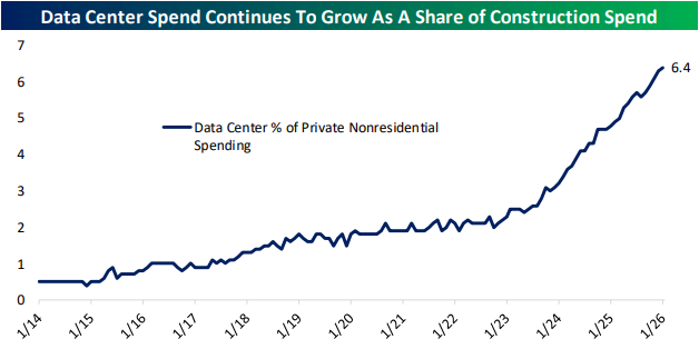
- Data center spending climbed to 6.4% of private nonresidential construction spending in January.
See today’s full post-market Closer and everything else Bespoke publishes by starting a 14-day trial to Bespoke Institutional today!
Daily Sector Snapshot — 3/23/26
Six Years Since COVID Crash Low
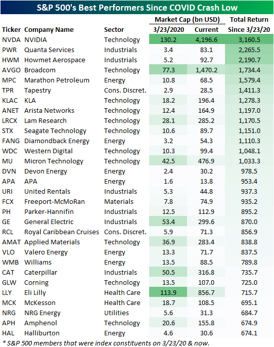
While it may feel like either ancient history or as though it was just yesterday, six years ago to the day, the S&P 500 put in its COVID Crash low. A lot has happened since then, but US equities have charged higher nonetheless. Since that low, the S&P has risen nearly 200%, with a number of huge moves under the surface driving those gains. In the table below, we show the 30 S&P 500 stocks that were a part of the index both at the time of the COVID Crash low (3/23/20) through today that have experienced the largest rallies over the past six years.
In total, there have been 17 ten-baggers since the COVID Crash low, and five stocks are up 1,500%+. That includes both Broadcom (AVGO) and NVIDIA (NVDA), which have joined the trillion dollar market cap club.
The 30 stocks shown below had a collective market cap of $735 billion at the time of the COVID low. Today, their combined market cap has eclipsed $10 trillion!
NVDA has been by far the biggest winner over this span thanks to both the early 2020s crypto boom and the emergence of AI. A number of Energy stocks have also found themselves on this list, thanks to a combination of solid dividend yields and exceptional price returns, especially more recently.
One final name that has been a top performer since COVID may be a surprise: Royal Caribbean Cruises (RCL). Even though six years ago this name was at the epicenter of lockdown doom, it’s up 857% since, which ranks as the 20th best.
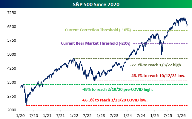
Pivoting back to the broader market, below we show the S&P 500 since the start of 2020. In the past several years, apart from the COVID Crash, there have been plenty of tough periods for the market including a prolonged bear in 2022, a near bear this time last year during the height of tariff turmoil, and this month once again with the war in Iran.
Amidst the turmoil, stocks haven’t struggled to eventually recover, and it would now take historic declines to return to levels from those prior periods.
Even after pulling back some from recent highs, we would note that it would require a 27.7% decline from current levels for the S&P 500 to return to its first post-COVID bull market high (1/3/22), and it would take a 46.1% drop to get back to the October 2022 bear market low.
For some historical context, only four (of the index’s 27 total) bear markets have seen larger declines than that over their full course from peak to trough. Further, it would require a nearly 50% drop to return to pre-COVID highs made on 2/19/20. There have only been three bear markets to see 50%+ drops in the S&P’s history. And finally, even if the S&P mirrored its worst bear market ever (a 62% decline during the 1931-1932 bear), the index would still be above its COVID Crash low from six years ago, which is 66% below current levels.
Like this analysis? Join our premium members by starting a trial today! Click below for details on how to sign up:

New Sector Snapshot Cover Page
Our Sector Snapshot provides a quick yet comprehensive look at several technical and fundamental readings across each of the eleven major sectors in addition to the S&P 500. Last week, we unveiled a freshened-up look for the cover page of our Sector Snapshot (shown below):
In the images below, we will work from top to bottom and left to right of the cover page to highlight each section.
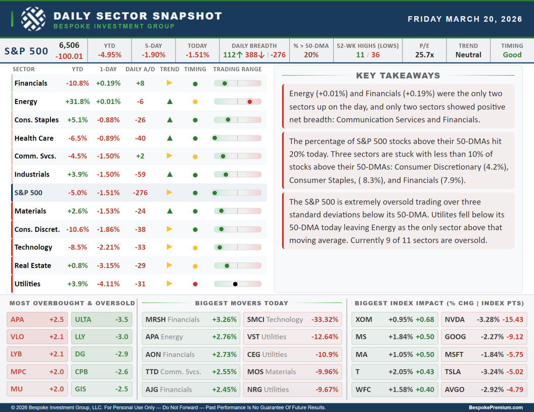
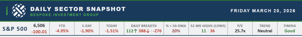
At the top of the page is a ticker tape of performance and breadth readings for the S&P 500. Moving left to right, we show the index’s price level (and daily change in terms of index points directly below) followed by its year to date, one week, and daily percentage changes. Next up are breadth readings including the daily number of advancing (in green) and declining (in red) stocks in addition to the net reading (number of advancers minus decliners). We then show the percentage of stocks trading above their 50-DMAs and the number of S&P 500 constituents that hit new 52-week highs and lows. Finally, on the righthand end of the strip, we show the updated price-to-earnings ratio and the trend and timing scores per our Trend Analyzer tool.
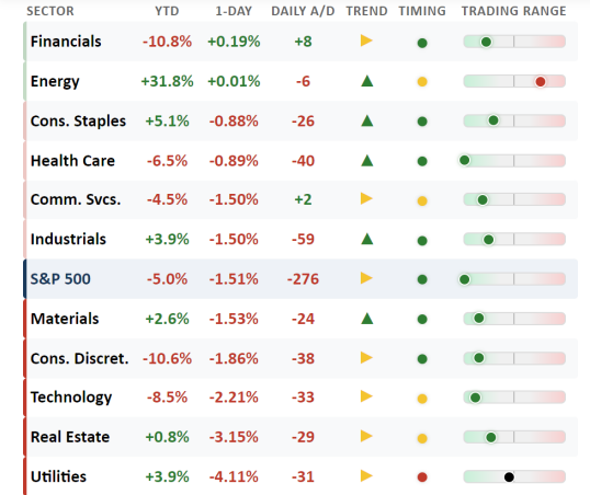
The next section is a matrix of the eleven S&P 500 sectors showing year to date and daily performance, the daily net advance/decline reading, a trend score (red arrows for downtrends, yellow arrows for sideways trends, and green arrows for uptrends), timing scores (red dots for poor, yellow dots for neutral, and green dots for good), and finally, a trading range chart. These bars’ midpoints are the sector’s 50-DMA, with the dot showing how far (in standard deviations) price is currently trading from that moving average. Readings further to the left or right indicate more extreme oversold or overbought readings, respectively. This matrix is sorted from best to worst based on one-day percentage change.
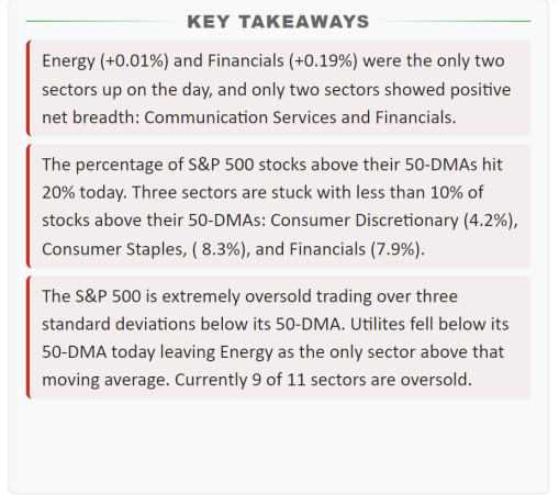
To the right of the sector matrix are key takeaways from recent sector price action. Refreshed daily, these notes parse through the indicators tracked throughout the full Sector Snapshot to highlight the most noteworthy findings.
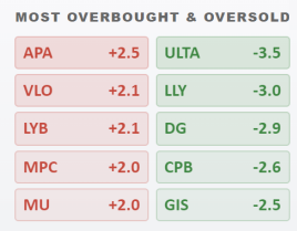
The bottom third of the page is dedicated to showing individual S&P 500 members that are standing out in various ways. The bottom left table shows the five S&P 500 stocks that are most overbought and oversold. This section includes tickers and how far each one is trading (in standard deviations) above or below its 50-DMA. Tickers in red are the most overbought stocks in the index, while tickers in green are the most oversold.
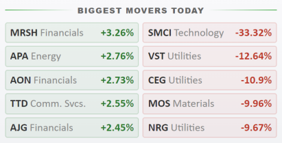
The bottom middle section highlights the S&P 500’s five biggest winners and losers each day:
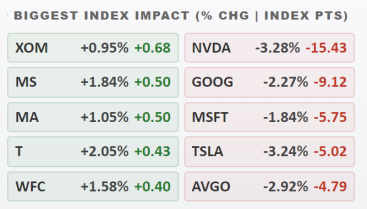
And finally, the bottom right section shows the five stocks that had the largest positive and negative impact on S&P 500 performance that day. For each of these stocks, its daily percentage change is shown in grey, while the numbers in green and red show the impact (in points) each stock had on the S&P 500’s price move that day.
If you have any questions or ideas for our daily Sector Snapshot, let us know!
Want to gain access to the Sector Snapshot? Join our premium or all access members by starting a trial today! Click below for details on how to sign up:
Chart of the Day: Cue the “Truth”
Bespoke’s Morning Lineup – 3/23/26 – Early Morning Reversal
See what’s driving market performance around the world in today’s Morning Lineup. Bespoke’s Morning Lineup is the best way to start your trading day. Read it now by starting a two-week trial to Bespoke Premium. CLICK HERE to learn more and start your trial.
“Appear weak when you are strong, and strong when you are weak.” – Sun Tzu

Below is a snippet of commentary from today’s Morning Lineup. Start a two-week trial to Bespoke Premium to view the full report.
Asian stocks plunged overnight, Europe was lower, and US futures were in the red about an hour ago, but all it took was one Truth Social Post to erase those losses and push stock futures firmly into the green. The S&P 500 and Nasdaq are both on pace to gap up more than 1.5% at the open, and European stocks are up by about 1%. Treasury yields are modestly lower, but the 10-year yield is still at an uncomfortably high 4.39%. After trading higher earlier, crude oil is down 7% to just under $92 per barrel. Gold is still trading down by close to 4%, sitting at $4,400 per ounce. At the end of January, it was more than $1,000 higher!
After last week’s declines, the Nasdaq finished lower for the fourth week in a row and the ninth week in the last ten. For ten weeks, that’s the fewest positive weeks since June 2022 and before that, July 2002. In the Nasdaq’s entire history, there have only been eight other periods when the Nasdaq declined for nine or more weeks in ten weeks, and only one of those periods saw the Nasdaq go ten straight weeks with declines.
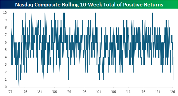
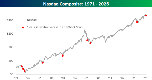
Below, we show when each of these prior periods occurred on a long-term chart of the Nasdaq. Outside of the period in the mid-1970s, these other occurrences all came in the later stages of market declines. That sounds like good news, but a counter to that is that the only other time the Nasdaq declined for nine weeks in a ten-week span and was still so close to 52-week highs was in that early 1970s period.
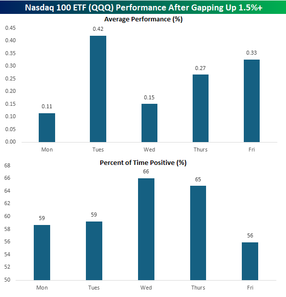
While it was looking like another negative start to the week earlier, futures took a sharply positive turn after the President’s Truth Social post saying that the US and Iran had engaged in conversations “regarding a complete and total resolution” of hostilities. As a result, the Nasdaq 100 ETF (QQQ) is on pace to gap up 1.5% at the open. If those gains hold through the open, it would be the first 1.5%+ upside gap for QQQ this year and the 266th since the ETF’s inception in 1999.
The chart below shows QQQ’s average performance from the open to close after gapping up 1.5%+ at the open based on the day of the week it occurred. Of the 46 that occurred on a Monday, QQQ’s average performance from the open to close was a gain of 0.11% with positive returns 59% of the time. While positive, that ranks as the worst performance from the open to close following a 1.5%+ upside gap of any other weekday.
Brunch Reads – 3/22/26
Welcome to Bespoke Brunch Reads — a linkfest of some of our favorite articles over the past week. The links are mostly market-related, but there are some other interesting subjects covered as well. We hope you enjoy the food for thought as a supplement to the research we provide you during the week.
A Tradition Unlike Any Other: The first Masters Tournament began on March 22, 1934, at Augusta National Golf Club, though, at the time, it was known as the Augusta National Invitation Tournament. Founded by Bobby Jones and Clifford Roberts, the event was conceived as a gathering of top players on a course designed to reflect Jones’ ideal vision of golf. Augusta National was still in its infancy, lacking many of the defining features and traditions that now make it iconic.
A field of 72 players teed it up in that inaugural event, both professionals and amateurs, in a relatively understated competition compared to today’s tournament. Horton Smith became the first champion, finishing at four under par and earning $1,500. There were no green jackets, no ceremonial traditions, and even the course was different. Back then, players started their round on what is now the back nine and finished on what we now know as the front nine. This meant that Amen Corner (holes 11–13), arguably the most pressure-filled stretch in golf, was played at the beginning of the round rather than near the finish. In 1935, Bobby Jones decided to reverse the nines to create a more exciting finish, which is the layout still used today.
Despite its modest beginnings, the foundation was set for something great. Within a few years, the tournament adopted the name “The Masters,” traditions began to take shape, and Augusta National evolved into one of the most revered stages in sports.

Markets & Investing
SEC Prepares Proposal to Eliminate Quarterly Reporting Requirement (WSJ)
The SEC is considering a rule that would let companies report earnings twice a year instead of quarterly, with a proposal expected soon and a final decision coming after public feedback. Supporters say it could ease the burden of being public, while critics worry it would reduce transparency for investors who rely on frequent updates. [Link]
Continue reading our weekly Brunch Reads linkfest by logging in if you’re already a member or signing up for a trial to one of our two membership levels shown below! You can cancel at any time.

The Bespoke Report – 3/20/26 – Closure Continues
To read our weekly Bespoke Report newsletter and access everything else Bespoke’s research platform offers, start a two-week trial to Bespoke Premium. This week we are closely focused on the three week war in Iran and its consequences for energy markets and the economy. The conflict has driven a massive surge in energy stocks around the world with US refiners especially benefitting. But broad indices have plunged into deep oversold territory as stocks reel from a sudden and extreme shift in central bank pricing. We recap a long list of central bank decisions across emerging and developed markets as well as the chaos in bonds markets that spent the week waking up to the risks for interest rates of significant global petroleum shortages. We also review economic data, which this week showed an economy with surprisingly solid labor markets, healthy balance sheets, and accelerating inflation…even before the impacts of oil price surges.

Daily Sector Snapshot — 3/20/26
Post-Iran Winners: Oil, Energy, and Israel
Equities around the world continue to take it on the chin this March, with month-to-date performance coinciding with the beginning of the start of the war in Iran over the last weekend of February.
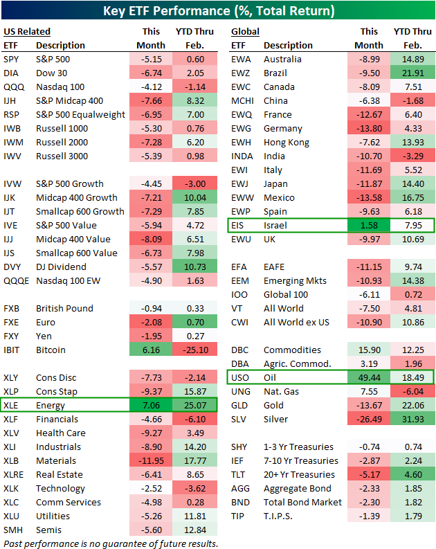
Below is a look at our asset class performance matrix featuring total returns for dozens of ETFs across domestic and international equities, sectors, currencies, commodities, and fixed income.
For each ETF, we show year-to-date performance through February along with performance so far in March.
ETFs across asset classes are bleeding red this month with the exception of a few: Bitcoin (IBIT), the Energy sector (XLE), oil (USO) and other energy/ag commodities, and Israel (EIS). Of these month-to-date winners, oil (USO), the agriculture commodities ETF (DBA), the Energy sector (XLE), and Israel (EIS) are the only ones that were also up year-to-date before the Iran war began.
On the downside, mid-caps and small-caps have been some of the hardest hit domestic index ETFs, with mid-cap value (IJJ) down the most at -8.1%.
Every sector ETF is down this month except Energy (XLE), with Materials (XLB) down the most at -12%.
Outside the US, country ETFs like France (EWQ), Germany (EWG), India (INDA), Italy (EWI), Japan (EWJ), and Mexico (EWW) are all down 10%+ since the war, while gold (GLD) and silver (SLV) have also gotten pummeled. Additionally, fixed income has not offered any safety due to inflation concerns brought about by the war. The 20+ Year Treasury ETF (TLT) is already down 5.2% since the bombings began.
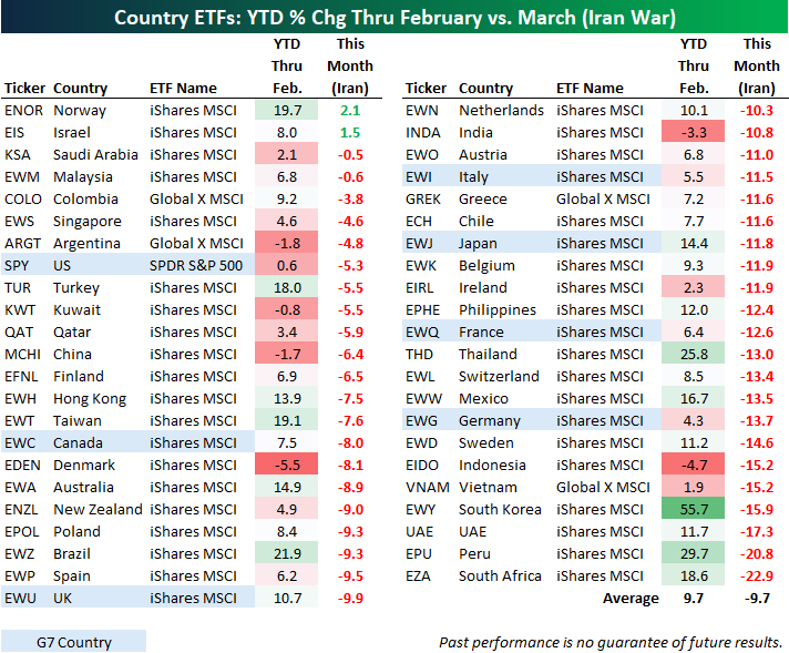
Below is a look at the recent performance of more than 40 country stock market ETFs traded on US exchanges.
On average, these country ETFs were up 9.7% through the first two months of 2026. Since the end of February, though, they’re down an average of 9.7%. Just a few weeks ago, it looked like 2026 was likely to be another year of outperformance for international markets. Now that there’s war in the Middle East and the Strait of Hormuz is unofficially closed for business, countries that heavily rely on energy imports are getting hit (with the exception of Israel). Along with Israel (EIS), Norway (ENOR) is the only other country ETF that’s positive this month. As a reminder, Norway is one of the few non-Middle Eastern countries that’s a net exporter of oil.
Six country ETFs are down 15%+ since the war began: Indonesia (EIDO), Vietnam (VNAM), South Korea (EWY), UAE (UAE), Peru (EPU), and South Africa (EZA).
Of the G7 countries, the US (SPY) is down the least with a decline of 5.3%, followed by Canada (EWC) — down 8%, and the UK (EWU) — down 9.9%.
Like this analysis? Become a Bespoke Premium member today using our March Madness special! Click below for details on how to sign up: