Bespoke Stock Scores — 11/28/23
Home Prices See Big Bounce Off 2023 Lows
The latest S&P CoreLogic Case Shiller home price data for September was released today and showed a 0.3% month-over-month (m/m) increase in home prices at the national level. Fifteen of twenty cities saw prices rise m/m, with Detroit, New York, and Las Vegas jumping the most, and Minneapolis, Denver, Seattle, Dallas, and Portland seeing declines. Year-over-year, Detroit, San Diego, New York, and Chicago are up the most at 6%+, while three cities are down year-over-year: Portland, Phoenix, and Las Vegas.
We highlight how these home price indices have changed over various time frames in the table below.

Home prices have jumped significantly from their lows at the start of 2023. Each of the twenty cities tracked peaked at some point in 2022 and then pulled back and made a low in either January or February of this year. In the chart below, we show how much home prices have jumped in each region from their respective 2023 lows. San Diego and Detroit have seen home prices rally more than 10% already, while Chicago, Cleveland, and Boston are up 8%+.

Below is a look at how much home prices are currently up since February 2020 right before COVID hit. As shown, the composite and national indices are up roughly 45% since COVID began, while Miami and Tampa — two Florida cities — are up the most at roughly 70%. On the other end of the spectrum, San Francisco, Minneapolis, DC, and Portland are up the least since February 2020 at 30-34%.

Finally, below we show how much home prices are up in each city versus their peaks seen during the last housing bubble in the mid-2000s before the Financial Crisis. The national index is now up 69% from its prior housing bubble peak, while Dallas and Denver are up the most at 133% and 126%, respectively. Chicago, Las Vegas, and DC are the cities up the least versus their prior housing bubble peaks at 25% or less.

Below is a look at historical pricing for the twenty Case Shiller cities and the three national indices. Cities in green are at all-time highs.
After the mid-2000s housing bubble burst and prices collapsed following the Financial Crisis, many thought it would take generations to get back to the peak levels seen prior to the crash. Now those prior peaks look like mere bumps in the road after the surge we’ve seen for housing so far this decade.


Gold Closes in on New Highs
In last night’s Closer and today’s Morning Lineup, we discussed areas in commodity markets that have been selling off. One that has avoided those declines has been gold. As shown below, gold’s outperformance isn’t exactly new. Gold relative to a broad basket of commodities massively outperformed early on in the pandemic, but that outperformance reversed up through the spring of 2022. The past year and a half has seen that outperformance generally return, especially over the past couple of months.

Amidst that outperformance, the yellow metal has been rallying since its early October low having gained 11.5% since then. That brings the commodity back within 0.65% of its 52-week set in May and 0.77% below the all-time high from August 2020 (what had been the first all-time high in nearly a decade). However, since the 2020 high those levels have repeatedly acted as tough resistance.


Bespoke’s Morning Lineup – 11/28/23 – Is It Dry Yet?
See what’s driving market performance around the world in today’s Morning Lineup. Bespoke’s Morning Lineup is the best way to start your trading day. Read it now by starting a two-week trial to Bespoke Premium. CLICK HERE to learn more and start your trial.
“Unlike the mediocre, intrepid spirits seek victory over those things that seem impossible.” – Ferdinand Magellan

Below is some introductory commentary of today’s Morning Lineup. Start a two-week trial to Bespoke Premium to get full access.
Futures are lower across the board this morning, but the magnitude of the implied losses is extremely small with the Nasdaq leading the way lower, and it’s only down 0.25%. On the economic calendar today, we’ll get Case Shiller Housing data at 9 AM and then Consumer Confidence and the Richmond Fed report at 10 AM. In Europe, most equity benchmark indices are also lower, but again, the magnitude of the losses is generally modest as only France’s CAC 40 is down over 0.5%. Overall, there has been little conviction in markets since Thanksgiving.
Is the paint dry yet? As you might expect for a shortened session after Thanksgiving, trading activity was very slow last Friday. More surprising, though, was the fact that yesterday’s trading was extremely quiet as well. Putting the two together, the S&P 500’s percentage spread between the intraday high and the intraday low over the last two trading days has just totaled 0.31%.

In terms of how this two-day spread stacks up over time, the chart below shows the S&P 500’s rolling two-day trading range over the last five years. The last two days rank as the narrowest spread of the entire post-Covid era, and you have to go back to Christmas Eve 2019 to find a narrower range over a two-day period. With a narrow range like that, is it any wonder why the VIX is trading under 13? What’s that saying about dull markets again?

Sign up for a two-week trial to Bespoke Premium to continue reading more of today’s macro analysis.
The Closer – Commodities Sell Off, Existing Homes Expensive, CoT – 11/27/23
Log-in here if you’re a member with access to the Closer.
Looking for deeper insight into markets? In tonight’s Closer sent to Bespoke Institutional clients, we begin with a check in on commodity prices and REIT performance (page 1). We then dive into the latest new home sales data (page 2) including a look at home existing home prices stack up to new homes and tenant rent prices (page 3). We then recaps the latest Treasury auctions (page 4) before reviewing the latest positioning data (pages 5 -8).

See today’s full post-market Closer and everything else Bespoke publishes by starting a 14-day trial to Bespoke Institutional today!
Daily Sector Snapshot — 11/27/23
Not Necessarily the Mega Caps and Everyone Else
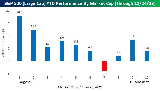
You would have to be living under a rock this year to not know that the performance of US stocks has been driven in large part by companies with the highest market caps. To illustrate it again, the chart below summarizes the YTD performance of stocks in the S&P 500 based on where their market caps stood at the beginning of the year. The first decile on the left in the chart contains the 50 stocks in the S&P with the largest market caps at the start of 2023, and so on and so forth until you get to the last decile which contains the 50 stocks in the index with the smallest market caps at the start of the year. As shown, the 50 stocks with the largest market caps at the beginning of the year are up an average of 18.2% YTD, and a lot more than any other of the nine deciles. In the S&P 500, this year has been all about the largest stocks and everybody else.
With the largest stocks in the S&P 500 trouncing the rest of the index, we were curious to see if there was a similar dynamic at play among mid-cap stocks (S&P 400) and small-caps (S&P 600), and we were surprised to see the opposite trend at play. Starting with stocks in the S&P 400 Mid Cap index, the 40 largest stocks in that index are down an average of 0.3% YTD, and every other decile of stocks in that index is up YTD. In fact, the three deciles comprising the stocks with the smallest market caps at the start of the year are all up by double-digit percentages YTD. Some reports would have you believe that the mega-caps are the only area of the market that has rallied this year, but stocks in the decile of the smallest stocks in the S&P 400 are actually up more, on average, than the stocks that make up the 50 largest stocks in the S&P 500.

Within the small-cap space, stock performance by market cap has been somewhat less correlated, although we would note that four of the six deciles with the largest stocks by market cap at the start of the year are down YTD. Meanwhile, deciles seven through ten, which are comprised of the 240 stocks in the index with the smallest market caps, are all up YTD.

Chart of the Day: It’s Good to Be Young
Dallas Fed Still In Contraction
Economic data was light this morning, but both US releases were disappointing with new home sales and the Dallas Fed’s reading on manufacturing activity coming in worse than expected. For the latter, the General Business Activity Index dropped to -19.9 from -19.2 the previous month. That was also 3.9 points below expectations.

With another negative reading, this headline index has now been in contraction for 19 straight months. That makes it the second-longest such streak on record (since 2004), surpassing the 18-month streak ending in June 2016. However, it would still need to last another six months to match the previous record streak of contractionary readings that occurred during the Global Financial Crisis.

Breadth in this month’s report was terrible with only two indices – inventories and capital expenditures – moving higher on a sequential basis. To make matters worse, with further declines across a number of categories, just under half of them now find themselves in the bottom deciles of their respective historical ranges. Expectations are similarly depressed with only three categories rising on a month over month basis.

Formerly, production and capacity utilization were two of the few indices that remained in positive territory as of last month. But steep declines meant both indices tipped into contraction in November. While production is nearing its recent low from August, capacity utilization’s enormous 15.5-point drop month over month was the largest one-month decline since June 2022 to leave the index at the lowest level since the spring of 2020. While the manufacturing sector has been weak for months, the now resolved auto strike didn’t help matters, so it will be interesting to see if December’s readings show any bounceback as workers come off the picket lines.

Readings on demand hit similar recent or post-pandemic lows. New orders have been in contraction since last June with this month’s reading of 20.5 marginally above the low from one year ago. But the order growth rate is down to -25.4 which is the lowest since April and May of 2020. Even though new orders and the order growth rate are at post-pandemic lows, current readings are much higher than they were in the spring of 2020. However, that margin is not as wide for unfilled orders. The new low of -18.1 is only 8.4 points below the April 2020 low.

Prices have also seen an interesting dynamic recently. Prices Paid are well off the highs and have been falling in the past couple of months, but readings are still positive meaning prices for raw materials are rising at a slower pace than other points of the past couple of years. Prices Received, on the other hand, are not exactly showing manufacturers passing on those higher prices. With demand showing weakness, prices received are falling sharply as the index re-entered contraction in November. In fact, outside of the onset of the pandemic, it was the most negative reading since April 2016.

Bespoke’s Morning Lineup – 11/27/23 – Heading into the Home Stretch
See what’s driving market performance around the world in today’s Morning Lineup. Bespoke’s Morning Lineup is the best way to start your trading day. Read it now by starting a two-week trial to Bespoke Premium. CLICK HERE to learn more and start your trial.
“I’ve been imitated so well I’ve heard people copy my mistakes.” – Jimi Hendrix
Below is some introductory commentary of today’s Morning Lineup. Start a two-week trial to Bespoke Premium to get full access.
There are just 24 trading days left in the year, but as we head into the home stretch of trading for the year, it’s hard to imagine a quieter start to the week of trading as there is very little in the way of corporate or economic news to speak of this morning. The only economic report on the calendar today is New Home Sales at 10 AM, but as the week progresses, the pace of reports will pick up steam. One change though is that even as Friday is the first Friday of December, because of where the reference week for November falls on the calendar, the monthly Non-Farm Payrolls report won’t be released until the following Friday (12/8). Outside of the US, it’s also been relatively quiet, but the tone is generally to the downside with modest losses across the board.
November and December have historically been one of the stronger times of year for the market, so as the calendar transitions from the Thanksgiving to Christmas/New Year’s holiday seasons, this morning we looked at market seasonality in the first full week of trading after Thanksgiving. This is usually (although not always) a time of year that includes the last days of November and the first day(s) of December.
The chart below shows the performance of the S&P 500 from the close on the Friday after Thanksgiving through the close on the following Friday. For all years since 1945, the S&P 500’s median gain during the post-Thanksgiving week has been a modest gain of 0.19% with positive returns 55% of the time; that’s slightly weaker than the 0.24% median gain for all five trading day periods since 1945. In years when the S&P 500 was already up at least 15% YTD, the median gain was an even weaker 0.16%. Over the long term, it appears as though bulls come out of the Thanksgiving holiday season a little hungover and sluggish following all the festivities.
While the period after Thanksgiving has been weak for the entire post-WWII period, as you can see in the chart, performance in more recent history has been stronger. In the last twenty years, for example, the S&P 500’s median gain during the current trading week has been 0.44% with positive returns 70% of the time.

Sign up for a two-week trial to Bespoke Premium to continue reading more of today’s macro analysis.