The Bespoke Report — Good, Bad, Or Ugly?
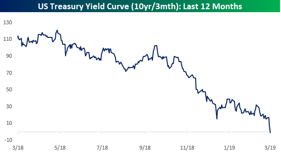
Stocks have basically held the line this week despite huge moves in interest rates and an ongoing rough run for global economic data. Curve inversion has many forecasting a recession, and we’ve seen a number of recent data releases that make us much more nervous about that outcome than we have been in almost a decade. On the other hand, the pivot to dovishness from global central banks, the relatively modest size and scale of yield curve inversion, some nascent signs of bottoming in global growth, and the nature of the plunge in interest rates are all reasons to not panic. Besides, despite all of the negativity US stocks have held up admirably well, and markets that trend higher on bad news are generally regarded as strong, rather than weak. In short, the outlook could be Good, Bad, or Ugly…depending how you read the tea leaves!
In addition to markets, we take a look at central bank policy, the recession outlook in the US, and weak economic data around the world this week. We cover everything you need to know as an investor in this week’s Bespoke Report newsletter. To read the Bespoke Report and access everything else Bespoke’s research platform has to offer, start a two-week free trial to one of our three membership levels. You won’t be disappointed!

The Closer: End of Week Charts — 3/29/19
Looking for deeper insight on global markets and economics? In tonight’s Closer sent to Bespoke clients, we recap weekly price action in major asset classes, update economic surprise index data for major economies, chart the weekly Commitment of Traders report from the CFTC, and provide our normal nightly update on ETF performance, volume and price movers, and the Bespoke Market Timing Model. We also take a look at the trend in various developed market FX markets.

The Closer is one of our most popular reports, and you can sign up for a free trial below to see it!
See tonight’s Closer by starting a two-week free trial to Bespoke Institutional now!
A Strange Trip With Some Strange Leaders
With sentiment where it was at the end of last year following the Q4 rout in equities, it’s safe to say that not a lot of investors were expecting double-digit gains in the first quarter. That’s exactly what we have seen in US equities, though, as the major averages are all up over 10% YTD heading into the final hours of the quarter. While the Dow has lagged many of its peer indices this year, it too is still on pace to finish Q1 with a gain of just over 10%.
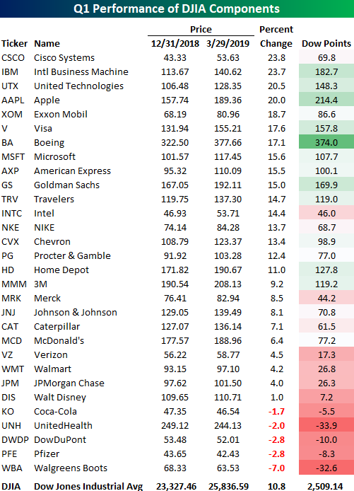
In the table below, we show how each of the 30 components in the DJIA have performed on a YTD basis as well as how much they have contributed to the index’s total gains. Remember, the DJIA is a price-weighted index, so the sole determinant of a stock’s weight in the index is its price. Looking at the table, you’re likely not the only one doing a double-take at the two stocks that top the list of best performers in the index so far this year. That’s right, Cisco (CSCO) and IBM have been the index’s two top performers in 2019 with gains of nearly 24%. Behind these two stocks, United Technologies (UTX) and Apple (AAPL) are the only two other stocks that are up 20% or more. To the downside, just five stocks in the DJIA are in the red on a YTD basis. Leading the way lower, Walgreens Boots (WBA), the newest stock in the index, has declined over 7%, but none of the four other stocks are down more than 3%.
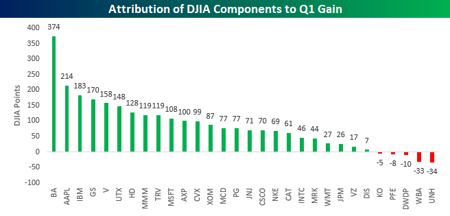
Because the DJIA is price-weighted, the best-performing stocks in the index haven’t been the biggest contributors to the YTD gains. The chart below shows how many points each stock in the index has contributed to the YTD gains. Looking at things this way, you may be surprised to see that Boeing (BA) still tops the list. With its 17% YTD gain and very high share price, BA has contributed 374 points to the DJIA’s upside this year, beating out the next closest component (AAPL) by 160 points! All else being equal, BA could fall another 23 points (6.0%) and it would still be the largest contributor to the DJIA’s YTD gains.
Eyes on Jobless Claims Indices
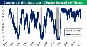
As we discussed in last night’s Closer and a blog post yesterday, weekly initial jobless claims moved back to 211K, the lowest in over two months and a pretty healthy print. While initial claims have been fairly volatile and more recent prints have been reassuring that recent highs are not a new trend, continuing claims have more steadily been working their way higher.
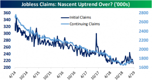
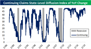
We made a diffusion index of the 50 states using this data to get a better idea of the health of these labor market indicators. In these indices, higher readings indicate more state-level claims falling, while lower numbers indicate more state-level increases. The index for continuing claims continues to appear fairly healthy. The index number has fallen, meaning an increasing number of states have been seeing increases in jobless claims, but this is far outweighed by states still seeing declines.
The diffusion index for initial claims, like the headline numbers, are telling a different story. On January 19th, the index had fallen as low as 15 which was the weakest reading since 2012. More recently, though, the number has been stronger, coming in at 28 this week; down from 30 last week.
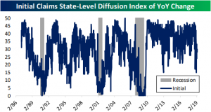
Averaging the two, the current reading is 36. Overall that is neither a strong or weak number, but it is still in stronger shape than the past several years lows in 2016. All in all, while claims have improved in the past few weeks and are not flashing recessionary signs, they should continue to be watched for signs of further deterioration.
Shanghai Rips Into Quarter End
Equities around the world have been looking to close out the quarter on a positive note, and China was no exception. With trade US and Chinese trade negotiators reportedly making progress in the always on the horizon trade deal, the Shanghai Composite ripped 3.2% higher in the last trading day of the quarter and nearly erasing all of the week’s prior losses. For the entire quarter, the index finished up just a hair shy of 24%, putting it at the top of the list in terms of major international stock market returns. While Chinese stocks finished the quarter strong, it is important to point out that during this consolidation phase the index has been in for the last several weeks, it has made a couple of lower highs. Ideally, we would like to see some follow-through next week from this Friday’s rally to break that string.

One factor working in favor of Chinese equities is solid breadth. The chart below compares the performance of the Shanghai Composite to its cumulative A/D line over the last twelve months. Ever since late last year, breadth has been leading price to the upside. It started with a positive divergence in late 2018 when prices made a new low (red line) but breadth (blue line) hung in there and has continued right up through the middle of the month when the cumulative A/D line made a new high. As long as that trend continues to play out, Chinese stocks should continue their leadership.

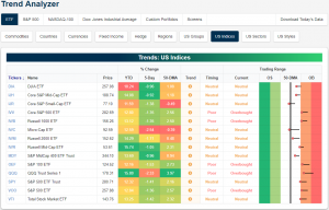
Trend Analyzer – 3/29/19 – Mixed End
We are capping off the quarter with a somewhat mixed picture as seen through our Trend Analyzer tool. There are currently five overbought ETFs while the remaining nine are neutral. Every ETF has seen a bit of mean reversion in the past week as seen through the long tails in the trading range section. Whereas many were firmly or—in the case of the Nasdaq (QQQ)—extremely overbought not long ago, about half are now teetering between overbought and neutral. Others are more firmly neutral with the Core S&P Small Cap (IJR) and Micro Cap (IWC) actually both moving below their respective 50-DMAs. Additionally, not a single ETF has managed to work its way into the green this past week as almost every index ETF has declined 1% or more as the hit from last Friday still lingers. Headed into today’s trading, the Micro-Cap (IWC) has seen the worst of the selling with a decline of 2.54% over the past five days. Coming off of the strongest overbought levels of the major indices, the Nasdaq (QQQ) has similarly been hit hard falling 2.33% in the past week. Meanwhile, Mid-Caps have actually held up relatively well. The Core S&P Mid Cap (IJH) and S&P MidCap 400 (MDY) are both down less than 1%, while their peer, the Russell Mid Cap (IWR), has only shed 1.05%.
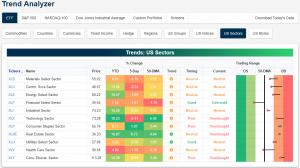
Turning to individual sectors, only Real Estate (XLRE) and Consumer Staples (XLP) are up in the past week with gains of 0.72% and 1.07%, respectively. They have also become the most overbought sectors. Consumer Discretionary (XLY) is also still pretty elevated but has pulled back slightly this week. Meanwhile, Health Care (XLV) has taken quite the hit falling from overbought territory to below its 50-DMA. Similarly, after falling below the 50-DMA, Financials (XLF) have gotten pretty oversold, although it has rebounded in the last couple of days.
Morning Lineup – In Like a Bear, Out Like a Bull
We’ve just published today’s Morning Lineup featuring all the news and market indicators you need to know ahead of the trading day. To view the full Morning Lineup, start a two-week free trial to Bespoke Premium.
It’s the last day of the quarter and investors around the world are looking to end it on a bullish note. With the S&P 500 on pace for its best first quarter of the year since 1998, it may be hard to remember that the year didn’t start out on nearly that optimistic of a note. In fact, after a big decline of over 2% on the second trading day of 2019 (thanks to an Apple warning), the S&P 500 was off to its worst start of a year since 2000 and just the fifth year in its history that it was down more than 2% two trading days into the year. For all the strength in equities this quarter, though, they haven’t held a candle to crude oil which is up over 30% this year for its best quarter since Q2 2009!
Please click the link below to read today’s Bespoke Morning Lineup.
We highlighted the massive relative performance gap between the Technology sector and the Transports in last week’s Bespoke Report, and if you are a fan of Dow Theory, the underperformance of the Transports has been a source for concern. This week, the Transports put a small dent, or better yet, scratch into that streak of underperformance.
The chart below shows the relative strength of the Technology sector and the Transports relative to the S&P 500 (rising lines indicate outperformance versus the S&P 500). Beginning in late January, the two really started to diverge from each other, but this week have started to close what has been, and still is, an enormous gap between the two.

Start a two-week free trial to Bespoke Premium to see today’s full Morning Lineup report. You’ll receive it in your inbox each morning an hour before the open to get your trading day started.

The Closer — Credit Still Trending Wider, Five Fed, Claims Diffusion — 3/28/19
Log-in here if you’re a member with access to the Closer.
Looking for deeper insight on markets? In tonight’s Closer sent to Bespoke Institutional clients, we begin with a look at the multi-year trend of widening credit spreads while dollar and rate volatility has fallen; mirroring that of stocks and WTI. We also observe the lackluster performance of green energy stocks before giving the full picture of our Five Fed Manufacturing Composite with the addition of today’s Kansas City Fed’s data. To finish, expanding on an earlier blog post, we created a diffusion index of state-level jobless claims. The index shows a bit of a contrast between Initial and Continuing Jobless Claims.

See today’s post-market Closer and everything else Bespoke publishes by starting a 14-day free trial to Bespoke Institutional today!
Bespoke’s Sector Snapshot — 3/28/19
We’ve just released our weekly Sector Snapshot report (see a sample here) for Bespoke Premium and Bespoke Institutional members. Please log-in here to view the report if you’re already a member. If you’re not yet a subscriber and would like to see the report, please start a two-week free trial to Bespoke Premium now.
In this week’s Sector Snapshot, we discuss mean reversion to close the quarter for the S&P 500, and we look at weakening relative strength for Health Care and Financials. Please click the thumbnail image below to read this week’s report.
To gain access to the report, please start a two-week free trial to our Bespoke Premium package now. Here’s a breakdown of the products you’ll receive.
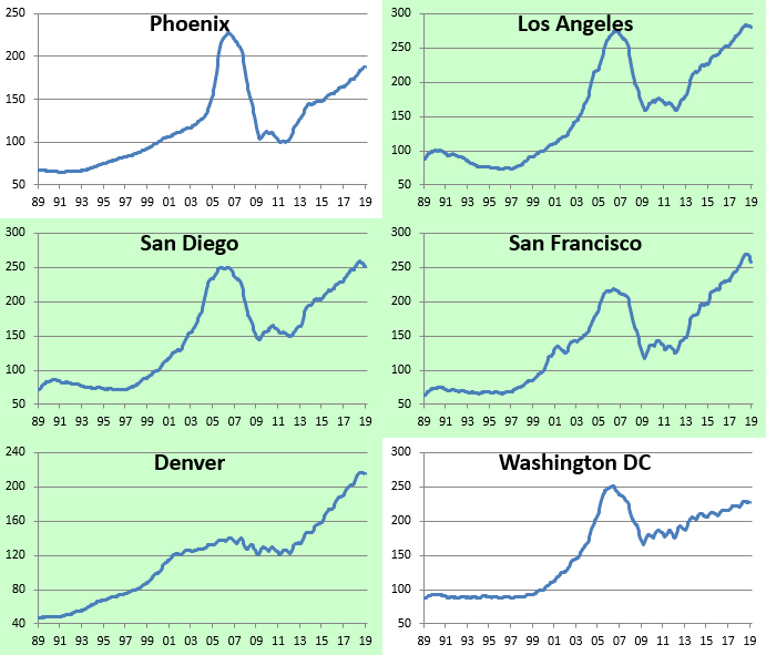
City-by-City Home Price Trends Around the Country
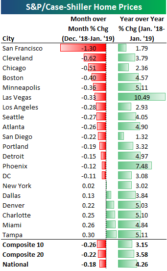
City-by-city home price data was released for January by S&P/Case Shiller earlier this week. Below we provide our regularly updated charts and tables covering the release.
The 10-city and 20-city composite indices that cover home prices across the country showed month-over-month declines to the tune of 20-25 basis points. San Francisco was by far the biggest standout with a month-over-month decline of 1.3%. The next closest city was Cleveland at less than half that with a decline of 0.62%. Other cities that saw decent-sized month-over-month drops in home prices include Chicago, Boston, Minneapolis, and Las Vegas.
Six cities saw increases in home prices from December 2018 to January 2019. Two Florida cities were up the most as the no-income-tax state continues to benefit from the sharp drop in state and local income tax (SALT) deductions that took place with Trump’s tax reform package. Miami was up 0.26% month-over-month while Tampa was up 0.30%.
Every city has still seen home prices increase on a year-over-year basis, but the rate of change is shrinking.
Below we show where home prices currently stand compared to each city’s peak price level at the highs during the mid-2000s housing bubble. The National index is now 11% above its prior highs. Denver and Dallas are by far the most above their prior highs at ~50%. Las Vegas, Phoenix, and Chicago are the furthest below their prior highs. Las Vegas prices are still 19% below levels seen at the peak of the mid-2000s bubble.
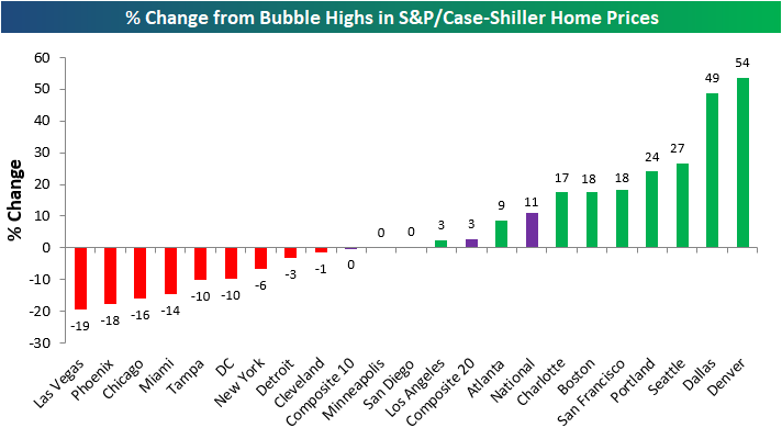
The next chart shows how much prices are up compared to their low points after the housing bubble burst. Most cities saw home prices bottom in 2011-2012. As shown, San Francisco has seen the biggest bounce off of its lows at +119%. And while Las Vegas is still 19% below its prior highs, prices have more than doubled off of their lows!
At the national level, home prices are up roughly 55% off of their lows, while New York and Cleveland have seen the smallest bounces. New York home prices have rebounded just 28%.

Below we show home price levels for each city tracked by S&P/Case Shiller. Cities shaded in green have managed to eclipse their prior housing bubble highs, while those that aren’t shaded still have a ways to go. You’ll notice in the charts that prices in a lot of cities have pulled back a bit recently, but so far it doesn’t look like we’ve reached a tipping point. For now, the drops can still be categorized as regular ebb and flow inside of an expansion.