Drudge Headline Indicator Highs and Lows
The Drudge Report, with its 30,000,000 page views per day, is one of the most widely followed news sources on the web. News junkies visit the site on a regular basis to get their daily link fix, while those in the media world — from the major networks and newspapers to independent journalists — check it multiple times a day. While political stories receive the majority of the site’s links, it’s whatever the site’s founder Matt Drudge believes to be the most important topic of the day that gets the main headline at the top of the page.
The Drudge Report is not a financial news site, so whenever a financial news story grabs the Drudge headline, it means that the story has crossed over from just a financial news story to the mainstream. And when a financial news story crosses over into the mainstream media, it means that those that don’t follow the market on a regular basis are suddenly following the market. This usually occurs when the market (or economy, etc.) is going down and not up.
Because of its reach to the masses, we view financial headlines on Drudge as a contrarian indicator. When financial stories dominate the front-page headlines on a regular basis, we’re probably getting close to an inflection point for the The Drudge Report, with its 30,000,000 page views per day, is one of the most widely followed news sources on the web. News junkies visit the site on a regular basis to get their daily link fix, while those in the media world — from the major networks and newspapers to independent journalists — check it multiple times a day. While political stories receive the majority of the site’s links, it’s whatever the site’s founder Matt Drudge believes to be the most important topic of the day that gets the main headline at the top of the page.
The Drudge Report is not a financial news site, so whenever a financial news story grabs the Drudge headline, it means that the story has crossed over from just a financial news story to the mainstream. And when a financial news story crosses over into the mainstream media, it means that those that don’t follow the market on a regular basis are suddenly following the market. This usually occurs when the market (or economy, etc.) is going down and not up.
Because of its reach to the masses, we view financial headlines on Drudge as a contrarian indicator. When financial stories dominate the front-page headlines on a regular basis, we’re probably getting close to an inflection point for the market, whether it’s a bottom or a top. When a large number of negative financial headlines are showing up on Drudge on a regular basis, it suggests that excess negativity is probably priced into the market. Conversely, if a large number of financial headlines are showing up when the market is soaring, it suggests that good news is probably priced in.
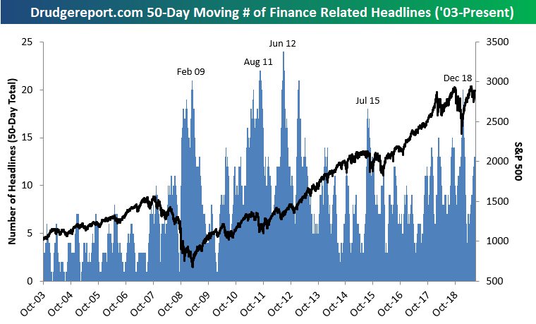
In order to quantify this sentiment, we tracked every Drudge headline at 9 AM, noon and 4 PM on daily basis going back to 2003 and tallied the number of stories that were finance related using the Drudge Report’s massive archives service. We essentially wanted to see how often a financial news story was a front-page headline and not just confined to the Money section. (We counted any story that involved the economy or any asset class as a finance related headline.)
Below is a chart showing the number of days in which there was a finance related headline on Drudge over a rolling 50-day period since mid-2003. At our starting point, the market was in the early stages of the 2002-2007 bull market. Unsurprisingly, the number of finance related headlines hit its first peak right around the time that the market made its financial crisis lows in early 2009. The max reading of 21 days out of 50 with financial related headlines on Drudge came on February 27th, 2009, which was just 10 days before the S&P 500’s bear market low on March 9th. The number of financial headlines on Drudge then cratered all the way down to zero as the market and the economy recovered from the bear market, but then it started to pick up steadily once again in early 2010 as the crisis moved from our shores over to Europe.
During 2011’s version of the Euro Crisis and the US debt downgrade, the Drudge Headline Indicator maxed out at a new record high of 22 in mid-August, breaking the high seen during the depths of the US financial crisis. It made a new high again in June 2012 and then went through a multi-year lull as the S&P 500 surged in 2013 and 2014. We didn’t see a spike again until mid-2015 during the Greek debt crisis and the peak of the Chinese equity bubble that burst in the second half of 2015.
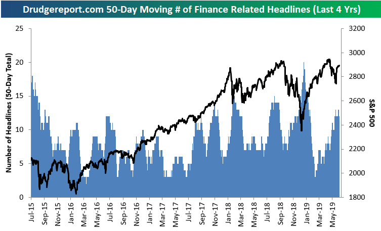
Following the mid-2015 spike, financial headlines on Drudge didn’t reach 20 over any 50-day period until this past December when the S&P 500 experienced a 19% correction (just barely missing the 20% decline threshold that would have marked a new bear market). As you can see in the charts, the recent peak for our Drudge reading occurred basically to the day that the correction low was made for the S&P 500 at the end of 2018. Since that market low, financial headlines on Drudge have been much more muted as the stock market has posted double-digit percentage gains through mid-year 2019 where we currently sit. At this point in time, our Drudge reading is neither excessively bearish or bullish, but it’s something we always like to keep a close eye on.
One final observation is that Drudge financial headlines were few and far between prior to the Financial Crisis in 2008 and 2009, but they have shown up much more frequently over the past ten years. The fact that we now see a much higher amount of financial headlines on what is mostly a political website represents a key shift in society, in our opinion, stemming from the collapse we saw in 2008. Everyday citizens now pay more attention to the economy and the markets than they did before, and sentiment on the topic is usually more negative than positive.
The Bespoke Report — An Easy Fed Gets the Bulls Out of Bed
This week’s Bespoke Report newsletter is now available for members. In this week’s report, we cover the Fed’s dovish tilt that was met with new all-time highs for the stock market.
We cover everything you need to know as an investor in our weekly newsletter. To read the Bespoke Report and access everything else Bespoke’s research platform has to offer, start a two-week free trial to one of our three membership levels. You won’t be disappointed!

The Closer: End of Week Charts — 6/21/19
Looking for deeper insight on global markets and economics? In tonight’s Closer sent to Bespoke clients, we recap weekly price action in major asset classes, update economic surprise index data for major economies, chart the weekly Commitment of Traders report from the CFTC, and provide our normal nightly update on ETF performance, volume and price movers, and the Bespoke Market Timing Model. We also take a look at the trend in various developed market FX markets.

The Closer is one of our most popular reports, and you can sign up for a free trial below to see it!
See tonight’s Closer by starting a two-week free trial to Bespoke Institutional now!
Broad Strength in Health Care Sector
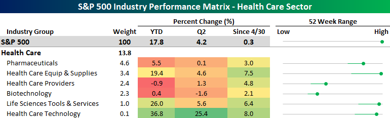
In an earlier post, we highlighted the fact that some of the ten best performing S&P 500 Industries between the S&P 500’s highs on 4/30 and 6/20 were from the Health Care sector. It hasn’t just been these four industries that have been strong in the Health Care sector either. The performance snapshot of the sector below shows just how strong the sector has been lately. While all six of the industries within the sector aren’t up YTD or so far in Q2, between the S&P 500’s highs on 4/30 and 6/20, Health Care is the only sector where every industry within the sector has posted positive returns. Not even the industries within the Utilities sector have been this uniformly positive. The best performer of the bunch has been Health Care Technology, which is up 8% since the end of April and has extended its YTD gain to 36.8%. The worst performing industry in the sector has been Biotech which is up 2.1% since 4/30, and while that may not sound like much, it’s still better than more than half of the other industries in the index. Start a two-week free trial to Bespoke Institutional to access our interactive tools and much more.
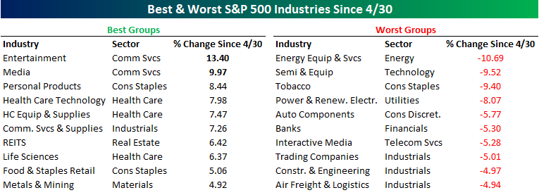
Best and Worst Groups Between Highs
While the S&P 500 made a new high for the first time in 35 trading days yesterday, many of the characteristics of the groups driving the rally have shifted. To highlight this, in the table below we summarize the ten best and worst performing S&P 500 Industries from the close on 4/30 through yesterday. During that 35 trading day stretch, 34 Industries saw positive returns while another 27 declined.
Industries that have seen the biggest gains between the two new highs are primarily defensive in nature as all but three come from sectors that are typically considered defensive (Consumer Staples, Health Care, and Real Estate). Health Care has been the real star of the show, though. Of the sector’s six different industries, four of them made the top ten!
On the downside, cyclical industries have dominated the weak side. When industries like Semis, Autos, Construction & Engineering, and Air Freight are lagging the market, it really illustrates the presence of economic concerns. Leading the way lower, Energy Equipment and Services declined over 10%, followed by Semiconductors which were down just under 10% after failing at resistance on Thursday for the third time in a month. These two industries are followed by two industries (Tobacco and Power and Renewable Energy) that come from sectors that are traditionally considered defensive, but they have their own specific issues to deal with. Start a two-week free trial to Bespoke Institutional to access our interactive tools and much more.
Trend Analyzer – 6/20/19 – Only Defensives Are Also At Highs
The major index ETFs began the day yesterday split down the middle with half overbought and the other half still neutral. A large gap higher at the open led to a few more also entering overbought territory; namely the large-cap S&P 100 (OEF) and Nasdaq (QQQ). Of this group, QQQ has surged the most over the past week and is now sitting almost 3% higher. While the gap higher did make conditions generally more overbought across the board, some intraday selling prevented things from reaching any sort of extreme level. With the Core S&P Small-Cap’s (IJR) gains in yesterday’s session, only the Micro-Cap ETF (IWC) still remains below the 50-DMA.
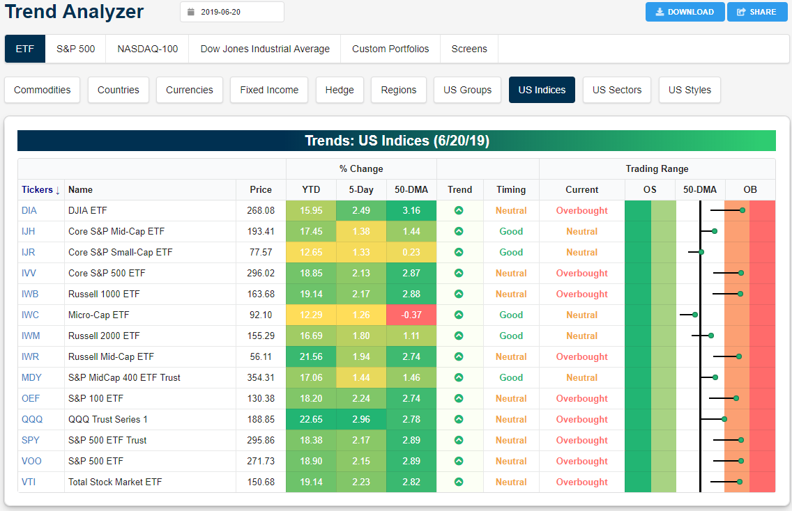
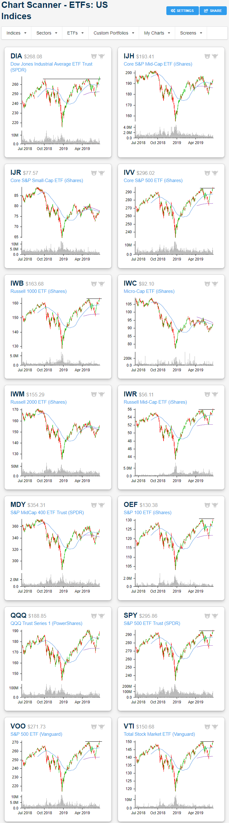
Panning over the charts of these same ETFs, the breakout to new highs is evident only for large caps. The Dow (DIA), Russell 1000 (IWB), and S&P 500 (SPY) clearly finished at new highs. The only non-large cap index ETF to also reach a new high is the Russell Mid Cap (IWR). Other small caps and mid caps all have a long way to go to reach last year’s highs though they have been progressing upwards in recent weeks.
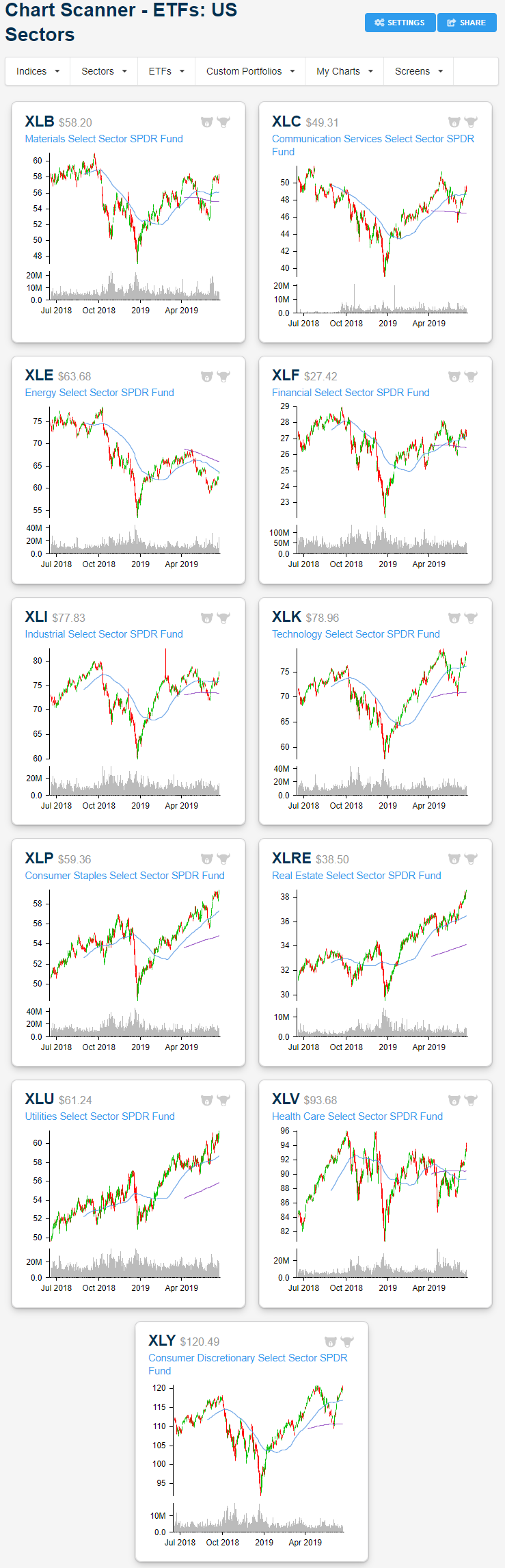
With the market reaching new highs, one would expect that most of the movement has been a result of cyclical high growth sectors, but that simply has not been the case. Defensives have continued to perform well with Consumer Staples (XLP), Utilities (XLU), Health Care (XLV), and Real Estate (XLRE) all sitting firmly at extremely overbought levels on solid gains (though XLP has lagged a bit this week). But now cyclical sectors have also begun to see a string of buying in the past week. Sectors like Communication Services (XLC), Industrials (XLI), and Tech (XLK) have all risen well over 2.5% and are slightly outperforming this week. While the performance of these sectors has been strong, Energy (XLE) has actually seen the largest gains over the past five days as it works off oversold readings from last week. This is also the only sector that is not in an uptrend. With yesterday’s substantial gains, it heads into trading today just barely below the 50-DMA.

The charts of the defensives are a bit better of a look into just how much they have outperformed in recent weeks. For most of the year, these have sat in solid, and relatively uninterrupted, uptrends. Whereas other sectors still sit a decent distance off of their 52-week highs, XLU, XLP, and XLRE all finished yesterday at another new high. Given that these sectors have become overextended, it is increasingly likely that they could see some sort of pullback. Additionally, while defensives have sat in uptrends (with their moving averages reflecting this), other sectors’, like Materials (XLB), Communication Services (XLC), and Industrials (XLI), moving averages have become very flat recently. XLE, despite strong performance this week, actually still has downward sloping moving averages.
Morning Lineup – On Again, Off Again
After authorizing a strike on Iran last night, President Trump reportedly abruptly called it off, putting the US’s response to the shooting down of a drone over international waters into question again. US futures, understandably, are trading modestly lower on the uncertainty as the on again off again series of breakouts to new highs pauses again. Since January of last year, the S&P 500 has now made four separate runs to new highs, but in the grand scheme of things has little to show for it, although so far in 2019, the first half is shaping up to be a very good one.
Ahead of the weekend today, there are no earnings reports to speak of, but we will get PMI data from Markit for June, and US Existing Home Sales at 10 AM
Please read today’s Morning Lineup for a discussion of the latest events surrounding Iran, the latest Flash PMIs from Europe and Asia, as well as some strong data on the French Labor market.
Bespoke Morning Lineup – 6/21/19

The ongoing tensions in Iran have provided a much-needed boost to oil prices. Through this morning, WTI crude has rallied 9.54% on the week. If this pace holds through the close, it will be the best week for ‘black gold’ since December 2016.

Start a two-week free trial to Bespoke Premium to see today’s full Morning Lineup report. You’ll receive it in your inbox each morning an hour before the open to get your trading day started.
The Closer – Dollar Down, Confidence Up, Current Account Sideways – 6/20/19
Log-in here if you’re a member with access to the Closer.
Looking for deeper insight on markets? In tonight’s Closer sent to Bespoke Institutional clients, as the dollar suffers its worst two-day span in over a year, we take a look at what crosses are leading this decline and taking a deeper look into CAD. Next, we review today’s Consumer Comfort index which came it at the second highest level of the current cycle. We make note of some of the interesting dynamics concerning political factors and homeownership. We then show how the leading versus coincident indicator ratio is not flashing any sort of alarming warning signs, and finish with an update on the US current account balance.

See today’s post-market Closer and everything else Bespoke publishes by starting a 14-day free trial to Bespoke Institutional today!
Bespoke’s Sector Snapshot — 6/20/19
Worst Stocks in June Taking a Turn
Headed into the final hour of trading, with oil surging over 5.7% on the back of tensions escalating with Iran, energy stocks have been the top performers today. Capital Goods and the Software and Services industries are also experiencing strong rallies today. A strong earnings report from Oracle (ORCL) has been the major catalyst for Software and Services. The only industry groups to have moved lower are Consumer Services, Telecom, and Banks. Another factor in some stocks’ gains today has also been recent weakness so far this month.
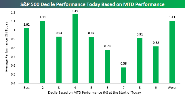
In the chart below, we break up the S&P 500 into deciles (groups of 50) based on month-to-date performance headed into today’s trading. As shown, the 10th decile made up of the weakest stocks in June through yesterday’s close (the only decile with MTD decliners) has been one of the best-performing groups. The average stock in this decile is up 1.11% today. That is the joint second best performance across these deciles shared with the second-best performers on a MTD basis. Additionally, the best-performing stocks in June have continued to rally over 1% on average today. But neither the best nor worst MTD stocks are the leading decile, that actually belongs to the fourth decile with an average gain of 1.19%. Some names in this decile include ULTA (ULTA), Phillips 66 (PSX), and BlackRock (BLK).
The best-performing stock in June has been Under Armor (UAA) with an MTD gain through yesterday’s close of 18.82%. It is down around 1.17% today. Whirlpool (WHR), which has seen similar performance MTD, is holding up a tiny bit better, but is still in the red today, down 0.3%. On the other end of MTD performance, GAP (GPS) has gotten crushed in June falling over 12.5%. The losses have kept coming today as it has fallen just under half of a percent more. But the second-worst performer this month, Noble Energy (NBL), has been lifted by strength in energy and has rallied 6% today; nearly erasing all of its June losses. Start a two-week free trial to Bespoke Institutional to access our interactive tools and much more.