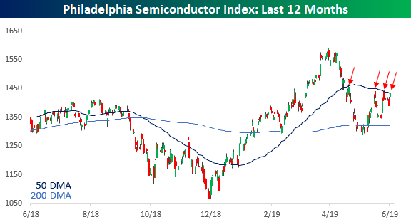
SOX Catching a Case of the “Quitters”
Whenever old socks start to lose some of their elasticity and won’t stay up anymore, they’re called quitters, and looking at a recent chart of the Philadelphia Semiconductors Index, otherwise known as the SOX, it too seems to have come down with a case of the quitters. Ever since initially falling below its 50-day moving average back on May 13th, bulls have made multiple attempts to pull up the SOX, but each time gravity has taken over. This morning’s rally in the semiconductor space, driven by Micron’s (MU) earnings report, marks the 4th attempt by the SOX to retake its 50-DMA in the last six weeks, but that early strength has given way to some modest profit-taking. There’s still a lot of time left in the trading day, though, and breadth for the semis is very strong today. Therefore, there’s still a chance that the group manages to rally back to its earlier highs, but a fourth unsuccessful attempt wouldn’t be very encouraging. Start a two-week free trial to one of our three membership levels to stay on top of all the economic trends and developments.
Bespoke’s Global Macro Dashboard — 6/26/19
Bespoke’s Global Macro Dashboard is a high-level summary of 22 major economies from around the world. For each country, we provide charts of local equity market prices, relative performance versus global equities, price to earnings ratios, dividend yields, economic growth, unemployment, retail sales and industrial production growth, inflation, money supply, spot FX performance versus the dollar, policy rate, and ten year local government bond yield interest rates. The report is intended as a tool for both reference and idea generation. It’s clients’ first stop for basic background info on how a given economy is performing, and what issues are driving the narrative for that economy. The dashboard helps you get up to speed on and keep track of the basics for the most important economies around the world, informing starting points for further research and risk management. It’s published weekly every Wednesday at the Bespoke Institutional membership level.
You can access our Global Macro Dashboard by starting a 14-day free trial to Bespoke Institutional now!

Morning Lineup – Trade Optimism Bubbles Up Again
US equities are attempting to get back on track this morning after three straight days of declines. Futures are currently indicated to erase about half of yesterday’s decline as sentiment regarding this weekend’s trade talks between the US and China was given a boost following some comments from Treasury Secretary Steve Mnuchin. Whether there is really anything to those comments remains to be seen.
Please read today’s Morning Lineup to get caught up on everything you need to know ahead of the new trading day including the latest news on trade, Asian markets, and confidence in Germany.
Bespoke Morning Lineup – 6/26/19

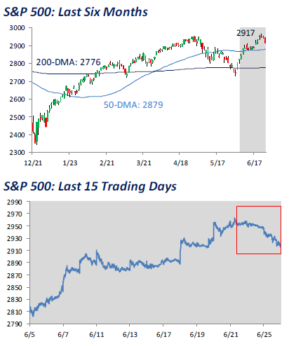
After hitting a new all-time high on Thursday, the S&P 500 comes into today having had three straight daily declines. Looking back over history this is not a very common occurrence. As we highlighted in The Closer last night, going back to 1928, there have only been 11 other periods where the S&P 500 closed at a 52-week high (after not having done so in the prior four weeks) only to follow it up with three straight days of declines.
Start a two-week free trial to Bespoke Premium to see today’s full Morning Lineup report. You’ll receive it in your inbox each morning an hour before the open to get your trading day started.
The Closer – Mean Reversion In Stocks, CBO Forecasts, New Homes Getting Cheap – 6/25/19
Log-in here if you’re a member with access to the Closer.
Looking for deeper insight on markets? In tonight’s Closer sent to Bespoke Institutional clients, given the decline over the past three sessions, we provide a decile analysis of the best-performing stocks in June and performance following similar declines. Next, we take an in-depth look at the CBO’s budget outlook including potential impacts of changes in rates. We finish with an update of today’s New Home Sales which showed significant weakness in the West, and that prices have gotten cheap.

See today’s post-market Closer and everything else Bespoke publishes by starting a 14-day free trial to Bespoke Institutional today!
Chart of the Day – Higher Highs vs Lower Highs
Bespoke Stock Scores — 6/25/19
That Was Bad
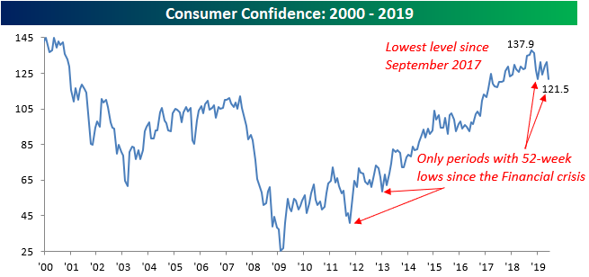
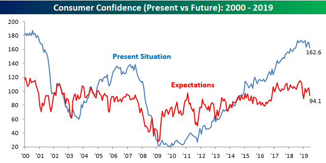
Consumer Confidence for the month of June missed expectations by a mile this morning as the headline reading dropped from 131.3 down to 121.5. That 9.8 point decline is tied with last December for the largest m/m decline since August 2011. Not only was the decline notable, but the magnitude of the miss relative to expectations (121.5 vs 131.0) was the largest since June 2010. While headlines surrounding trade and Iran can understandably hurt sentiment, the fact that the stock market was bouncing off the June 3rd lows during this period and had no positive impact was notable. This month’s reading in the headline index of the Consumer Confidence report was also the lowest since September 2017 and only the fourth period since the Financial Crisis that the index dropped to a 52-week low.
In terms of the breakout between Present Situation and Expectations, both indices saw similar declines in June.
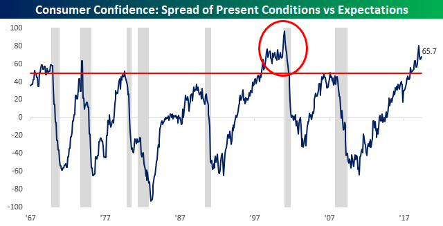
With both indices seeing similar declines, the spread between the two was little changed and remains extremely elevated and at levels that have typically been seen leading up to recessions.
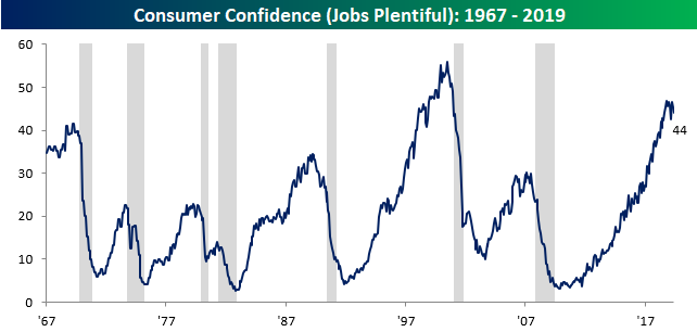
While the spread between Present Conditions and Expectations is worrisome, the percentage of consumers responding that jobs are plentiful didn’t see as large of a decline, falling from 45.3 down to a three-month low of 44.0.
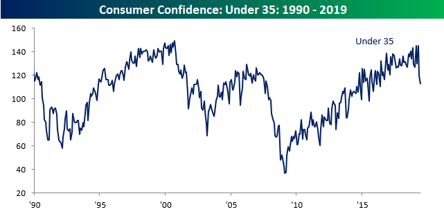
Finally, while there may not have been much of a decline in the percentage of consumers viewing jobs as being plentiful, young consumers have seen a sharp drop in confidence levels. While we saw across the board declines in confidence by age group, consumers under the age of 35 have seen the sharpest declines falling to the lowest levels since May 2016. Start a two-week free trial to one of our three membership levels to stay on top of all the economic trends and developments.
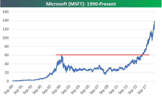
The Comeback Stock of the Decade: Microsoft (MSFT)
After winning the 90s by having its Windows operating system on the large majority of PCs, Microsoft (MSFT) experienced a lost decade in the 2000s. From its peak in December 1999 to its trough in March 2009, Microsoft (MSFT) fell 75%! Throughout the 2000s, “Mr. Softy” as it was called was considered “dead money,” and it was all but forgotten by momentum and growth investors.
If there was an award given out for “Comeback Stock of the Decade,” there’s no doubt that MSFT would be an odds on favorite for the 2010s. After missing out on search and social media, MSFT hit a homerun with its transition from a traditional software company to a “software as a service” (SaaS) cloud company.
The long-term price chart for MSFT is something to behold. While the stock experienced bigger gains in percentage terms during its run in the 1990s, its sheer price move this decade totally dwarfs the 90s move at this point. The point at which MSFT really took off was after it finally broke above its 1999 highs back in late 2016. This is one of the best examples you’ll find of a breakout from a long-term base.
Since its Financial Crisis low in 2009, MSFT’s price has moved up 809%. Since breaking out above its 1999 highs in late 2016, the stock has more than doubled with a gain of 131%, making it the largest company in the world once again with a market cap of $1.06 trillion!
Unfortunately for those that missed out on MSFT’s epic comeback decade (which is most investors), the chart below is certainly not one you would want to go out and buy right now! You certainly can’t make the argument that you’d be “buying low.” Start a two-week free trial to one of our three membership levels for access to our premium research.
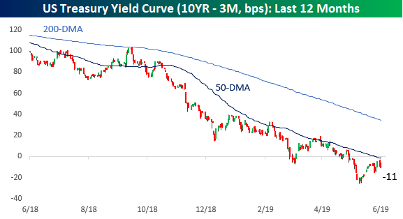
Yield Curve Rejected at the 50-DMA…Again
After moving down as low as -25 basis points (bps) earlier this month, the yield curve (the spread between the yield on the 10-year and 3-month US Treasuries) looked like it was going to move back into positive territory closing out last week. That was until the 50-day moving average came into play. On Friday, the yield curve finished the week inverted by less than 5 bps, but today it’s back inverted to the tune of 11 bps. Looking at the chart below, the latest experience with the 50-DMA looks to be just one in a series of times in the last year where the yield curve has stalled out at or near the 50-DMA. What will it be that breaks this trend? A larger than expected rate cut from the FOMC or a sharp increase in rates at the long end of the curve? Start a two-week free trial to Bespoke Institutional to access our interactive tools and much more.
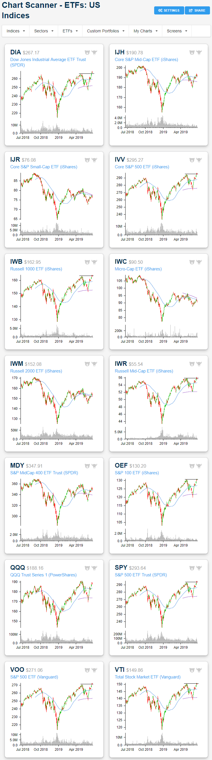
Trend Analyzer – 6/25/19 – Small Caps and the Moving Average
The fourteen ETFs tracking the major US indices in our Trend Analyzer tool are still split down the middle with half overbought and the other half neutral. While large-cap ETFs are overbought after sitting at neutral last week, conditions are less overbought and closer to the 50-DMA with declines over the past two sessions. Weekly performance is still solid though with most of these ETFs up just under 2%. The Nasdaq (QQQ) and Dow (DIA) have actually outperformed with even larger gains of 2.41% and 2.34%, respectively. With this, DIA has become the most extended above the 50-DMA. Small caps, meanwhile, have continued to lag behind. The Micro-Cap ETF (IWC) and Russell 2000 (IWM) are both down over the past week. In fact, IWC is just barely sitting above oversold levels. While not in the red, mid-caps like the Core S&P Mid-Cap ETF (IJH) and S&P Mid-Cap 400 (MDY) have also been fairly week relative to other market caps.
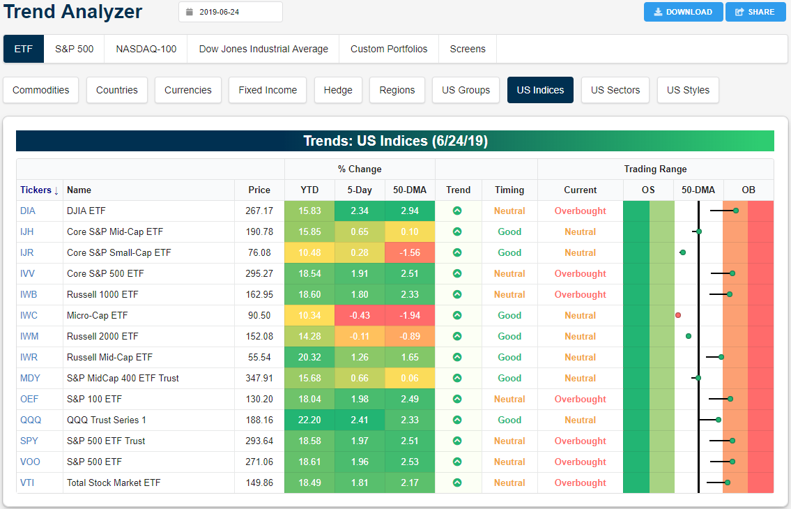
Looking at the charts of these same ETFs, with declines in the past couple of sessions bringing the ETFs off of new highs, former resistance at previous highs has not necessarily held as support for indices like the S&P 500 (SPY). Only the Dow (DIA) is still sitting noticeably above these prior highs. Doubling back on smaller-cap ETFs’ recent weakness, others like the Russell 1000 (IWB) and Russell Mid Cap (IWR) have more clearly broken below these levels. Additionally, for these ETFs, the failure to take out both the 200 and 50-day moving averages is pretty clear. Each sits below these averages, despite some like the Core S&P Mid-Cap ETF (IJH) and Russell 2000 (IWM) managing to close above both the 200 and 50-day last week. Start a two-week free trial to Bespoke Institutional to access our interactive Trend Analyzer, Chart Scanner, and much more.