Bespoke’s Morning Lineup — Tweet-nical Analysis
See what’s driving market performance around the world in today’s Morning Lineup. Bespoke’s Morning Lineup is the best way to start your trading day. Read it now by starting a two-week free trial to Bespoke Premium. CLICK HERE to learn more and start your free trial.

The Bespoke Report — 8/23/19
This week’s Bespoke Report newsletter is now available for members.
In this week’s newsletter, we look at a big week for retail earnings, more market volatility, housing numbers, and much more. To read the Bespoke Report and access everything else Bespoke’s research platform has to offer, start a two-week free trial to one of our three membership levels. You won’t be disappointed!

The Closer: End of Week Charts — 8/23/19
Looking for deeper insight on global markets and economics? In tonight’s Closer sent to Bespoke clients, we recap weekly price action in major asset classes, update economic surprise index data for major economies, chart the weekly Commitment of Traders report from the CFTC, and provide our normal nightly update on ETF performance, volume and price movers, and the Bespoke Market Timing Model. We also take a look at the trend in various developed market FX markets.

The Closer is one of our most popular reports, and you can sign up for a free trial below to see it!
See tonight’s Closer by starting a two-week free trial to Bespoke Institutional now!
Crude Oil’s Descending Triangle
Earlier this week, crude oil was trading well over 2% higher than last Friday’s close. Over the past few sessions, though, oil has given up all of those gains. The catalyst for today’s declines are the Chinese retaliatory tariffs on US crude which are expected to dampen demand. This week’s negative reversal comes as the commodity ran into multiple points of resistance. For starters, the rally began to stall out mid-week when it met the converging 200 and 50-day moving averages. This also coincided with a downtrend that traces itself all the way back to the highs from late last year. In fact, crude is down around 30% from these previous highs.
Overall, the technical picture for crude oil is not in a great place as the chart is forming a descending triangle pattern. Despite the big gains at the beginning of 2019, over the past few months, crude has been making consistent lower highs and lower lows. Given this most recent failure to retake the moving averages and break out of the downtrend, the next major support level to watch is around $50 which is a level that has held up at multiple times in the past few months. This support also draws back to late last year prior to the collapse in December. Start a two-week free trial to Bespoke Institutional to access our interactive Security Analysis tool and much more.

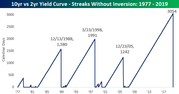
Yield Curves: Another Record Streak Bites the Dust
After the 3-month vs 10-year US Treasury yield curve first inverted earlier this year, the market has shifted its focus to the 2-year vs 10-year part of the curve which had yet to reach inverted levels. That was, until yesterday. While the 10s2s curve flirted with inverted territory for the last few days on an intraday basis, Thursday was the first time in more than a decade that the closing yield on the two-year US Treasury was above the yield on the 10-year. And with another closely watched part of the curve moving into inverted levels, recession fears increased.
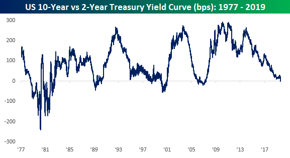
As the chart above illustrates, it has been a while since the 10s2s curve was inverted. In fact, the streak that just ended was the longest on record going back to 1977, and it wasn’t even close. Going back to 1977, there have only been three prior streaks where the 10s2s curve was inverted for more than 1,000 days, and never before had the curve been positively sloped for more than 2,000 days. The current streak, though? 3,054 days. It was fun while it lasted! Start a two-week free trial to Bespoke Institutional for full access to all of our research and interactive tools.
Trend Analyzer – 8/23/19 – Small Caps Surge
Headed into the end of the week, the overbought/oversold picture of the major index ETFs looks similar to yesterday. Each one remains below their 50-DMA as the majority are also in neutral territory. The only two outliers are the Micro-Cap ETF (IWC) and Russell 2000 (IWM). IWM managed to briefly push out of oversold territory earlier this week but yesterday’s declines brought it back below one standard deviation from its 50-DMA. Each of the small and mid-cap ETFs are similarly teetering between oversold and neutral despite having risen the most this week as a result of a bounce from more extreme oversold levels. Meanwhile, large caps are more firmly in neutral territory. The Nasdaq (QQQ) is closest to its 50-DMA, but yesterday once again failed to close above its 50-DMA.
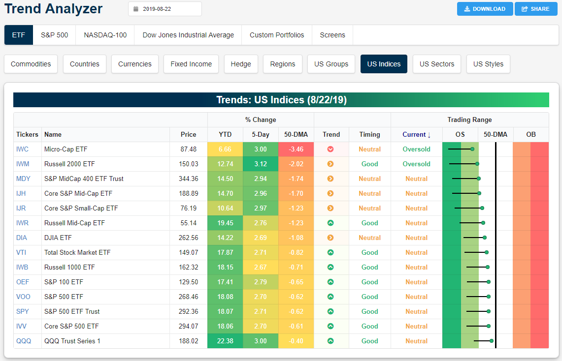
After their massive rip higher over the past few months, precious metals have begun to see some mean reversion after reaching extreme overbought levels last week. While still overbought, each one is now down roughly 1% or more over the past five days. Oil (USO), on the other hand, has seen a solid move upwards this week but has run up to resistance and is now looking to erase all of these gains and then some this morning. Start a two-week free trial to Bespoke Institutional to access our interactive Trend Analyzer and much more.

Bespoke’s Morning Lineup — Trade Headlines Make Another Appearance
See what’s driving market performance around the world in today’s Morning Lineup. Bespoke’s Morning Lineup is the best way to start your trading day. Read it now by starting a two-week free trial to Bespoke Premium. CLICK HERE to learn more and start your free trial.
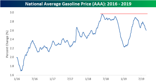
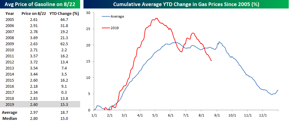
Get Ready For Lower Gas Prices
Gas prices have recently declined more than 10% based on the national average price from AAA. After hitting a 2019 peak of $2.90 in early May, we have now seen both a lower high and a lower low, taking prices back to levels last seen back in March. Purely from a chart perspective, the outlook for gas prices doesn’t look positive as the recent trend lower follows a failed rally off the 2018 lows that stalled out just below the high from earlier that year.
In addition to a weak technical picture for gas prices, seasonal factors are also pointing to lower prices through year-end. As shown in the chart below, when we compare prices so far in 2019 (red line) to a composite of the seasonal pattern going back to 2005 (blue line), this year is following the historical script relatively closely. Prices rallied through early May but then lost momentum heading into the summer driving season. Normally, prices peak around Memorial Day and basically move sideways with a downside bias during the summer. This year, though, the move higher to start the year was much stronger than average, while the summer drift lower had more momentum behind it as well. If the pattern continues to hold for the final four months of 2019, expect prices to keep falling. Going back to 2005, gas prices have experienced a median decline of 9.8% from 8/22 through year-end with positive returns just 35% of the time. That’s a move that would provide another boost to an already strong consumer. Start a two-week free trial to Bespoke Institutional to access our interactive Chart Scanner and much more.
The Closer – Retail Rally, Manufacturing Miss, Leading Indicator, TIPS and Rates – 8/22/19
Log-in here if you’re a member with access to the Closer.
Looking for deeper insight on markets? In tonight’s Closer sent to Bespoke Institutional clients, as retail stocks surge, we show just how rare the move for the industry is and what it could mean going forward. Next, we review some of the disappointing manufacturing data released today before turning to some more positive economic data shown in the Conference Board’s Leading Indicator. We finish with a recap of today’s strong 30-year TIPS reopening and what has been driving rates recently.

See today’s post-market Closer and everything else Bespoke publishes by starting a 14-day free trial to Bespoke Institutional today!
Adapt or Die
A common characteristic of most investors and traders is to always be on the lookout for patterns and connections between various asset classes. Whenever one correlated asset confirms the move in another it adds a layer of confidence to an investor’s thesis. One long-held example is the Dow Transports as a leading or coincident indicator for the broader market. For decades now, many investors have followed the transports for confirmation of the broader market moves. If the transports — which move all of the physical goods in the economy — rally, it suggests that the broader market will be strong, while periods when the transports start to roll over are read as a signal that there’s an underlying weakness in the economy.
As the US economy has become more service and digital-oriented in nature, there has been a valid argument made that the transports have lost some of their importance as an indicator of the broader economy. Along these lines, we have suggested that rather than transports, semiconductors may represent this century’s ‘transports’ as they are a part of just about everything in this digital age. Whether you agree with this or not isn’t important, but the important takeaway is that just because two asset classes have been highly correlated in the past doesn’t mean that they will remain that way in the future. It’s one thing to recognize a correlation between two asset classes, but it’s much more important to understand why they are correlated and be on the lookout for factors that may change the status quo in the future.
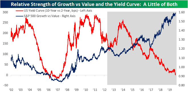
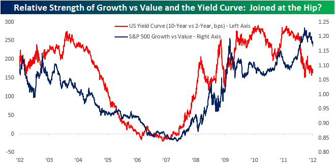
One example of a radical change in a relationship between two asset classes is the interaction between the relative strength of growth and value stocks versus the slope of the yield curve. From 2002 through 2011, the two were closely correlated. As the curve flattened in the early part of this century, growth stocks underperformed value by a wide margin (falling blue line). Then in mid-2007, as the curve steepened and came out from inverted territory, growth stocks started to rip higher relative to value. Beginning in 2009, though, the curve stopped steepening and the relative strength of growth relative to value stalled out. The two series were so closely joined at the hip during this ten-year stretch that the correlation coefficient between the two was +0.82, which is indicative of two series moving in lockstep with each other.
If the paths of the yield curve and the relative strength of growth versus value couldn’t be separated from 2002 through 2011, the relationship soured in 2012 when the two came down with a case of the ten-year itch. At that point, they couldn’t separate fast enough. The chart below shows the same two series from the start of 2012 through the present. Now, when one goes up the other goes down and vice versa, as the paths are nearly exact opposites. In fact, in the nearly eight years since 2012, the correlation between the two is -0.90.
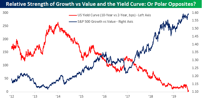
In the chart below we have shown the two series over the entire time period spanning 2002 through 2019. The non-shaded area represents the period covered in the first chart, while the shaded area covers the second period. Right around the time where the shaded period starts is when the positive correlation turned on a dime, and beginning in 2013 when the curve started to flatten, investors who were still hanging on to the idea that a flatter yield curve was a green light for value stocks, saw what turned out to be an extended period of misery relative to the performance of growth stocks. In the words of Intel Founder Andy Grove, “Adapt or Die.” Start a two-week free trial to Bespoke Institutional to access our interactive Chart Scanner and much more.