Trend Analyzer – 9/4/19 – Extended Defensives
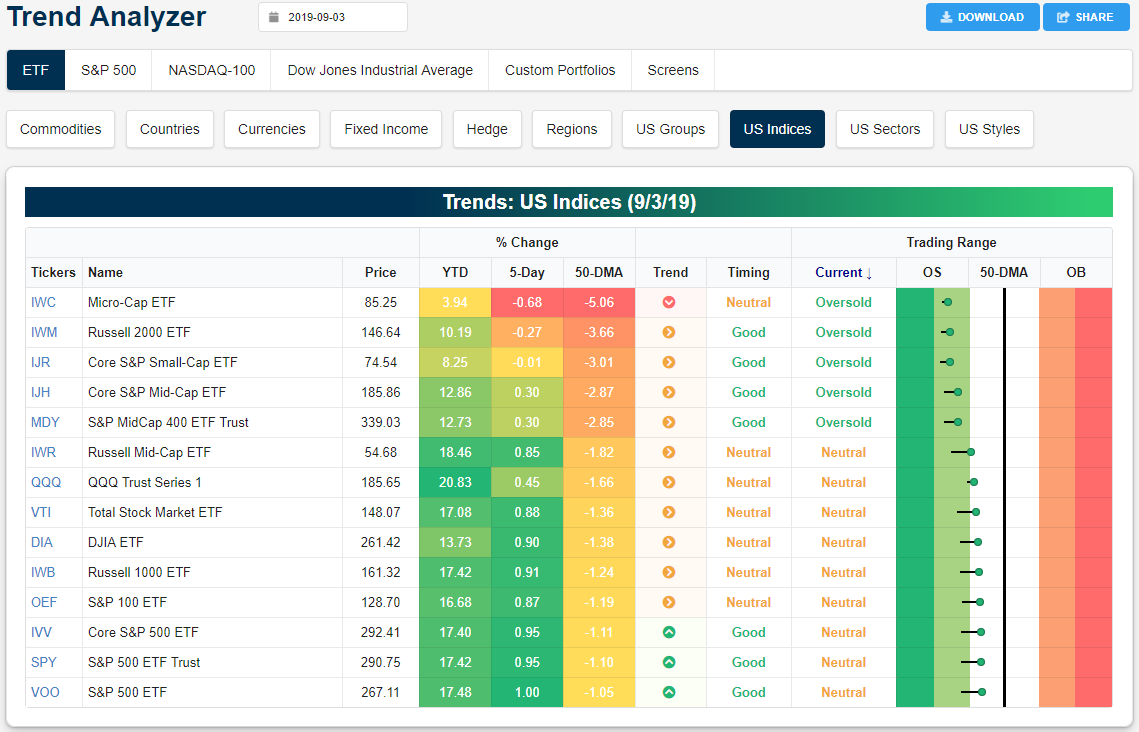
Small and mid-caps have returned to oversold territory after moving up into neutral territory at the end of last week. Meanwhile, although further below their 50-DMAs than yesterday’s open, large caps are looking to hold firm in neutral territory. The Micro-Cap ETF (IWC), Russell 2000 (IWM), and Core S&P Small-Cap ETF (IJR) are the only major index ETFs that are currently lower now than they were last week. IJR, however, has a loss of only 1 bp. Longer term trends have weakened across the board recently as only the ETFs tracking the S&P 500 (SPY, VOO, and IVV) all remain in uptrends. All others have been trending sideways over the past six months while IWC is actually in a downtrend.
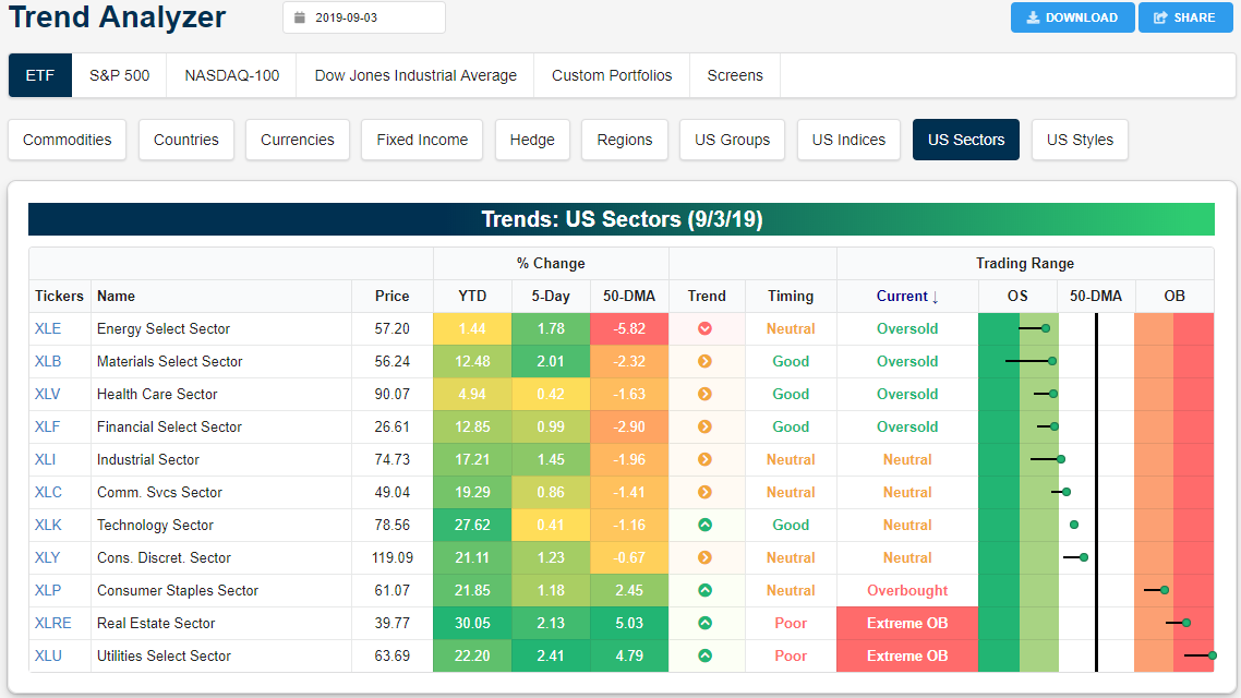
Looking at individual sectors, the overbought/oversold picture is a bit less consistent with an about equal split between oversold, neutral, and overbought. Energy (XLE) has begun to see some mean reversion recently. Still the most oversold of the eleven sectors, XLE has worked off of more extreme levels from last week and has been one of the top-performing sector ETFs over the past five days rising 1.78%. But XLE still remains in a longer-term downtrend and has only risen 1.44% so far in 2019. The Materials sector (XLB) is a similar story. After reaching extreme oversold levels last week, it has begun to rally and is closing in on reentering a more normal trading range. While these two cyclical sectors have begun to rally, so too have the defensives. Real Estate (XLRE) and Utilities (XLU) have been surging—both this week as well as this year as XLRE sits up over 30% YTD—with both seeing the best and second-best performance over the past five days which has brought them deeper into overbought territory. XLU, in particular, is now over 3 standard deviations above its 50-day, which is basically off the chart in our Trend Analyzer below! Start a two-week free trial to Bespoke Institutional to access our interactive economic indicators monitor and much more.
Bespoke’s Global Macro Dashboard — 9/4/19
Bespoke’s Global Macro Dashboard is a high-level summary of 22 major economies from around the world. For each country, we provide charts of local equity market prices, relative performance versus global equities, price to earnings ratios, dividend yields, economic growth, unemployment, retail sales and industrial production growth, inflation, money supply, spot FX performance versus the dollar, policy rate, and ten year local government bond yield interest rates. The report is intended as a tool for both reference and idea generation. It’s clients’ first stop for basic background info on how a given economy is performing, and what issues are driving the narrative for that economy. The dashboard helps you get up to speed on and keep track of the basics for the most important economies around the world, informing starting points for further research and risk management. It’s published weekly every Wednesday at the Bespoke Institutional membership level.
You can access our Global Macro Dashboard by starting a 14-day free trial to Bespoke Institutional now!

Bespoke’s Morning Lineup – Turnaround Tuesday on Wednesday
See what’s driving market performance around the world in today’s Morning Lineup. Bespoke’s Morning Lineup is the best way to start your trading day. Read it now by starting a two-week free trial to Bespoke Premium. CLICK HERE to learn more and start your free trial.

The Closer – EM and Brent Underperform, Manufacturing, Construction Spending – 9/3/19
Log-in here if you’re a member with access to the Closer.
Looking for deeper insight on markets? In tonight’s Closer sent to Bespoke Institutional clients, we show how US equity markets have stacked up against emerging markets. We also show the underperformance of Brent versus WTI crude oil before turning to our thoughts on the blowout of recent manufacturing data, especially in regards to ISM New Export Orders. We finish with a note on today’s construction spending release.

See today’s post-market Closer and everything else Bespoke publishes by starting a 14-day free trial to Bespoke Institutional today!
Manufacturing Activity Comes to a Grinding Halt
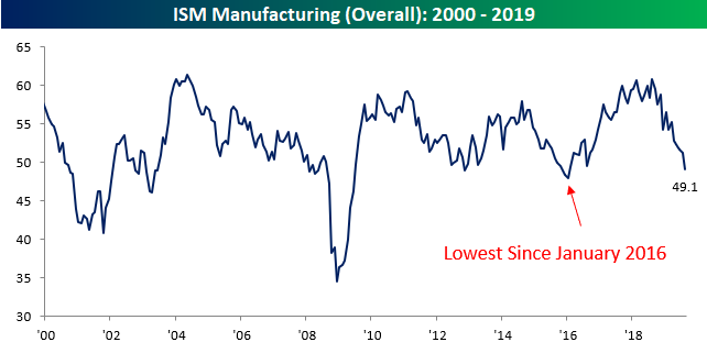
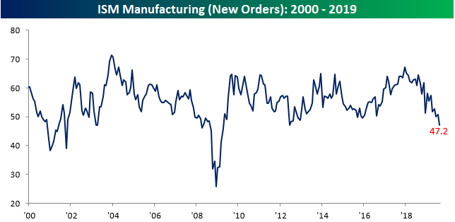
Here’s a question for you. Given the escalation of trade tensions with China and the increased uncertainty surrounding the global economy, how on earth were economists expecting activity in the US manufacturing sector to increase in August? The reality is that the manufacturing sector was not only weaker than expected, it contracted for the first time in three years! While economists were expecting the headline ISM Manufacturing index to increase from 51.2 up to 51.3, the actual reading came in at 49.1 for the fifth straight monthly decline in the index. The last time the ISM Manufacturing Index declined for five months straight was in January 2016 which also happens to be the last time it was lower than it is now.
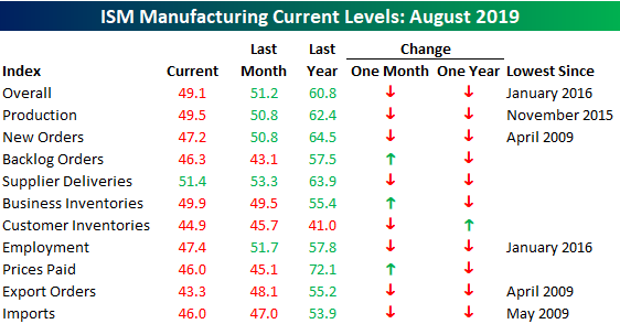
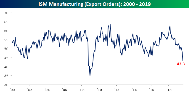
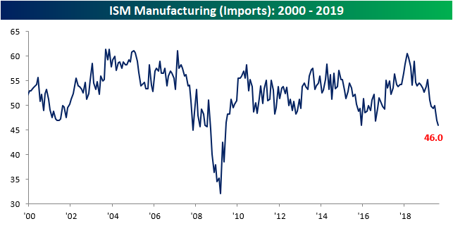
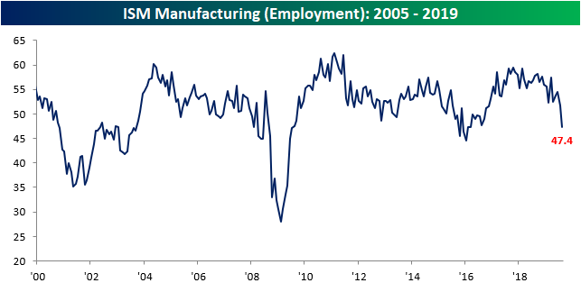
The internals of this month’s report were also very weak. For starters, we saw the most flips from growth (>50) to contraction (<50) in a monthly report since August 2016. On top of that, just one category in the report – Supplier Deliveries- is above 50. The last time there was such broad-based weakness was in June 2009! In the case of Production, current levels are the weakest since November 2015, but for New Orders (first chart below), things haven’t been this weak since April 2009. The same goes for Export Orders and Import Orders (second and third charts below). If you think that the ongoing trade war with China isn’t impacting global trade, think again. Finally, ahead of the August Jobs report on Friday, the Employment Index (bottom chart) of this month’s report fell to 47.4 which is the lowest level since January 2016. Start a two-week free trial to Bespoke Institutional to access our interactive economic indicators monitor and much more.
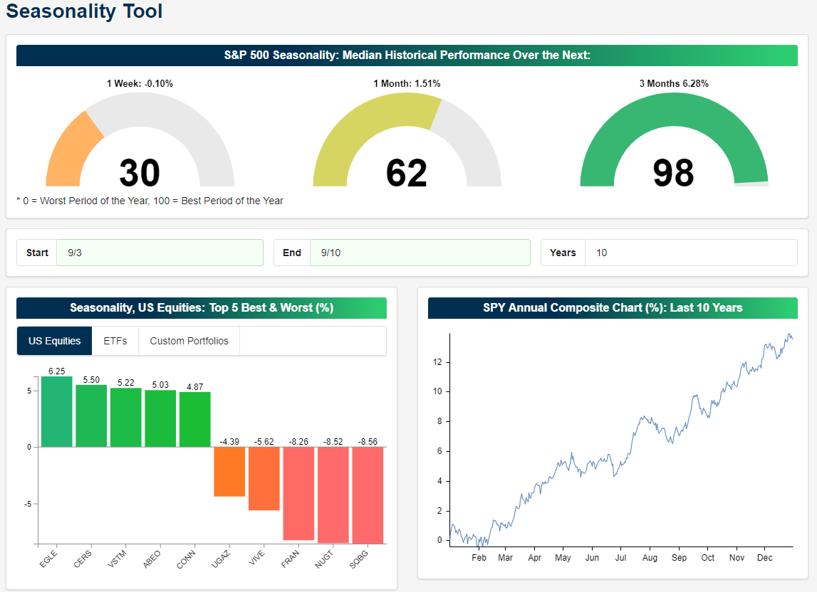
Labor Day Seasonality
We are now headed into the home stretch of the year and fortunately for bulls even though September is the worst month of the year, market performance over the next three months is one of the best periods of the year. As shown in the screenshot from our Seasonality Tool below, performance of the S&P 500 over the next week over the past ten years has been fairly weak with a 0.1% median decline. One month performance is slightly better with a modest gain of 1.51%, but 3 months out the S&P 500 has been higher by an average of 6.28%.
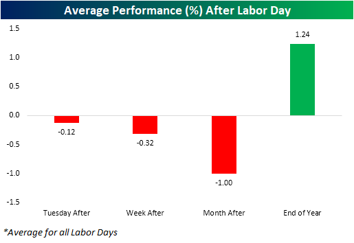
Coming off of the long Labor Day week, we wanted to take a look at seasonality around the holiday. As shown below, similar to what our Seasonality Tool is showing, going back to 1928, near term performance of the S&P 500 has been weak after Labor Day with declines that Tuesday after the holiday, the week after and one month after. But by New Year’s Eve, the index is higher by an average of 1.24%. Furthermore, the index has only been up in the weeks after Labor Day less than half of the time, while it is positive 70% of the time by the end of the year.
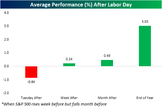
When it comes to what has happened over the month leading into the holiday weekend, with the S&P falling 1.81% in August but rising 2.8% last week, this year has actually been more of a setup for outperformance relative to seasonal patterns around Labor Day. As shown in the chart below, average performance in the days, weeks, and months following Labor Days that were preceded by declines in the month leading up to the holiday but gains in the week before typically have been stronger than other periods (11 prior occurrences). In fact, the week and month after Labor Day have typically been positive rather than negative after similar scenarios to the current one. Start a two-week free trial to Bespoke Institutional to access our interactive Seasonality Tool and much more.
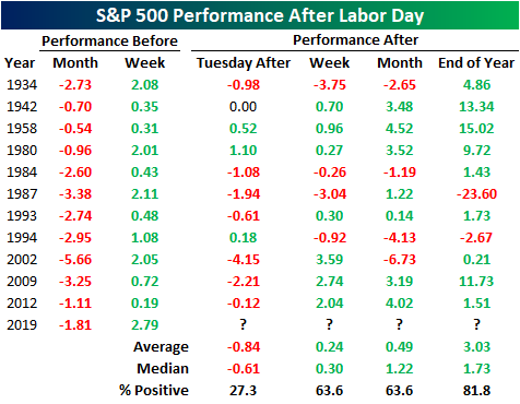
In the table below, we break down the performance across each of the eleven prior times that this has occurred. The Tuesday Labor Day is actually more consistently negative than other years—which we have ended up see play out this year. Again though, longer-term performance gets stronger and is more consistently positive. By the end of the year, there have only been two years where the S&P 500 was lower after similar price action to the current situation. One of those declines was in 1987 when the S&P fell 23.6% through the end of the year. Needless to say, this was a bit of an outlier.
The Warren Buffett Berkshire Stock Portfolio — Q3 2019
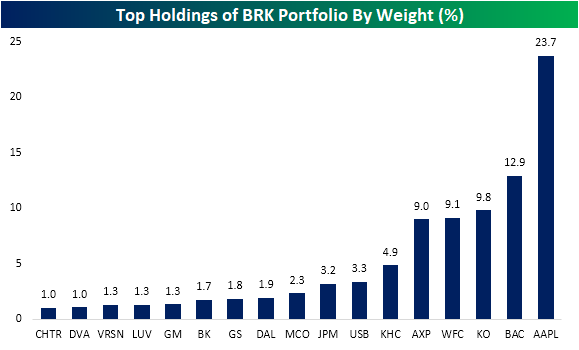
In data from its most recent 13-F filing, Warren Buffett’s Berkshire Hathaway (BRK/A) portfolio showed significant additions to its positions in Bank of America (BAC), US Bancorp (USB), Amazon (AMZN), and Redhat (RHT) which was acquired earlier this year. With these additions, the portfolio is still very overweight financial stocks, which is 45.4% of the portfolio, and technology which makes up for another 26.5% of the total portfolio thanks to a large position in Apple (AAPL). As shown below, Buffett’s position in AAPL is the largest single holding of the portfolio at 23.7%. The next highest is BAC at nearly half of that and a number of other financials stocks also take up 1% or more of the portfolio. The consumer staples and discretionary sectors also make up sizeable portions of the holdings at 15.2% and 7%, respectively. While several holdings were added on to, the company trimmed its position in Charter Communications (CHTR) and closed out of its position in USG (USG) which was acquired earlier this year. CHTR still is one of the larger holdings in the portfolio at around 1% in spite of this cut.
In the table below, we show each of the portfolio’s holdings as well as the percentage of the total portfolio value the stock takes up, its price, and both YTD and QTD performance. As shown, YTD the portfolio has done pretty well with only eight stocks down. But Q3 has been a tough quarter as more than half have fallen. The worst of which has been Teva Pharmaceuticals (TEVA) which is down 26.54%; tacking on to its 56.03% YTD decline. Fortunately TEVA was only 0.19% of the portfolio as of the end of Q2. American Airlines (AAL), Kraft Heinz (KHC), and M&T Bank (MTB) are all also down over 10% this quarter. While not quite as bad as TEVA, KHC’s 41.08% decline this year is also notable. Each of the aforementioned stocks that the company increased their position size on also has fallen in Q3. With a heavyweight in the sector, the performance of the portfolio’s financial stocks has been somewhat mixed. Moody’s (MCO) has been the second best performing stock behind StoneCo (SNTE) with its 53.35% YTD gain, and while this quarter it has continued to do well rising just under 10%, every other financial stock is down this quarter. On the bright side, there are more stocks that are up over 10% than those that have fallen 10%. Given the surge in real estate, the best of these has been STORE Capital (STOR) which has risen 15%. STOR is the only real estate stock in the portfolio. United Parcel Services (UPS), Restaurant Brands International (QSR), VeriSign (VRSN), Costco (COST), and Procter & Gamble (PG) are also all up double digits.

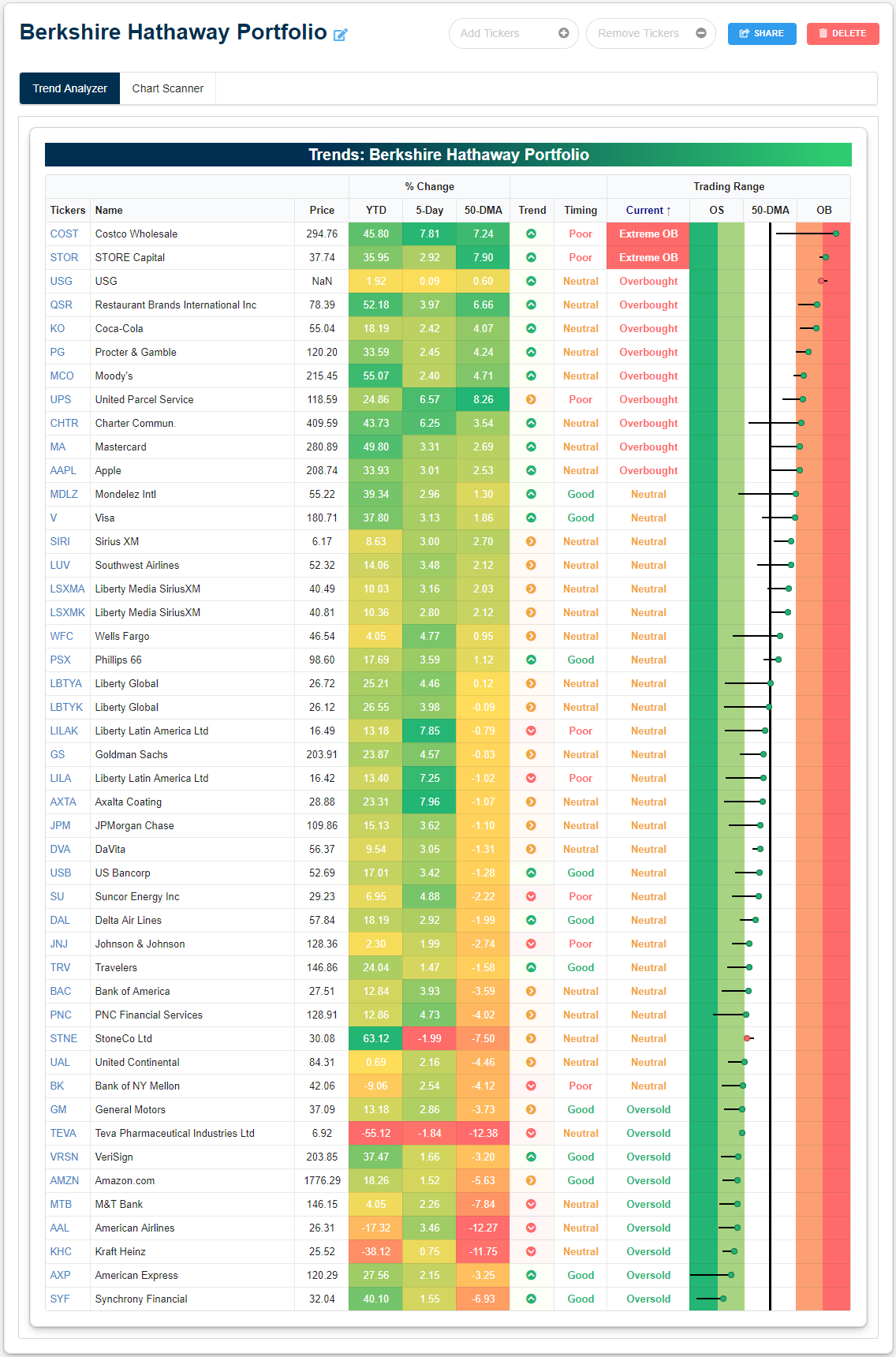
We created a custom portfolio of Buffett’s holdings so that members can use our tools to keep track of these stocks. In terms of longer-term trends as well as overbought and oversold levels, as shown in our Trend Analyzer below, the portfolio’s holdings are a bit all over the place. An equal share of the portfolio’s stocks (19) are in uptrends and trending sideways. The remaining nine stocks are in long term downtrends. After recent mean reversion, a majority are now sitting in neutral territory while there are also more that are overbought than oversold. Only Costco (COST) and STORE Capital (STOR) are currently at any sort of extreme levels (both overbought at more than 2 standard deviations above their 50-days). Start a two-week free trial to Bespoke Premium to use our Custom Portfolios tool where you can easily monitor portfolios like Buffett’s.
August 2019 Headlines
ISM Commodities Survey Falls Again
Although the Prices Paid component of the ISM Manufacturing report for August showed a slight increase this month, at a level of 46, it still remains well in contraction territory. Looking at the results of this month’s Commodities survey within the report also reflects the fact that downward price pressures remain in effect. In this month’s ISM Manufacturing report, respondents noted price increases in just two commodities and price declines in 11. This represents the fifth straight month that more commodities were up in price than down in price and took the three-month rolling average down to negative 8.3. While five straight months of negative readings undoubtedly indicates a weak pricing environment for manufacturers, we would note that back in the 2015/2016 period, there were 17 straight months where more commodities were reported as down in price than up in price.
While the relationship hasn’t been perfect, we would note that over time, changes in the direction of the ISM Commodities survey (light blue line) have tended to coincide with or precede changes in direction of the y/y readings in CPI. Looking at the chart, both series tended to track each other pretty closely from 2015 through mid-2018, but since then, we’ve seen a much steeper descent in the commodities survey than we’ve seen in CPI. That would suggest that either the commodities survey has to start rising again or else CPI may see downward pressure in the months ahead. One thing we would note is that since 1999, when the commodities survey has been two points either above or below the current level of -8.3, the average y/y CPI reading has been +0.5% versus the current level of 1.8%. Start a two-week free trial to Bespoke Institutional to access our interactive economic indicators monitor and much more.
