Bespoke’s Morning Lineup – 11/27/19 – Range Bound No More
See what’s driving market performance around the world in today’s Morning Lineup. Bespoke’s Morning Lineup is the best way to start your trading day. Read it now by starting a two-week free trial to Bespoke Premium. CLICK HERE to learn more and start your free trial.

The Closer – Small Cap Confirmation & Data Feast Week – 11/26/19
Log-in here if you’re a member with access to the Closer.
Looking for deeper insight on markets? In tonight’s Closer sent to Bespoke Institutional clients, we begin with a look at small caps which are breaking out despite earnings estimates still lagging. We also show the lagging performance of banks on the basis of market cap. We then review the large slate of economic data beginning with the much stronger than expected goods trade deficit and inventories numbers and its impact on GDP. Next, we show the drivers of the goods deficit, new home sales, and finally our Five Fed Manufacturing Index.

See today’s post-market Closer and everything else Bespoke publishes by starting a 14-day free trial to Bespoke Institutional today!
Bespoke CNBC Appearance (11/26)
Bespoke co-founder Paul Hickey appeared on CNBC’s Squawk Box this morning to discuss the current market backdrop. To view the segment click on the link below.

Another ROW Fake Out?
In terms of relative strength, it’s been a long decade for global equities outside of the United States. In the aftermath of 9/11 through most of the first decade of the 21st Century, US equities lagged their global peers as European economic growth outpaced the United States. Since 2007, though, global equities have consistently underperformed the S&P 500. While there have been brief periods where international equities had their time in the sun, clouds have always been quick to appear.
This past summer, the relative strength of the MSCI ex US index dropped to its lowest level since at least 1999. From the lows in August, we started to see another period where capital shifted back towards international stocks, but as shown in the lower chart, as the S&P 500 has been hitting record highs just about every other day in the last month, their global peers haven’t been able to keep up. As a result of the underperformance, the nascent uptrend for international equities has started to breakdown. If the prior low in relative strength from the summer doesn’t hold up, all of the goodwill that international stocks had built up in recent weeks will quickly melt away. Sign up for Bespoke’s “2020” special and get our upcoming Bespoke Report 2020 Market Outlook and Investor Toolkit.

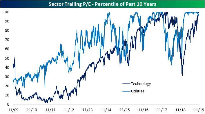
Technology Sector P/E Highest in Ten Years
As equities run to all-time highs, valuations are at a fairly interesting point. As shown in the chart below using data from our Daily Sector Snapshot included with our Morning Lineup and The Closer, most sectors’ valuations are at the upper end of the past ten years’ range. Four sectors, Consumer Discretionary, Communication Services, Utilities, and Technology all have trailing P/E ratios in the 90th percentile or higher of the past ten years’ readings.
Since the S&P 500 established its first all-time high since July on October 28th, Health Care and Financials have been two of the strongest performers rising 6.68% and 4.35%, respectively. Despite these runs, both of these sectors still have reasonable valuations relative to the past decade. For Financials, the current trailing price-to-earnings ratio is in the 42nd percentile of all days of the past ten years. No other sector has such a low reading although Materials and Energy are on the lower end relative to other sectors. On the other hand, Utilities and Technology have some of the highest valuations of the past ten years with the current P/E in the 97th and 99th percentiles, respectively.

As shown in the chart below, most of the last 9-12 months has seen valuations for Utilities consistently in the uppermost range of the past ten years as investors chased yield in a low interest rate environment. But as risk-free rates have risen more recently, valuations for Utilities have pulled back a bit as price has slid. While there have been other periods in the past ten years where Utilities’ P/E ratio was similarly elevated, arguably only 2016/2017 saw it remain at the upper end of the ten-year range as consistently as has been the case this year.
For Technology it is a whole different story. The P/E for the sector got crushed this time last year and after plummeting to the 31st percentile, it is has rebounded to the highest levels of the past ten years. The only other time that the sector traded at a similar premium relative to the past decade’s range was back in early 2018. Sign up for Bespoke’s “2020” special and get our upcoming Bespoke Report 2020 Market Outlook and Investor Toolkit.
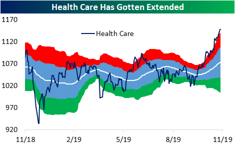
Health Care (XLV) Finishing the Year Strong
Time is ticking for 2019 with just 23 trading days left until the New Year. Performance has been strong this year with just about every sector seeing double-digit gains with Technology (XLK) being the strongest performer; having risen better than 40% YTD as shown below. While tech has stood out with its outperformance, two other sectors have lagged a bit this year. Energy (XLE) is perhaps the most notable underperformer but Health Care (XLV) is the second worst-performing sector in 2019. But more recently, this is by no means the case.
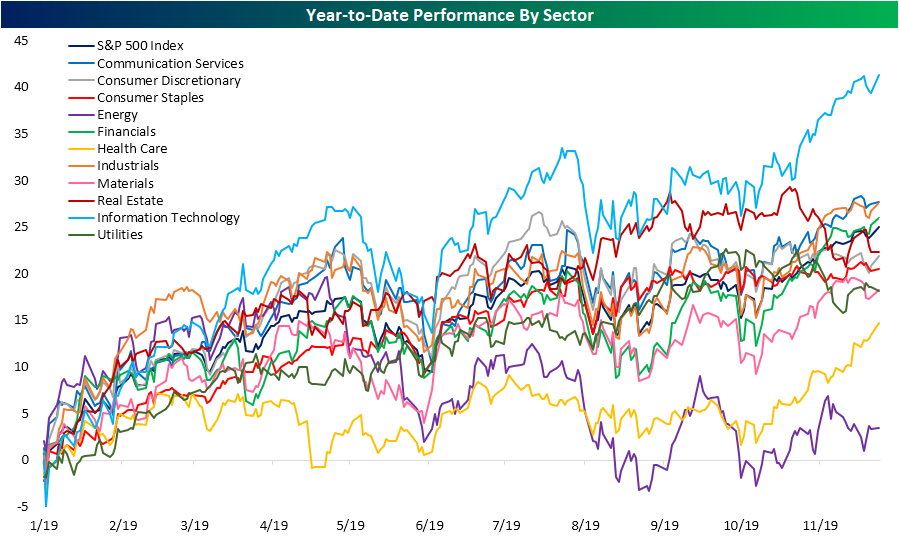
Since the S&P 500 broke back out to new all-time highs on October 28th, the Health Care sector has risen 6.68%. That is 2.5 percentage points better than the next best-performing sectors: Technology and Financials. While Health Care has led the way higher as the market reaches record highs, it has also gotten pretty extended. Now at 52-week highs, it is extremely overbought at more than two standard deviations above its 50-DMA. In percentage terms, yesterday’s close left the sector over 7% above its 50-DMA. No other sector is this overbought.
While this typically defensive sector has gotten overbought, other defensives (Real Estate and Utilities) have sold off given the more positive risk appetite as the broader market has reached new highs. Since the October 28th breakout for the S&P, the average performance for defensives (Real Estate, Health Care, Utilities, and Consumer Staples) is just +0.84% while cyclicals (the other 7 sectors) have averaged a 2.58% gain. With regards to defensives, 2019 has actually been a solid year with both Real Estate (XLRE) and Utilities (XLU) having traded in solid uptrends up until recently as shown below. In fact, up until only a few months ago, Real Estate (XLRE) had the second-best performance YTD of all 11 sectors. But the recent moves have broken their uptrends and left them trading in oversold territory for much of the past month. Neither one has traded above their respective 50-DMAs since the first few days of November. Sign up for Bespoke’s “2020” special and get our upcoming Bespoke Report 2020 Market Outlook and Investor Toolkit.

Consumer Confidence Drops Again
While the magnitude of the decline hasn’t been particularly large, Consumer Confidence dropped for the fourth straight month in November, in what is now tied for the longest monthly losing streak of the entire expansion. The only other streak since the end of the last recession that was as long was from March through June 2012. Not only did the headline index decline in November, but it also came in weaker than expected. While economists were expecting the Conference Board’s headline index of Consumer Confidence to rise to 127.0, the actual reading came in at 125.5.

Breaking out this month’s report by Present Situation and Expectations, these two indices actually moved in opposite directions with Expectations rising to 94.5 while the Present Situation index moved down to 173.5.

Even with both indices moving in the opposite direction, the spread between the two remains extremely elevated. The only period besides the current one where the spread was wider came in the late 1990s and early 2000s leading up to and during the dot.com bust.

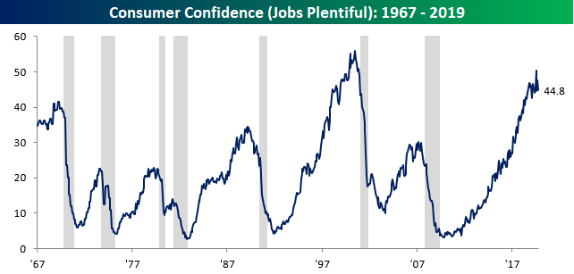
We also closely track the percentage of consumers who think jobs are plentiful. November’s reading of 44.8 remains relatively high, but we have really started to see some volatility in this reading over the last few months which is unlike the pattern of the last several years.
Where we have really started to see volatility, though, is in confidence levels by age. Over the last few months, confidence among consumers under the age of 35 has been all over the map. After a two-month increase of 32.3% in August, confidence has declined 23% over the last two months. The result of these swings is that just two months after confidence among consumers under the age of 35 hit the highest level since at least 1980, it has now cratered down to its lowest level since May 2016! Those swings are dramatic enough, but the fact that they have occurred during a period when sentiment readings among other age cohorts haven’t seen moves even remotely as large is a bit confusing.

Finally, the chart below shows the historical spread in confidence between young (under 35) and older (over 55) consumers. Because of the extreme volatility in the confidence reading for younger consumers, the spread between the two age cohorts is now at a record low. Traditionally, it has always been young Americans who have been the most optimistic as they have their entire lives and careers ahead of them. In the last few years, though, younger consumers have become much more downbeat relative to their older peers. For all the blame on boomers for everything wrong in this country, when it comes to confidence, they’re pulling their weight.Want to see Bespoke’s most actionable insights in real-time? Start a two-week free trial to Bespoke Premium for immediate access.

Bespoke’s Morning Lineup – 11/26/19 – It’s Raining Records
See what’s driving market performance around the world in today’s Morning Lineup. Bespoke’s Morning Lineup is the best way to start your trading day. Read it now by starting a two-week free trial to Bespoke Premium. CLICK HERE to learn more and start your free trial.
The Closer – Get Ready for a Snoozer, Soy Sag, Energy Current Account, Trade – 11/25/19
Log-in here if you’re a member with access to the Closer.
Looking for deeper insight on markets? In tonight’s Closer sent to Bespoke Institutional clients, given the shortened week, we begin with a note on seasonality of volumes during the Thanksgiving week. Next, we review the recent damage done to soybean futures. Staying on the topic of commodities, we then take a look at the balance of payments for petroleum and petroleum products. We finish with global trade data and production data from the Netherlands; statistical agency.
See today’s post-market Closer and everything else Bespoke publishes by starting a 14-day free trial to Bespoke Institutional today!
The Most and Least Heavily Shorted Stocks
The average stock in the large-cap Russell 1,000 has 4.9% of its float sold short. As shown below, Communication Services is the most heavily shorted sector, followed by Consumer Discretionary and Energy. Utilities has the lowest short interest levels along with other relatively high yielding sectors like Financials and Real Estate. For the Financials, it has been a big change since the Credit Crisis when the sector was one of the most heavily shorted areas of the market.

Below is a list of the most heavily shorted individual stocks in the Russell 1,000. Each of the stocks listed in the table have at least 20% of their float sold short.
Investors don’t believe in love at first click as online dating company Match Group (MTCH) is at the top of the list with nearly 59% of its float sold short. Cloud “Customer Experience Management” company Medallia (MDLA) is the second most heavily shorted stock with 46.6% of its float sold short, while home and business security company ADT ranks third at 37.5%. Other notables on the list include retailers and other consumer discretionary names like Nordstrom (JWN), Dick’s (DKS), Macy’s (M), Mattel (MAT), Grubhub (GRUB), World Wrestling Entertainment (WWE) and of course, Tesla (TSLA).
Coincidentally, there are four single-letter stock tickers on the list of most heavily shorted stocks, and three of them are W, X, and Z. If only Alleghany (Y) had made it, we’d have the last four letters of the alphabet covered! That will be a long time coming, though, because Alleghany (Y) is actually the 18th least shorted stock in the Russell 1,000 with just 0.77% of its float sold short.

Brown-Forman (BF/A) is the least shorted stock in the Russell 1,000 with just 0.20% of its float sold short. Nike (NKE), Johnson & Johnson (JNJ), Philip Morris International (PM), PepsiCo (PEP), Altria (MO), Microsoft (MSFT), and Amazon (AMZN) are other notable names on the list of least shorted stocks. While tobacco companies like MO and PM certainly aren’t popular in the ESG space, their high dividend yields (which shorts have to pay) help keep the shorts away.
In terms of performance, the Russell 1,000 stocks with more than 20% of their float sold short have posted total returns of 14.81% so far in 2019. While that’s a solid gain, it’s less than the 25%+ that large-cap indices have returned, meaning the shorts have done okay on a relative basis. The 35 least shorted stocks are up 31.27% year-to-date, which is more than double the return of the most heavily shorted stocks. Want to see Bespoke’s most actionable insights in real-time? Start a two-week free trial to Bespoke Premium for immediate access.
