The Closer – Rally In Reverse, But For How Long? – 2/26/20
Log-in here if you’re a member with access to the Closer.
Looking for deeper insight on markets? In tonight’s Closer sent to Bespoke Institutional clients, we with a look at how the S&P 500’s intraday pattern has changed from the Q4 rally to now. We also show a decile analysis based upon the best and worst-performing stocks from October until before the current sell-off began. Next, we review put volumes before reviewing today’s EIA data and crude oil’s negative technicals. Turning to macroeconomic data, we review today’s new home sales.

See today’s post-market Closer and everything else Bespoke publishes by starting a 14-day free trial to Bespoke Institutional today!
The Biggest Beneficiary of Coronavirus — Chinese Markets?
In our prior post we noted that the country whose stock market is the closest to its YTD highs is China — the country at the epicenter of the Covid-19 virus. We’ve got more stats in this regard.
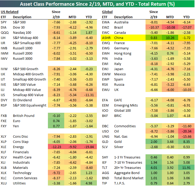
Below is a look at our ETF performance matrix highlighting recent returns of asset classes around the world. While the US stock market is down 7-8% since February 19th when the S&P peaked, the China ASHR ETF is actually up 0.83% over the same time frame.
Your best bet to play the global fear trade this month has not been to buy the 20+ Year Treasury ETF (TLT) or something like Gold (GLD), which are both up more than 3%. No, the best trade for a US equity investor would have been to go all-in on the Chinese equity market ETF (ASHR). Join Bespoke Premium to access Bespoke’s most actionable stock market research and analysis. Start a two-week free trial now!
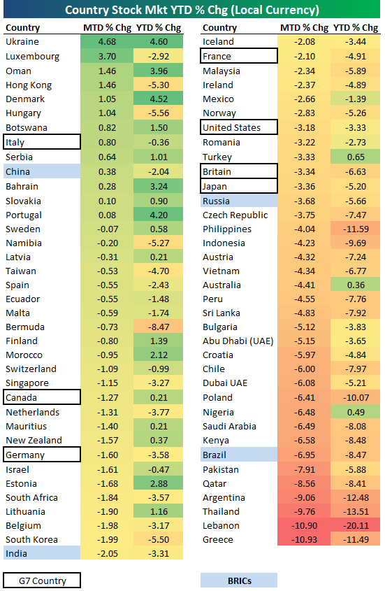
In terms of performance in local currency as opposed to performance in US dollars which is what our asset class matrix above shows, below is a look at month-to-date and year-to-date returns for the major equity indices of 73 countries around the world. As shown, even in local currency, China has easily been the best of the “BRICs” with a month-to-date gain of 0.38%.
And to boot, the country in the G7 where a worrisome coronavirus outbreak has occurred (contributing in large part to this week’s major sell-off) — Italy — is the only one that’s actually up month-to-date with a gain of 0.80%. All six other G7 countries are down more than 1% month-to-date.
Finally, below is a table that shows the percentage of total world equity market cap that the largest stock markets around the world make up. The country that has seen the biggest increase in its share of world equity market cap both year-to-date and month-to-date is — you guessed it — China. Up until this year, China had been seeing a decrease in its share of world market cap due to the trade war. But so far in 2020, China has managed to increase its share of world market cap from 8.44% up to 9.30%. So far in February — when corona fears really started to ramp up — China has increased its share of world market cap by 63 basis points, while the US has lost 6 basis points.
While you might not want to physically be in China right now, from an investment standpoint, there has been no better place in the world for a US investor to put their money.

Global Equity Benchmarks Distance From YTD Highs
The recent equity sell-off has clearly been global in nature as concerns of a global pandemic rise. Perhaps the most surprising aspect of the way equities have sold off recently is that the country that has been hardest hit by the virus is closer to its YTD high than any other major global equity benchmark. The chart below shows the distance that each major global equity benchmark has declined relative to its YTD high. China’s Shanghai Composite is down just 4.45%, which is better than any other country shown. Sure, you could argue that the Chinese government is manipulating the market and prohibiting investors from selling, but even the ETF that tracks the CSI 300 (ASHR) is down less than 6%, so anyone could go in and trade at these levels. Manipulated or not, the numbers are the numbers.
At the bottom of the list, Brazil’s Ibovespa index is down more than any other country at 11.6% and that country has only reported one confirmed case so far. With respect to US indices, the Russell 2000 is down the second most of any major global benchmark (-9.19%), while the Nasdaq is down the fourth most at 8.68%. Even the S&P 500 is down close to 8%. These weak US readings come in a backdrop where there have only been 57 confirmed cases and all but a couple are instances where Americans contracted the virus outside of the United States and have been brought to the US under quarantine. Join Bespoke Premium to access Bespoke’s most actionable stock market research and analysis. Start a two-week free trial now!

Testing Trendlines
US stocks have struggled to hold on to positive levels today as the S&P 500 has given up an intraday gain of more than 1.5%. Looking at a longer-term chart of the S&P 500, we’re currently testing the uptrend that has been in place since the lows in December 2018. If that trendline fails to hold (~3,100), technicals would suggest that another round of selling is in store.

Outside of the US, Brazil announced its first case of the coronavirus today, and the country’s benchmark Ibovespa index is down over 5%. Like the S&P 500 in the US, today’s decline in Brazil is also resulting in a test of a trendline that has been in place since the summer of 2018. Unless the news flow on the coronavirus starts to improve, these trendlines will increasingly come under pressure. Join Bespoke Premium to access Bespoke’s most actionable stock market research and analysis. Start a two-week free trial now!

Fixed Income Weekly – 2/26/20
Searching for ways to better understand the fixed income space or looking for actionable ideas in this asset class? Bespoke’s Fixed Income Weekly provides an update on rates and credit every Wednesday. We start off with a fresh piece of analysis driven by what’s in the headlines or driving the market in a given week. We then provide charts of how US Treasury futures and rates are trading, before moving on to a summary of recent fixed income ETF performance, short-term interest rates including money market funds, and a trade idea. We summarize changes and recent developments for a variety of yield curves (UST, bund, Eurodollar, US breakeven inflation and Bespoke’s Global Yield Curve) before finishing with a review of recent UST yield curve changes, spread changes for major credit products and international bonds, and 1 year return profiles for a cross section of the fixed income world.
In this week’s report we evaluate what the recent decline in interest rates implies.
Our Fixed Income Weekly helps investors stay on top of fixed income markets and gain new perspective on the developments in interest rates. You can sign up for a Bespoke research trial below to see this week’s report and everything else Bespoke publishes free for the next two weeks!
Click here and start a 14-day free trial to Bespoke Institutional to see our newest Fixed Income Weekly now!
Russell Rarely This Oversold
The massive declines in equities this week has sent the major indices reeling in their respective trading ranges as shown in the snapshot of our Trend Analyzer below. Every major index ETF is now extremely oversold (2 standard deviations or more below their 50-DMA) with the exception of the Nasdaq 100 (QQQ). That compares to one week ago when just about everything was overbought, some to nearly extreme degrees. One interesting point concerning the Nasdaq is that despite having fallen the most in percentage terms over the past week, it is the only index that entered today up on the year and it remains the least oversold of these index ETFs. While perhaps not to the same degree as QQQ, another dynamic worth mentioning is that small and mid-cap indices are much more oversold than large caps.

The small-cap Russell 2000 has generally underperformed large-caps for much of the past two years (it still has not gotten back up to its summer 2018 all time highs), and this recent weakness leaves it much more dramatically oversold than other major indices. As of yesterday’s close, the Russell sat over 4 standard deviations below its 50-DMA. That compares to the prior day when it was just over 2 standard deviations below and the day before when it was within one standard deviation of its 50-DMA.
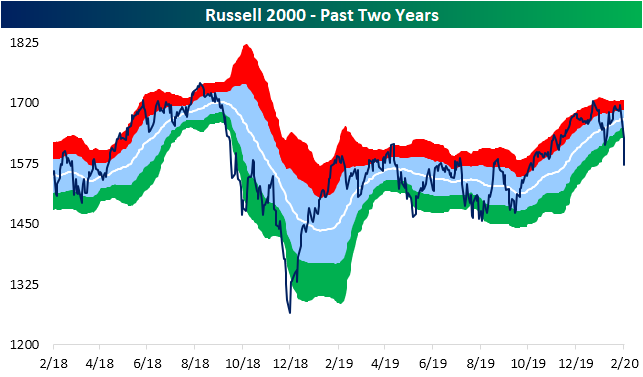
This is only the sixth day in the index’s history that it had gotten this oversold. The last time this happened was in August 2011. Prior to that there was one occurrence in August 1990 and another cluster of three days in during the October 1987 crash. Performance following these prior instances have been very mixed. While the 1987 and 1990 instances were followed by severe declines in the Russell 2000 over the next few months, more recently in 2011 performance was very strong over the next year. Join Bespoke Premium to access Bespoke’s most actionable stock market research and analysis. Start a two-week free trial now!

Bad Breadth Across Sectors
No sector has been safe from this week’s declines. Not a single sector is higher than it was five days ago although the declines for defensive sectors like Consumer Staples (XLP), Utilities (XLU), and Real Estate (XLRE) have been less than those of other sectors. More cyclical sectors, on the other hand, are down at least 3% compared to one week ago. With regards to these sectors’ trading ranges, the past week’s declines leaves most of these deep in oversold territory. Energy, Financials, Health Care, Industrials, Materials, and the S&P 500 more broadly are now over two standard deviations below their 50-DMA as shown below in the trading range charts from our Daily Sector Snapshot.

Looking through some other charts included in our Sector Snapshot, the spread between the price and 50-DMA in percentage terms for Consumer Staples, Energy, Financials, Industrials, Materials, and again the S&P 500 more broadly is at the lowest level of the past year. With every sector having moved lower, there are now only two sectors that are above their 50-DMA (positive 50-DMA spread): Real Estate and Utilities.

Not only are sectors falling below their 50-DMAs, but so are the individual stocks within each sector. The charts below show the percentage of stocks within each sector that are above their 50-DMAs. As shown, every sector has seen these readings fall sharply over the past several days. Energy is the worst of these as not a single stock in that sector is above its 50-DMA. Although not quite as bad, Industrials, Materials, and the S&P 500 also have the fewest stocks above their 50-DMA of all readings of the past year.

Across the board, breadth has been notably weak as we discussed in last night’s Closer. One way of showing this is through 10-day advance/decline lines. As with most other indicators, these have fallen sharply over the past several days which means there have been far more stocks moving lower than higher each day. Over the past couple of weeks, each sector had reached fairly extreme overbought levels (red shading in charts below) at some point. But the extremely week breadth since those peaks has left every sector with the exception of Real Estate with a negative 10-Day A/D line reading. Now these lines are approaching oversold levels.

Finally, every sector outside of Health Care has seen more stocks reaching new 52-week lows than 52-week highs. The net percent of stocks at 52-week highs for Consumer Discretionary and Energy have blown the lowest readings of the past year out of the water. For both of these sectors, these are the lowest reading since late December 2018. Start a two-week free trial to Bespoke Institutional to access our Daily Sector Snapshot, Closer, Morning Lineup, and more.

Bespoke’s Global Macro Dashboard — 2/26/20
Bespoke’s Global Macro Dashboard is a high-level summary of 22 major economies from around the world. For each country, we provide charts of local equity market prices, relative performance versus global equities, price to earnings ratios, dividend yields, economic growth, unemployment, retail sales and industrial production growth, inflation, money supply, spot FX performance versus the dollar, policy rate, and ten year local government bond yield interest rates. The report is intended as a tool for both reference and idea generation. It’s clients’ first stop for basic background info on how a given economy is performing, and what issues are driving the narrative for that economy. The dashboard helps you get up to speed on and keep track of the basics for the most important economies around the world, informing starting points for further research and risk management. It’s published weekly every Wednesday at the Bespoke Institutional membership level.
You can access our Global Macro Dashboard by starting a 14-day free trial to Bespoke Institutional now!

Bespoke’s Morning Lineup – 2/26/20 – Looking For a Waypoint
See what’s driving market performance around the world in today’s Morning Lineup. Bespoke’s Morning Lineup is the best way to start your trading day. Read it now by starting a two-week free trial to Bespoke Premium. CLICK HERE to learn more and start your free trial.
Investors are searching for a waypoint on the path of the coronavirus outbreak, and global futures have been all over the place with S&P 500 futures trading in a range of over 2% from their highs last night to their lows this morning. Currently, futures are indicating a slightly higher open, but those levels can and likely will change by the time you read this.
Read today’s Bespoke Morning Lineup for the latest on the impact of the coronavirus, how the outbreak is impacting economic data, and the latest stock-specific news.

Given the magnitude of the declines over the last several days, it’s hard to believe that many major US indices still aren’t oversold relative to their 50-day moving averages. In fact, despite falling more than any other major index ETF over the last five trading days, the Nasdaq 100 (QQQ) is still above its 50-DMA!

The Closer – Epic Drop in Stocks as Covid-19 Blasts Markets – 2/25/20
Log-in here if you’re a member with access to the Closer.
Looking for deeper insight on markets? In tonight’s Closer sent to Bespoke Institutional clients, after the past two days’ brutal declines for stocks, we take a look at the moves in the VIX and credit spreads. We then review just how bad breadth has been and the negative reversal in today’s session. Turning to economic data, we review global trade activity and our Five Fed composite with the addition of the Richmond Fed’s data. We finish tonight’s note with an update on home prices.
See today’s post-market Closer and everything else Bespoke publishes by starting a 14-day free trial to Bespoke Institutional today!