Homebuilders Appear Attractive As Rates Move Lower
Earlier today we updated our weekly Stock Scores, which ranks each of the stocks in the S&P 1500 based on various fundamental, technical, and sentiment factors. Coincidentally on the same day that the Federal Reserve surprised with a 50 bps rate cut, one group of stocks poised to benefit from lower rates, the homebuilders, came in with very strong scores. As shown in the chart below, breaking down the S&P 1500 by the GICS Level 4 Sub-Industries, the average stock in the homebuilder sub-industry had a score of 65.9 (out of 100). That is higher than any other group with the next highest-ranked sub-industry being Heavy Electrical Equipment. Another interesting group to note is Airlines, which despite having been crushed in the coronavirus fallout, surprisingly find themselves in the top ten.
The strength in Airlines is due in large part to high fundamental ratings for stocks in the group. Those high scores don’t fully take into account the weaker earnings that the market is pricing in, but unlike prior periods over time, airlines as a whole are in a lot better financial shape than they were in the past.

Looking at just the homebuilder stocks, Taylor Morrison Home (TMHC) boasts the highest total score this week at 81.1 thanks to strong fundamental, technical, and sentiment scores. TMHC has such a strong score this week that it also places second out of all S&P 1500 stocks. Several others have similarly strong fundamental scores, but only DR Horton (DHI) has a flawless technical score.

While equities more generally have traded violently in the last two weeks, they have moved decidedly lower this afternoon, even after the FOMC cut rates. The homebuilders, however, have been the exception . Following steep declines last week, the Homebuilders ETF (ITB) fell back down to the 200-DMA for the first time in nearly a year. That level acted as support, though, as ITB bounced off that level over the past couple of sessions. This bounce has been helped further today by low rates providing a stimulus to the industry. This is as already low mortgage rates have led to housing being a bright spot for the economy. Looking ahead, the next resistance to watch for ITB would be the 50-DMA. If you’d like full access to our weekly Stock Scores ratings, start a two-week free trial to Bespoke Institutional today.

Bespoke’s Morning Lineup – 3/3/20 – Two for Tuesday?
See what’s driving market performance around the world in today’s Morning Lineup. Bespoke’s Morning Lineup is the best way to start your trading day. Read it now by starting a two-week free trial to Bespoke Premium. CLICK HERE to learn more and start your free trial.
The market was hoping for more than a statement from the G7 this morning, but that’s all it got for now. As a result, positive action in the futures market quickly headed south. Things have bounced back quite a bit from the initial reaction as current indications suggest a modestly weaker open…for now.
Read today’s Bespoke Morning Lineup for the latest on Biden’s surge in the political polls ahead of Super Tuesday, news on coronavirus, and the latest stock-specific events.

The S&P 500 is already up over 4% MTD, and if yesterday’s gains don’t hold it would mark a truly momentous milestone for the S&P 500. That’s because we have already seen two straight months where the S&P 500 was up over 3% MTD but finished down in a given month. In the entire history of the S&P 500, there have only been four periods of back to back months where we have seen similar reversals with the most recent occurrence back in January and February of 2009. In case you were curious, there were only three other months in between these two periods where we saw a similar reversal in a single month (October 2009, January 2010, and November 2010).
Looking at the prior back to back monthly negative reversals, the S&P 500 was higher six months later three out of four times. The only negative period was in May and June of 1973 when the S&P 500 fell 6.4% over the next six months and 17.5% over the next year.

The Closer – Fear Sent Flying as Stocks, Commodities, & Rates Surge – 3/2/20
Log-in here if you’re a member with access to the Closer.
Looking for deeper insight on markets? In tonight’s Closer sent to Bespoke Institutional clients, we begin with a look at today’s rally in historical context before reviewing the price action of the VIX, rates, crude oil, copper, and high yield bonds. We then turn to US politics to look at where the Democratic candidates stand headed into Super Tuesday. We then show how consumer sentiment has been impacted by the coronavirus. We finish with a look at today’s construction spending data.
See today’s post-market Closer and everything else Bespoke publishes by starting a 14-day free trial to Bespoke Institutional today!
Not a Normal Bounce Back Day
The large-cap Russell 1,000 was up 4.35% on the day, but notably, the average stock in the index was up much less than that at just +3.25%. The reason for the big performance divergence is because the largest ten stocks in the index were up an average of 5.29% on the day. A cap-weighted index that’s as top-heavy as it is now benefits greatly when its largest members outperform, and that’s what happened today. The two trillion-dollar companies in the index — Apple (AAPL) and Microsoft (MSFT) — were up 9.31% and 6.65%, respectively.
Normally on big bounce-back days, the stocks that got hit the hardest during the selloff bounce back the most. That didn’t happen today. Below we’ve broken the Russell 1,000 into deciles (10 groups of 100 stocks each) based on share price performance during the massive selloff we saw from the market’s peak on 2/19 through last Friday (2/28). The stocks that fell the most during the selloff (decile 10) actually bounced the least today, rising just 1.92% on average.
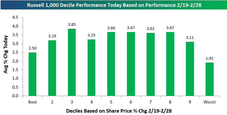
Below is a table showing the thirty best-performing stocks in the Russell 1,000 today. For each stock, we also show how it performed during the 2/19-2/28 selloff as well as its current market cap. Four stocks in the Russell 1,000 were up 10%+ today. Vaccine-maker Moderna (MRNA) was up the most with a gain of 15.23%, adding to the 37.05% it gained from 2/19-2/28. Sage Therapeutics (SAGE) was up the second most at +13.53%, followed by Tesla (TSLA) at +11.32%. Tesla buyers were back out in full force after suffering through a 27% decline from 2/19-2/28. Finally, medical waste disposal company Stericycle (SRCL) was up the fourth most with a gain of 10.74% today.
Costco (COST) and Apple (AAPL) were the 5th and 6th best performers in the Russell 1,000 today with gains of 9.96% and 9.31%, respectively. Other notables on the list of biggest winners today include S&P Global (SPGI), Gilead (GILD), Scotts Miracle-Gro (SMG), Moody’s (MCO), Clorox (CLX), Twitter (TWTR), and Church & Dwight (CHD). From Health Care to Consumer Staples to Tech, a large number of sectors were represented. However, one sector with no names on the list of best performers today was Energy. What else is new? See our most actionable market analysis with a Bespoke Premium membership. Click here to start a two-week free trial now.

The Impact of COVID-19 on Earnings Reports
Below is a look at the historical earnings beat rate (vs. consensus analyst estimates) for US companies reporting quarterly numbers on a rolling 3-month basis. These charts are updated on a regular basis at our popular Earnings Explorer tool. The first chart shows the bottom-line EPS beat rate, while the second chart shows the top-line revenue beat rate. Prior to the last week or so, beat rates had been on the upswing, but they’ve taken a slight dip since the market peaked on February 19th.

The reading that has really taken a hit since the COVID-19 virus began to spread is forward guidance. The chart below shows our Guidance Spread tracker from our Earnings Explorer tool, which looks at the difference between the number of companies raising guidance and lowering guidance on a rolling three-month basis. As shown, our guidance spread has fallen dramatically over just the last three weeks, which coincides with the rapid outbreak of the coronavirus both inside and outside of China. At this point, our guidance spread has taken out lows seen in November 2019, but it’s not nearly as negative as it was in the early part of 2019.

Along with the big drop in our guidance spread tracker, share price reactions to earnings reports have also taken a big hit. The chart below shows the median one-day share price change that stocks have experienced on their earnings reaction days on a rolling three-month basis. Over the last three months, the median share price change for stocks on their earnings reaction days has been -0.56%. That’s the most negative reading seen in the last twelve months, and it’s a complete reversal of the trend of positive share-price reactions we were seeing as recently as January. Stocks have gone from reacting very positively to their earnings reports to reacting very negatively to their earnings reports in just a few weeks. You can see these charts over a longer time frame at our Earnings Explorer page, which is available to Bespoke Institutional members. Start a two-week free trial to Bespoke Institutional to access our Earnings Explorer, the rest of our interactive investor tool-kit, and our actionable investment research.

Covid-19 Slowing Manufacturing
Similar to the final Markit readings for the month of February released this morning, the headline February ISM Manufacturing number has yet to show any major negative impact as a result of the coronavirus outbreak. The headline index was expected to fall to 50.5 from 50.9, but the actual decline was larger down to 50.1. Despite the weaker than expected reading, the ISM Manufacturing index remains at expansionary levels, and it is also a stronger reading than most months since the second half of 2019.

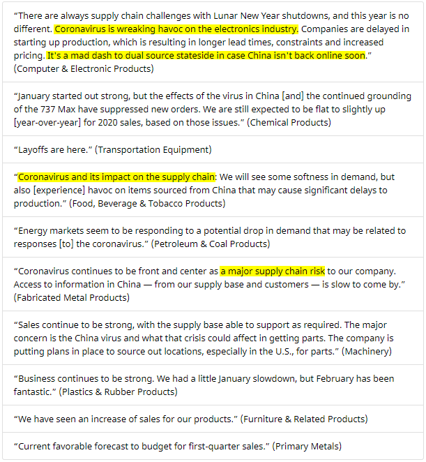
While the headline number may not flash any huge negative impacts from the coronavirus, the commentary section of February’s report makes frequent mention with respondents stating that the virus is “wreaking havoc” as it poses “a major supply chain risk.” Likely due to the timing of the surveys predating the other major outbreaks around the globe, the comments mainly make note of the effects of the virus on operations in China. In other words, seeing as this data is lagged a bit, the full effects of more recent outbreaks outside of Asia (namely China) are not likely to be fully reflected in the February report.
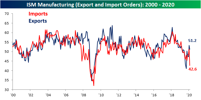
Breadth across the individual categories of the report was on the weaker side with only three improving from January and only two improving versus one year ago. These moves have brought the indices for New Orders, Prices Paid, and Imports all into contraction territory from expansionary readings in the prior month. Again, the headline index did not experience any major shifts as might have been expected as a result of Covid-19, but under the hood, some components are beginning to show a more prominent negative impact.
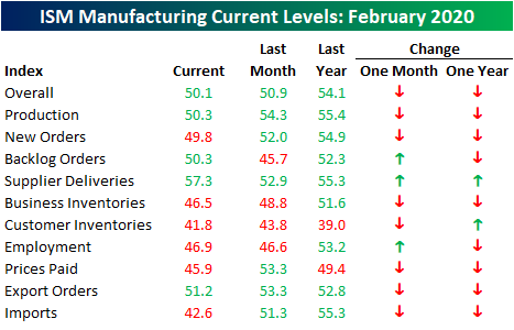
The worst of those declines were for Imports which fell from 51.3 in January to 42.6. As shown below, that is the weakest reading since the Financial Crisis (May 2009) when it dropped down to 38.5. The 8.7 point decline was also the largest month over month decline on record in the data going back to 1989. This drop is perhaps the most obvious result of Covid-19 disruptions. Shutdowns from the virus in addition to the New Years Holiday in China would have resulted in weaker trade activity. Export orders are echoing this as they declined 2.1 points although that drop was not nearly as large as that of imports.
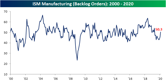
Supplier deliveries (readings above 50 indicate longer delivery times and under 50 indicate faster deliveries) are giving further evidence to negative impacts from the Coronavirus. The index surged to 57.3 in February from 52.9 in January. That is the highest reading since November 2018 and was the largest one month increase since June of 2018. In other words, suppliers are struggling to deliver due to supply chain disruptions.

As suppliers struggle to deliver, backlogs have begun to grow with the index ticking up to 50.3. That is the first expansionary reading since April of last year. Start a two-week free trial to Bespoke Institutional to access our interactive economic indicators monitor and much more.
Bespoke Market Calendar — March 2020
Please click the image below to view our March 2020 market calendar. This calendar includes the S&P 500’s average percentage change and average intraday chart pattern for each trading day during the upcoming month. It also includes market holidays and options expiration dates plus the dates of key economic indicator releases. Start a two-week free trial to one of Bespoke’s three research levels.

Bespoke’s Morning Lineup – 3/2/20 – Will They or Won’t They?
See what’s driving market performance around the world in today’s Morning Lineup. Bespoke’s Morning Lineup is the best way to start your trading day. Read it now by starting a two-week free trial to Bespoke Premium. CLICK HERE to learn more and start your free trial.
Will they or won’t they cut rates? That is the question this morning as futures fluctuate massively overnight, trading in a range of over 4%. US Treasury rates are at record lows, the dollar is down and gold is up. It’s going to be another crazy week!
Read today’s Bespoke Morning Lineup for the latest stock-specific events, news on coronavirus, and the changing dynamics of the Democratic Presidential primary process.
The charts below are from page two of the Morning Lineup and as you can see, the moves last week were practically off the charts. The S&P 500 is more than three standard deviations below its 50-DMA, more than 85% of S&P 500 stocks are oversold, and equities are underperforming treasuries by their widest margins in nearly a year.

Bespoke Brunch Reads: 3/1/20
Welcome to Bespoke Brunch Reads — a linkfest of the favorite things we read over the past week. The links are mostly market related, but there are some other interesting subjects covered as well. We hope you enjoy the food for thought as a supplement to the research we provide you during the week.
While you’re here, join Bespoke Premium for 3 months for just $95 with our 2020 Annual Outlook special offer.
Covid-19
Panic buying strips store shelves as people stockpile amid coronavirus outbreak with one woman turning her basement into a ‘supermarket’ and a man buying a YEAR’S supply of food which includes 192 tins of SPAM by Emily Crane (Daily Mail)
Stockpiling ahead of a nearly-inevitable Covid-19 outbreak inside the US is not yet reaching any kind of fever pitch but some early buyers are looking for canned goods, cough medicines, masks, and thermometers. [Link; auto-playing video]
Amazon bars 1 million products for false coronavirus claims by Jeffrey Dastin (Yahoo!/Reuters)
As snake oil salesmen flock to the online marketplace, Amazon has stepped in and blocked listings for products which claim to be able to kill the Covid-19 virus. [Link]
How One Patient Turned Korea’s Virus Outbreak Into an Epidemic by Heesu Lee and Kyunghee Park (Bloomberg)
A member of a secretive, apocalyptic religious sect helped turbocharge the outbreak of coronavirus in Korea by passing the virus to members of her church and beyond. [Link; soft paywall, auto-playing video]
Why Some COVID-19 Cases Are Worse than Others by Katarina Zimmer (The Scientist)
A very helpful and detailed analysis of factors that make the Covid-2019 outbreak so dangerous to the elderly but of so little concern to younger members of the population. [Link]
Lessons From Singapore
Singapore Emerges as Litmus Test for Coronavirus Containment by Philip Heijmans (Bloomberg)
The city-state’s world-class health care system has been able to cap spread of cases while also delivering a much lower death rate than what’s been observed in Wuhan. [Link; soft paywall, auto-playing video]
Living With Coronavirus Anxiety In Singapore by Megan K. Stack (The NYer)
An investigation of how pandemics change the lives of people and the broader community, regardless of how many are infected by whatever the pathogen is. [Link]
Sentiment
Reddit’s Profane, Greedy Traders Are Shaking Up the Stock Market by Luke Kawa (Bloomberg)
Every bull market inevitably has its small corners of extreme excess, and the huge gains for the stock market at the end of 2019 and start of 2020 are no different: welcome to r/wallstreetbets! [Link; soft paywall]
Bloomberg U.S. Startups Barometer (Bloomberg)
A catalog of the current funding backdrop for Silicon Valley, which has seen a plunge to multi-year lows in deals, deal amounts, first financings and exits that portends poorly for the space. [Link; soft paywall]
Fraaaaaud!
I stumbled across a huge Airbnb scam that’s taking over London by James Temperton (Wired)
While the company claims it’s been able to step up enforcement against malefactors that use its service, recent evidence from the capitol of the UK shows fraud is absolutely rampant on the platform. [Link]
How North Korean Hackers Rob Banks Around the World by Ben Buchanan (Wired)
There’s a long history of North Korean efforts to both fund its economy and attack the American economy via counterfeiting of currency, but the country has now moved into hacking banks instead of simple physical bill printing. [Link]
Millennial Women Made LuLaRoe Billions. Then They Paid The Price. by Stephanie McNeal (BuzzFeed)
The latest multi-level marketing scheme to wreck havoc on victims of its over-promised, under-delivered pitch of financial freedom was targeted at women approaching middle age who wanted to cover student loans and keep heads above water in a challenging post-crisis economy. [Link]
Sports Yarns
That Time Obama Pardoned a Guy Who Stole Charlie Sheen’s Honus Wagner Card by Jon Wertheim (Sports Illustrated)
Kick back, relax, and enjoy this zany tail about one of the most expensive baseball cards in history and one of the stranger pardons that ended up ending the affair. [Link]
Olympian’s cameo caps DeKalb student’s Black History Month report by Marlon A. Walker (AJC)
An assignment to do a project on Afro-Latinos who had made a big impact on society got taken above and beyond: with a visit to Barack Obama Elementary Magnet School of Technology from Olympian and civil rights icon John Carlos. [Link]
Durable Goods
The Case for the $100,000 Mattress by Alicia Brunker (Architectural Digest)
Online mattress sellers are passé, with the $149,000 Savoir mattress (which takes 320 hours of craftsmanship in Sweden to create) the undisputed leader of sleeping luxury. [Link]
Where’s My Cup? Offices Find It’s Not Easy Going Green by Te-Ping Chen (WSJ)
Going green isn’t always easy, though one does wonder how inconvenient keeping track of a water bottle could possibly be. [Link; paywall]
Qui Custodiet?
Facial-Recognition Company That Works With Law Enforcement Says Entire Client List Was Stolen by Betsy Swan (The Daily Beast)
It’s pretty hard to believe a company that can’t keep its client list locked down deserves to have billions of pictures designed to create a near-panopticon surveillance infrastructure. [Link]
Climate Change
Newly waterproofed Arctic seed vault hits 1m samples by Damian Carrington (The Guardian)
A seed vault buried in Svaldbard has been upgraded to prevent flooding due to warmer temperatures, but now holds over 1mm samples as part of an effort to prevent a catastrophic loss of global biodiversity. [Link]
Read Bespoke’s most actionable market research by joining Bespoke Premium today! Get started here.
Have a great weekend!
The Closer: End of Week Charts — 2/28/20
Looking for deeper insight on global markets and economics? In tonight’s Closer sent to Bespoke clients, we recap weekly price action in major asset classes, update economic surprise index data for major economies, chart the weekly Commitment of Traders report from the CFTC, and provide our normal nightly update on ETF performance, volume and price movers, and the Bespoke Market Timing Model. We also take a look at the trend in various developed market FX markets.
The Closer is one of our most popular reports, and you can sign up for a free trial below to see it!
See tonight’s Closer by starting a two-week free trial to Bespoke Institutional now!