Dec 15, 2015
Today’s Chart of the Day takes a look at the performance of the S&P 500 relative to prior years and how similar months of December at this point have finished up the second half of the year.
To continue reading our Chart of the Day, enter your info below and start a free Bespoke research trial. During your trial, you’ll also receive access to our model stock portfolios, daily market alerts, and weekly Bespoke Report newsletter.
[thrive_leads id=’59052′]
Dec 14, 2015
Today’s Chart of the Day takes a look at the downright eerie comparison between the S&P 500’s trading pattern in 2011 versus its pattern in 2015, and we also take a look at weakening sector breadth levels.
To continue reading our Chart of the Day, enter your info below and start a free Bespoke research trial. During your trial, you’ll also receive access to our model stock portfolios, daily market alerts, and weekly Bespoke Report newsletter.
[thrive_leads id=’59052′]
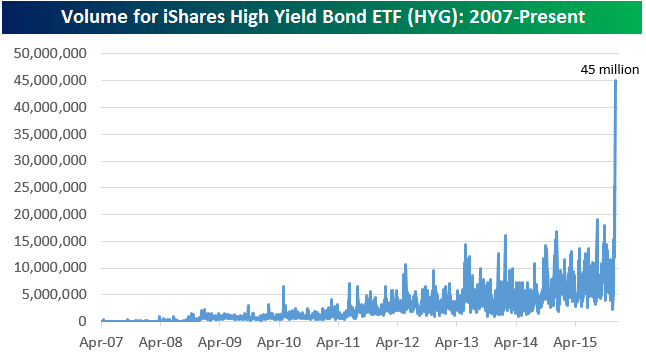
Dec 11, 2015
Today’s Chart of the Day takes a look at the huge spike in volume in the junk bond HYG ETF today. We also look at its negative price action today and what it means going forward.
To continue reading our Chart of the Day, enter your info below and start a free Bespoke research trial. During your trial, you’ll also receive access to our model stock portfolios, daily market alerts, and weekly Bespoke Report newsletter.
[thrive_leads id=’59052′]
Dec 10, 2015
Today’s Chart of the Day takes a look at the number of times the S&P 500 has crossed the unchanged line on YTD basis so far this year and how the S&P 500 has performed following prior years where there were a large number of crosses of the unchanged line.
To continue reading our Chart of the Day, enter your info below and start a free Bespoke research trial. During your trial, you’ll also receive access to our model stock portfolios, daily market alerts, and weekly Bespoke Report newsletter.
[thrive_leads id=’59052′]
Dec 9, 2015
Today’s Chart of the Day takes a look at what a weak start to the month of December means for the rest of the month.
To continue reading our Chart of the Day, enter your info below and start a free Bespoke research trial. During your trial, you’ll also receive access to our model stock portfolios, daily market alerts, and weekly Bespoke Report newsletter.
[thrive_leads id=’59052′]
Dec 8, 2015
Today’s Chart of the Day takes a look at the Energy sector’s historical weighting in the S&P 500. We’ve seen dramatic weight loss for the Energy sector over the last 7 years, to the point where Energy now makes up just 6.5% of the S&P! How does this drop compare to drops for other sectors over the years, and when is it safe to get long Energy again?
To continue reading our Chart of the Day, enter your info below and start a free Bespoke research trial. During your trial, you’ll also receive access to our model stock portfolios, daily market alerts, and weekly Bespoke Report newsletter.
[thrive_leads id=’59052′]