Dec 31, 2015
In today’s Chart of the Day, we take a look at just how bad economists have been in forecasting the Chicago PMI in 2015.
To continue reading our Chart of the Day, enter your info below and start a free Bespoke research trial. During your trial, you’ll also receive access to our model stock portfolios, daily market alerts, and weekly Bespoke Report newsletter.
[thrive_leads id=’59052′]
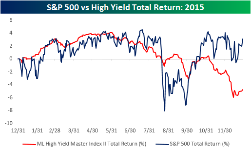
Dec 30, 2015
In today’s Chart of the Day, we take a look at the diverging performance of high yield and the S&P 500 in 2015 and what it implies for 2016.
To continue reading our Chart of the Day, enter your info below and start a free Bespoke research trial. During your trial, you’ll also receive access to our model stock portfolios, daily market alerts, and weekly Bespoke Report newsletter.
[thrive_leads id=’59052′]
Dec 29, 2015
In today’s Chart of the Day, we take a look at Facebook and make recommendation for a trade.
To continue reading our Chart of the Day, enter your info below and start a free Bespoke research trial. During your trial, you’ll also receive access to our model stock portfolios, daily market alerts, and weekly Bespoke Report newsletter.
[thrive_leads id=’59052′]
Dec 28, 2015
In today’s Chart of the Day, we compare the percentage of days where our Economic Indicator Diffusion Index was positive in 2015 to the percetnage in prior years.
To continue reading our Chart of the Day, enter your info below and start a free Bespoke research trial. During your trial, you’ll also receive access to our model stock portfolios, daily market alerts, and weekly Bespoke Report newsletter.
[thrive_leads id=’59052′]
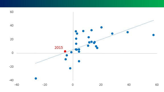
Dec 24, 2015
In today’s Chart of the Day. we compared the performance of two asset classes that typically move in the same direction but have diverged in 2015. In fact, this year’s divergence is only the third time in the last 25+ years that the two asset classes have moved in opposite directions. To find out which asset classes this scatter-chart is comparing sign up for a free trial. Merry Christmas!
To continue reading our Chart of the Day, enter your info below and start a free Bespoke research trial. During your trial, you’ll also receive access to our model stock portfolios, daily market alerts, and weekly Bespoke Report newsletter.
[thrive_leads id=’59052′]
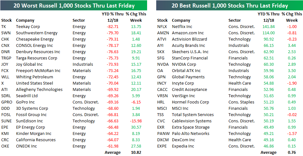
Dec 23, 2015
What’s driving the market higher this week? It surely isn’t 2015’s leaders. No — instead it’s all of the beaten down names that have gotten crushed this year that are rallying. We took a closer look at this week’s trend in today’s Chart of the Day.
To continue reading our Chart of the Day, enter your info below and start a free Bespoke research trial. During your trial, you’ll also receive access to our model stock portfolios, daily market alerts, and weekly Bespoke Report newsletter.
[thrive_leads id=’59052′]