Chart of the Day: Some Off The Radar IPOs
In a CNBC segment yesterday, Bespoke’s Paul Hickey discussed a recent analysis we did of high flying IPOs and how they compared to other hot IPOs from the past. If you did not see the segment, you can see it via this link. While it is hard to purchase a recent IPO that has already more than tripled in just a few months, we looked through the charts of all relatively new IPOs and found a number of interesting charts. Unfortunately, many of these new issues are in the biotech sector and have little in the way of current or future earnings at this point. Therefore, unless you have some intimate knowledge of the specific treatment the company produces, it’s hard to make an informed decision.
In today’s Chart of the Day, which was sent to paid subscribers, we highlighted three non-biotech off the radar IPOs that looked interesting from both a technical and fundamental perspective. Interestingly, each of the three names also stands to benefit from a major demographic shift taking place within the US population. To see the full report, start a two-week free trial to our premium research product below.
Chart of the Day: 2015’s Losers Shine
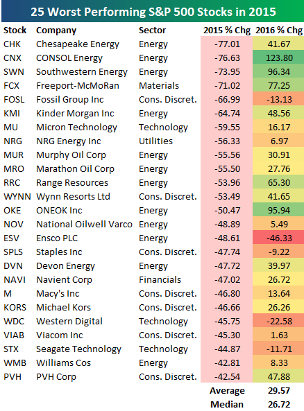 At right is a table showing the 25 worst performing S&P 500 stocks in 2015 and how they have performed so far in 2016. As shown, these stocks which fell sharply in 2015 are up an average of nearly 30% so far this year. Chesapeake Energy (CHK) was the worst performing stock in 2015, and it’s up 41.67% this year. CONSOL Energy (CNX) fell essentially the same amount as CHK in 2015, and it’s up 123.80% in 2016. Other Energy stocks like Southwestern (SWN), Kinder Morgan (KMI), Range Resources (RRC), and ONEOK (OKE) also saw big losses in 2015 only to turn it around this year.
In today’s Chart of the Day, which was sent to paid subscribers, we further analyzed stock performance in 2015 to see what impact it has had on performance in 2016. The results suggest that 2016 has signaled a new “leg” of the current bull market that we’ve been in since early 2009. To see the full report, start a two-week free trial to our premium research product below.
Chart of the Day: Herman Miller (MLHR) Breakout
This content is for members onlyChart of the Day – Volume, Like Paint, Drying Up
 In many ways, the last few weeks for the market have been like watching paint dry, as volatility has been non-existent. Given it’s August, this is the way it normally is, so we aren’t complaining. Along with the lack of volatility, volume has really dried up as well. In fact, the last time that we had an above average volume day in the S&P 500 tracking ETF (SPY) was on July 15th. That’s 25 straight days of below average volume.
In today’s Chart of the Day, which was sent to paid subscribers, we looked at prior periods where volume in SPY was below average for at least 25 trading days and then provided an analysis of the ETF’s returns going forward. To see the report, please start a 14-day free trial to Bespoke’s paid research below.
Chart of the Day – Nasdaq Losing Streaks Take the Summer Off
 There have been no shortage of memorable moves in the market this summer, but one that ranks up there concerns the Nasdaq. Since the two-day 6.5% decline following the Brexit vote in late June, the Nasdaq has gone 37 trading days now without posting back to back daily declines. In the Nasdaq’s history dating back to 1971, there have only been seven other periods where the Nasdaq went longer than 35 trading days without back to back declines and the current streak of 37 ranks as the longest since December 2004! If the Nasdaq can go three more trading days without a two-day losing streak, it will be the longest streak since 1978!
In today’s Chart of the Day, which was sent to paid subscribers we looked at prior periods where the Nasdaq went a similar amount of time without a two-day losing streak and calculated the index’s returns going forward. To see the report, please start a 14-day free trial to Bespoke’s paid research below.