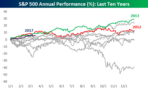
 It’s hard to believe that we’re already fifty trading days into the year, meaning that 2017 is already just about 20% in the books. The best way to characterize 2017? We’d say “so far, so good.” With a gain of 6.5%, 2017 ranks as the third best start to a year in the last ten years, behind both 2012 and 2013, and in both of those years, the index finished the year higher than it was on 3/15. Today, we wanted to take this one step further and look at past years that started off looking the most similar to 2017.
To that end, as we do throughout the year, we analyzed years where the S&P 500’s closing prices had the greatest correlation to the closing prices so far in 2017. Then, for each year, we provided a summary including the correlation coefficient between closing prices for that year to the S&P 500 YTD through 3/15, how the S&P 500 performed YTD in each year through 3/15, and then how the index performed over the remainder of the year, including maximum gains and losses from the 3/15 closing level.
While history doesn’t always repeat itself exactly, patterns in the market have a way of repeating themselves, which makes this analysis extremely interesting as well as useful. To see the report, sign up for a monthly Bespoke Premium membership now!
