Aug 11, 2025
See what’s driving market performance around the world in today’s Morning Lineup. Bespoke’s Morning Lineup is the best way to start your trading day. Read it now by starting a two-week trial to Bespoke Premium. CLICK HERE to learn more and start your trial.
“As I grow older, I pay less attention to what men say. I just watch what they do.” – Andrew Carnegie

Below is a snippet of commentary from today’s Morning Lineup. Start a two-week trial to Bespoke Premium to view the full report.
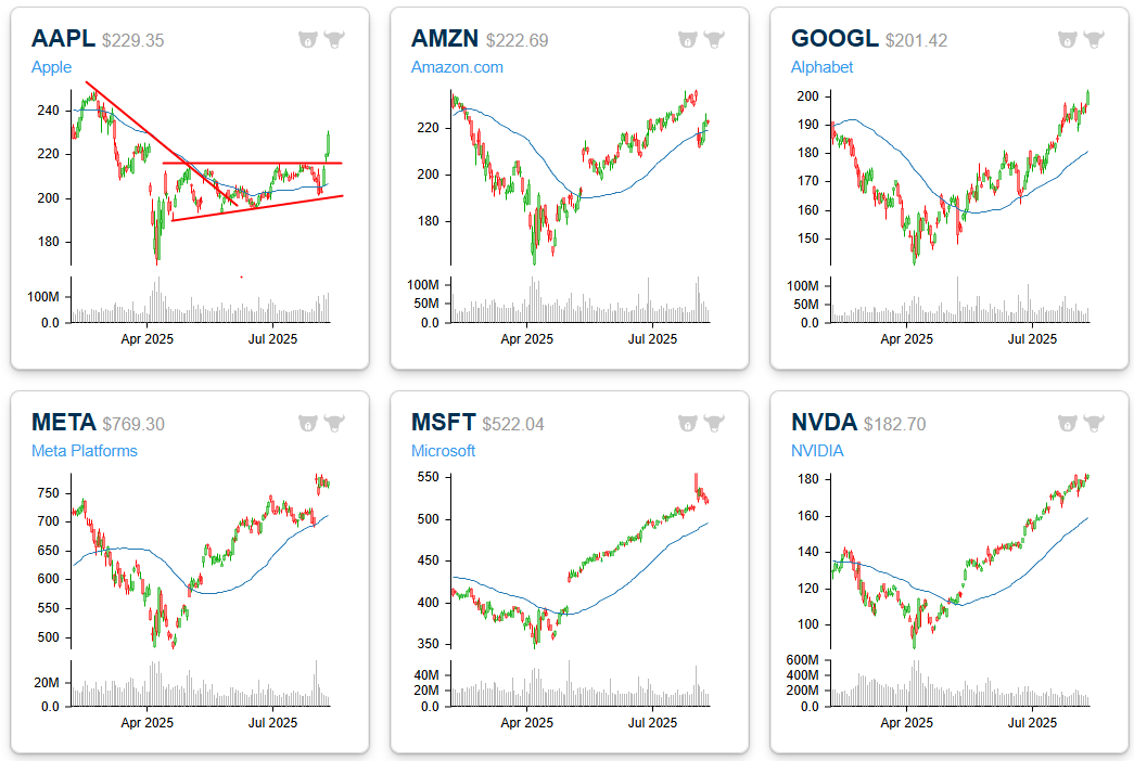
Below are six-month price charts of the mega-caps. A few months ago, pretty much all of these charts were in downtrends, but now that Apple (AAPL) has recovered and broken above resistance, all six look to be trending higher.
Aug 8, 2025
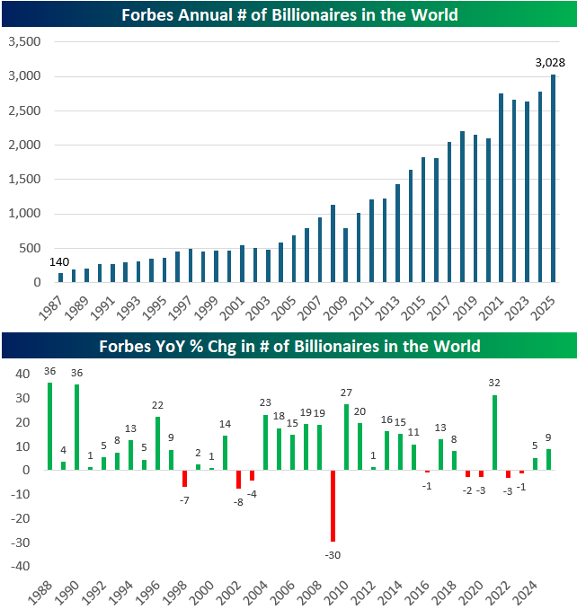
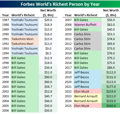
The growth in the number of billionaires over the past four decades is nothing short of extraordinary. Back in 1987, Forbes counted just 140 billionaires globally. As of 2025, that number has surged to a staggering 3,028, a 21x increase. This rise has been largely consistent, interrupted only during periods of financial turbulence. The Dot Com crash in the early 2000s and the Great Financial Crisis in 2009 triggered sharp declines, including a record 30% drop in 2009. More recently, 2022 and 2023 saw modest pullbacks in billionaire numbers, reflecting broader market volatility. But the trend remains unmistakable: billionaire status is becoming more common in an increasingly capital driven world.
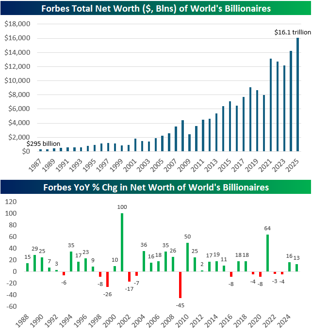
While the number of billionaires has soared, their collective net worth has grown even faster. In 1987, the global billionaire club was worth a combined $295 billion. Today, their net worth has ballooned to $16.1 trillion, more than a 50x increase. The 2009 crash wiped out nearly half of billionaire wealth (-45%), but recoveries have been swift and powerful. For instance, in 2021 alone, billionaire net worth rose by a massive 64% as markets roared back from COVID lows. Even in recent years, with inflation, rate hikes, and geopolitical stress, total billionaire wealth has continued to grow, up 13% in 2024 and another 16% in 2025. It’s clear that the billionaire class not only survives economic storms, it often thrives in their aftermath.
Tracking the richest person in the world each year offers a fascinating glimpse into broader economic and technological trends. The late 1980s and early 1990s were dominated by Japanese real estate moguls like Yoshiaki Tsutsumi and Taikichiro Mori, reflecting Japan’s then-surging property boom. But by the mid-1990s, Bill Gates took over and stayed on top for 13 out of 14 years, riding the explosive growth of Microsoft and the personal computing revolution.
The 2010s saw Carlos Slim ascend amid the rise of telecom and infrastructure in emerging markets. But the real shift came with the tech titans of the 2010s and 2020s: Jeff Bezos led the way during Amazon’s global expansion, and Elon Musk rocketed to the top during the EV and space boom, now commanding a mind-bending $342 billion fortune. The occasional lead by Bernard Arnault, representing luxury goods via LVMH, shows how wealth today isn’t just tech-driven, it’s increasingly global, diversified, and tied to brand power, scale, and platforms.

Aug 8, 2025
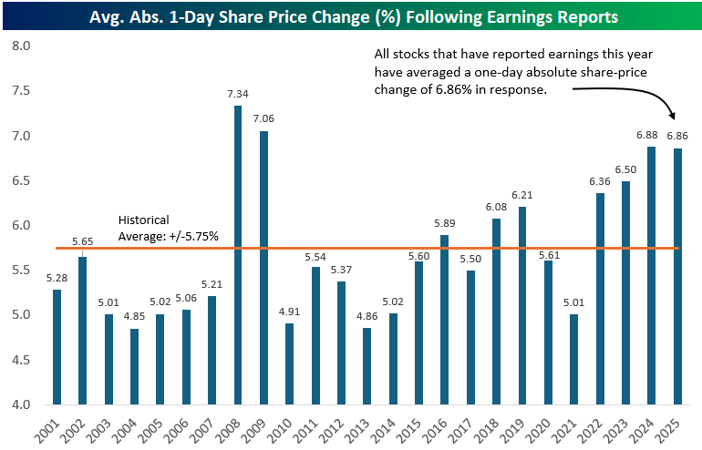
The average stock that has reported earnings this week (more than 600 companies) has seen a one-day share price reaction of more than +/-8.5% (absolute change). That’s much higher than the 20+ year average absolute move of 5.75% that US-traded stocks have historically experienced on their earnings reaction days. (What this means is that in modern markets, the average stock can expect to see a one-day move of +/-5.75% once per quarter following its earnings release. Yes, a large portion of a stock’s move over its lifetime comes from the one trading day each quarter after it reports earnings.)
Notably, stocks have been getting more volatile on their earnings reaction days in recent years. Below is a chart showing the average one-day absolute percentage change that stocks saw in reaction to earnings by year going back to 2001 using our Earnings Explorer tool. (We find this tool extremely useful, and it’s available with a Bespoke Institutional subscription if you’d like to try it out.)
In the early 2000s before the Financial Crisis, investors could expect the average stock to move a little over +/-5% on its quarterly earnings reaction day. The average move on earnings then spiked to record levels above +/-7% during the Financial Crisis when overall market volatility increased dramatically and investors sold everything like their life depended on it for a couple of years.
From 2010 to 2015, things settled down again and the average stock once again moved about +/-5% on earnings. Since 2015, however, we’ve seen a general uptrend in earnings-day volatility for stocks. In 2018, the average move on earnings ticked back above +/-6% for the first time since the Financial Crisis. Aside from a random dip back down to 5% in 2021, daily vol on earnings has ticked higher and higher back up near 7% in 2024 and 2025. So far this year, the average stock that has reported has seen a one-day move of +/-6.86%.
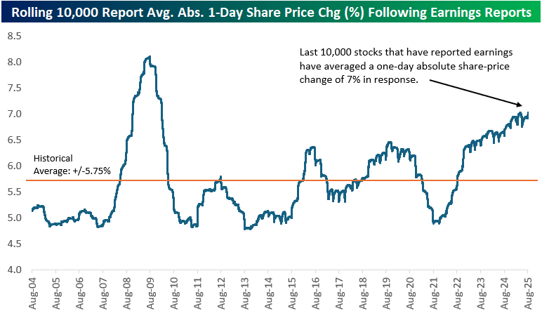
Another way to chart long-term earnings-day volatility is to look at the rolling 10,000-earnings report average one-day move for US stocks that have reported since 2001. Each point on the blue line in the chart below shows the average one-day change on earnings that the prior 10,000 stocks reporting have experienced.
Interestingly, the spike in earnings vol during the Financial Crisis came during a nasty bear market when equities were drawing down sharply for more than a year. The recent move higher has come during a period when US equities have been in an uptrend for multiple years.
In the current day and age of easy, commission-free trading on brokerage apps available right on your smartphone, share-price volatility in reaction to stock-specific earnings news has moved increasingly higher. At the same time, overall market volatility hasn’t seen a similar increase, which means that more and more of a stock’s overall performance is coming from the one trading day per quarter when it posts its financial results and forward guidance.
You can try out our Earnings Explorer and all of the other unique investor tools shown in the snapshot below by starting a trial to Bespoke Institutional. Click here to start a trial today!
Aug 7, 2025
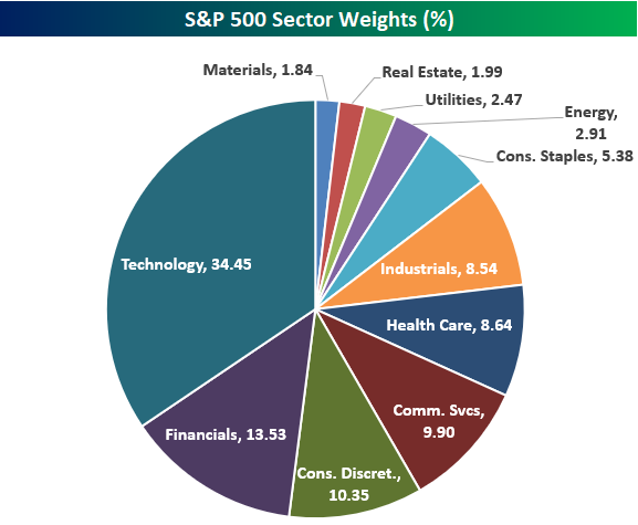
The Technology sector now has a weighting of 34.45% in the S&P 500, which is basically near record-highs only seen at the peak of the Dot Com Bubble in early 2000. Below is a pie chart showing current S&P 500 sector weights. Tech’s weighting is now more than 20 percentage points higher than Financials (13.53%), which is the second largest sector in the index.
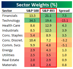
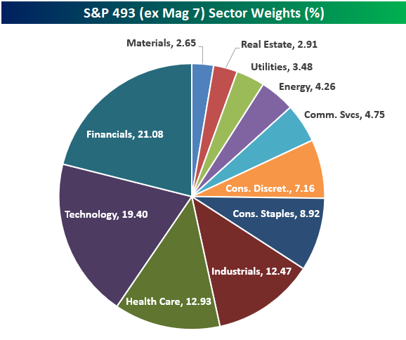
Things look significantly different if we remove the mega-cap Mag 7 stocks (AAPL, AMZN, META, MSFT, NVDA, TSLA) and only look at the “S&P 493.” As shown in the table and pie chart below, Tech is no longer the largest sector when looking at the S&P 500 ex Mag 7. Financials actually takes the top spot with a 21.1% weighting in the S&P 493. Tech moves down to second with a weighting of 19.4%, followed by Health Care (12.9%) and Industrials (12.5%) in third and fourth. Consumer Discretionary and Communication Services also become quite a bit smaller when looking at their weightings in the S&P 493. Consumer Discretionary is the 3rd largest sector in the S&P 500 at 10.4%, but it ranks as just the 6th largest in the S&P 493 at 7.2%. Communication Services sees an even bigger drop when going from the S&P 500 to S&P 493, falling from 9.9% down to 4.8%.
On the flip side, Consumer Staples jumps from the 7th largest sector in the S&P 500 to the 5th largest sector when looking at the S&P 500 ex Mag 7. Similar to how large-cap valuations look a lot less excessive when removing the Mag 7 from the equation, sector weightings also become a lot more balanced.
Aug 6, 2025
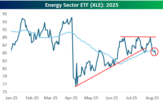
While some sectors like Tech (XLK) and Consumer Discretionary (XLY) are rallying sharply today, Energy (XLE) is going in the opposite direction with a decline of 1%.
The chart for the Energy sector doesn’t look so hot. As shown below, XLE recently made a triple top just below resistance from the Q1 highs, broke below the bottom of its uptrend channel, and now it’s back below its 50-day moving average.
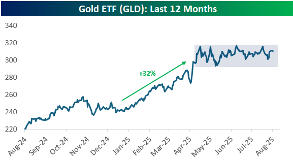
Another chart we thought looked interesting was the gold ETF (GLD). After a huge rally in the first few months of 2025, GLD has stalled out since early April. This looks like a classic “consolidation” pattern after a big move higher. At some point, it will break out of this sideways range and either start another leg higher or start breaking down.