Nov 2, 2025
With just two months left in the year, it’s time to update our asset class performance matrix and highlight the best and worst performing stocks year-to-date.
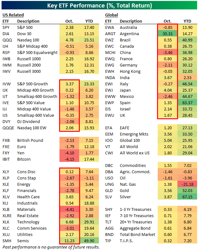
Below is a look at total returns across a range of ETFs both year-to-date and during the month of October.
October was a month dominated by the mega-caps, as they pushed large-cap ETFs like SPY, DIA, and QQQ solidly green, while the equal-weight ETF (RSP) and mid-caps actually fell. Small-cap growth (IJT) and value (IJS) were also red, along with the Dow Jones Dividend ETF (DVY).
Across sectors, more fell in October (6) than rose (5), with Technology (XLK) and Health Care (XLV) the only two big areas of strength.
Outside the US, Argentina (ARGT) rose 35% in October after President Milei’s party maintained control in elections. China (MCHI), Germany (EWG), and Mexico (EWW) were the three worst country ETFs in our matrix during October.
On a year-to-date basis, large-cap domestic ETFs are sitting on solid gains of 15-20%, and the Semis ETF (SMH) is up a whopping 49.9%. Silver (SLV), gold (GLD), and Spain (EWP) are the three best performers in the entire matrix so far in 2025 with 50%+ returns.
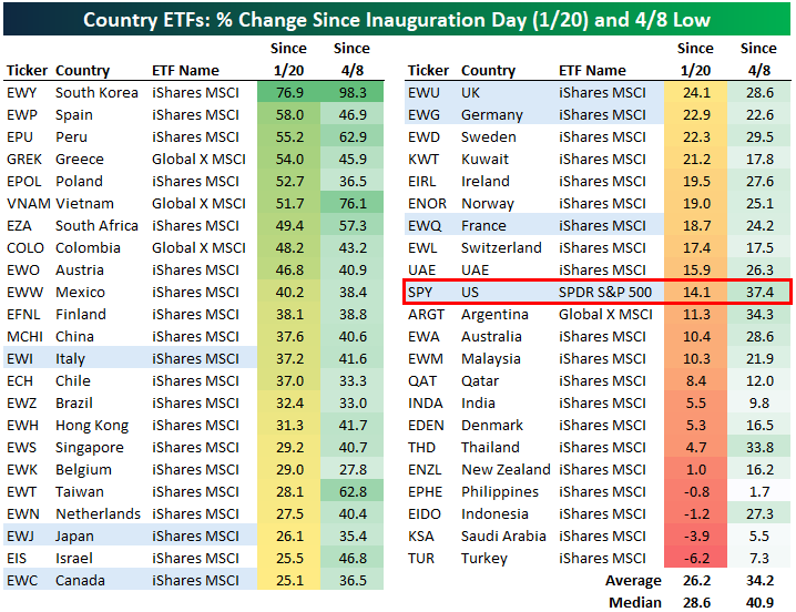
Below is an updated look at performance across a more expansive list of country ETFs since President Trump’s 2nd term began as well as since the “tariff tantrum” lows on April 8th.
The average country ETF is up 34.2% since 4/8 and 26.2% since Trump’s Inauguration on 1/20. The US (SPY) is slightly outperforming since the 4/8 low, but it’s underperforming since Inauguration Day with a gain of 14.1%.
South Korea (EWY), Spain (EWP), Peru (EPU), Greece (GREK), Poland (EPOL), and Vietnam (VNAM) have been the best performers since Trump’s 2nd term began with gains of more than 50%.
There are just four country ETFs in the red since Inauguration Day (Philippines – EPHE, Indonesia – EIDO, Saudi Arabia – KSA, and Turkey – TUR), and every single country ETF is positive since the tariff tantrum low on 4/8.
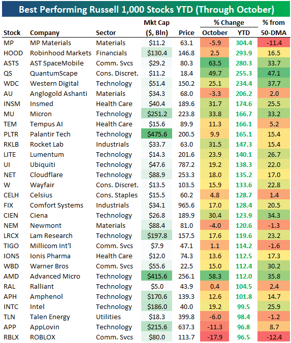
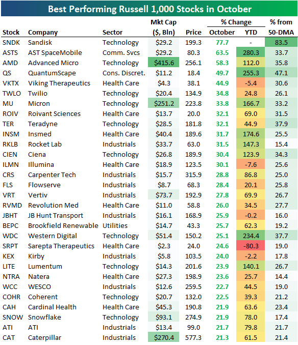
The average stock in the large-cap Russell 1,000 is up 9% year-to-date even though it fell 1% in October.
The tables below show the 30 best and worst performing stocks in the index both year-to-date and in October.
There are 26 stocks in the index up more than 100% year-to-date, along with six that are up 200%, and one that’s up 300%. MP Materials (MP) ranks first with a YTD gain of 304.4%, followed by Robinhood (HOOD), AST SpaceMobile (ASTS), QuantumSpace (QS), and Western Digital (WDC).
Other notables on the list of 100%+ gainers this year include Micron (MU), Palantir (PLTR), Cloudflare (NET), Wayfair (W), Celsius (CELH), Warner Bros (WBD), Advanced Micro (AMD), Intel (INTC), AppLovin (APP), and ROBLOX (RBLX).
In October, Sandisk (SNDK) was up the most with a gain of nearly 78%, followed by AST SpaceMobile (ASTS) and Advanced Micro (AMD). Other notable winners in October include Twilio (TWLO), Rocket Lab (RKLB), Ciena (CIEN), Vertiv (VRT), JB Hunt (JBHT), Natera (NTRA), and Caterpillar (CAT).
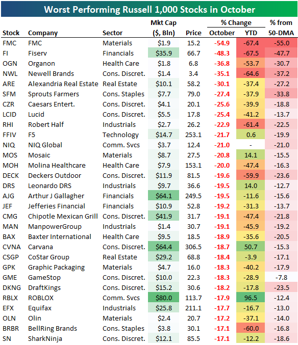
On the flip side, FMC was the worst performing Russell 1,000 stock in October with a decline of 54.9%. Fiserv (FI), Organon (OGN), and Newell Brands (NWL) each fell more than 35% as well.
Some of the biggest names on the list of October losers include Chipotle (CMG), Carvana (CVNA), and ROBLOX (RBLX). RBLX is on the list of October’s biggest losers even though it’s also on the list of 2025’s biggest winners.
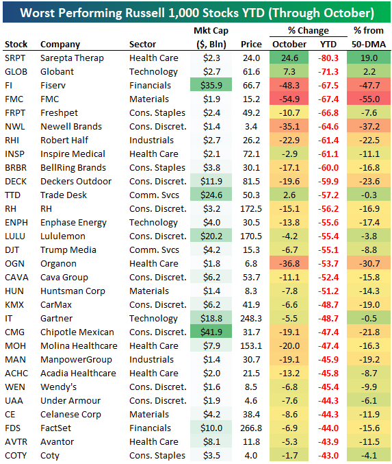
Even though it has been a strong year for major cap-weighted US indices, 44.4% of stocks in the Russell 1,000 are in the red on the year. Below are the year’s biggest decliners thus far. W
You won’t find many “AI” names on this list…
Not a Bespoke client? We’d love for you to give our equity research platform, Bespoke Premium, a try. You can sign up for complimentary access for 14 days at this link to start receiving our daily emails today!

Oct 28, 2025
The following is an in-depth analysis of tightening liquidity in the repo and Fed Funds markets that was included in our post-market macro note, The Closer, on 10/27/25. Start a trial here to receive our Closer in your inbox daily for the next two weeks!
One area of interest for the FOMC this week that has little to do with the economy or the lack of data due to the government shutdown is the rapid evaporation of liquidity over the past few months. For the purposes of this discussion, when we say “liquidity” we mean sufficient supplies of liquid assets in the repo market and Fed Funds market to keep rates on the target set by the FOMC.
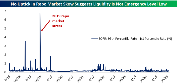
To illustrate, below we show the spread between the midpoint of the Fed Funds target range and market repo rates captured by the Secured Overnight Funding Rate (SOFR) benchmark that replaced LIBOR. SOFR is volume-weighted median repo rate and includes both tri-party repo where large batches of securities are financed via a clearing bank and delivery-versus-payment transactions which can reference general collateral or specific issues. It’s a comprehensive snapshot of repo markets and the rates they charge.
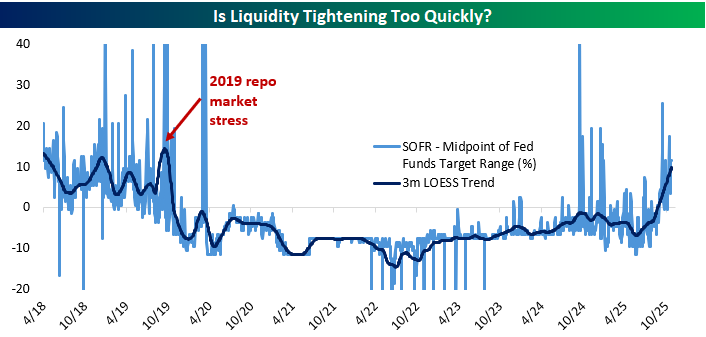
This spread is quite volatile, so we show it with a LOESS trend, a form of regression designed to isolate the central tendency of a series with respect to time. Think of it as a fancier version of a moving average. As shown above, while there were some spikes in the spread last fall, the trend never moved above zero and was well below its current range (around 10 bps above the midpoint). Since the start of September, there have been four different days when SOFR printed above the Fed Funds target range ceiling.
As for the trend, it’s now the highest since the fall of 2019 when repo rates surged thanks to excess runoff during the quantitative tightening program of the time. If repo were to print consistently above the Fed Funds target range, it would represent a failure of monetary policy to control short-term interest rates, which would be a huge problem for implementation of monetary policy.
The good news is that the financial system looks less desperate for liquidity now than it did then. For example, the spread between 99th percentile (highest) and 1st percentile (lowest) rates in the SOFR distribution has not risen dramatically as it did during that fall 2019 stress period.
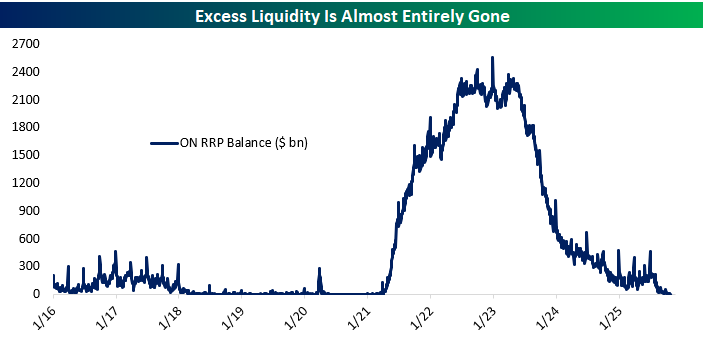
We’ve been noting the steady decline in the volume of excess reserves (proxied by the uptake for the Fed’s overnight reverse repo facility or ON RRP, which sterilizes excess liquidity from the financial system) for some time now.
As shown in the chart below, the balance in that facility has fallen steadily but it remains a few billion dollars above zero; in other words, there is still some excess liquidity in pockets that is being deposited with the NY Fed via this repo tool. On the other hand, quantitative tightening was slowed by the FOMC earlier this year in part because liquidity has evaporated faster than expected.
The concern is that they will accidentally roll off too many securities, starving the financial system of liquidity since security assets of the Fed are funded by the reserve liabilities which underpin liquidity conditions.
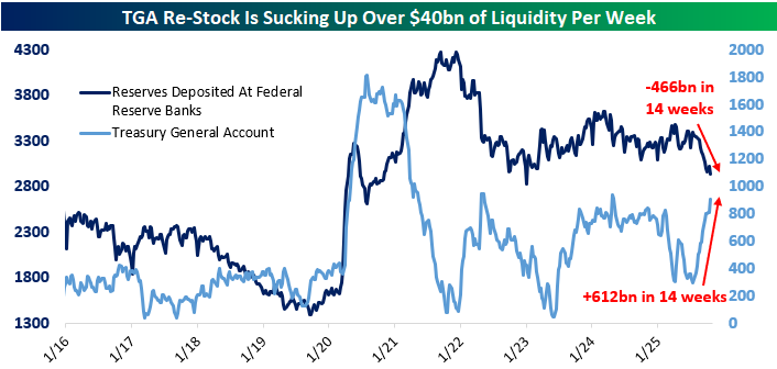
In addition to rolloff, the more acute driver right now has been the surge in the Treasury General Account. After passage of the OBBB this past summer, the debt limit was raised which allowed Treasury to rebuild its cash position (the TGA is effectively Treasury’s checking account). As shown below, it’s risen by over $600bn in the past three months.
Since the TGA is a liability of the Fed, assuming no change in Fed assets (and because of rolloff they are actually declining right now) increases in the TGA reduce liquidity elsewhere. Reserve assets of banks have fallen by over $450bn in the same period, illustrating the reduction of liquidity thanks to the changing composition of the Fed’s balance sheet.
In addition to rolloff and the TGA balance rising, we also note that banks are illustrating a very strong preference to hold reserves in recent years.
Reserves as a share of assets surged from 2008 to 2014 as QE created reserves that banks had to hold (as no other entities can hold them by law). The QE asset swap (which converts private sector holdings of bonds to holdings of deposits, with banks matching those deposit liabilities with reserve assets and the Fed matching reserve liabilities with security assets) meant reserves soared as a share of bank assets.
QT during the late 2010s drove down the share, but ultimately it bottomed (and created liquidity issues) at much higher levels than pre-crisis. That elevated reserve asset allocation by banks was driven mostly by post-GFC regulation which required greater liquidity in bank assets; reserves are by far the most liquid asset available. Another round of QE during COVID drove bank reserves as a share of assets back up again, but they’ve since stayed stable around 13% instead of falling to single digits.
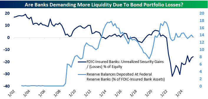
That may be in part because banks are sitting on significant paper losses in bond portfolios purchased during the COVID stimulus. As shown above, at their peak, unrealized losses were almost one-third of banking system equity capital. As rates have stopped rising and bonds have amortized, unrealized losses have declined. But in the meantime, bank treasury managers appear to be keeping holdings of reserves elevated in order to offset the risk that a need for liquid assets could force sales of bonds.
In other words, banks are holding more cash (reserves) than they otherwise might so they don’t have to book losses by selling bonds marked far above market prices, which would reduce the book value of equity. Over time, those underwater bonds will amortize down and asset growth will reduce their relevance, which is what has happened since 2021. But while that process plays out demand for reserves will remain inflated and combined with QT and the TGA rebuild liquidity conditions are tight as a result.
Taken together, we would not be surprised to see the FOMC halt QT in aggregate (while continuing to shift composition of the balance sheet away from mortgage bonds and towards Treasuries, a process which should not have a significant effect on liquidity conditions).
On the other hand, there is an insurance policy: since 2019, the FOMC has stood up an equivalent to the ON RRP designed to automatically provide liquidity via repo markets rather than remove it. So far that tool has not been used and Fed repo assets (provision of liquidity to the financial system via repo) has been negligible. Either way, expect some questions about liquidity for Chair Powell and in the minutes to this meeting when they are released at a lag.
One final note. This evolving liquidity backdrop makes Dallas Fed President Lorie Logan’s September 25 speech (link) calling to move the policy target from the Fed Funds rate to a repo rate all the more interesting. While this doesn’t seem likely to happen soon, it’s a good example of how liquidity management is constantly evolving.
Start a Bespoke Institutional trial here to receive our post-market macro note, The Closer, in your inbox each day for the next two weeks!
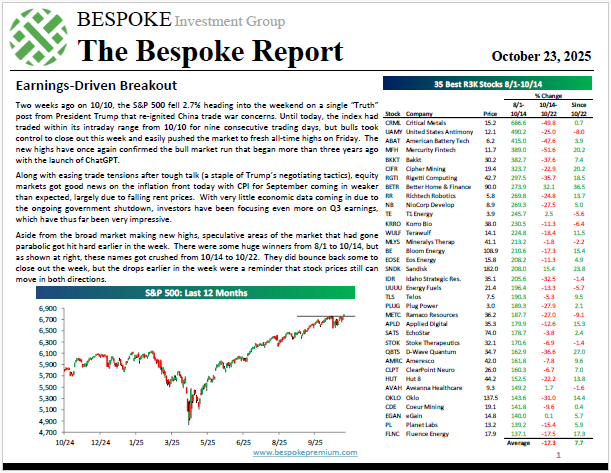
Oct 23, 2025
The “Bespoke 50” is a basket of noteworthy growth stocks in the Russell 3,000. To make the list, a stock must have strong earnings growth prospects along with an attractive price chart based on Bespoke’s analysis. There were 11 changes to the list this week.
The Bespoke 50 is available with a Bespoke Premium subscription or a Bespoke Institutional subscription. With Bespoke Premium, you’ll receive a number of daily market updates from us along with our weekly newsletter and a portion of our investor tools. With Bespoke Institutional, you’ll receive everything that’s included with Premium plus additional daily macro analysis and more stock-specific research.
To see all 50 stocks that currently make up the Bespoke 50, simply start a two-week trial to Bespoke Premium or Bespoke Institutional.
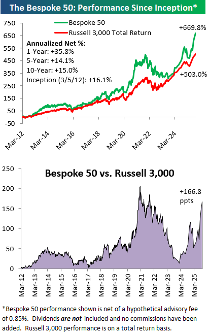
The Bespoke 50 performance chart shown does not represent actual investment results. The Bespoke 50 is updated monthly on Thursdays unless otherwise noted. Performance is based on equally weighting each of the 50 stocks (2% each) and is calculated using each stock’s opening price as of Friday morning after publication. Entry prices and exit prices used for stocks that are added or removed from the Bespoke 50 are based on Friday’s opening price. Any potential commissions, brokerage fees, or dividends are not included in the Bespoke 50 performance calculation, but the performance shown is net of a hypothetical annual advisory fee of 0.85%. Performance tracking for the Bespoke 50 and the Russell 3,000 total return index begins on March 5th, 2012 when the Bespoke 50 was first published. Past performance is not a guarantee of future results. The Bespoke 50 is meant to be an idea generator for investors and not a recommendation to buy or sell any specific securities. It is not personalized advice because it in no way takes into account an investor’s individual needs. As always, investors should conduct their own research when buying or selling individual securities. Click here to read our full disclosure on hypothetical performance tracking. Bespoke representatives or wealth management clients may have positions in securities discussed or mentioned in its published content.