Nov 28, 2025
The “Bespoke 50” is a basket of noteworthy growth stocks in the Russell 3,000. To make the list, a stock must have strong earnings growth prospects along with an attractive price chart based on Bespoke’s analysis. There were 7 changes to the list this week.
The Bespoke 50 is available with a Bespoke Premium subscription or a Bespoke Institutional subscription. With Bespoke Premium, you’ll receive a number of daily market updates from us along with our weekly newsletter and a portion of our investor tools. With Bespoke Institutional, you’ll receive everything that’s included with Premium plus additional daily macro analysis and more stock-specific research.
To see all 50 stocks that currently make up the Bespoke 50, simply start a two-week trial to Bespoke Premium or Bespoke Institutional.
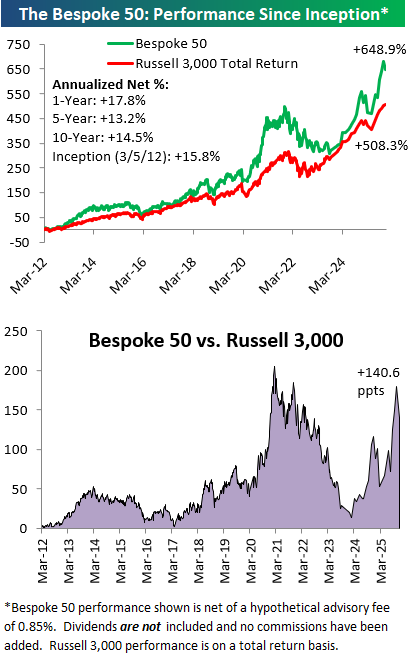
The Bespoke 50 performance chart shown does not represent actual investment results. The Bespoke 50 is updated monthly on Thursdays unless otherwise noted. Performance is based on equally weighting each of the 50 stocks (2% each) and is calculated using each stock’s opening price as of Friday morning after publication. Entry prices and exit prices used for stocks that are added or removed from the Bespoke 50 are based on Friday’s opening price. Any potential commissions, brokerage fees, or dividends are not included in the Bespoke 50 performance calculation, but the performance shown is net of a hypothetical annual advisory fee of 0.85%. Performance tracking for the Bespoke 50 and the Russell 3,000 total return index begins on March 5th, 2012 when the Bespoke 50 was first published. Past performance is not a guarantee of future results. The Bespoke 50 is meant to be an idea generator for investors and not a recommendation to buy or sell any specific securities. It is not personalized advice because it in no way takes into account an investor’s individual needs. As always, investors should conduct their own research when buying or selling individual securities. Click here to read our full disclosure on hypothetical performance tracking. Bespoke representatives or wealth management clients may have positions in securities discussed or mentioned in its published content.
Nov 26, 2025
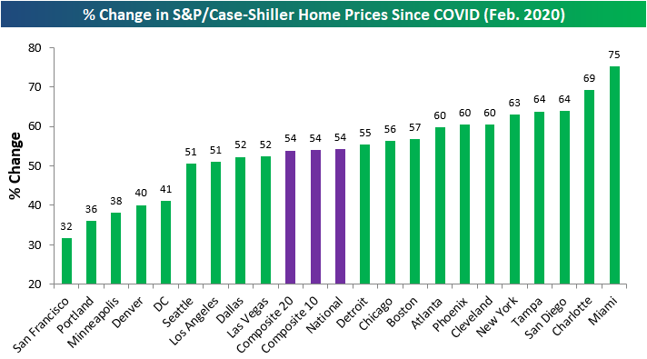
Home price data from S&P Cotality for September was posted this week and showed that not one of the twenty cities tracked by Case Shiller saw a month-over-month gain. Tampa, Seattle, and San Diego saw the biggest monthly drops, while Detroit and Cleveland were down the least.
Below is a table showing home price movements over various time frames for the twenty cities tracked along with the national and composite indices.
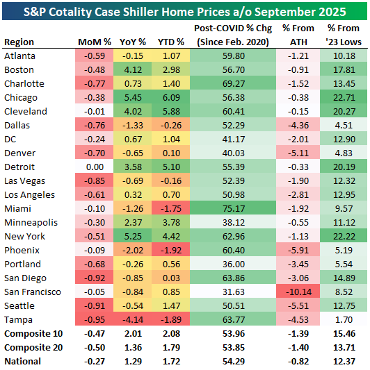
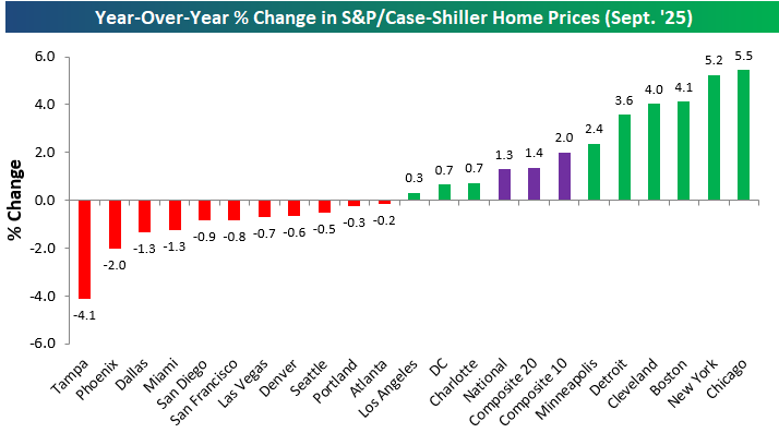
Over the last year, gains and losses are split roughly 50/50 across the country. East coast and mid-west cities like Chicago, New York, Boston, Cleveland, and Detroit are all up 4%+ over the last year, while home prices in Tampa, Phoenix, Dallas, and Miami are down the most with drops of more than 1%.
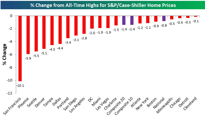
A year or so ago, nearly every city tracked by Case Shiller was sitting at record highs, but now there’s not one city that hasn’t seen at least a small drop from all-time highs.
As shown below, San Francisco home prices are in the biggest drawdown at -10.1%, followed by Phoenix (-5.9%), Seattle (-5.5%), and Denver (-5.1%).
While prices have begun to dip a bit, they’re still up massively since February 2020 just before COVID hit. The composite indices tracking the entire country are still up more than 50% since COVID, while Miami, Charlotte, San Diego, Tampa, and New York are up the most at more than 60%.
The cities where home prices are up the least versus February 2020 levels are San Francisco, Portland, Minneapolis, Denver, and DC, but even these cities are still up more than 30%.
Not a Bespoke client? We’d love for you to give our equity research platform, Bespoke Premium, a try. You can sign up for complimentary access for 14 days at this link to start receiving our daily emails today!

Nov 26, 2025
Amid the ups and downs of the past year including the “tariff crash” in April, the US stock market has still posted a double-digit total return since last Thanksgiving.
Below is a look at the performance of various asset classes since the close before last Thanksgiving using key ETFs traded on US exchanges.
The Tech-heavy Nasdaq 100 (QQQ) and S&P 500 Growth (IVW) have been the best performers of the domestic index ETFs shown with gains of more than 20%.
On the flip side, mid-caps (IJH, IJJ, IJS, IJK) and small-caps (IWM, IJT, IJS) have been either flat or down over the last year.
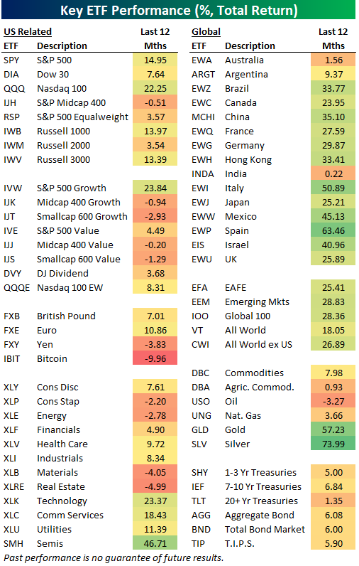
Looking at US sector ETFs, there has been quite a bit of divergence, with Consumer Staples (XLP), Energy (XLE), Materials (XLB), and Real Estate (XLRE) all in the red since last Thanksgiving, while Technology (XLK), Communication Services (XLC), and Utilities (XLU) are all up 10%+.
Aside from Australia (EWA), Argentina (ARGT), and India (INDA), the country ETFs listed in our matrix are all up 20%+ over the last year, so investors that decided to gain more exposure outside of the US have a lot to be thankful for.
The same goes for investors long the gold (GLD) and silver (SLV) ETFs. These two precious metal ETFs are up the most in our entire matrix!
On the flip side, the iShares Bitcoin ETF (IBIT) has been the worst performer in the matrix since last Thanksgiving with a decline of 9.96%. Just a month or so ago, IBIT owners had a lot to be thankful for, but after a 30% drawdown from highs, now it’s “not so much.”
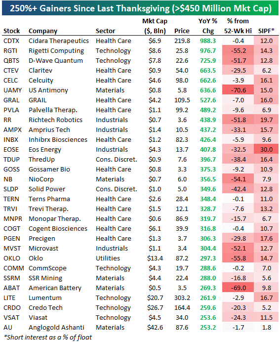
Speaking of being thankful, anyone that managed to go long the names below a year ago should probably be offering to pay for this year’s Thanksgiving turkey.
The stocks shown are Russell 3,000 names that are up more than 250% since last Thanksgiving, of which there are thirty.
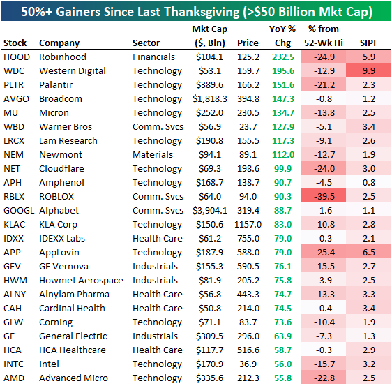
If you’re just interested in the largest, most well-known stocks, below is a list of names with market caps of $50+ billion that have done the best over the last year. There are eight that have doubled: Robinhood (HOOD), Western Digital (WDC), Palantir (PLTR), Broadcom (AVGO), Micron (MU), Warner Bros. (WBD), Lam Research (LRCX), and Newmont (NEM).
Not a Bespoke client? We’d love for you to give our equity research platform, Bespoke Premium, a try. You can sign up for complimentary access for 14 days at this link to start receiving our daily emails today!
Nov 26, 2025
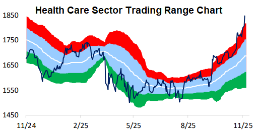
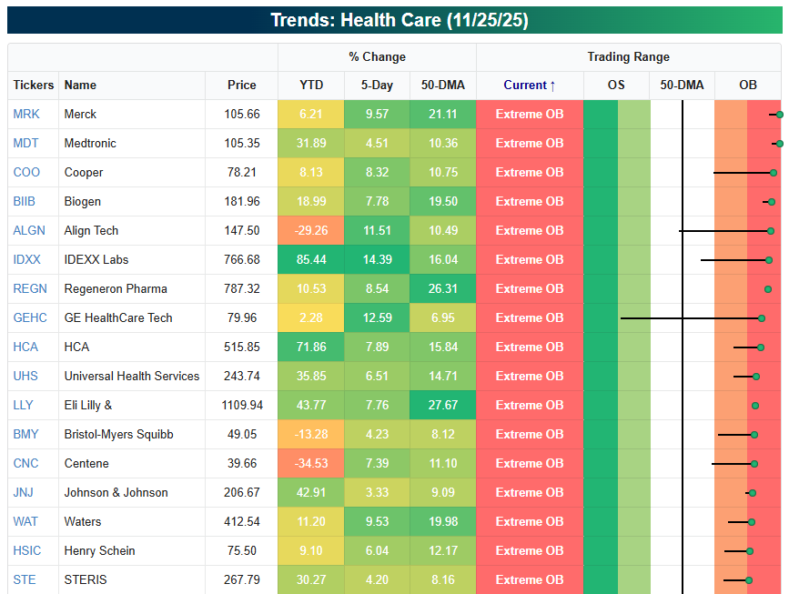
As the Tech/AI trade has hit a speed bump this month, the Health Care sector has been shot out of a cannon. At yesterday’s close, the S&P 500 Health Care sector was 10% above its 50-day moving average and 2.5 standard deviations above its 50-DMA. Check out the one-year trading range chart of the sector below:
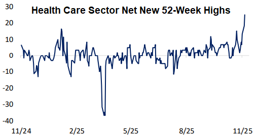
Health Care’s move in the last month has left a good chunk of the stocks in the sector at new 52-week highs. Net new 52-week highs for the sector have exploded to the highest level of the last year:
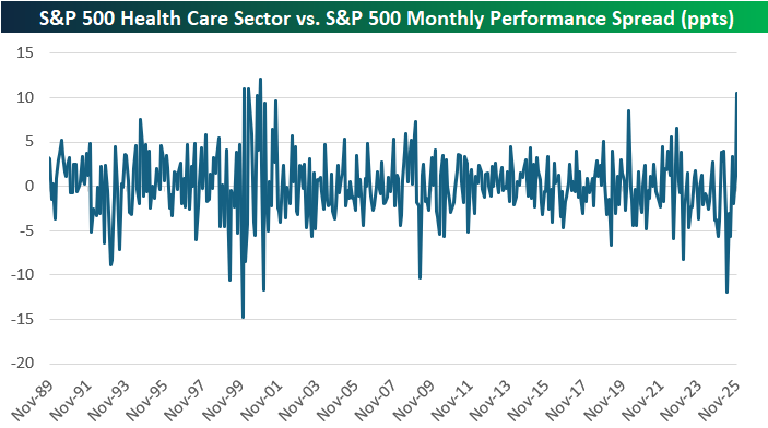
So far this month, the Health Care sector is outperforming the broad S&P 500 by more than ten percentage points. As shown below, that hasn’t happened since November 2000!
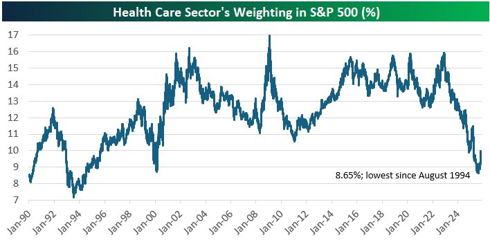
While Health Care is catching a bid these days, it’s still deep in the hole based on its action over the last couple of years. Just over two years ago, Health Care’s weighting in the S&P 500 was at 16%. By this September, its weighting had nearly been cut in half down to just 8.65%; its lowest weighting since August 1994.
Health Care’s 18% gain in the last two months has only pushed its weight in the S&P back up to 10% as of today, so there’s plenty of runway left for the sector if the good vibes continue.
Below is a look at the most extreme overbought stocks in the sector right now. Even names like Bristol Myers (BMY) and Johnson & Johnson (JNJ) have joined in on the rally.
Of course, after moves like this, most traders would tell you to wait for some downside mean reversion before jumping in on the long side.
Not a Bespoke client? We’d love for you to give our equity research platform, Bespoke Premium, a try. You can sign up for complimentary access for 14 days at this link to start receiving our daily emails today!
Nov 26, 2025
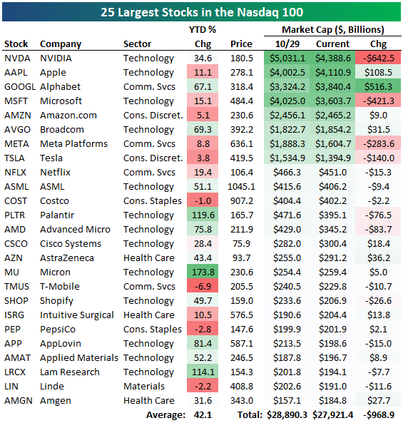
Since the Nasdaq 100 peaked on 10/29, the 25 largest stocks in the index have lost roughly $1 trillion in market cap.
Of the eight “trillion dollar companies” in the index, four have seen their market caps fall by at least $140 billion (NVDA, MSFT, META, TSLA), while the other four have actually seen their market caps increase (AAPL, GOOGL, AMZN, AVGO).
No stock has seen a bigger jump recently than Alphabet (GOOGL), whose market cap has risen by more than half of a trillion dollars since 10/29.
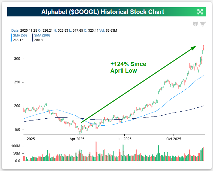
2025 has turned into the Year of Alphabet (GOOGL). It is now the best performer of the mega-caps with a 70% year-to-date gain, and it has more than doubled (+124%) since its April low. Check out the near-parabolic move that GOOGL shares have seen just in the last couple of months.
While Alphabet has recently spiked because of rave reviews for its latest LLM model (Gemini 3), GOOGL shares have actually risen for eight straight months:
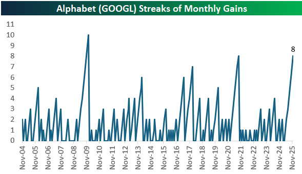
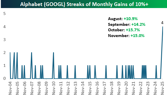
Even more remarkable is that GOOGL shares have gained more than 10% for four consecutive months, which is easily a record since it went public in 2004. (This presumes shares don’t collapse on the final trading day of November on Friday.)
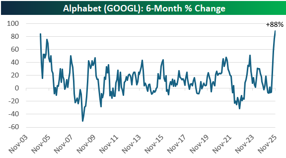
As shown below, GOOGL’s 88% gain over the last six months is its strongest six-month move in its history! An 88% move over six months is impressive for a company of any size, but it’s even more astounding for a company with a $3.8 trillion market cap.
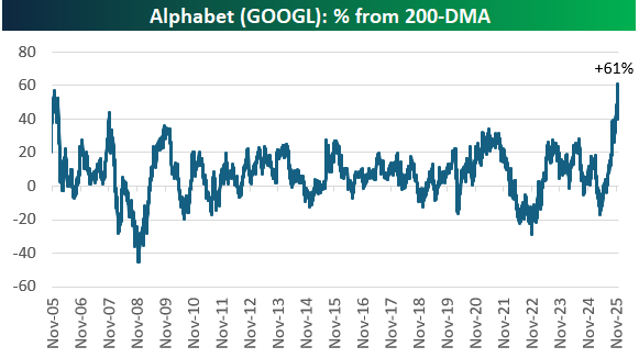
Of course, a move higher of this magnitude leaves shares extremely elevated relative to moving averages. As of yesterday, GOOGL shares were a record 61% above their 200-day moving average.
Congratulations if you’ve taken part in GOOGL’s gains this year, but most traders would say it’s too risky to take a new position in any name that gets this extended.
Not a Bespoke client? We’d love for you to give our equity research platform, Bespoke Premium, a try. You can sign up for complimentary access for 14 days at this link to start receiving our daily emails today!