Apr 18, 2017
 With most of the major financials reporting earnings within the past week, today we were looking at market cap levels for a group of stocks we’ll call the “Surviving Six” — the six big banks and brokers that suffered through but made it out of the depths of the Global Financial Crisis. The “Surviving Six” members are JP Morgan (JPM), Wells Fargo (WFC), Bank of America (BAC), Citigroup (C), Goldman Sachs (GS), and Morgan Stanley (MS).
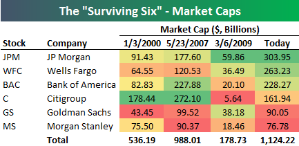
At right is a table showing market cap levels for the “Surviving Six” at various points in time dating back to the start of the year 2000. Back then, Citigroup was on top by a wide margin with a market cap of $178 billion. JP Morgan (JPM) ranked second with a market cap that was half that of Citi’s. The next date highlighted in the table is May 23rd, 2007 — the day the Financial sector saw its peak prior to the collapse. On that date, Citi was still the largest of the group, but Bank of America (BAC) had moved up to 2nd with a market cap of $227.9 billion.
The third date highlighted is March 6th, 2009 — the low point of the Financial Crisis for the sector. In less than 2 years, Citi went from a market cap of $272 billion to just $5.64 billion. But hey, at least it survived! At the lows, JP Morgan (JPM) stood in first with a market cap of $59.9 billion, while Goldman (GS) had moved up to second at $38.2 billion.
Finally, today’s market caps are shown, with JP Morgan on top at just over $300 billion. Citi now ranks 4th at $162 billion, which is roughly $16 billion less than where it stood at the start of 2000. Notably, Morgan Stanley’s market cap is almost at the exact same level it was at back in 2000. Wells Fargo has impressively moved up the ranks over the years. Back in 2000, WFC was the 2nd smallest of the bunch, but now it ranks as the 2nd largest.
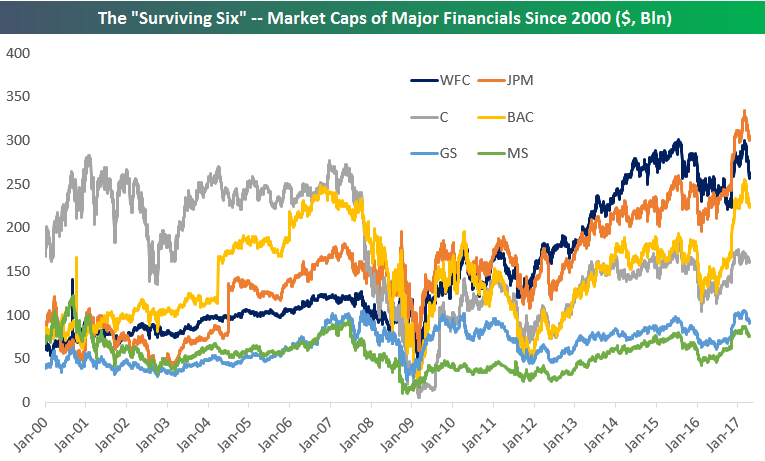
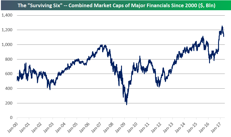
Below is a chart showing the historical market caps of the “Surviving Six” going back to 2000. It’s a fascinating look at the changing landscape of the industry over time. The second chart below shows the combined market caps of the six companies. While the S&P 500 Financial sector as a whole is still trading about 25% below its highs from 2007, you can see that the combined market caps of the “Surviving Six” has indeed taken out its 2007 high.
Start a 14-day free trial to unlock all of Bespoke’s financial markets research.
Apr 18, 2017
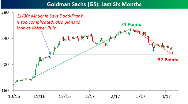
Shares of Goldman Sachs are under a ton of selling pressure today after the company reported weaker than expected earnings. With a decline of nearly 5% on the day, the stock is on pace for its second worst earnings reaction day since at least 2001. What makes today’s decline even more noteworthy is the fact that the stock has now given up half of its gains since Election Day. As shown in the chart below, from Election Day through its intraday high on 3/1, shares of Goldman rallied 74 points. Since then, the stock has now declined roughly 37 points through this morning’s low.
Following today’s decline, shares of Goldman are also sitting at a critical support level which coincides with the level they opened up at on 11/30 when Treasury Secretary Steve Mnuchin was officially nominated and made comments that Dodd-Frank is ‘too complicated’ and that he also planned to take a closer look at the Volcker Rule. A lot of the rally in the Financial sector was predicated on less in the way of regulatory burdens and to a lesser degree tax reform. With Goldman now giving up half of its post-election gains, the case can be made that much of the optimism over less regulation has been erased.
Start a 14-day free trial to unlock all of Bespoke’s market analysis.
Apr 18, 2017
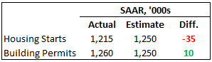 Housing data this morning came in mixed as Housing Starts missed expectations while Building Permits exceeded forecasts. As shown in the table to the right, starts came in 35K below consensus forecasts while permits exceeded forecasts by 10K. The table below breaks down today’s report in terms of both regions and size of units.
As far as unit sizes are concerned, both single and multi-family units were just about equally weak in March with both declining between six and eight percent. Building Permits saw more disparate results as single-family permits declined modestly while multi-family units surged over 13%. On a regional basis, the only area of the US where starts increased was in the Northeast. Meanwhile, permits saw a m/m increase in every region except the Midwest.

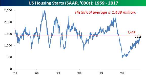
So how does the current level of starts compare to history? The chart below shows the historical monthly Housing Starts report going back to 1959. At this month’s level of 1.215 mln on a seasonally adjusted rate, Housing Starts are still more than 200K below their historical average going back to 1959, and haven’t seen even an average monthly reading once during the current expansion. The closest we came to average was last October when the SAAR monthly reading hit 1.32 million. What’s even more startling about this lack of a single ‘average’ monthly reading is that it doesn’t even account for the increase in population during this period. Decades ago, Housing Starts were routinely in the 1.5 million range even when the US population was not much more than half of the size that it is now. Start a 14-day free trial to unlock all of Bespoke’s financial markets research.
Apr 18, 2017
South Africa remains an outperformer on a five day trailing basis, while the pain for commodities and industrial names (steel, metals and mining, oil names, transports) are major laggards. Gold miners, gold, silver, other currencies, long-term bonds, and REITs are all gainers as well, while banks are prominent on the underperformers list.

Bespoke provides Bespoke Premium and Bespoke Institutional members with a daily ETF Trends report that highlights proprietary trend and timing scores for more than 200 widely followed ETFs across all asset classes. If you’re an ETF investor, this daily report is perfect. Sign up below to access today’s ETF Trends report.
See Bespoke’s full daily ETF Trends report by starting a no-obligation free trial to our premium research. Click here to sign up with just your name and email address.
