Apr 21, 2017
We’re now right smack dab in the middle of earnings season, so today we wanted to highlight a couple of interesting sector trends we’ve recently identified. Thanks to our Interactive Earnings Report Database, we have a list of every single quarterly earnings report for US stocks going back to 2001. For each report, we know whether the stock beat or missed consensus earnings and revenue estimates and how the stocks performed.
Using our database, we track the rolling 3-month earnings beat rate for all US stocks. This shows the percentage of companies that are beating consensus analyst earnings per share estimates over time. We also track the rolling 3-month earnings beat rate by sector.
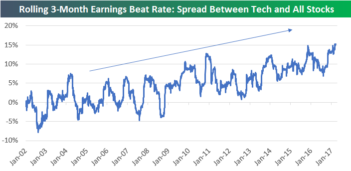
Below is a chart showing the rolling 3-month earnings beat rate for all US stocks compared to just Technology stocks. As you can see, from 2002 through 2009, the earnings beat rate for Tech stocks generally tracked the beat rate for all stocks. But during the current bull market that began in early 2009, we’ve seen Tech stocks separate from the pack when it comes to beating analyst earnings estimates. Since 2014, the divergence has gotten even more prominent. As of now, the rolling 3-month earnings beat rate for Tech stocks stands at 75%, while the beat rate for all stocks is just 60%.

You can see the spread between the beat rate for Tech and the beat rate for all stocks in the chart below. Over the years, Tech stocks have gotten better and better than the rest of the market at beating analyst earnings estimates. Whether that’s the result of legitimate strength for the sector (it has outperformed) or Tech accounting departments getting better and better at “beating the number” is a different story. We honestly don’t know the answer, but it’s probably a little bit of both.
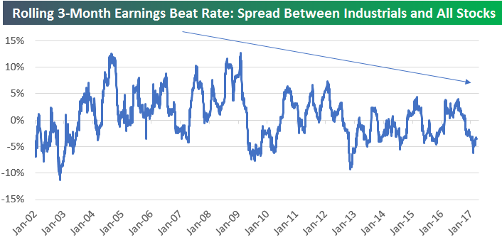
A counter example is the Industrials sector. Below is the rolling 3-month earnings beat rate for Industrials stocks versus the 3-month beat rate for all stocks. Unlike Tech, these two data series have been tracking each other very closely for the last 15 years. If anything (as shown in the second chart), Industrials stocks have gotten worse at beating estimates.
Start a 14-day free trial to see more of Bespoke’s earnings analysis.

Apr 20, 2017
Log-in here if you’re a member with access to the Closer.
Looking for deeper insight on global markets and economics? In tonight’s Closer sent to Bespoke Institutional clients, we introduce our “irrational exuberance” indicator, also discussing jobless claims and the outlook for gold.

The Closer is one of our most popular reports, and you can sign up for a free trial below to see it!
The Closer is one of our most popular reports, and you can see it and everything else Bespoke publishes by starting a no-obligation 14-day free trial to our research!
Apr 20, 2017
We’ve just released our weekly Sector Snapshot report (see a sample here) for Bespoke Premium and Bespoke Institutional members. Please log-in here to view the report if you’re already a member. If you’re not yet a subscriber and would like to see the report, please start a 14-day trial to Bespoke Premium now.
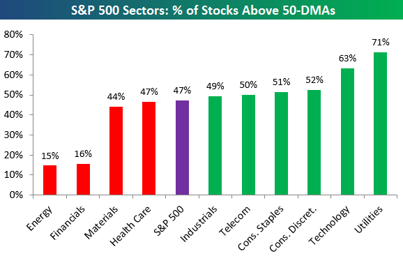
Below is one of the many charts included in this week’s Sector Snapshot, which highlights the percentage of stocks in each S&P 500 sector that are trading above their 50-day moving averages. This breadth measure helps investors identify the underlying strength of the individual members that make up a sector or index. As shown, under 50% of stocks in the S&P 500 are currently above their 50-days, and the same is true for the Health Care, Materials, Financials, and Energy sectors.
To see our full Sector Snapshot with additional commentary plus six pages of charts that include analysis of valuations, breadth, technicals, and relative strength, start a 14-day free trial to our Bespoke Premium package now. Here’s a breakdown of the products you’ll receive.
Apr 20, 2017
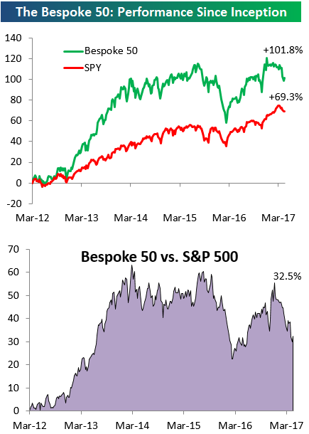
Every Thursday, Bespoke publishes its “Bespoke 50” list of top growth stocks in the Russell 3,000. Our “Bespoke 50” portfolio is made up of the 50 stocks that fit a proprietary growth screen that we created a number of years ago. Since inception in early 2012, the “Bespoke 50” has beaten the S&P 500 by 30 percentage points. Through today, the “Bespoke 50” is up 101.8% since inception versus the S&P 500’s gain of 69.3%. Always remember, though, that past performance is no guarantee of future returns.
To view our “Bespoke 50” list of top growth stocks, sign up for Bespoke Premium ($99/month) at this checkout page and get your first month free. This is a great deal!