Investors Beware As USO Contango Collapse Fuels PnL Pain
The United States Oil Fund (USO) has had a rough few weeks. With oil at the front of the WTI curve collapsing as far as massively negative prices on Wednesday, the ETF’s asset values decline as it sells near-term crude to purchase out-month crude. This “contango” in the crude curve is one reason that USO has so persistently returned less than the actual spot price of oil; when the curve is in contango as it has been for the last few years, it has persistently cost money to own oil exposure via USO. In order to avoid negative prices, the ETF’s issuer has spread out purchases across the front few months of the crude curve, which should help if June contracts trade negative at some point like May’s did this week. But investors are still paying a cost for direct crude exposure because the whole crude curve is in contango. That hasn’t stopped individual investors from trying, though: as shown below the last week has seen by far and away the biggest inflows into USO on record!
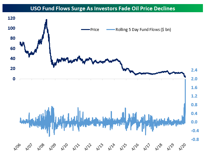
We should also note that the closing price of the ETF yesterday was more than 30% above the value of the futures it holds. Because price has dropped while flows surge, the fund’s assets have surged and share count has exploded, requiring an expanded authorization for new shares. That takes time to register, and as a result yesterday USO had to suspend creation of new shares. As a result, shares closed more than 35% above the value of the assets in the fund!

That’s bad news for the billions of new dollars of capital investors have thrown at USO in recent days. As shown below, as-of the flows yesterday, the prior five days of flows (assuming net purchases paid roughly the volume-weighted average price for the day) are now sitting on losses of more than $600mm. When combined with the huge net asset value premium which can be expected to eventually compress, we cannot strongly enough urge investors take caution when investing in this particular oil market vehicle. Start a two-week free trial to Bespoke Institutional to access our Chart Scanner, custom screens, and much more.

Inverse Oil ETFs Soaring
The collapse in oil prices has sent ETFs like the United States Oil Fund (USO) scrambling to quickly adapt as the ETF plummets to record lows. While these ETFs have plummetted, inverse ETFs in the space have been doing great. Products like the DB Crude Oil Double Short ETN (DTO) and ProShares UltraShort Crude Oil ETF (SCO)—which are more short term focused and track the inverse performance of crude oil (when crude is down, these products move higher and vice versa)—have soared this year. As shown in the charts below, the past month’s volatility has made the charts of DTO and SCO fairly messy, but both had their best days ever on Tuesday gaining 50.1% and 52.2%, respectively. Volumes were also huge at well over 300% of their 50-day averages for both. For DTO, which is the more thinly traded of the two, yesterday and Monday’s rise were a clear and massive break above the prior highs from mid to late March. Meanwhile, even though yesterday’s close was a new high, SCO actually saw higher intraday highs back on March 18th.
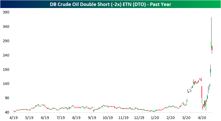

Obviously, given their nature of seeking to double the volatility of crude oil moves, these inverse ETFs will see much larger performance numbers, whether those be positive or negative than the more vanilla USO. Regardless, given the novelty of the current situation around oil, performance numbers all around are huge. For example, in terms of YTD performance in 2020, DTO is up nearly 500% as of today. At yesterday’s close, it was up even more at 527%! As for the more popular SCO, the ETF is up over 300% YTD. Meanwhile, the main crude oil ETF (USO) has been cut by more than three quarters since the start of the year. Start a two-week free trial to Bespoke Institutional to access our interactive tools including a screen of inverse and leveraged ETFs.

Two Months Without an Increase in Prices at the Pump
While consumers staying home have not had much of a chance to enjoy the decline in gas prices, the decline has been relentless. The last time the national average price of a gallon of gas increased was on February 22nd. That’s 59 days ago. The chart below shows historical streaks where the national average price of gasoline did not show a day/day increase. At 59 days, the current streak is the fourth-longest on record dating back to 2005. The longest streak ended at 123 days in January 2015, while the next two ended at just under 90 days.

With the current streak of days without an increase at just 59 days, it sure doesn’t seem extreme relative to those other periods. So what gives? Even though the current streak is much shorter than the three longest streaks, this one is perhaps even more extreme given the time of year when it is occurring. Looking at the chart above, each of the three longest streaks on record all ended in December and January. The blue line in the chart below shows the seasonality of gas prices throughout the year, and the weakest time of year is typically from the beginning of December through year-end. Therefore, it shouldn’t be too much of a surprise that the three longest streaks on record took place during that time of year. The current streak, however, has occurred during a time of year where prices at the pump are normally at their strongest. In fact, this is the first time since 2005 that gas prices have ever been down on a YTD basis at this time of year. In other words, this current streak of declines is rather extraordinary. Start a two-week free trial to Bespoke Premium to access our full range of research and interactive tools.
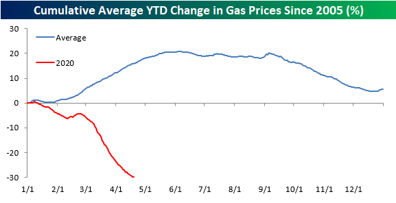
Chart of the Day: Stocks vs. COVID Symptom Search Trends
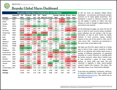
Bespoke’s Global Macro Dashboard — 4/22/20
Bespoke’s Global Macro Dashboard is a high-level summary of 22 major economies from around the world. For each country, we provide charts of local equity market prices, relative performance versus global equities, price to earnings ratios, dividend yields, economic growth, unemployment, retail sales and industrial production growth, inflation, money supply, spot FX performance versus the dollar, policy rate, and ten year local government bond yield interest rates. The report is intended as a tool for both reference and idea generation. It’s clients’ first stop for basic background info on how a given economy is performing, and what issues are driving the narrative for that economy. The dashboard helps you get up to speed on and keep track of the basics for the most important economies around the world, informing starting points for further research and risk management. It’s published weekly every Wednesday at the Bespoke Institutional membership level.
You can access our Global Macro Dashboard by starting a 14-day free trial to Bespoke Institutional now!
S&P 500 Dividend Yield vs. 10-Year Yield Blowout
With the dramatic plunge in equities in late February and March, the S&P 500’s dividend yield rose all the way up to a high 2.81% on the March 23rd low. The subsequent rally off of that March 23rd low has seen the dividend yield pull back to 2.15%. While dividend cuts on account of slowed business could result in that yield falling further as earnings season progresses, at the moment, the S&P 500’s yield remains far more attractive than that of US Treasuries which are historically low after the flight to safety recently. As of today, the 10-Year Treasury only yields 55 bps which is just off of the March 9th low of 54.07 bps.

On March 23rd the difference between the S&P 500’s dividend yield and that of the 10-Year Treasury was around 1.915 percentage points; the most in the past half century. Today the spread has narrowed a bit to 1.59 percentage points, but as shown below, that still remains wider than anything we’ve seen over the last 50 years. Start a two-week free trial to Bespoke Premium to access our full range of research and interactive tools.

Health Care Leading in New Highs
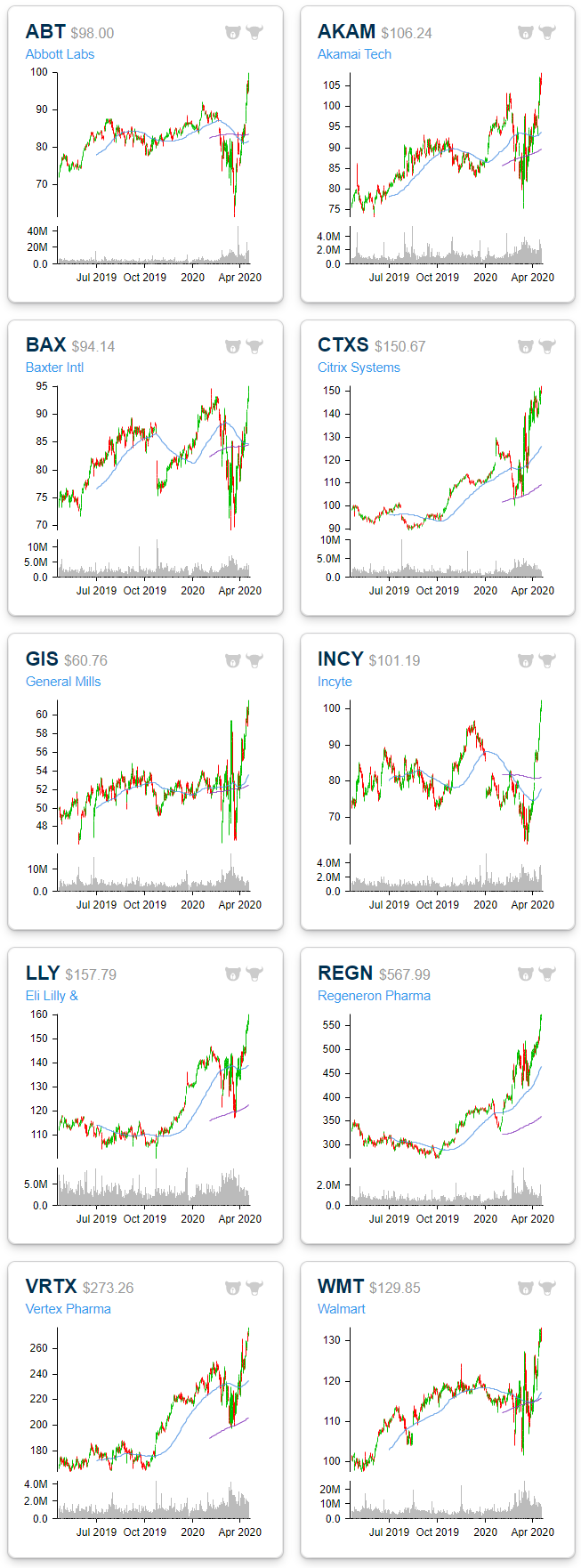
Breadth was pretty lackluster yesterday with only about 15% of the S&P 500 finishing the day higher. Despite this, of the stocks that did rise, there were a handful that reached new 52-week highs. As shown below in charts from our Daily Sector Snapshot, with yesterday being no exception, recently the stocks reaching 52-week highs have been predominately concentrated in the Health Care sector which saw a net of 10% of its stocks at new highs yesterday. Meanwhile, Technology and Consumer Staples were the only other sectors that saw an uptick in net 52-week highs yesterday. While there were no other highs across each of the other sectors, there was not an increase in 52-week lows either. In other words, for the most part, S&P 500 stocks are now trading somewhere within the past year’s range rather than breaking out or down.

The charts below are from the 52-week highs screen at our Chart Scanner tool. These are the 10 S&P 500 stocks that broke out to new 52-week highs yesterday. Most of these have been in uptrends for the past year while the recent spike in volatility has ended patterns of sideways trends for others like Abbot Labs (ABT) and General Mills (GS). As previously mentioned, the bulk of these stocks are Health Care names including Abbott Labs (ABT), Baxter (BAX), Incyte (INCY), Eli Lilly (LLY), Regeneron (REGN) and Vertex (VRTX). Additionally, Consumer Staples stocks benefiting from the COVID economy like major grocery chain Walmart (WMT) and food manufacturer General Mills (GIS) also make the list. Start a two-week free trial to Bespoke Institutional to access our Chart Scanner, custom screens, and much more.
Not Your Typical Tuesday. Or Is It?
While every other day of the week has seen multiple gaps down of more than 1.5% since the peak in February, today is the first time in that span that there will be a gap down of more than 1.5% on a Tuesday. Given the lack of big gaps down, Tuesdays have also seen the strongest average return of any weekday so far in 2020. While every other day of the week has averaged declines, Tuesday has seen an average gain of 1.16%. That’s quite a disparity!

While average returns for Tuesday relative to other weekdays have been stellar, it doesn’t tell the whole story. The table below shows the S&P 500’s daily returns so far in 2020. Looking at the individual occurrences, Tuesdays have actually been up days less than half of the time. If it wasn’t for three strong Tuesdays in the month of March, returns for the second trading day of the week wouldn’t be nearly as positive.
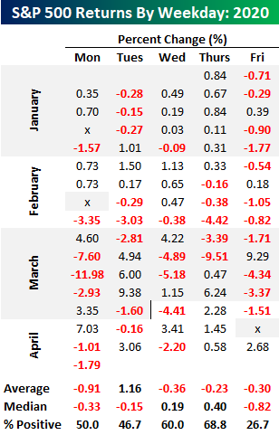
Looking at median returns instead of averages shows how Tuesdays haven’t been nearly as strong as they seem. Looked at this way, Tuesday’s median decline of 0.15% ranks right in the middle of the pack behind gains for Thursday and Wednesday but well ahead of the 0.33% decline for Mondays and the 0.82% decline on “Corona Fridays”. Outside of a couple of outliers, Fridays have not been a good day for equities this year. Start a two-week free trial to Bespoke Institutional to access our full range of research and interactive tools.

Chart of the Day: S&P 500 (SPY) Gaps Down of 1.5%+
The Closer – WTI: Two Truths & A Lie – 4/20/20
Log-in here if you’re a member with access to the Closer.
Looking for deeper insight on markets? In tonight’s Closer sent to Bespoke Institutional clients, we delve deep into the historic drop into negative crude oil prices today. We look at where else saw negative prices and who is to benefit from the chaos. Next we show just how few companies are providing guidance and how the few largest companies are impacting the market.

See today’s post-market Closer and everything else Bespoke publishes by starting a 14-day free trial to Bespoke Institutional today!