Fund Flow Rebound Continues
This week the Investment Company Institute reported fund flows across ETFs and mutual funds for the week ending April 22nd. Below, we summarize flows across a range of periods as well as how those numbers stack up to historical ranges since 2013. The most recent week saw massive flows into commodity ETFs as vehicles like USO saw massive interest from retail investors. Total inflows to commodity ETFs totaled $14bn in the four weeks ended April 22. The current week is a record result. For equities, the week was mostly weak with $9.5bn in overall outflows mostly thanks to $7.9bn in global equity outflows. Bond funds continued to reverse their extreme outflows from March with $9.8bn in inflows across ETF and mutual funds.
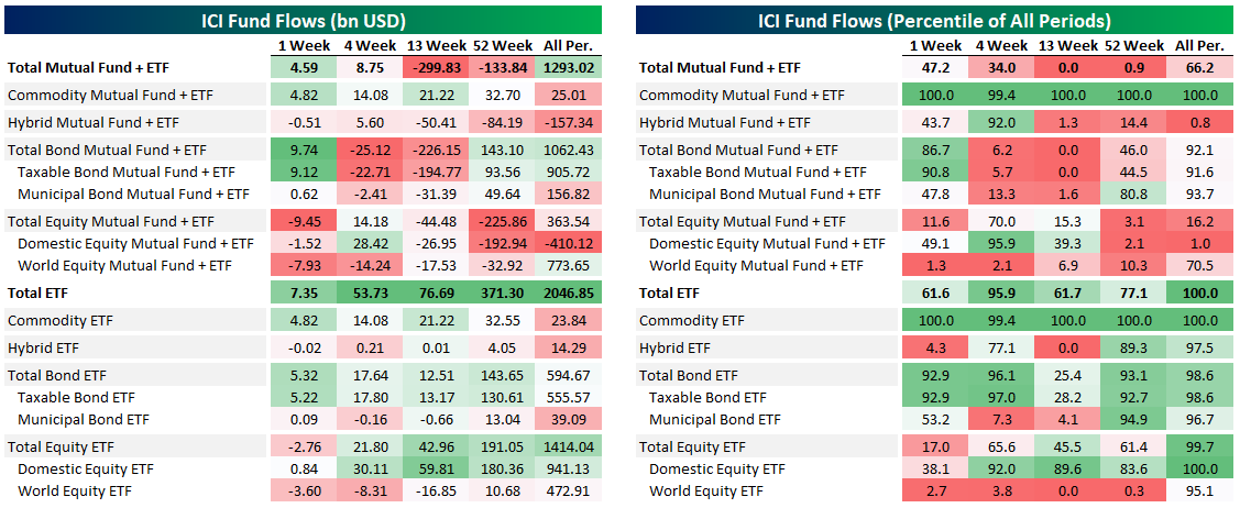
Mid-April saw the aggregate fund universe draw inflows for two straight weeks after massive outflows in March. As we discussed above, the biggest cause for outflows was bond markets, with $306bn leaving the combined ETF and mutual fund universe in six weeks from March 4th to March 8th. Equity flows have been much more muted, as shown in the second chart below. Gain access to Bespoke’s most actionable investment research with a two-week free trial to Bespoke Premium.

10-Day Advance/Decline Lines Running Hot
The gains in the first half of the week lifted every sector but two—Utilities and Financials—above their 50-DMAs. Meanwhile, Health Care had even touched overbought territory (over 1 standard deviation above its 50-day) earlier in the week, making it the first sector to be overbought since late February.
When it comes to another measure we monitor, the 10-day advance/decline line, conditions are more broadly appearing overbought. The 10-day advance/decline line measures the average number of daily advancers minus decliners in an index or sector over the last 10 trading days. Very high readings suggest that things have gotten extended in the very near term and downside mean reversion can be expected. Very low reading suggest the opposite.
The 10-day A/D lines for sectors have been pretty strong recently indicating broad participation in the rally, but this has led these readings to become elevated indicating conditions may be running a bit too hot in the near term. Outside of the defensive sectors like Consumer Staples, Utilities, and Real Estate, every sector’s 10-day A/D line has been in overbought territory at some point over the past week. The same can also be said for the 10-day A/D line for the S&P 500. We’d note, though, that while A/D lines are extended, they’re not at extreme levels seen at other points over the past year. Start a two-week free trial to Bespoke Institutional to access our Sector Snapshot report and much more.

Chart of the Day: 50/50 Pros & Cons
Over 30 Million Initial Jobless Claims Filed
Initial jobless claims fell this week for the fourth week in a row since the record high print of 6.867 million back in the final week of March. Claims came in at 3.839 million which was 588K less than last week but also above estimates of 3.5 million. That brings the total number of initial jobless claims filed over the past six weeks (when there was the first print over 1 million) to over 30 million which is over 9% of the entire US population.

On a non-seasonally adjusted basis, this week was only the third consecutive decline off of the peak of 6.211 million which came one week later than the seasonally adjusted data’s peak. This week’s decline brought jobless claims down to 3.489 million.

Since the huge spike in jobless claims began in late March, the 4-week moving average has risen every single week, except for today. This week, the four week average fell 753.25K down to 5.033 million. As with the other readings, while that is still lower, the moving average remains extremely high compared to the rest of history. Start a two-week free trial to Bespoke Institutional to access our interactive economic indicators monitor and much more.

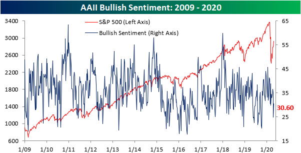
Bulls Crawling Back
The volatile swings in crude oil last week sent investor sentiment sharply lower with only 24.86% of investors reporting as bullish which was the lowest level of bullish sentiment since the COVID-19 outbreak began.. With things calming down in the days since and with equities continuing to grind higher, sentiment has improved as the percentage of investors reporting as bullish rose to 30.6%. While an improvement, that is still less than where bullish sentiment has been over the past several weeks. Since the sell-off began on 2/19, bullish sentiment has averaged 33.44%, around 3 percentage points above current levels.
Last week, we noted a strong bearish bias in which the percentage of bearish investors doubled those reporting as bullish. That has subsided this week as bearish sentiment pulled back from 50% to 44.03%. With less than half of investors now negative, bearish sentiment is within one percentage point of its average since the 2/19 peak, 44.83%.
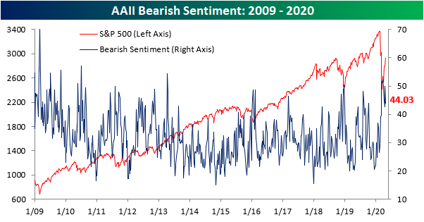
Most of the gains and losses to bulls and bears took from each other as neutral sentiment went little changed. 25.37% of investors reported as neutral which was only 0.23 percentage points more than last week’s reading of 25.14% Start a two-week free trial to Bespoke Institutional to access our interactive economic indicators monitor and much more.

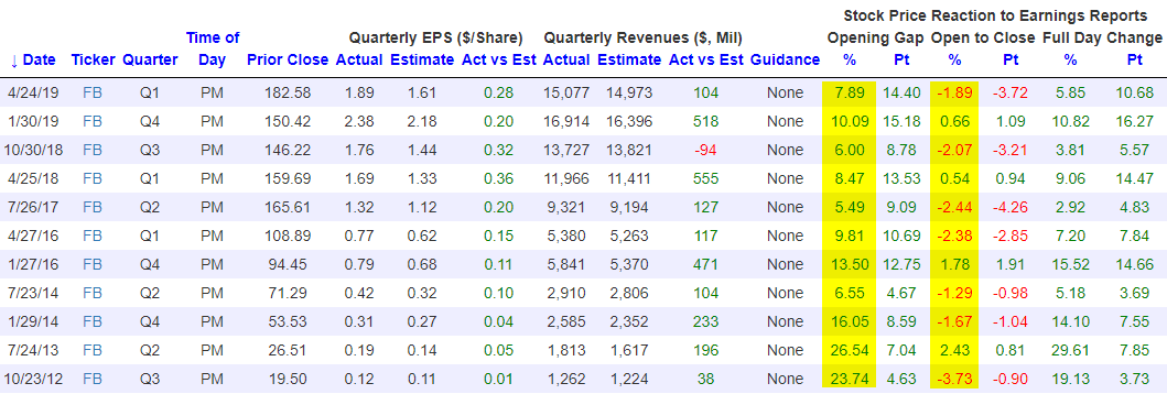
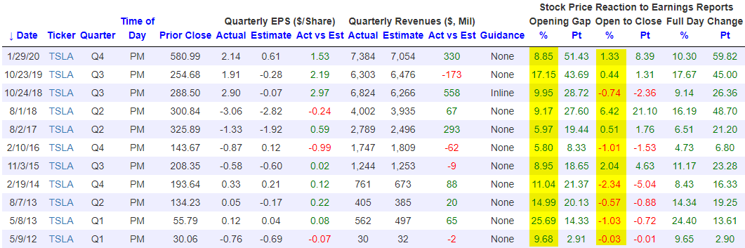
Facebook (FB) and Tesla (TSLA) Set for 5%+ Gaps Higher on Earnings
Our popular Earnings Explorer tool has quarterly earnings results and share price reactions to those earnings reports for nearly every US stock going back to 2001. The database is online, massive, and it’s interactive so that users can quickly look up historical results for individual companies. One way to use the database is to see how stocks that are set to experience huge opens higher on earnings typically trade from the open to the close of trading after their initial moves higher. Two stocks that are set to gap up sharply on earnings this morning are Facebook (FB) and Tesla (TSLA). At the moment, both are set to open higher by more than 5%.
Below we have pulled all historical instances in which both Facebook and Tesla have gapped higher by at least 5% at the open of trading following quarterly earnings reports. Coincidentally, each stock has had 11 prior gaps up of 5%+ on earnings in their history as public companies. For Facebook (FB), when it has gapped up 5%+ in the past, it has actually traded lower from the open to the close 7 of 11 times for an average open to close change of -0.91%. This tells us that at least in the past, investors have more often than not used these opportunities to lighten up on shares during the regular trading day.
For Tesla (TSLA), when it has gapped up 5%+ on earnings, the stock has also traded down from the open to the close more often than it has traded up from the open to the close, but its average open to close change on these 11 prior gaps higher has been positive at +0.46%. We’d note that this will be the third quarter in a row that TSLA has opened higher by 5%+ on earnings, and the prior two quarters saw a slight positive move from the open to the close for the stock. If you’d like to test out our Earnings Explorer tool to see how your stocks typically trade on earnings, start a two-week free trial to Bespoke Institutional. You’ll also gain access to our entire platform that includes our most actionable research reports and our full suite of investor tools.
50-DMAs in the Rearview
Stocks have continued to rally this week and for many individual names, these gains have lifted them above their 50-DMAs. As shown in the chart below, over three quarters of stocks in the S&P 500 have now moved back above their 50-DMAs. Three sectors—Technology, Communication Services, and Health Care—have more than 90% of their stocks above their 50-DMAs with Health Care leading the way at 96.7%. Readings above 90% are very rare — just as rare as the sub-10% readings we saw in March. As for the other sectors, similar to the S&P 500, Consumer Staples, Consumer Discretionary, and Materials all have over three-quarters of their stocks above their 50-DMAs. Meanwhile, Financials, Industrials, and Energy are lagging somewhat but still have more than half of their stocks above. The only two sectors that are truly lagging with just 32.1% and 38.7% above, respectively, are Utilities and Real Estate — two defensives.

Health Care and to a lesser degree Consumer Staples were the first sectors to see a large number of stocks trade above their 50-DMAs. This reading for both sectors saw a more gradual build throughout April. As for the rest, the percentage of stocks trading above their 50-DMAs has exploded higher and in a much more rapid fashion, especially within the past week. In fact, as recently as last Thursday, excluding Health Care and Consumer Staples, the highest reading across sectors was only 40.85% (Technology). The big pickup in the number of stocks moving above their 50-DMAs means two things. For starters, many stocks are clearing resistance at their averages which is a positive technical development. Second, many stocks are roughly around the same areas of their trading ranges and are moving higher together (strong breadth). Start a two-week free trial to Bespoke Institutional to access our interactive economic indicators monitor and much more.

Chart of the Day – An Impressive Streak for Small Caps
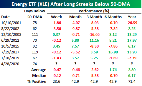
Energy (XLE) Finally Above Its 50-DMA
As we noted yesterday, more and more sectors have begun to cross back above their 50-DMAs in the last couple of weeks. With the outperformance of recent underperformers in yesterday’s session, the most beaten-down sector, Energy (XLE), finally managed to move back above its 50-DMA. Yesterday marked the first time that XLE had closed above its 50-DMA since January 10th. As for today, XLE is poised to gap up over 3% at the open bringing it further above its 50-DMA.

With XLE being under its 50-DMA for nearly four full months, that streak ending at 74 trading days was the fifth-longest in the ETF’s history. The last time XLE experienced a similar streak was in 2017 which was actually the longest streak on record ending at 119 days. The other longer streaks came in 2015, 2008, and in 2001.

As for performance after these long streaks below the 50-DMA come to an end, XLE has typically been pretty weak. In the table below, we look at all prior streaks below the 50-DMA that lasted for at least 60 trading days (roughly three months). One week after such streaks come to an end has only seen XLE higher around a quarter of the time with an average decline of 0.47%. Returns have also been positive less than half of the time one, three, and six months later. Fortunately, one year later XLE has been higher 71.4% of the time with an average gain of 2.8% (median 6.17%), although even here, those returns are nothing to get overly excited about. Start a two-week free trial to Bespoke Institutional to access our full range of research and interactive tools.
Historically Bad GDP For Q1 As Services Suffer
This morning the BEA released one of the worst GDP numbers in the modern history of the US economy. Total output fell 4.79% at annual rates, worse than the 4.0% decline (again, at annual rates) that economists had forecasted. That’s not as bad as the worst numbers from the financial crisis, but the details under the hood were qualitatively different. Instead of being led down by falling capital expenditures and gradually decelerating consumption, Q1 saw an outright collapse in services and durable goods spending with large but historically less remarkable declines in business spending. Services spending has been the steady Eddie of US growth for the better part of a century now: it’s never contributed more than an 82 bps headwind to total QoQ SAAR growth since World War 2. But in Q1 it was a 5% headwind, almost an order of magnitude more than its worst quarter in the global financial crisis. We outline the sobering numbers in more detail below. Start a two-week free trial to Bespoke Institutional to access our Chart Scanner, custom screens, and much more.
