Jonesing For A Hedge
The world is a scary place right now. 10% of the US population and 20% of the labor force have filed for unemployment insurance in the last few weeks, and stock markets have seen record volatility. For the Americans that do have more than $400 saved up, the question is where do you put it? With interest rates at zero and with central banks flooding the market with liquidity, many are concerned that the dollar they put under the mattress today won’t be worth that much when the rainy day comes. Sure, the stock market has historically delivered superior returns, but those above average returns aren’t guaranteed to be there when you need it either. Gold, on the other hand, has fared relatively well. After a sharp decline in the early days of the Covid Crash, it has since broken out to five-year highs and is only about 10% from all-time highs.
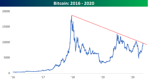
In addition to gold, bitcoin has done extremely well recently, and unlike gold which is normally associated with grumpy old guys, bitcoin is cutting edge. Just today, bitcoin received another endorsement as it was reported that hedge fund legend Paul Tudor Jones has been buying the crypto-currency saying it reminds him of gold in the 1970s. Like gold, bitcoin is considered an inflation hedge but an extremely volatile one at that. Not only is it something they can’t make more of, but the supply is actually shrinking. That’s because bitcoin has to be stored in a digital wallet and if you lose your wallet, you lose your bitcoin. Way back in 2018, the Wall Street Journal reported that up to a fifth of all bitcoin had been lost and in most cases, those losses were permanent.
Looking at the recent performance of bitcoin, the last month or so has been extremely strong with the price more than doubling off its March lows. After today’s PTJ bounce, it’s not far from its highest levels of the year right around $10,400.

Just as bitcoin is nearing short-term resistance, it is also bumping up right against a long-term downtrend as well. Since its record high during the late 2017/early 2018 mania when bitcoin peaked just under 20,000, bitcoin has seen a series of lower highs at 14,000, then around 12,500, and earlier this year at 10,400. It’s still below 10,000 now, but a break above 10,400 to new 2020 highs would put that downtrend line in the rearview mirror. And while panic over pandemic has drowned out talk of just about anything else, not even COVID-19 would be able to silence the crypto crowd if that downtrend breaks. Start a two-week free trial to Bespoke Institutional for full access to our research and interactive tools.
10% of Population Filing Jobless Claims
Initial jobless claims fell for a fifth consecutive week down from 3.839 million last week to 3.169 million this week. While that is still extremely high by historical standards, that is the lowest print since jobless claims starting printing more than a million in late March. In other words, a massive number of people are continuing to file for unemployment insurance, but the pace of increase has slowed down with the peak in the rearview for the time being.

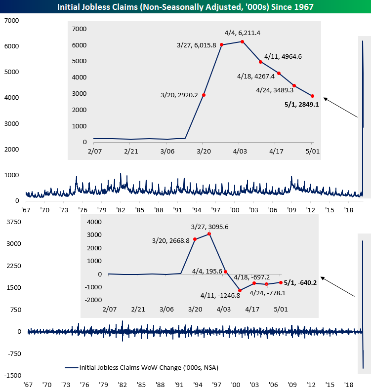
On a non-seasonally adjusted basis, this week was only the fourth consecutive decline with claims now down to 2.849 million. As with the seasonally adjusted number, this week’s print was the smallest of the past several weeks since claims first began to print in the millions but is still very high compared to the rest of history.
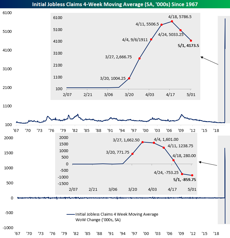
The four-week moving average has also seemed to have peaked for the time being as it fell for a second straight week. The moving average is now down to 4.174 million compared to over 5 million last week. While it could be expected given the massive volatility of the indicator over the past couple of months, that 859.75K decline from last week is the largest single week decline on record (second chart below).
Since the March 20th print (the first one in the millions) to today, a total of 33.483 million initial jobless claims have been filed. That is more than 10% of the US population and over 20% of the labor force!. As such, continuing jobless claims (lagged by a week) came in at another record of 22.647 million this week. Start a two-week free trial to Bespoke Institutional to access our interactive economic indicators monitor and much more.
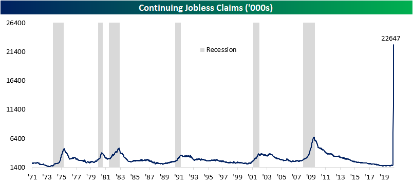
Chart of the Day: Investor Sentiment Slammed
Chart of the Day: Google Search Trends Round 2
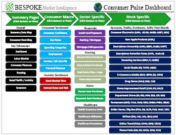
Bespoke’s Consumer Pulse Report — May 2020
Bespoke’s Consumer Pulse Report is an analysis of a huge consumer survey that we run each month. Our goal with this survey is to track trends across the economic and financial landscape in the US. Using the results from our proprietary monthly survey, we dissect and analyze all of the data and publish the Consumer Pulse Report, which we sell access to on a subscription basis. Sign up for a 30-day free trial to our Bespoke Consumer Pulse subscription service. With a trial, you’ll get coverage of consumer electronics, social media, streaming media, retail, autos, and much more. The report also has numerous proprietary US economic data points that are extremely timely and useful for investors.
We’ve just released our most recent monthly report to Pulse subscribers, and it’s definitely worth the read if you’re curious about the health of the consumer in the current market environment. Start a 30-day free trial for a full breakdown of all of our proprietary Pulse economic indicators.
No Love for the Banks
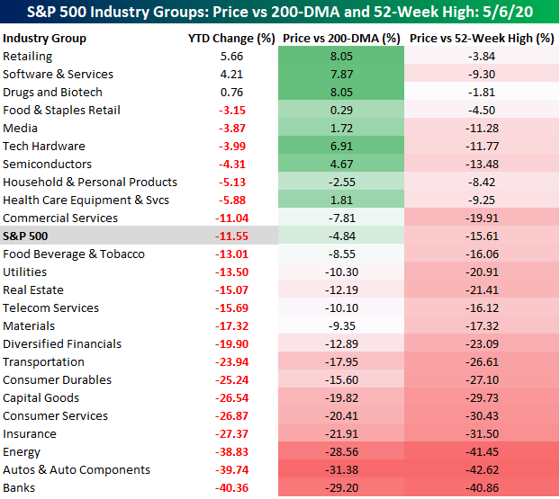
While the S&P 500 has started to run out of momentum in recent days, there are still a handful of S&P 500 industry groups that are hanging onto gains on a YTD basis. Leading the way higher, the Retailing Industry Group is up over 5% YTD. That performance is a bit misleading, though, as the majority of retailers are under enormous pressure. Here’s a bananas stat for you. Of the 25 stocks in the Retailing industry group, Amazon.com (AMZN) accounts for 59.4% of the group’s entire market cap. While AMZN is up 25% YTD, the average performance of the stocks in the group on an unweighted basis is a decline of over 18% and the only other stock in the group that is up YTD is Home Depot (+4%). Given the divergent paths of AMZN and everyone else, it has seen its share of total market cap increase by ten percentage points just since the start of the year. The increasing dominance of AMZN over the rest of the retail sector can ultimately become problematic for both. The continuation of the shutdown and AMZN’s dominance only make it more likely that pressure on traditional retailers will increase, but as more retailers shut their doors, the empty stores and out of work employees that follow will undoubtedly lead to increased political pressure on AMZN.
In terms of winners on a YTD basis, behind AMZN Retailing, the only two other groups in the black are Software & Services (4.21%) and Drugs and Biotech (0.76%). These three industry groups are also the furthest above their 200-DMA with Tech Hardware and Semis rounding out the top five.
On the downside, there’s no shortage. While just about everyone knows that the Energy sector has been one of the worst-performing groups in the market, you may be surprised to learn that it is not the worst-performing industry group on a YTD basis. In fact, both Autos (-39.74%) and Banks (-40.36%) are both down more than Energy (-38.83%) at this point. While bank balance sheets were a lot healthier heading into this crisis than they were in the last one, investors haven’t been convinced that they will be able to get through the COVID pandemic without taking a major hit. Learn more about Bespoke’s premium insights at our membership options page.
Bespoke’s Global Macro Dashboard — 5/6/20
Bespoke’s Global Macro Dashboard is a high-level summary of 22 major economies from around the world. For each country, we provide charts of local equity market prices, relative performance versus global equities, price to earnings ratios, dividend yields, economic growth, unemployment, retail sales and industrial production growth, inflation, money supply, spot FX performance versus the dollar, policy rate, and ten year local government bond yield interest rates. The report is intended as a tool for both reference and idea generation. It’s clients’ first stop for basic background info on how a given economy is performing, and what issues are driving the narrative for that economy. The dashboard helps you get up to speed on and keep track of the basics for the most important economies around the world, informing starting points for further research and risk management. It’s published weekly every Wednesday at the Bespoke Institutional membership level.
You can access our Global Macro Dashboard by starting a 14-day free trial to Bespoke Institutional now!
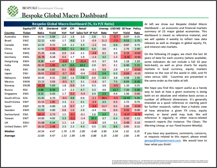
Chart of the Day: Off the Shelf Indicators – Google Search Trends
ISM Collapse All Around
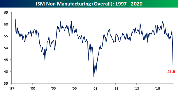
While the results for ISM’s Non-Manufacturing index for the month of April were better than expected (the index was forecasted to come in at 38), the index fell 10.7 points from March down to 41.8. That is the fifth lowest level of the index since its inception in 1997 and the weakest reading since March of 2009. April also marked the first time that the headline number showed a contractionary reading (those below 50) since December of 2009.
As shown in the table below, not only was the headline number at one of its lowest levels ever, but the 10.7 point decline was the largest month over month decline ever recorded. The same can also be said for the month over month declines for multiple sub-indices including those for Business Activity, New Orders, Employment, and the Manufacturing and Non-Manufacturing composite. On the other hand, the indices for Supplier Deliveries and Inventory Sentiment experienced their largest one month gains ever, but those are not necessarily positives as detailed later on. Breadth across each of the sub-indices was overall very weak in April as several readings are now at or near some of their weakest levels on record with most now sitting in contractionary territory.

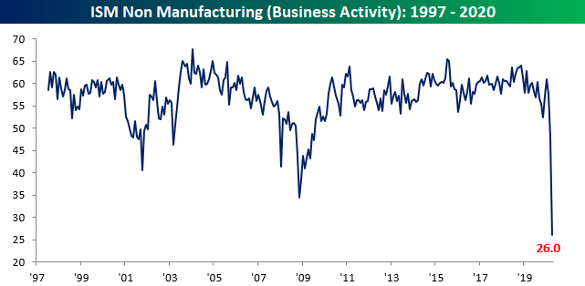
One of the weakest areas of last month’s report was Business Activity. The index only registered a reading of 26 in April compared to 48 in March. That 22 point decline is nearly double the previous largest MoM decline of 11.8 points from December of 2007 to January of 2008. This index is now sitting at its lowest level ever, surpassing the previous low of 34.4 from November of 2008.
The same can also be said for New Orders. Demand in the services sector has been crushed by the COVID pandemic and the New Orders index fell to 32.9. That is also a record low, and the 20 point drop was the largest on record which follows last month’s 10.2 point decline which is now the third biggest MoM drop. Only 2 industries surveyed, Public Administration and Finance & Insurance, reported growth in New Orders with another 16 reporting contraction indicating the weakened demand is occurring throughout the service sector.

In addition to weak demand, the supply side has also taken a hit. Supply chains appear to have become severely disrupted from the pandemic. The index for Supplier Deliveries is the only one that is inverse (readings above 50 indicate slower deliveries rather than faster) in the ISM report. In other words, the index rises when it takes longer for suppliers to make deliveries which as ISM details “is typical as the economy improves and customer demand increases”. But in the current scenario, the index has surged by the most of any month in its history to a record high of 78.3 on a function of supply weakness rather than demand strength (as indicative in New Orders’ collapse). Supply chains have faced serious headwinds as all 18 industries reported slowed deliveries in April. This record high in Supplier Deliveries, which again in more normal circumstances could be taken as a positive sign for the economy, helped to bolster the weak headline number.

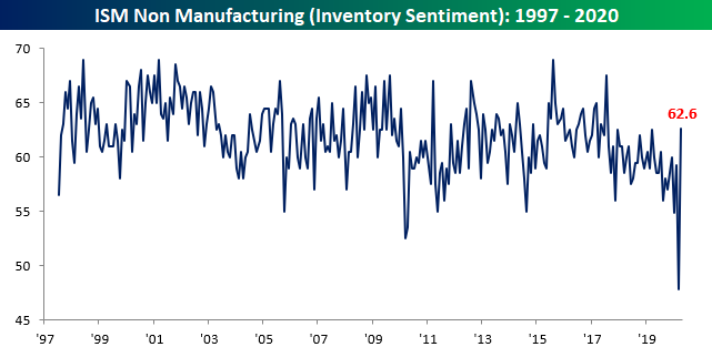
With weak demand and long lead times, industries are reporting inventories as too high. The index for Inventory Sentiment saw a massive surge rising 14.8 points to 62.6. While that is only the highest level since July 2017, this furthers the point that supply chains are facing trouble and demand remains weak. That large increase in the number of industries reporting inventories as too high comes as inventories are appearing to be drawn down as that index is still at a contractionary reading of 46.9.
Employment has also collapsed with a second consecutive reading below 50. All 18 industries reported that there was a decline in employment which sent the index to a record low of 30. As with the other categories mentioned, this was also the largest monthly decline ever. In the commentary section, one responder made an interesting note stating business has been impaired “due to employees afraid to work side-by-side with other employees.”

After today’s release and last Friday’s release of the manufacturing counterpart, the composite index is now at its weakest level (41.8) since March of 2009 (39.8) with the 10.3 point decline from last month the largest one month decline ever recorded for the composite. All in all, the two reports for the month of April gave a very bleak outlook for the US economy. Start a two-week free trial to Bespoke Institutional to access our interactive economic indicators monitor and much more.

Was Warren Right?
Warren Buffett made headlines over the weekend when he disclosed that he had completely sold out of his airline holdings. While some questioned whether he was selling out at the lows, for now at least, he appears to be right. As shown in the chart below, the S&P 500 Airlines Group is currently right near its COVID lows, and a close at current levels would actually be a new closing low.
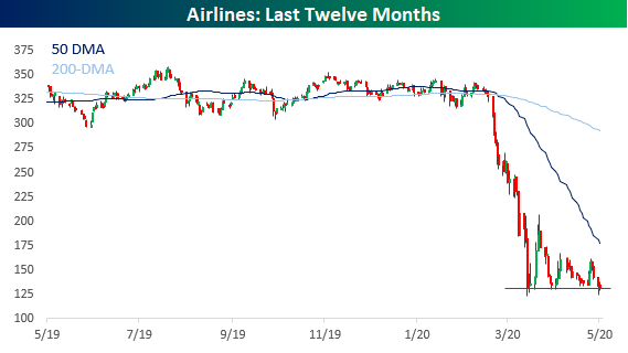
Given the national stay at home orders still in place, it’s not much of a surprise that airlines haven’t bounced, but the same could be said for a number of the other 60+ S&P 500 industries. The table below lists the S&P 500 industries that are currently at their lowest levels relative to their 52-week range. At a level of just 3%, the Airlines group is trading by far the lowest level relative to its 52-week range. The next closest sector, Energy Equipment & Services, is currently trading at much higher levels versus its 52-week range at 20%. In total, there are just 13 industries that are trading in the lower third of their 52-week range, and most of them are clustered in the Financials and Industrials sectors.
On the upside, the fact that there are more groups in the upper third of their 52-week range than the lower third suggests positive breadth. Sectors represented on this part of the list include Consumer Discretionary, Technology, and Health Care.

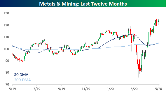
While Airlines is the only industry on the verge of making new lows, there is also just one industry on the verge of making new highs too. The Metals and Mining industry definitely wasn’t spared during the February and March declines, but the magnitude of the bounce has been even stronger with a gain of over 66% off the lows. Start a two-week free trial to Bespoke Institutional for full access to our research and interactive tools.