Bespoke’s Morning Lineup – 6/5/20 – Bonds Banished
See what’s driving market performance around the world in today’s Morning Lineup. Bespoke’s Morning Lineup is the best way to start your trading day. Read it now by starting a two-week free trial to Bespoke Premium. CLICK HERE to learn more and start your free trial.
Here comes the big jobs report! Looking at where futures are trading, though, investors don’t seem all that concerned as the S&P 500 is indicated higher by about 0.8%. The re-opening stocks are once again flying today, led by the airlines. Based on where it is trading this morning, the Airlines ETF (JETS) is up 40% on the week. On the WEEK!
Be sure to check out today’s Morning Lineup for a rundown of the latest stock-specific news of note, European markets, economic data out of Germany, global and national trends related to the COVID-19 outbreak, and much more.

The chart below is from the second page of our Morning Lineup and shows the relative strength of the S&P 500 versus long-term US treasuries. When the line is rising, it indicates that equities are outperforming bonds and vice versa when it’s declining. From the S&P 500 peak in February to the lows in March, equities were crushed and long-term treasuries surged as yields dropped to record lows. Since then, we’ve seen a steady uptick in the relative strength of equities relative to bonds, but that pace has really accelerated this week to the point where equities are almost back to outperforming bonds on a trailing one-year basis.
As of this morning, SPY is up over 3% on the week while the long-term treasury ETF (TLT) is down over 5%. While we saw wider 5-day performance gaps as recently as March, for a period where volatility has been relatively restrained, this is a wide gap.

Bearish and Neutral Sentiment Normalized
While the Nasdaq is within tangible reach of its all time highs and the S&P 500 is closing in on going positive YTD, bullish sentiment has continued to pick up. AAII’s weekly survey of investor sentiment showed 34.55% of respondents reported as bullish this week which is up from 33.07% last week. While a smaller increase than the past couple of weeks (1.48 percentage points compared to 4.07 percentage points last week and 5.69 percentage points the week before), this was the third consecutive week with bullish sentiment moving higher. At the current reading, bullish sentiment is at its highest level since the mid-April.

Meanwhile, bearish sentiment has continued to fall from its elevated levels. Bearish sentiment fell back below 40% to 38.87% this week. That is the first time that bearish sentiment has been below 40% in 12 weeks. In the history of the AAII survey, there were only two other streaks above 40% that ran that long if not longer: one ending in December of 1990 at 19 weeks and another ending in March of 2008 at 14 weeks. S&P 500 performance following both of those past occurrences differed greatly with the index higher by 17% six months later in 1990, but down over 10% in 2008.
Additionally, this was the first time that bearish sentiment has been within one standard deviation of its historical average of 30.48% in 12 weeks. There have only been three other similar stretches that have gone on at least 12 weeks. Two of those were during the previously mentioned periods in 1990 and 2008 lasting for 18 and 14 weeks, respectively. Additionally, there was a 14-week long stretch that ended in August of 2006. In terms of performance of the S&P 500 following that period, it more closely resembled 1990 than 2008 with the index higher by 12.18% six months after the streak came to a close.

With bearish sentiment continuing to move to more historically normal levels and bullish sentiment clawing higher, the bull-bear spread still favors bears at -4.32, but by the narrowest margin since the first week of March when it stood at -0.9.

Meanwhile, neutral sentiment also continues to move back to more normal levels. Historically, neutral sentiment has averaged a reading of 31.5% but is now at 26.58%. That is the highest level for neutral sentiment and the closest to its historical average since the final week of February. Click here to view Bespoke’s premium membership options for our best research available.

Nasdaq’s Historical Run
At its highs earlier this morning, the Nasdaq Composite was within 2% of its record high from earlier in the year. Besides the steep V-shape of the Nasdaq’s pattern over the last four months, the other aspect of the chart that stands out is just how steep the 50-day moving average is trending lately.

To illustrate just how steep the Nasdaq’s 50-DMA has become, the chart below shows the daily percentage change of the 50-day going back to 1971. Currently, the Nasdaq 50-DMA is rising at an average of over 0.5% per day. That’s an incredible slope and a level that has been exceeded only a handful of times in the Nasdaq’s 50-year history. Start a two-week free trial to Bespoke Institutional to access all of our research and interactive tools.

Chart of the Day: What’s Driving The Rally
Continuing Claims Higher Again
Weekly jobless claims left a sour taste in investors mouths this morning. Despite coming in lower (by 249K) for a ninth consecutive week—the longest streak of week over week declines on record—seasonally adjusted initial jobless claims once again came in well into the millions at 1.877 million. Additionally, last week’s number was revised up 3K to 2.126 million. This week’s print was also once again above expectations of 1.8 million. Ironically enough, despite a record streak of weekly declines, jobless claims have been weaker than expected for six consecutive weeks. That’s the longest streak of weaker than expected prints since November of 2013.
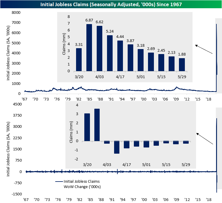
On a non seasonally adjusted basis, claims fell 314.6K and are a bit lower at 1.6 million. This week marked an eighth straight week with WoW declines which is tied with streaks from 1972, 1975, 1980, 1991, and 2002 for the longest such streak ever. This week’s extra 1.6 million claims brings the total NSA claims filed since March 20th (first weekly print above 1 million) to 42.6 million.

Another sticking point of this week’s jobless claims release was the continuing claims number which resumed WoW increases after a massive decline last week. This week, continuing claims were up to 21.49 from 20.84 last week.

Last week, we noted reason for skepticism as continuing claims recorded its largest one week decline ever thanks to massive outliers like Florida and California which saw claims drop by an unexplained 76.35% and 40.46%, respectively. This week (week of May 23rd), a large share of the overall move can once again be largely accredited to California where claims rose 28.69% WoW. Florida also saw a sizeable uptick of 14.54% from last week. Oregon, Pennsylvania, and Texas were the other states that largely accounted for this week’s increase in continuing claims. Start a two-week free trial to Bespoke Institutional to access our interactive economic indicators monitor and much more.

Bespoke’s Morning Lineup – 6/4/20 – More Stimulus
See what’s driving market performance around the world in today’s Morning Lineup. Bespoke’s Morning Lineup is the best way to start your trading day. Read it now by starting a two-week free trial to Bespoke Premium. CLICK HERE to learn more and start your free trial.
Markets had gotten a boost this morning following the ECB’s decision to nearly double the size of its Pandemic Emergency Purchase Program from 750 billion euros up to 1.350 trillion euros. While former US Senator Everett Dirksen is famously quoted as saying “A billion here, a billion there, pretty soon, you’re talking real money.” These days, trillions are the new billions as global central banks continue to flood financial markets with liquidity.
Although central bank liquidity has acted as a support, economic data released this morning was mixed. Initial Jobless Claims dropped week/week again but came in higher than expected. Continuing Claims, however, weren’t as strong. Not only were they higher than expected, but they also increased on a week/week basis. In reaction to the data, some of the post ECB gains were erased.
Be sure to check out today’s Morning Lineup for a rundown of the latest stock-specific news of note, European markets, economic data out of Sweden, global and national trends related to the COVID-19 outbreak, and much more.
This rally continues to amaze just about everyone, and yesterday we saw some encouraging signs regarding its durability. The latest example is the continued outperformance of the Philadelphia Semiconductor Index (SOX) which rallied 2% for the second day in a row. At yesterday’s closing level, the SOX has only closed higher six other times in its history!
Big Gains From Smaller Tech
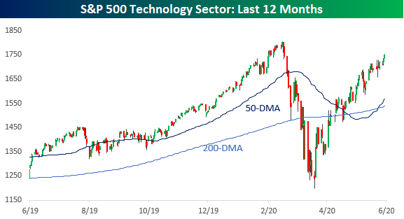
It’s still difficult to fathom the moves in the US equity market over the last four months. The fact that the Nasdaq and more specifically the Technology sector aren’t far from record highs is definitely something no one was expecting two months ago. There’s an old market saying that equities take the stairs up and the elevator down, but in the latest market cycle, the elevator up was almost as fast as the way down!

If you’ve been following the markets, all you’ve likely heard up until recently is that large-cap tech, and more specifically, Microsoft (MSFT), Apple (AAPL), Amazon (AMZN), Alphabet (GOOGL), and Facebook (FB), are single-handedly driving the market higher. The reality is not nearly as clear-cut. Given their market caps, the “Big 5” (as they’re often referred to) have done a lot of heavy lifting, but in terms of performance, they’re hardly the only game in town.
The table below lists Technology sector stocks in the Russell 3000 with market caps of more than $1 billion that are outperforming all of the ‘big 5’ tech stocks on a YTD basis. Actually, since Amazon is doing so well relative to the rest of the “big 5” these are all stocks that are outperforming Amazon. If we looked for stocks that were doing better than the average return of the “big 5” the list would be a lot, lot longer (+16.4%).
Looking through the list of names below, the two top-performing names are Zscaler (ZS) and Twilio (TWLO), which have both more than doubled. Behind these two, DocuSign (DOCU) and Sprout Social (SPT) are both knocking on the door of triple-digits. All 28 of the names listed have market caps of $1 billion, but the average market cap is just over $21 billion, while Nvidia (NVDA) is the largest company on the list with a market cap of $216 billion. For the most part, these aren’t names that have been driving the indices, but anyone holding these stocks in their portfolio probably doesn’t care! Start a two-week free trial to Bespoke Institutional to access all of our research and interactive tools.
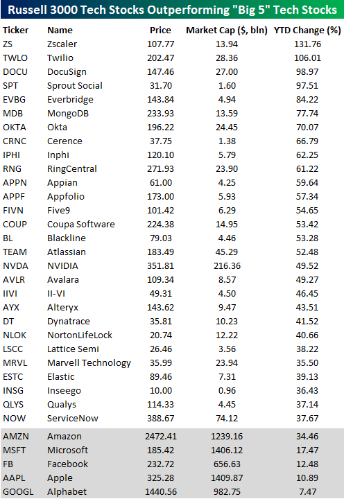
Chart of the Day: Best 50-Day Rally in 75+ Years
Service Sector Still Sliding
Despite beating expectations of 44.4, the ISM Services report for May showed another month of contractionary activity. Although still at contractionary levels, May was not as weak as April as the headline index rose 3.6 points to 45.4. Along with January of 2018, that 3.6 point MoM increase was the largest one month increase in the index since September of 2017. So like the manufacturing report on Monday, this month’s report for the non-manufacturing sector showed activity is still declining.
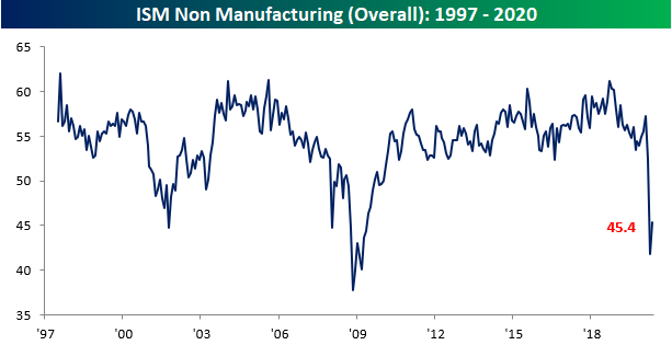
In combination with Monday’s manufacturing release, the composite index for manufacturing and services has shown back to back months with contractionary activity for the first time since August of 2009. Though activity for manufacturing and services both continue to contract, there was a significant pickup in May with the largest month over month increase (3.7 points) since September of 2017.

Like the headline number, most of the sub-indices also remain in contraction territory and around some of the weakest levels on record despite massive improvements from the prior month. Six of the ten sub-indices are still in the bottom 5% of all readings (since 1997) even after some of the largest one month increases on record.

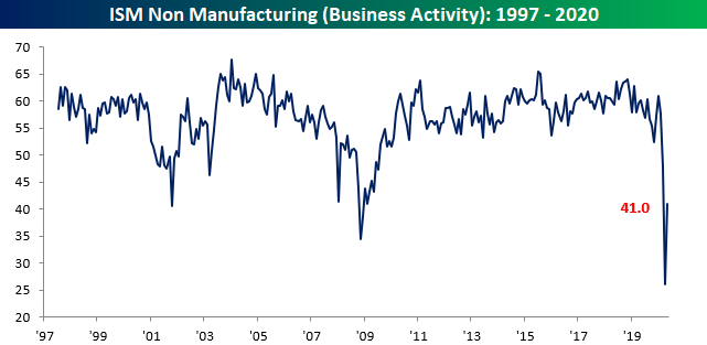
The indices for Business Activity and New Orders are two categories that declined to record lows in April, but in May both experienced massive rebounds. For Business Activity, it’s 15-point m/m increase was the largest on record, and yet it still remains at a contractionary level of 41. For New Orders, the 9 point increase to 41.9 was the second largest one month gain on record behind April of 2009 (+9.6). Here again, though it remains in the bottom 2.5% of all readings.

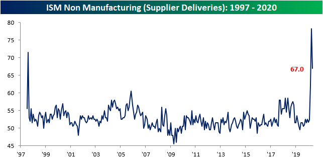
As we noted in Monday’s manufacturing report, the pandemic has seemed to massively disrupt supply chains. Even after experiencing the second largest drop ever (11.3 points to 67), Supplier Deliveries remain at their third highest level for any month in the history of the data. That indicates further slowing lead times. The respondent commentary offered some interesting insight’s into why supplier deliveries have slowed. One commented that “Production shutdowns have greatly increased lead times” while another noted that “if the product is coming out of China, the delays are even longer.”
In addition to the supply shock being observed, another area worth mentioning in this month’s report was that of commodities in short supply. With measures to thwart the spread of the virus still in place and supply chains still disrupted, cleaning supplies and protective equipment still dominate the commodities that are reported to be in short supply. As such, they also continue to rise in price.

One of the areas that perhaps remains the weakest in ISM’s survey has been that of Employment. There was not a single industry that reported an increase in employment in May, and the index for that sector only rose 1.8 points to 31.8. Even with that uptick, it is below the lows from 2009. Start a two-week free trial to Bespoke Institutional to access our interactive economic indicators monitor and much more.

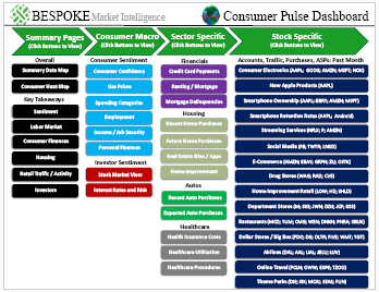
Bespoke Consumer Pulse Report – June 2020
Bespoke’s Consumer Pulse Report is an analysis of a huge consumer survey that we run each month. Our goal with this survey is to track trends across the economic and financial landscape in the US. Using the results from our proprietary monthly survey, we dissect and analyze all of the data and publish the Consumer Pulse Report, which we sell access to on a subscription basis. Sign up for a 30-day free trial to our Bespoke Consumer Pulse subscription service. With a trial, you’ll get coverage of consumer electronics, social media, streaming media, retail, autos, and much more. The report also has numerous proprietary US economic data points that are extremely timely and useful for investors.
We’ve just released our most recent monthly report to Pulse subscribers, and it’s definitely worth the read if you’re curious about the health of the consumer in the current market environment. Start a 30-day free trial for a full breakdown of all of our proprietary Pulse economic indicators.